Quick Scan
- Zillow reports color-drenching mentions in listings jumped 149% in past year; Yelp ceiling painter searches spiked 16,884%
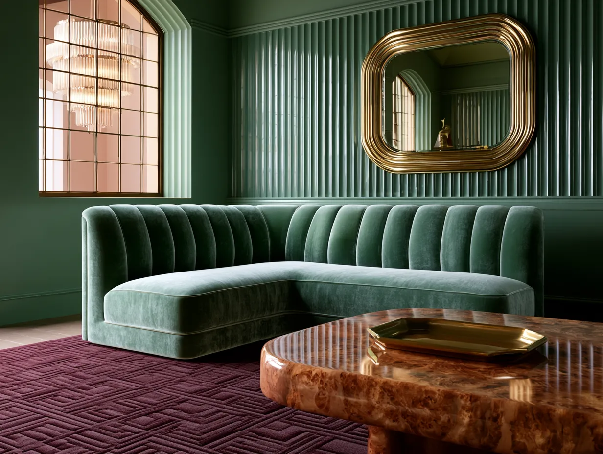
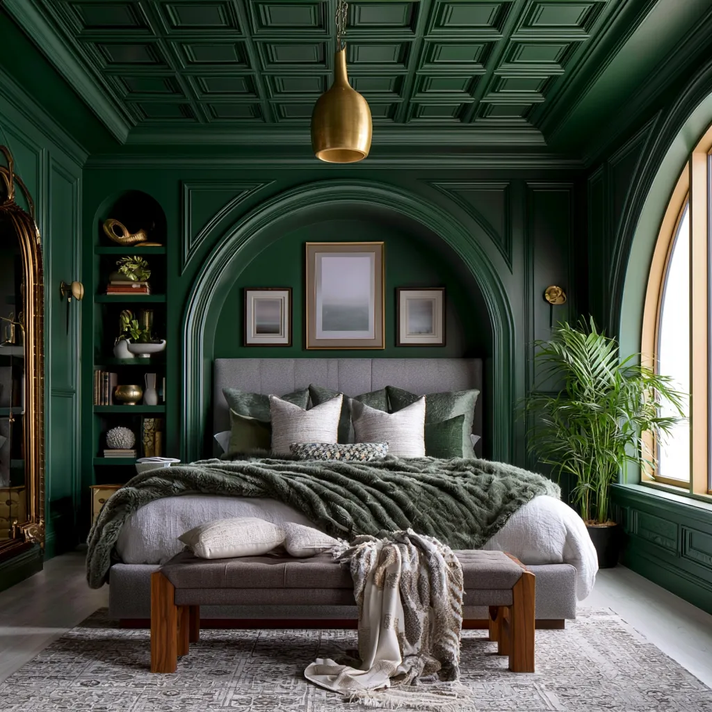
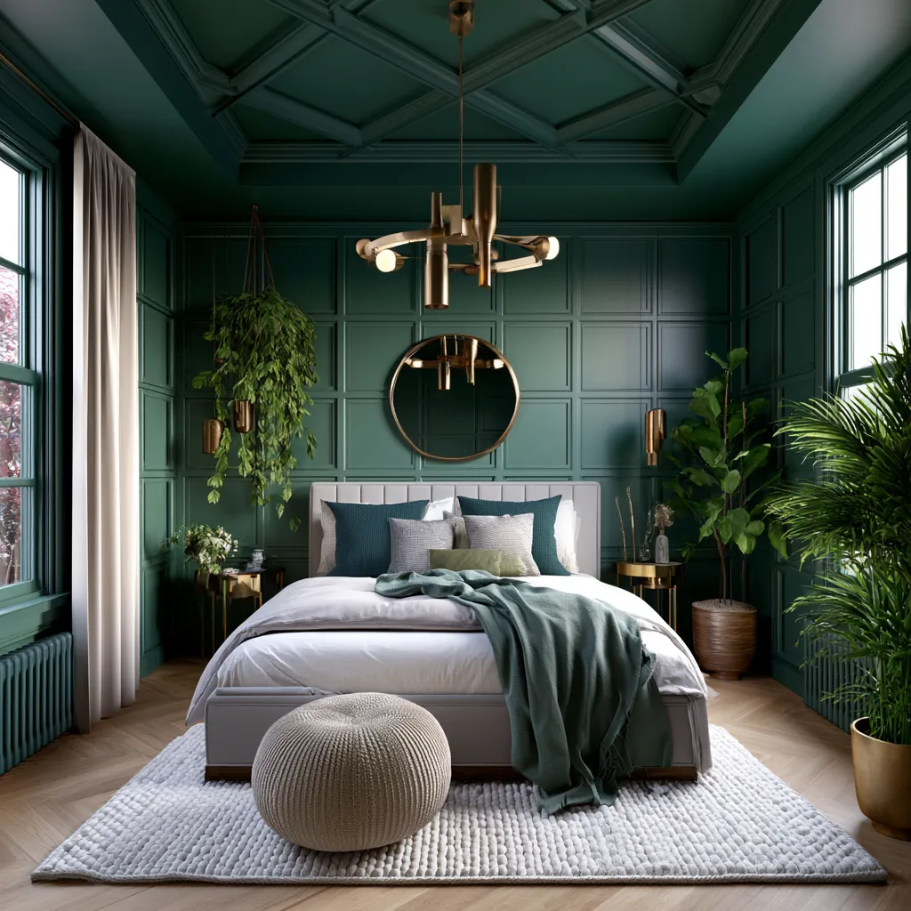
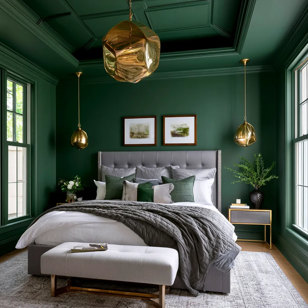
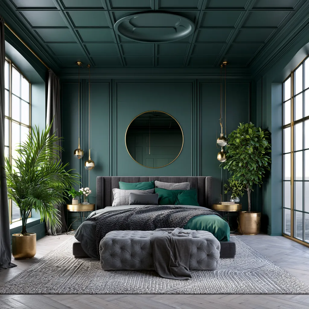
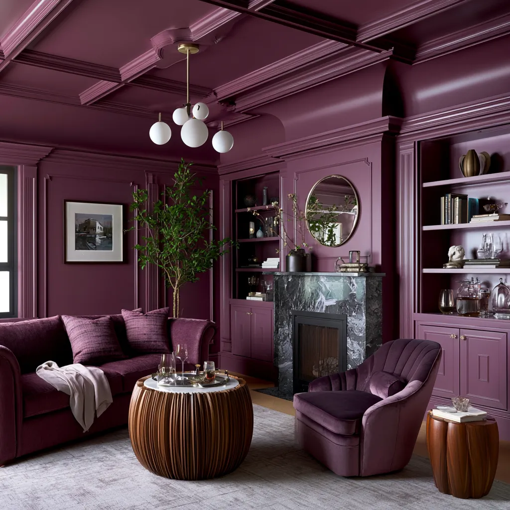
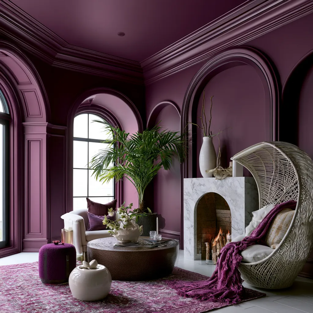
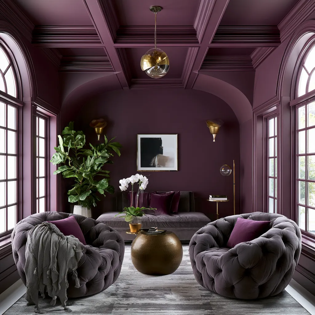
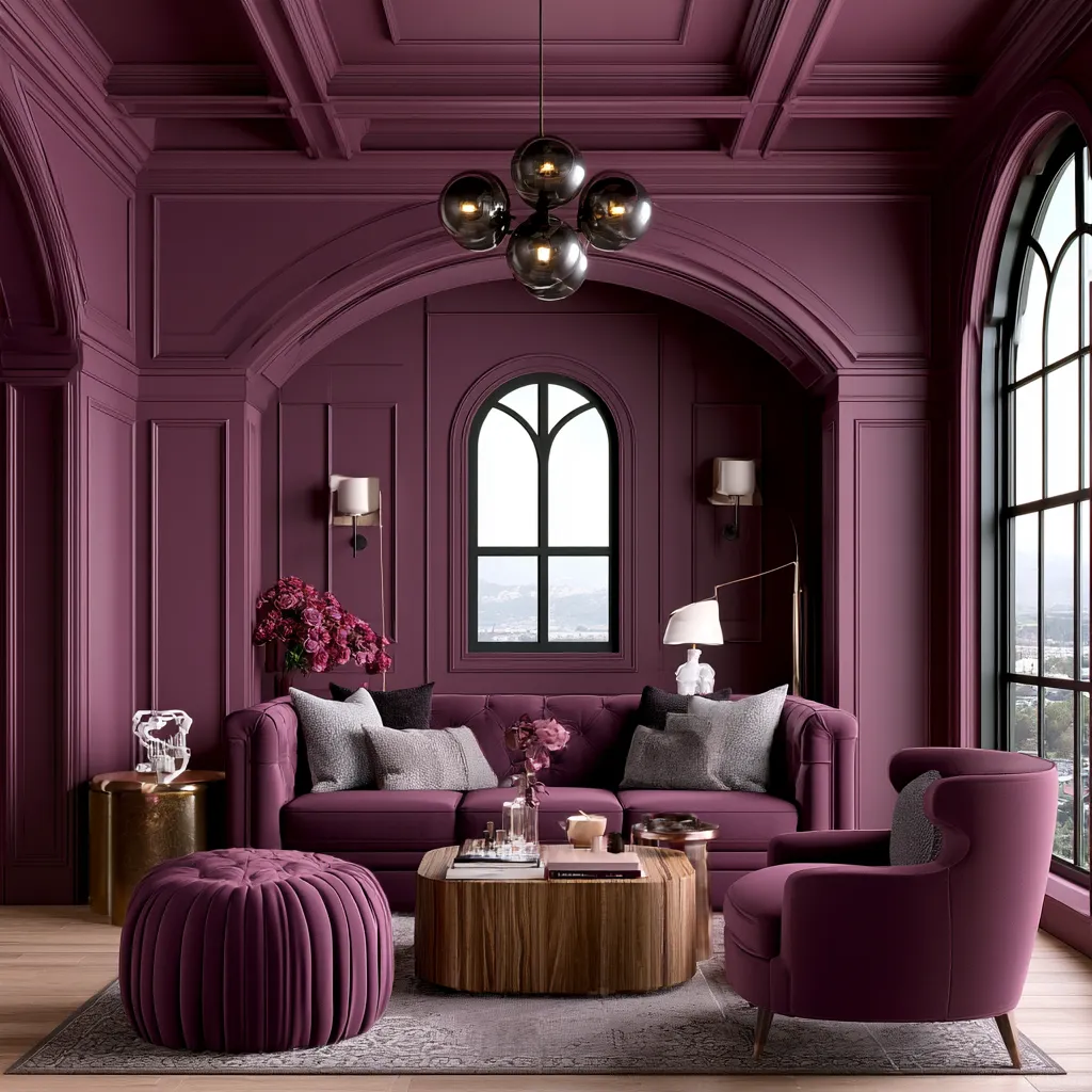
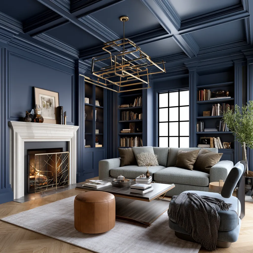
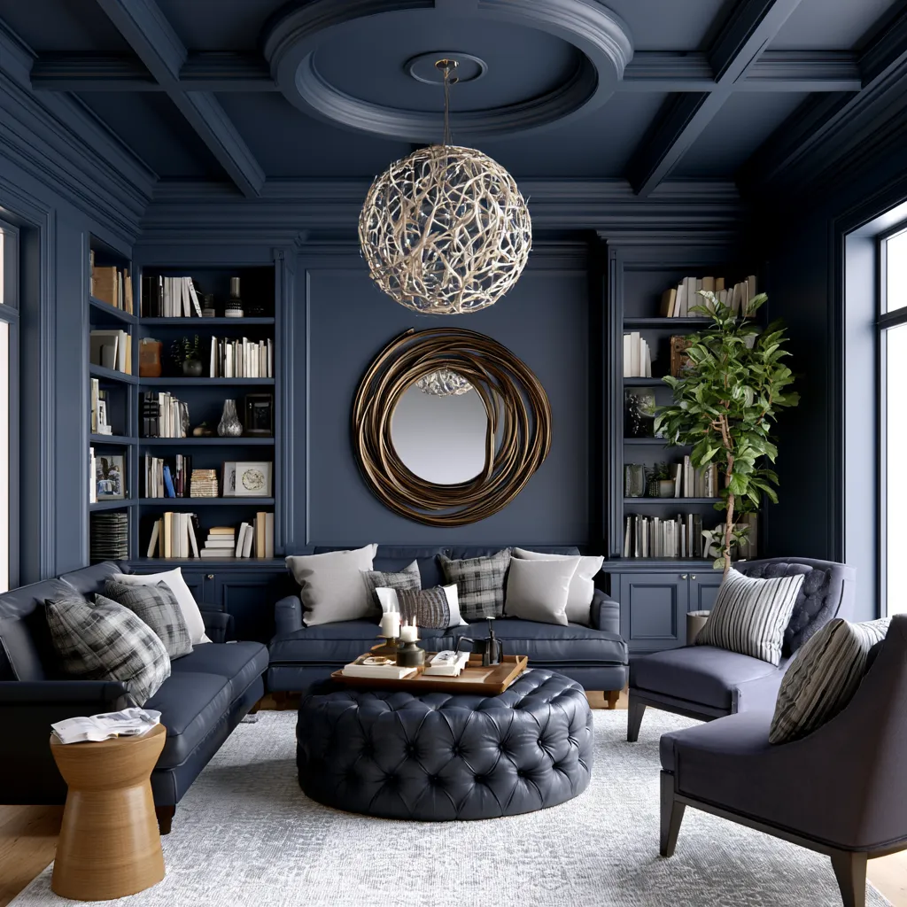
- Top colors: deep forest green, rich navy, moody plum, warm charcoal, burgundy—all saturate walls, ceilings, trim, and doors as one hue
- Designer Alicia Savin reports the effect is 'oddly calming' because lack of contrast eliminates visual chaos without harsh visual competition
- Benjamin Moore, Behr, and Farrow & Ball all released color-drenching collections at Lightovation 2026; matte finish amplifies immersion better than gloss
- Room size, ceiling height, natural light timing, and furniture selection become critical because there's nowhere to hide inconsistency in drenched spaces
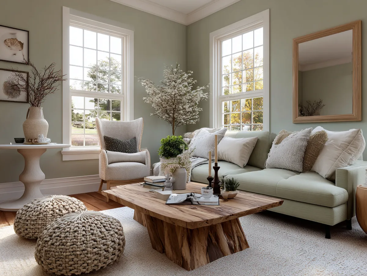
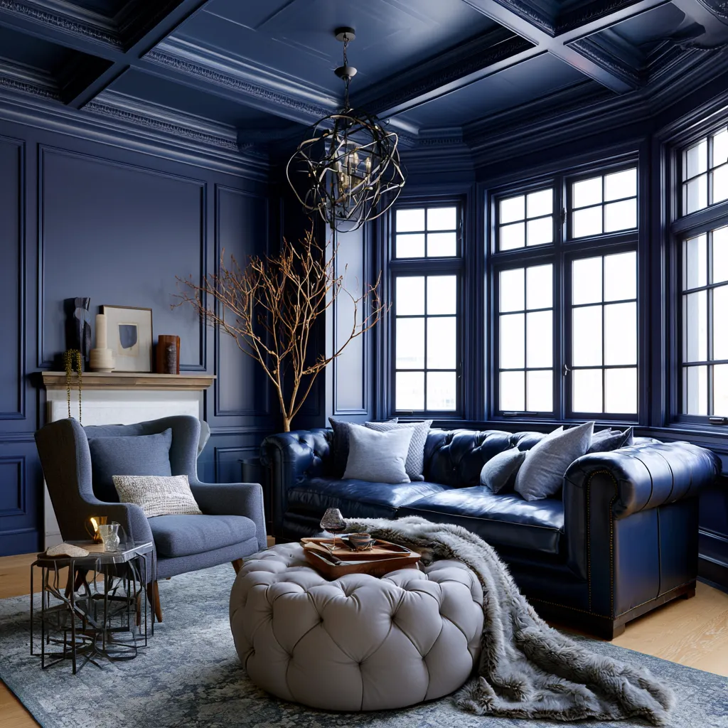
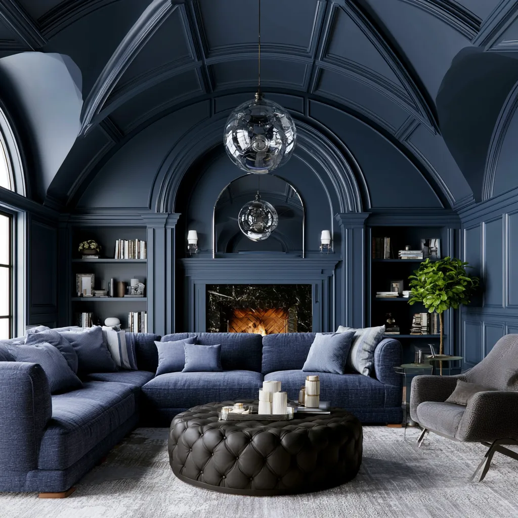
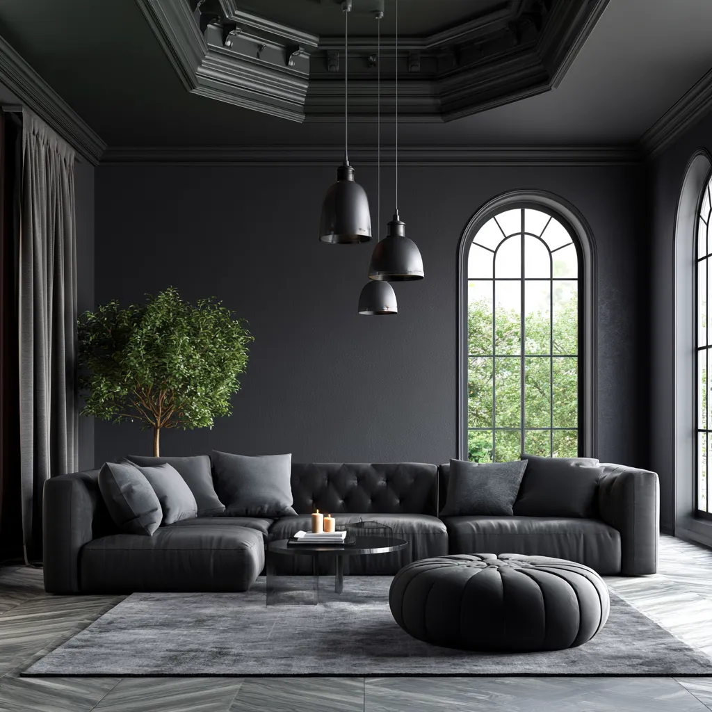
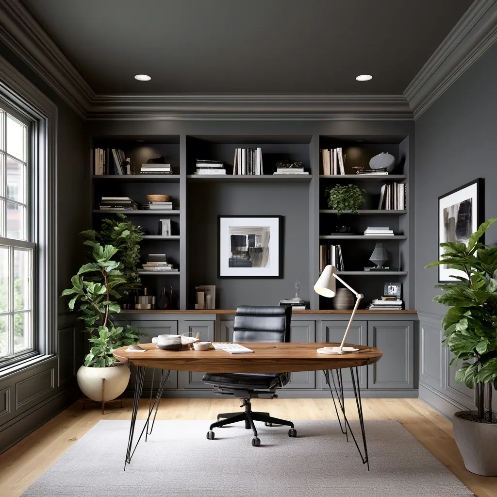
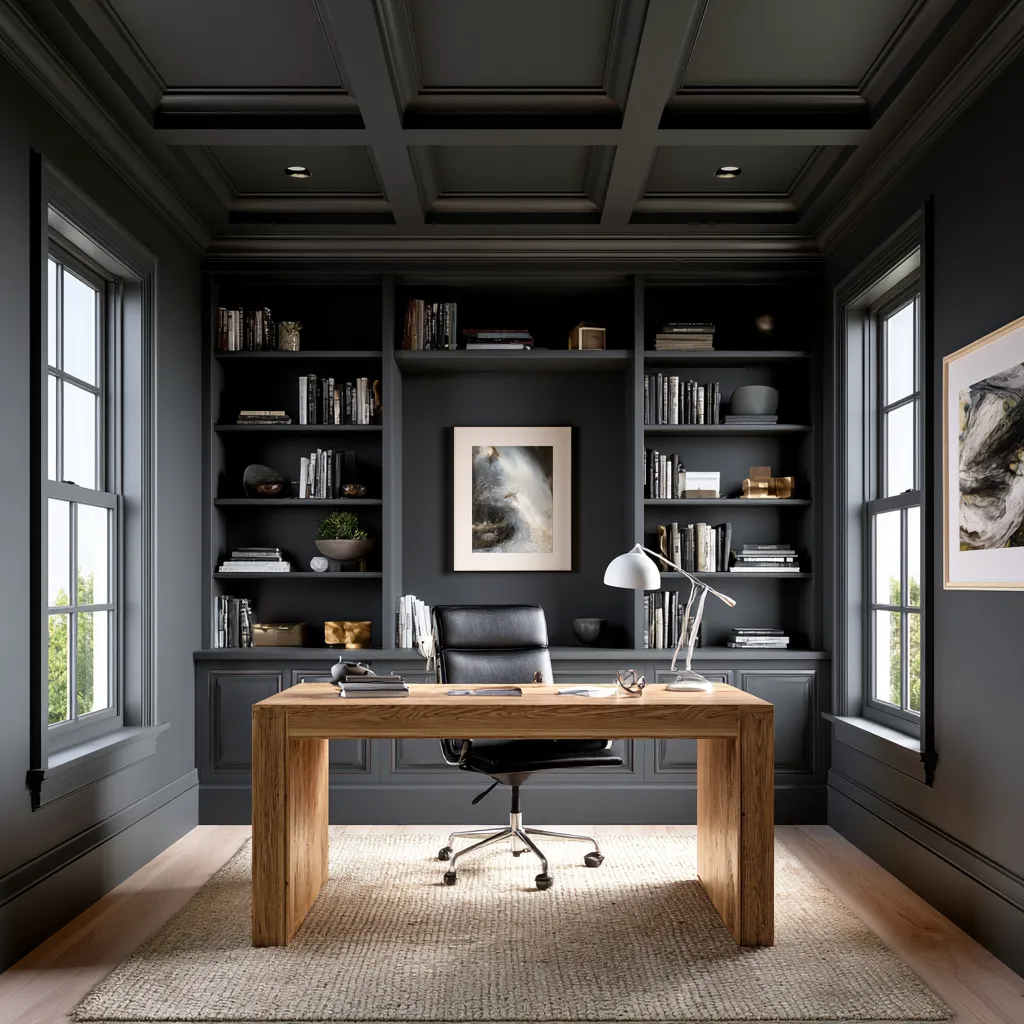
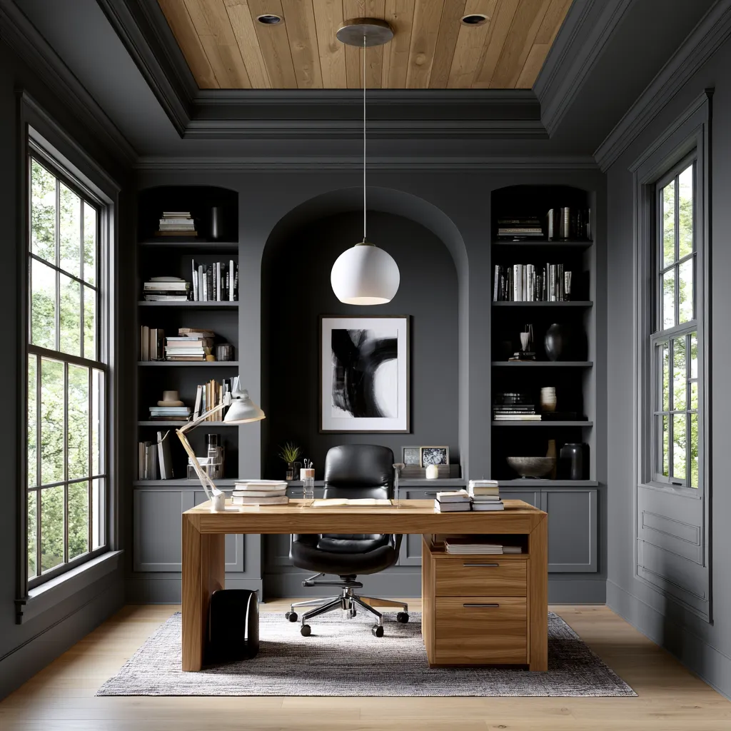
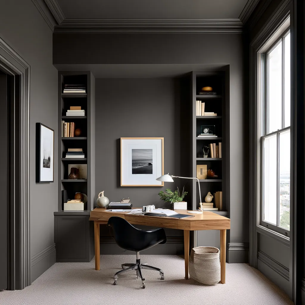
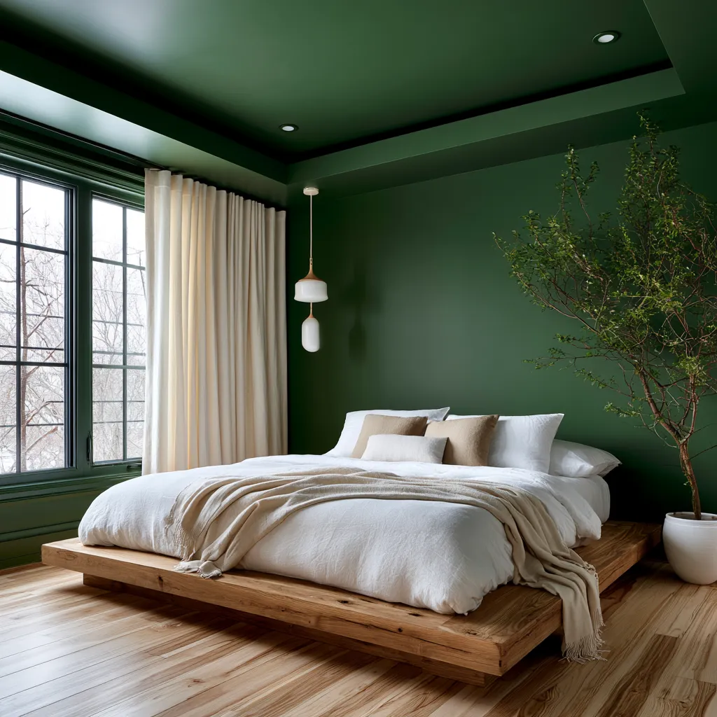
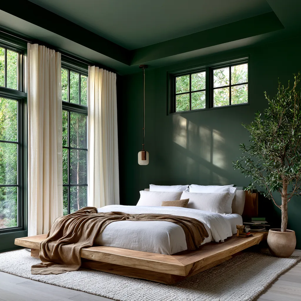
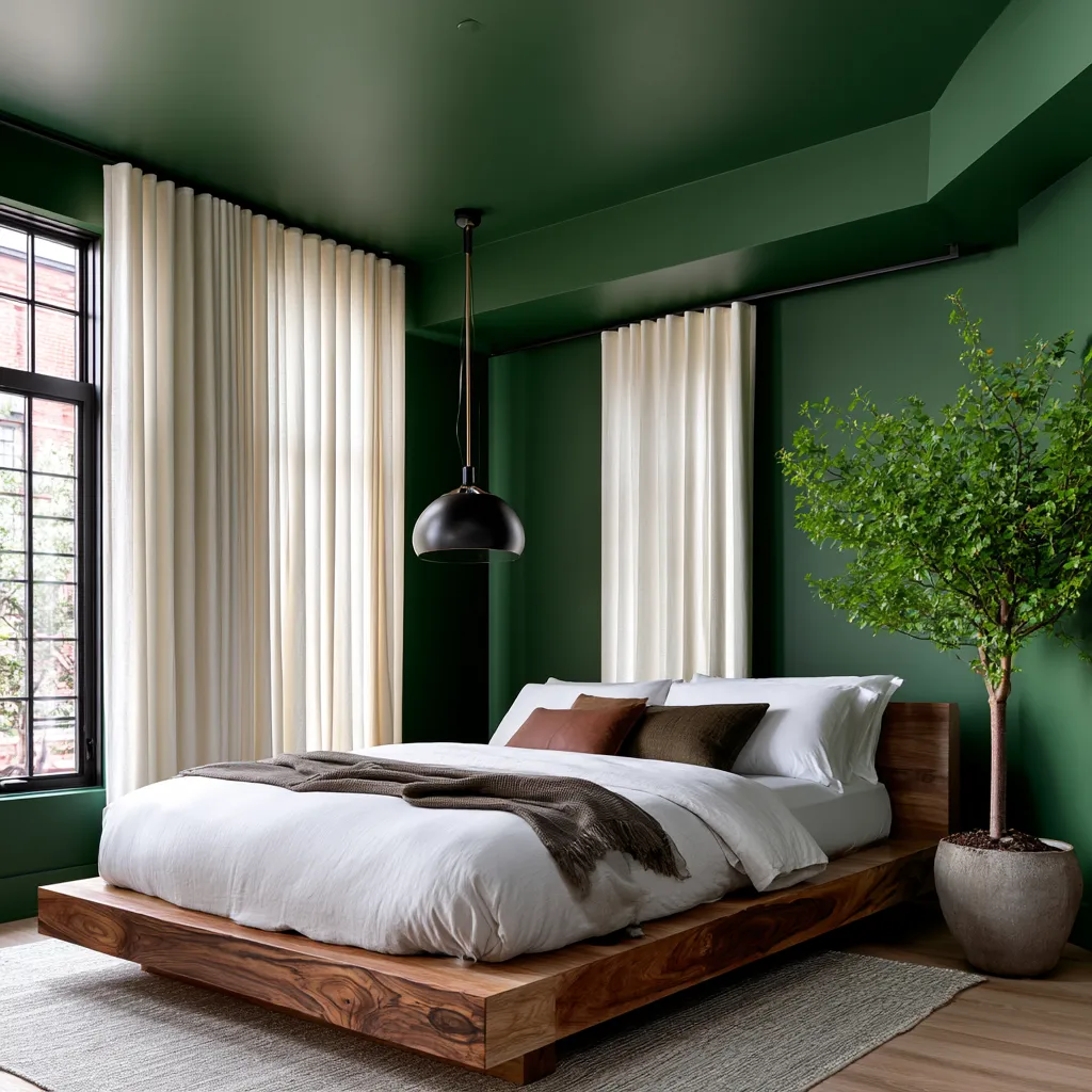
Minimalism whispered for fifteen years. Now color drenching is shouting. This interior design trend saturates entire rooms—walls, ceilings, trim, doors, sometimes even furniture—in a single bold hue. Not an accent wall. Not a painted door frame. Everything.
Zillow reports mentions of ‘color-drenching’ in listings jumped 149% in the past year. Ceiling painter searches spiked 16,884% on Yelp. Architectural Digest and Elle Decor both rank it the #1 color trend of mid-2026. Homeowners are abandoning the safe palette for spaces that feel emotionally immersive, intentional, and oddly calming despite their saturation.
Why Saturated Single-Hue Rooms Feel Calming Instead of Chaotic
Designer Alicia Savin describes the effect as ‘oddly calming.’ That sounds counterintuitive—shouldn’t deep plum surrounding you feel intense? But here’s what happens: when contrast disappears, visual chaos stops. Your eye doesn’t jump between competing tones, seeking a focal point. The room becomes a container rather than a collection of surfaces.
A black and white color palette works through contrast and drama. Color drenching works through immersion. No visual harshness means the brain relaxes.
This matters now because digital overstimulation is the baseline. You’ve spent the day staring at screens, notifications, competing windows. A room where every surface breathes the same rich navy feels like the opposite—intentional space, not fragmented attention.
Google Trends shows ‘color drenching’ reached all-time search volume in early 2026, with ‘color drenching in a bedroom’ as the top related query. People aren’t just trying one accent wall. They’re committing to entire rooms.
The top colors dominating the trend are deep forest green, rich navy, moody plum, warm charcoal, and burgundy. Pinterest’s 2026 Palette confirms momentum with Cool Blue, Jade, Plum Noir, Wasabi, and Persimmon gaining saves across the platform. Each sits in that saturated zone—not pastel, not neutral. Present.
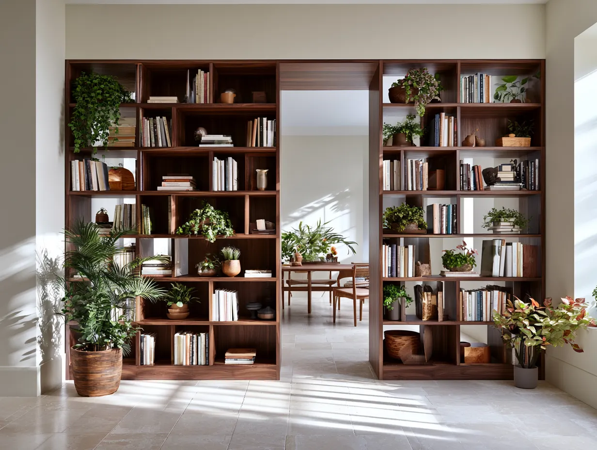
What not to do: don’t assume every room in your home needs color drenching. The effect only works when you’ve chosen a single space intentionally. A kitchen, bedroom, or home office benefits. Every wall in a 1,500-square-foot apartment painted in deep plum becomes claustrophobic, not calming.

Don’t Do This
- Don't assume every room needs color drenching—the effect only works in intentionally chosen single spaces like a bedroom or home office, not entire homes
- Don't mix finish sheens (matte walls with gloss ceiling, etc.)—consistency matters; uneven coverage breaks the immersive psychological effect completely
- Don't commit to color drenching without visiting paint samples at multiple times of day and in different seasons—north-facing rooms read differently than south-facing at sunset
Paint Brands and Colors Leading the Color Drenching Movement
Every major paint manufacturer saw this coming. Behr, Benjamin Moore, and Farrow & Ball all introduced rich, saturated collections aligned with color drenching at trade shows including Lightovation 2026. These aren’t new formulas. They’re marketing validation that the trend is real.
Specific standout collections: Benjamin Moore’s ‘Caliente’ (deep red-orange, $60–$80 per gallon) and ‘Hale Navy’ ($60–$80) dominate designer mood boards. Farrow & Ball’s ‘Drawing Room Blue’ ($110–$140 per gallon) and ‘Incarnadine’ (burgundy, $110–$140) are premium-tier choices. Behr’s ‘Darkroom’ (charcoal, $35–$45) and ‘Evergreen Fog’ (muted green, $35–$45) offer budget-friendly entry points.
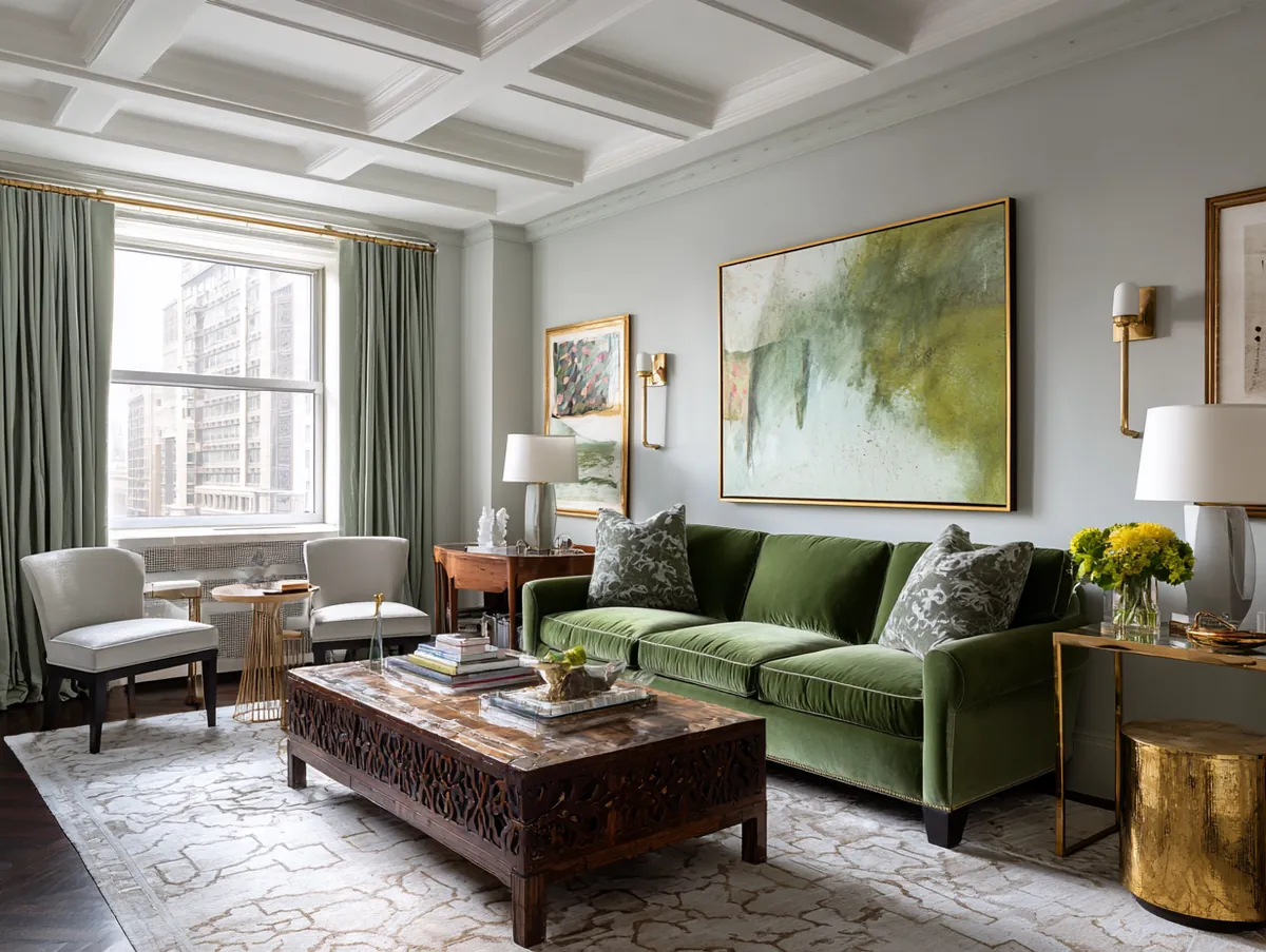
Pink interior design has proven that bold single-hue rooms work psychologically. Color drenching extends that logic to every hue spectrum. The difference: pink targets a playful tone. Deep plum, navy, or forest green create sophistication and intentionality.
Sheen matters more than most homeowners realize. Matte or eggshell finish amplifies the immersive effect by absorbing light. Semi-gloss on ceilings reads differently—it bounces light, creates subtle visual separation. Don’t go full high-gloss unless you want the room to feel lacquered.
Application cost varies dramatically. A 12-by-14-foot bedroom (walls plus ceiling) requires roughly 3–4 gallons. Labor runs $1,200–$2,500 depending on your region and ceiling height. Doing it yourself saves $1,000+ but demands skill—uneven coverage breaks the immersion completely.
What not to do: don’t mix finish sheens across the same room. Using matte on walls and gloss on trim creates visual confusion. If you’re drenching, commit to consistency. All surfaces speak one language.
How Color Drenching Changes Room Perception and Furniture Selection
A room painted in deep burgundy reads smaller, more intimate. The same room in warm navy feels expansive and grounded. In light-flooded spaces, charcoal absorbs light and creates drama. In north-facing rooms, forest green feels almost black—wrong choice entirely. Color drenching is site-specific design, not trend-chasing.
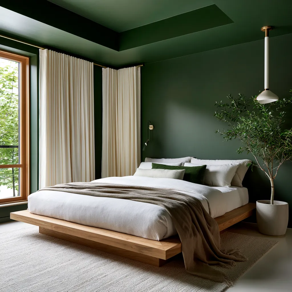
Furniture color becomes critical because there’s nowhere to hide. In a traditional multi-color room, a mismatched chair disappears visually. Drenched rooms demand coherence. You’ll notice every piece. Pale oak furniture against deep plum reads as contrast intentionality—either buy in or paint the wood. Half-measures fail.
Ceiling height perception shifts dramatically. Drenching a low ceiling in deep color compresses the space psychologically—it feels lower. High ceilings in the same color feel grounding and enveloping. A 10-foot ceiling in forest green is sanctuary. An 8-foot ceiling in the same shade becomes a cave. Measure before committing.
Natural light timing affects how colors read. A north-facing bedroom in moody plum photographs blue-grey at noon and purple-brown at sunset. The same room in charcoal reads brown in afternoon light and nearly black at dusk. Visit paint samples at different times before final selection. One afternoon visit is insufficient.
Drywall preparation matters more than standard painting. Color drenching amplifies every imperfection—uneven wall compound, nail pops, seams. Professional painters charge premium rates because the work demands higher standards. DIY shortcuts will be visible. Budget accordingly.
What not to do: don’t color-drench a room you’ve never sat in during different seasons. A guest bedroom you use twice yearly demands different psychological positioning than a daily home office. The immersion works only when you’re actually inhabiting the space regularly. Short-term rentals are poor candidates.
Save this
Color Drenching Transforms Rooms From Neutral Backdrops Into Emotionally Immersive Spaces
Color drenching isn't a design accident—it's a calculated rejection of minimalist restraint. By wrapping every surface in one saturated hue, rooms stop feeling like blank canvases and start feeling like containers for intentional living. The immersion works because contrast disappears, chaos quiets, and your nervous system relaxes into a space that breathes one color.
This trend will continue accelerating because the psychology is sound. Digitally overstimulated homeowners aren't looking for subtle. They're looking for sanctuary. A deep navy bedroom or forest green home office doesn't whisper. It commits. It says: you belong here, and the world outside can wait. The 149% jump in color-drenching mentions and 16,884% surge in ceiling painter searches prove that thousands of people are already making that choice. Save this post.
📌 Save to PinterestYou Might Also Like