German house design has long carried a reputation for severity, but the best modern German houses prove that restraint and visual drama are not opposites. Scroll through any recent project from firms like SEHW Architektur, Paul de Ruiter, or Buero Wagner and you notice the same trick: a tight material palette deployed with surgical confidence. That’s the real language of german architecture houses — not ornament, but precision. I’ve spent months collecting these projects, and every single one of them earns its presence on the street.
What separates a forgettable German home from a genuinely arresting one is usually a single decision — the facade material, the roof line, the ratio of glass to solid wall. Get that one thing wrong and the whole composition collapses. Get it right and the building looks inevitable, like it could not have been built any other way. That’s the standard these architects work to.
What you’ll see in this collection
- German country houses with dark facade cladding — architects Daniel Laubrich and SEHW
- Glass and steel villas with industrial accents — Paul de Ruiter and Biehler Weith
- Modern German homes where interior and exterior share one material logic
- German wood frame houses from Buero Wagner with copper screens and larch cladding
- FAQ on styles, costs, and what these houses are actually called


Dark Facades on German Country Houses — What Architects Know That Developers Don’t
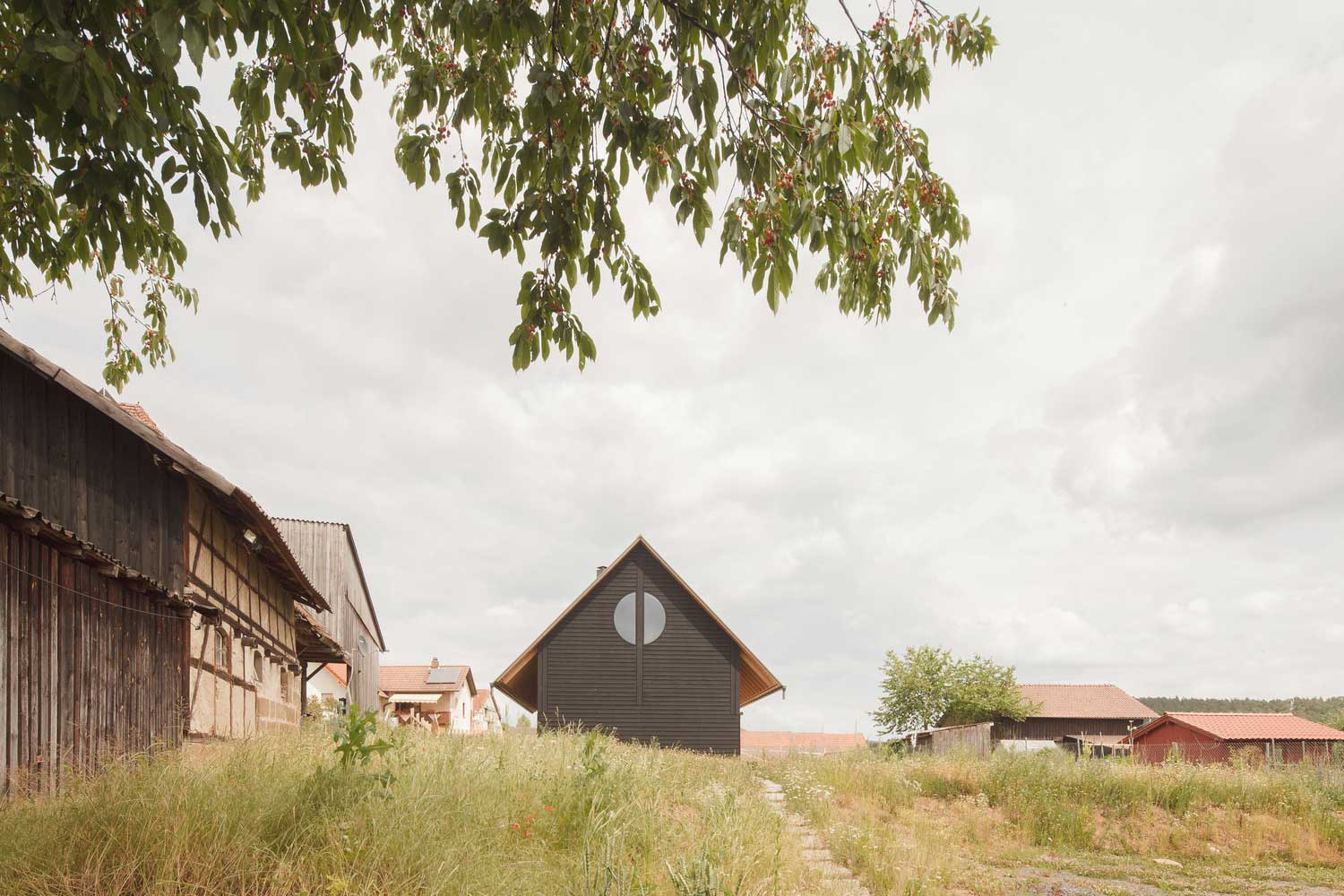
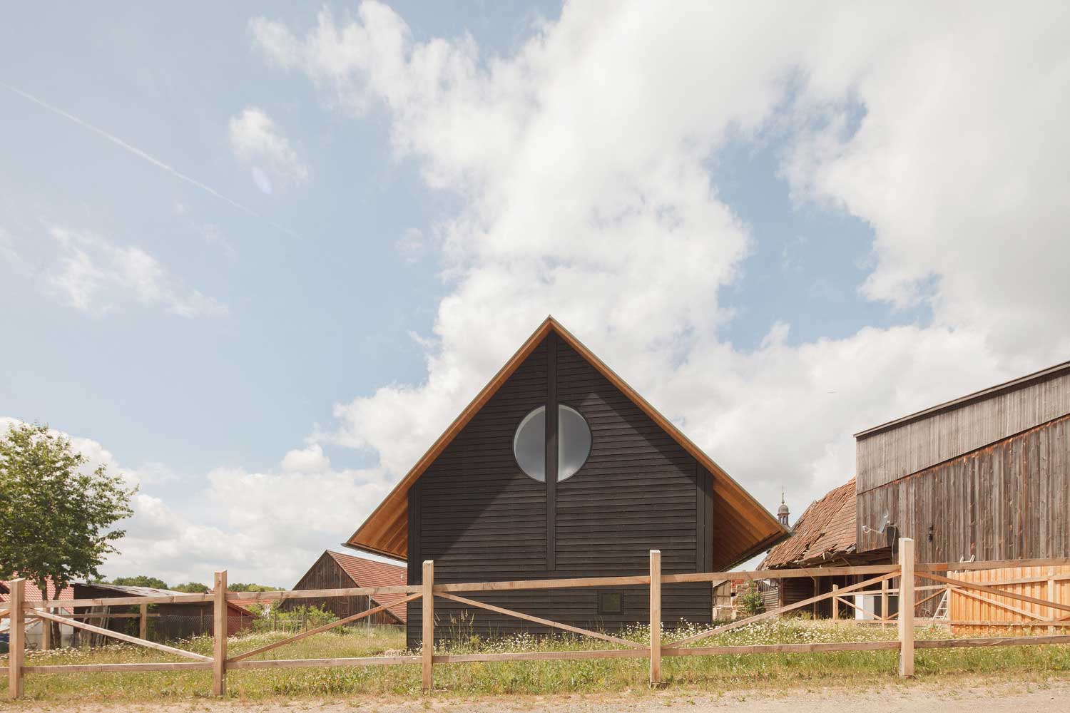
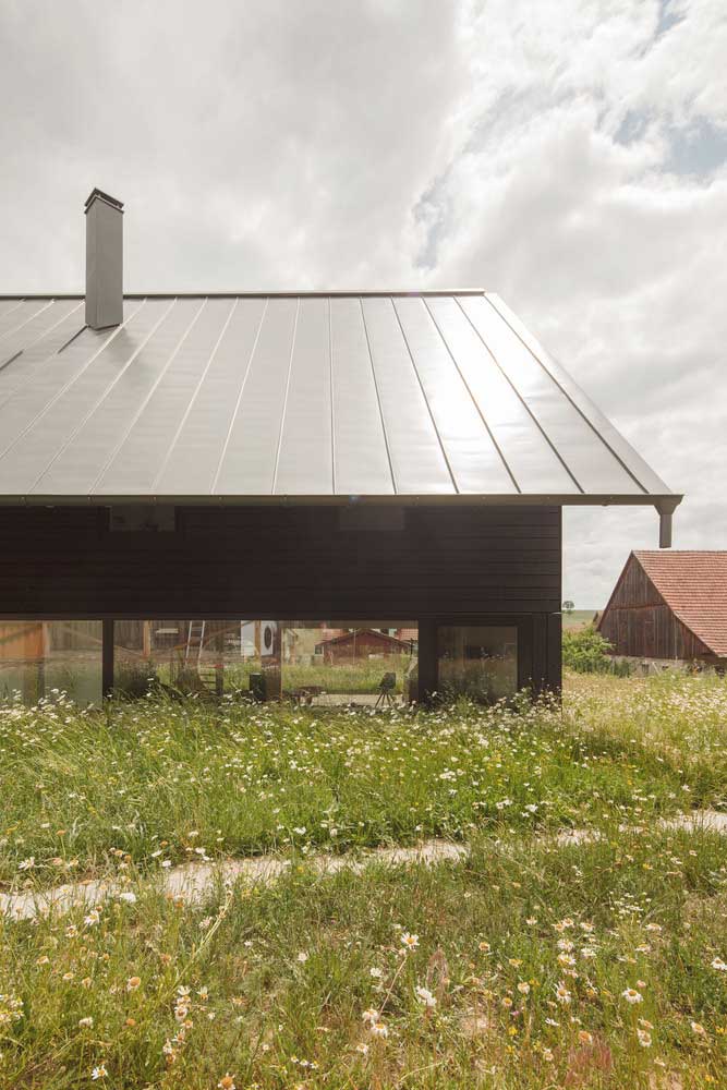
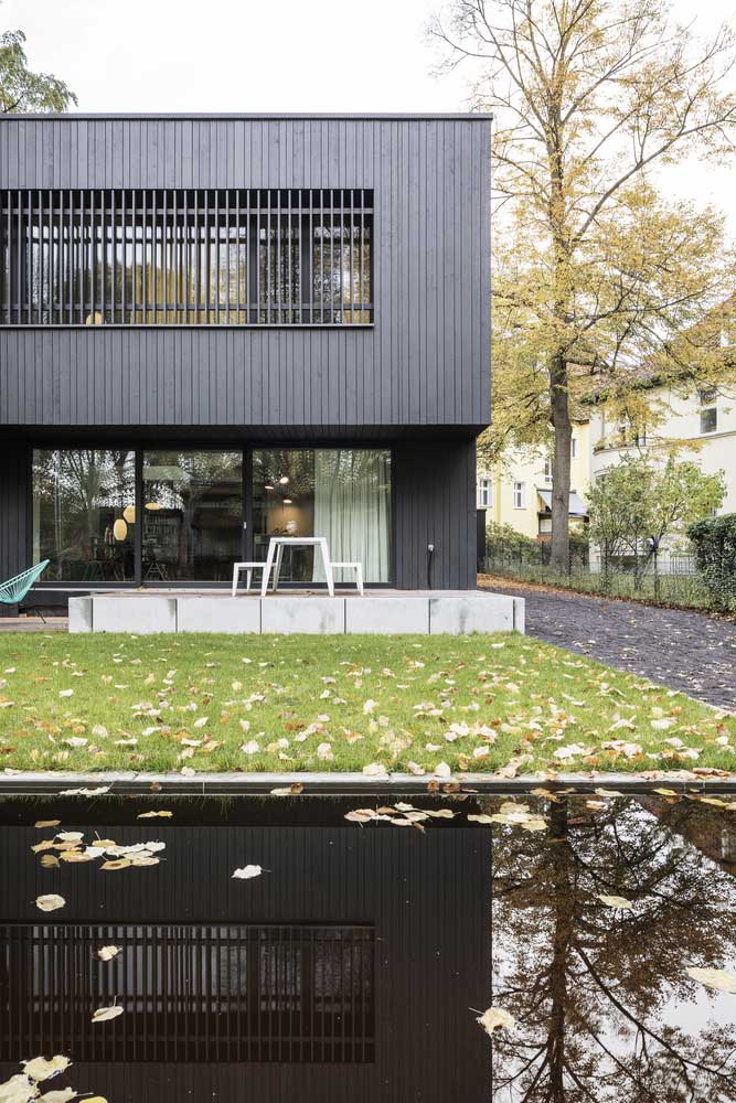
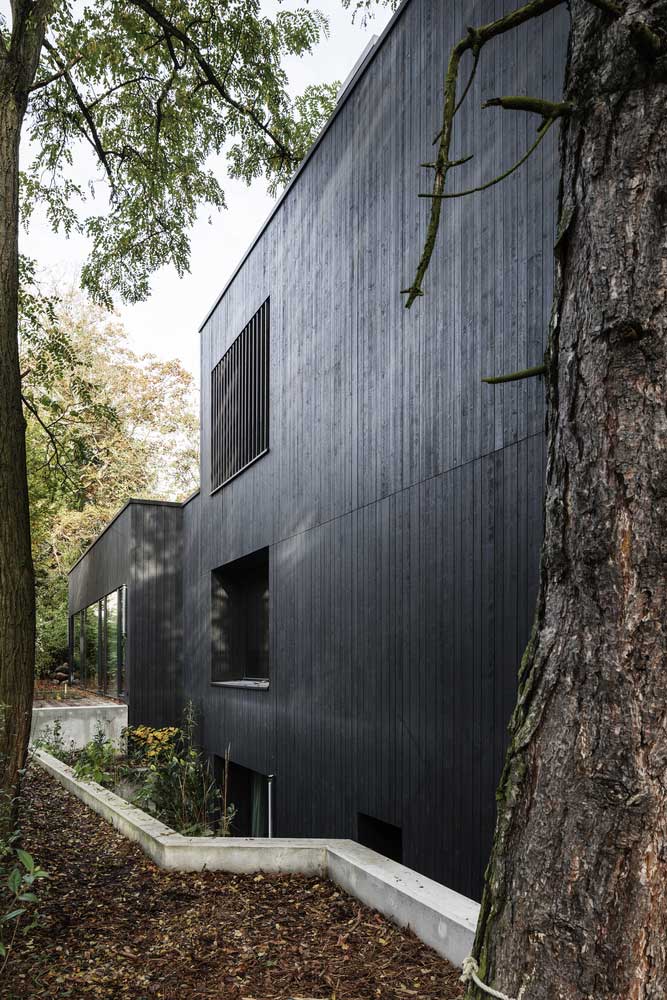
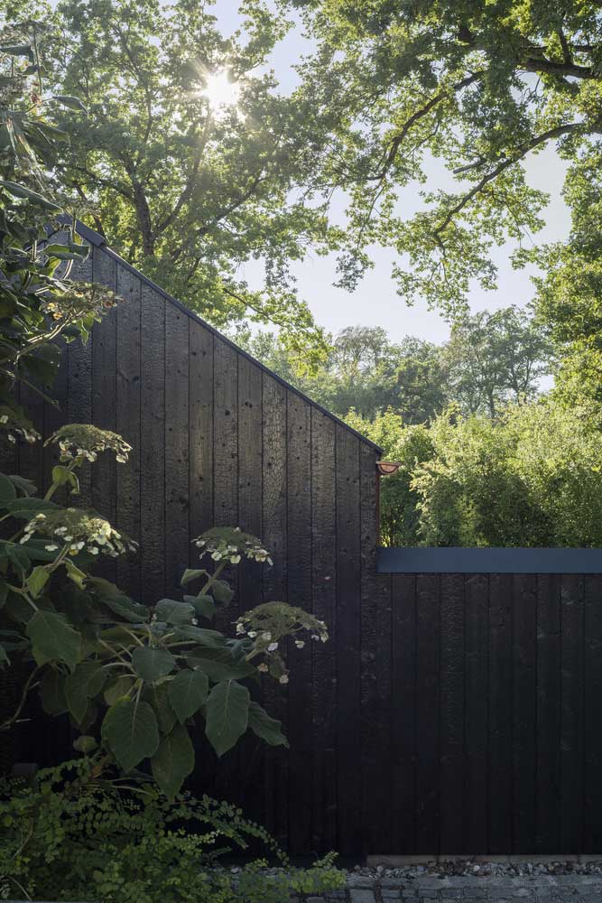
Rural Germany is full of respectable beige boxes. Nothing wrong with a beige box, but nothing memorable either. Architect Daniel Laubrich chose a different route: black timber cladding on a farmhouse-scale volume with a classic gable roof, photographed here by Martin Geyer of EMILBlAU. The result does not look rebellious — it looks authoritative, like the house always knew it was going to be this color. I’ve seen projects where clients panicked halfway through and switched to charcoal gray. That’s the wrong move. The full black commits to the idea and that’s why it reads.
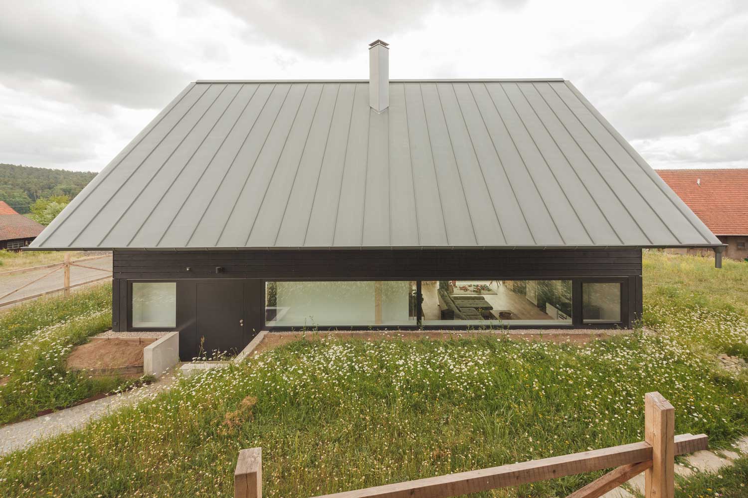

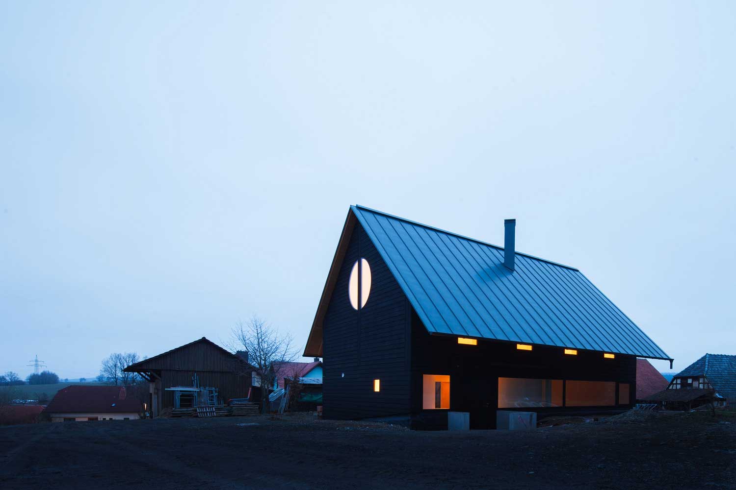

| Architects | Daniel Laubrich |
| Photo | Martin Geyer – EMILBlAU |
The shape of the house barely matters once you commit to a black exterior. You’ll notice this in both the gable-roof burgher’s house typology and the flat-roofed rectangular cottage — black reads as original against a backdrop of yellow render and red brick. Doesn’t read? A dark brown. Brown is the compromised version of this idea and it never quite convinces. The second project in this section comes from SEHW Architektur, with photography by Philipp Obkircher. SEHW paired black timber with light wood balcony frames — that contrast keeps the facade from collapsing into monotony, and it takes the edge off the severity without undermining it.


| Architects | SEHW Architektur |
| Photo | Philipp Obkircher |
The black wood facade here is fully aligned with the German character — composed, a little closed off, completely sure of itself. Wooden frames and the contrast palette on the balconies soften what could be oppressive into something that reads as calm authority. My go-to advice for anyone trying this at home: don’t add a bright front door to “balance” the darkness. The black needs to be allowed to hold. A matte black door, dark hardware, done.
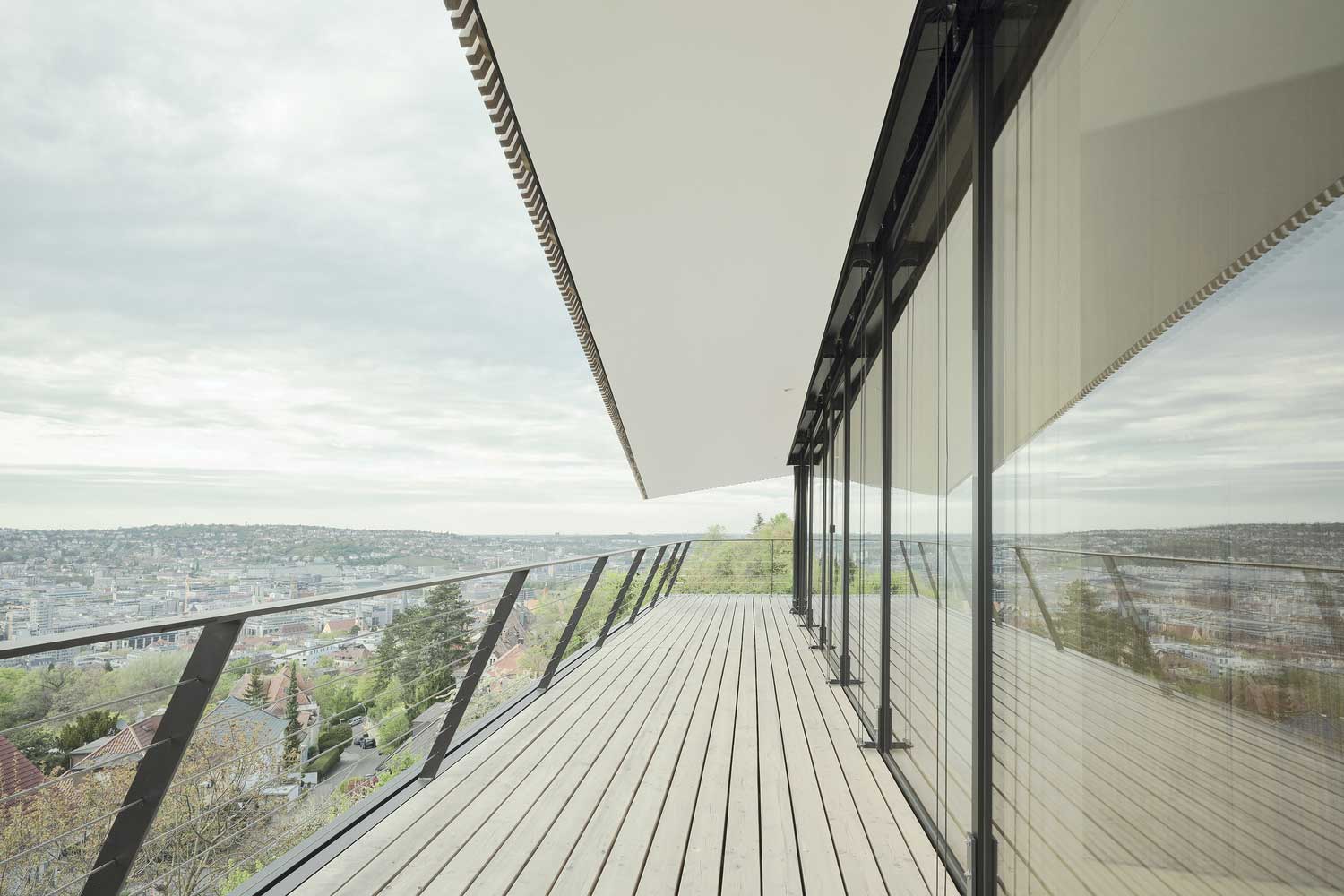
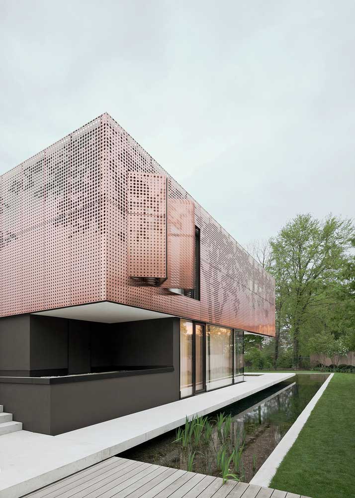
Glass and Steel in German House Design — Paul de Ruiter’s Formula for Fitting a Villa Into Fields

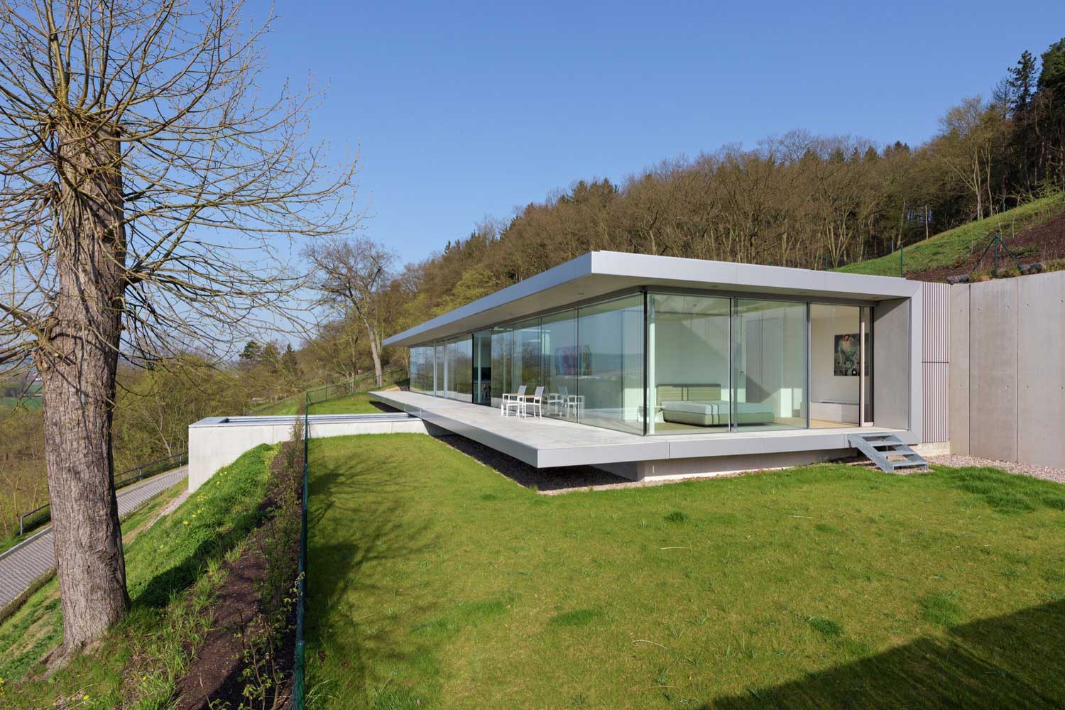
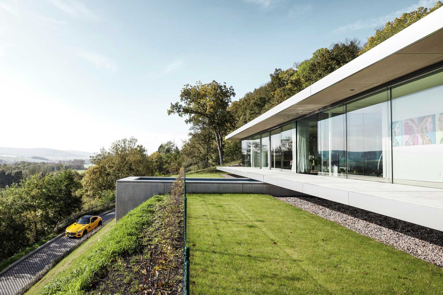


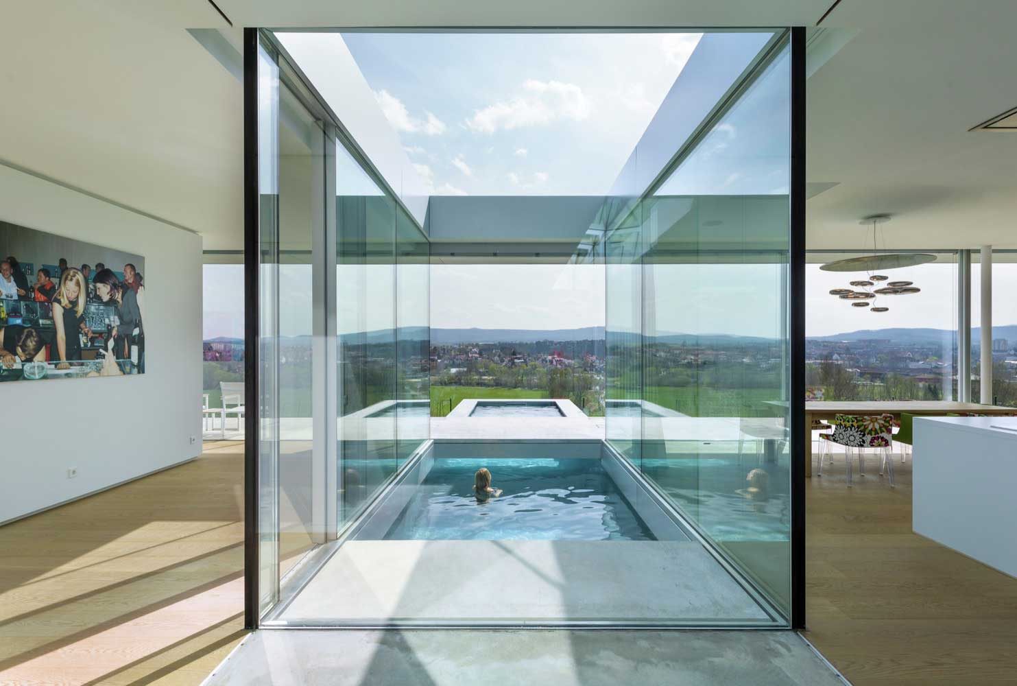


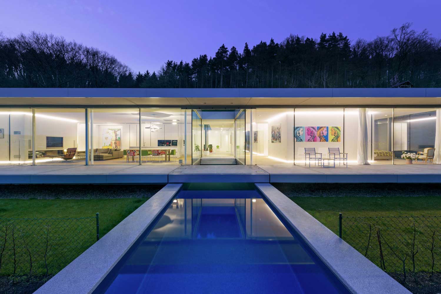


| Architects | Paul de Ruiter Architects |
| Photo | Pieters Kers & Patrick Voigt |
Paul de Ruiter’s villa sits on a flat agricultural plot and does something glass-and-steel buildings almost never manage: it disappears into the landscape. Glass, steel, and concrete are the materials, and they work here because the massing follows the topography of the rear slope rather than sitting on top of it like a container dropped from a crane. You’ll notice the interior reads as a continuation of the fields outside — that’s intentional, not accidental. What doesn’t work in this typology is the mirrored glass version. I’ve seen projects where architects reach for reflective glazing to “reduce visual impact.” The impact is still there, it’s just annoying now.
Don’t Do This with German House Design
Avoid pairing a glass-and-steel volume with decorative shutters or ornamental ironwork “to add warmth.” The industrial language of this architecture needs to be resolved through material — wood ceilings, stone floors, linen textiles — not stuck-on ornament that belongs to a completely different tradition. I’ve seen this mistake on projects in Bavaria and Baden-Württemberg that cost upwards of $800,000 to build and look confused because someone added shutters in the last week of design development.
Also: do not specify off-white render on a building whose massing reads as modern. Off-white render is a material for traditional forms. On a flat-roofed concrete-frame house it reads as a budget decision, not an aesthetic one.


| Architects | Biehler Weith |
| Photo | Brigida González |
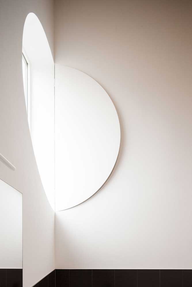
Biehler Weith’s complex on Lake Baden is the most instructive example in this collection for anyone dealing with a narrow plot. Three polygonal buildings, each a distinct form, each carrying the same concrete-and-glass material language — it’s like a family of siblings that argue constantly but dress identically. What you can steal from this: the staggered footprints create privacy between units without fences or hedges, and the varied window opening shapes give each building a slightly different silhouette despite sharing the same facade palette. Concrete clear forms and glass abundance produce an interior that is genuinely bright. That is not a given on a narrow lakeside plot where your neighbor is six meters away.
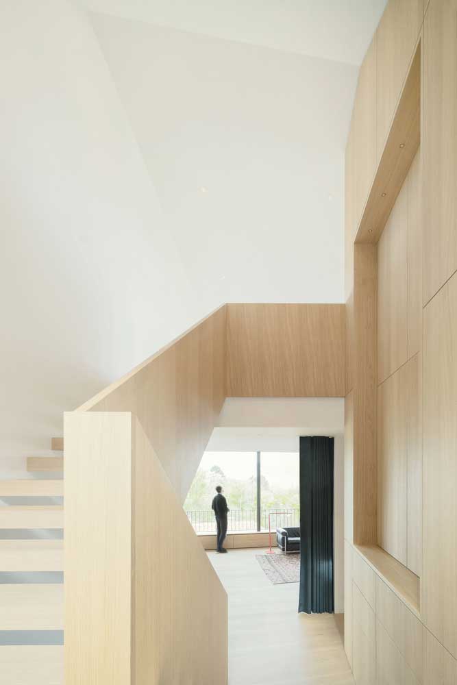
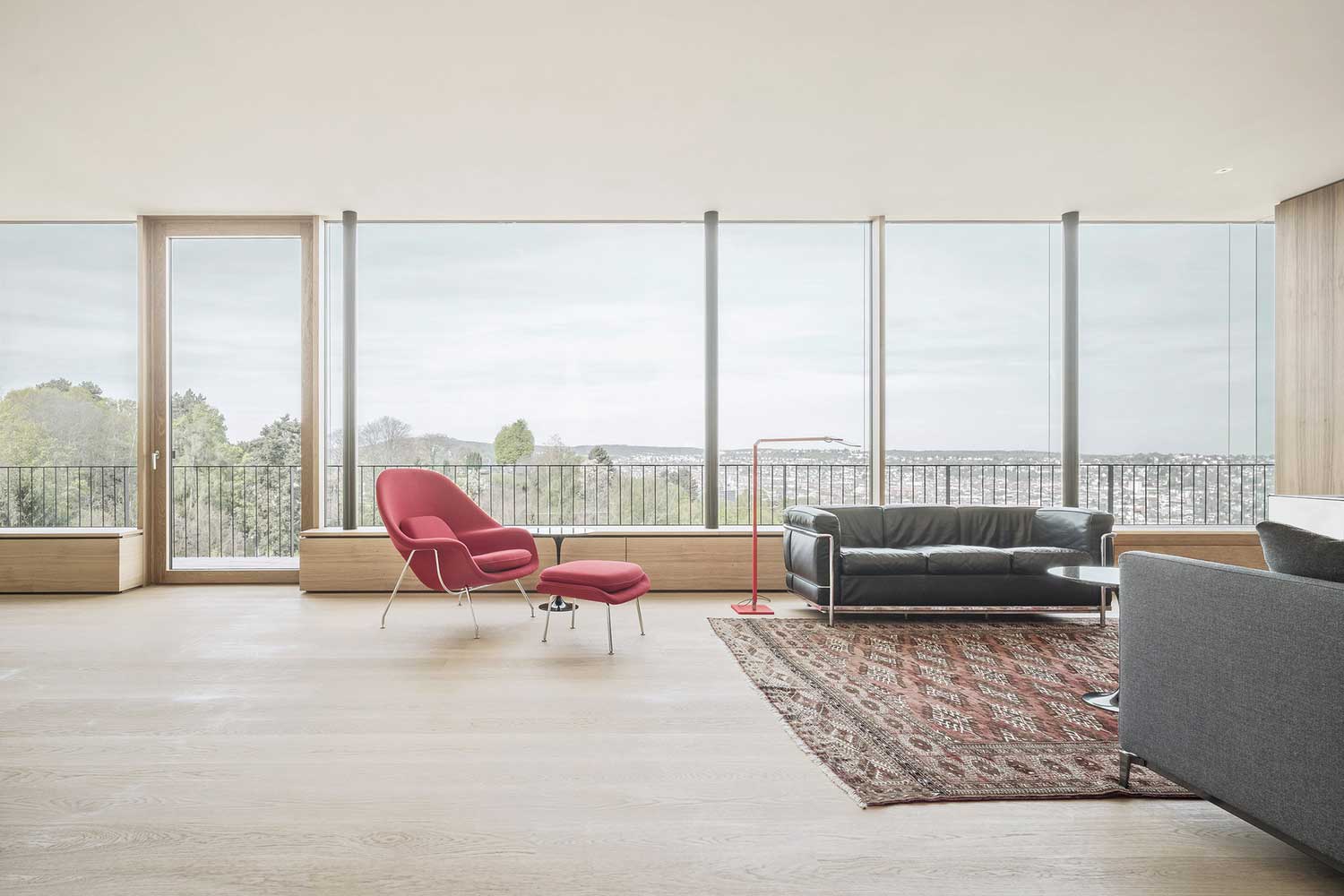
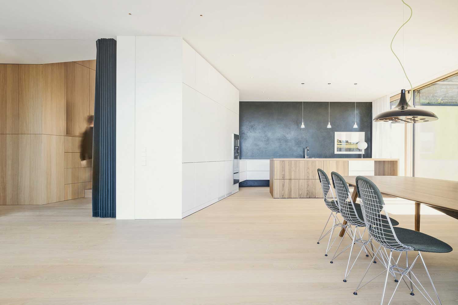
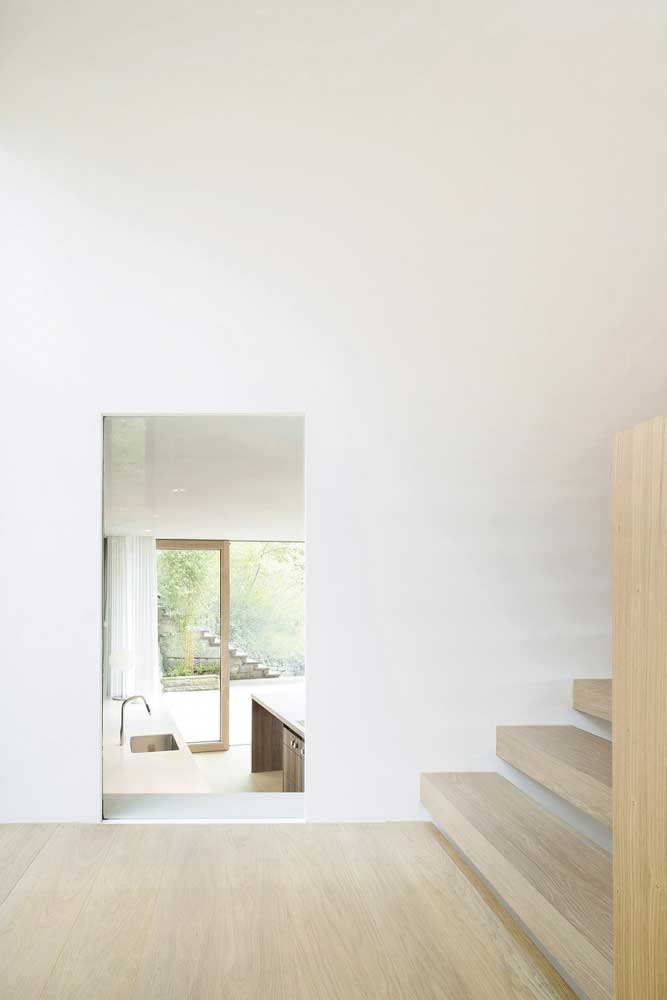
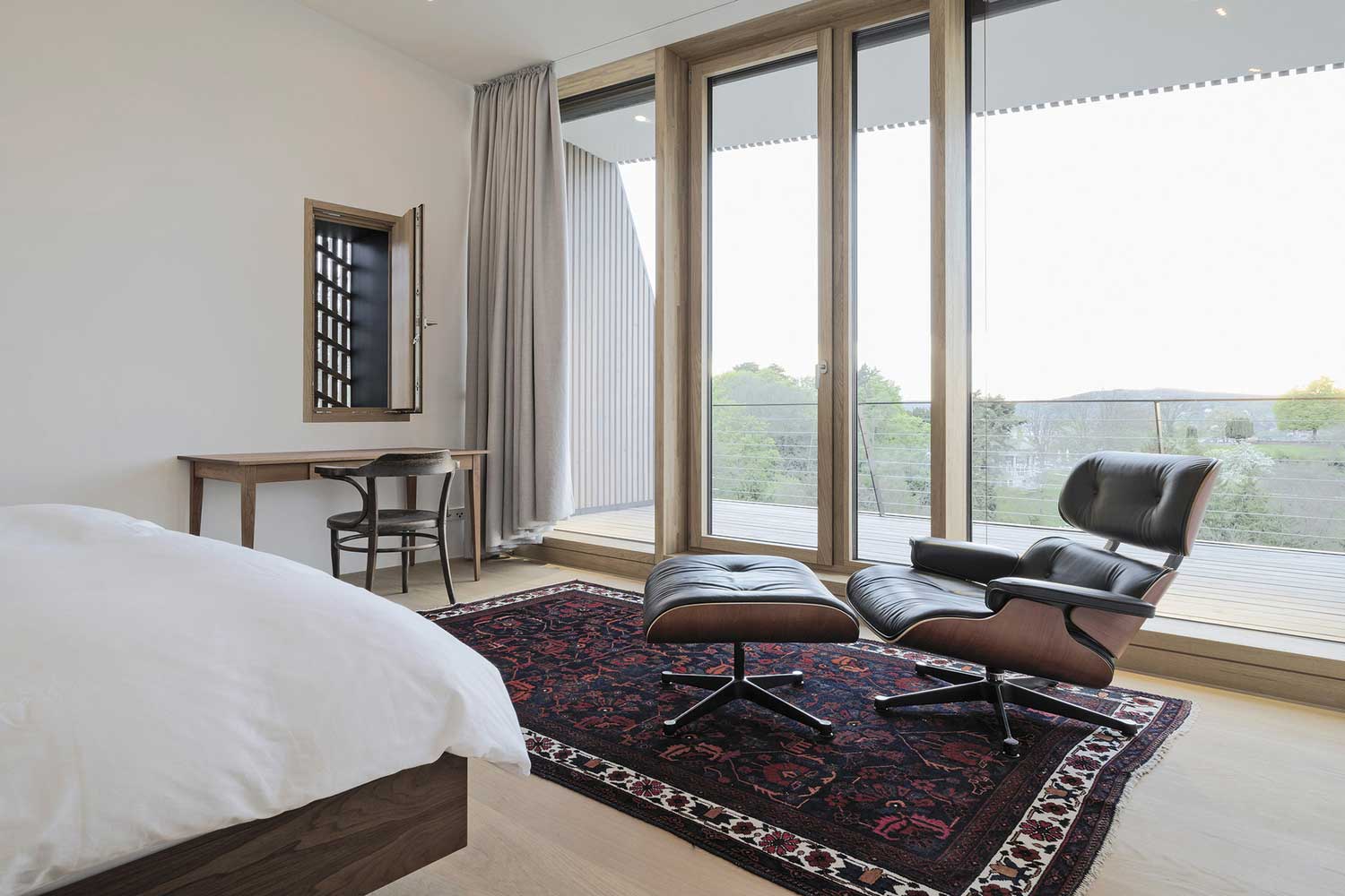
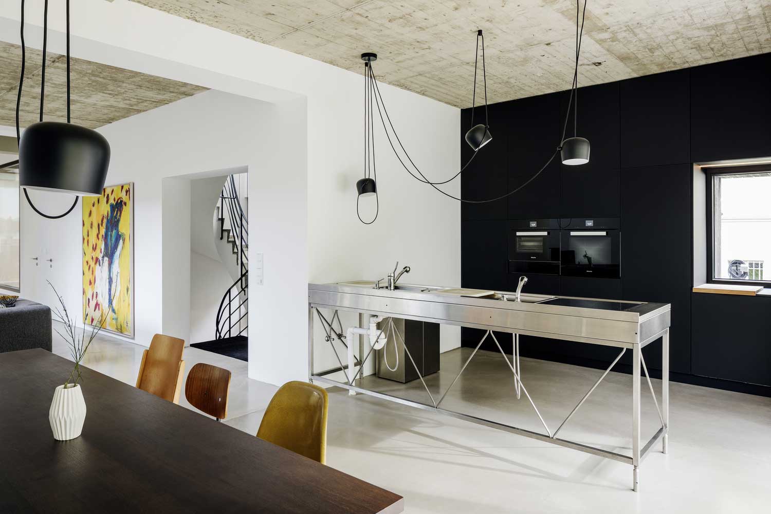
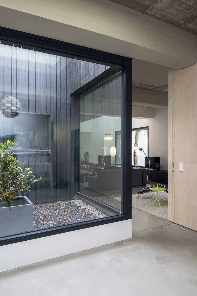
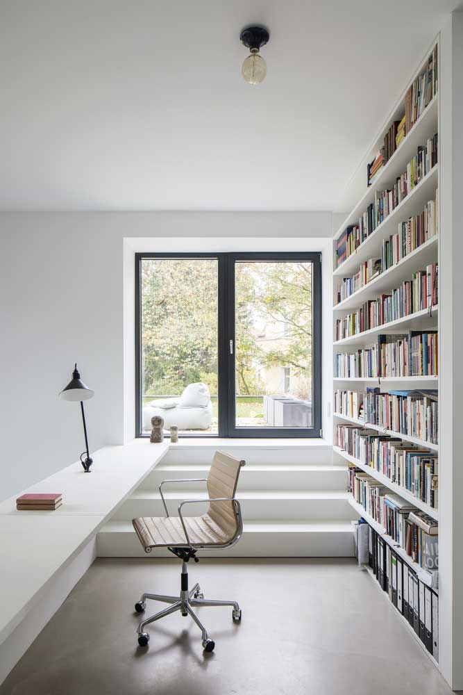
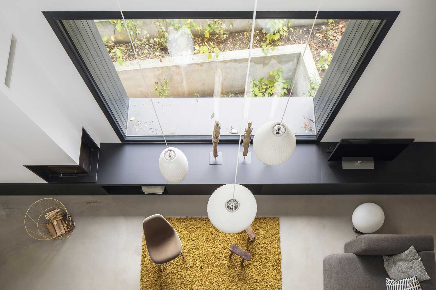
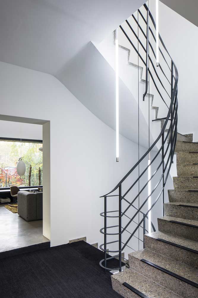
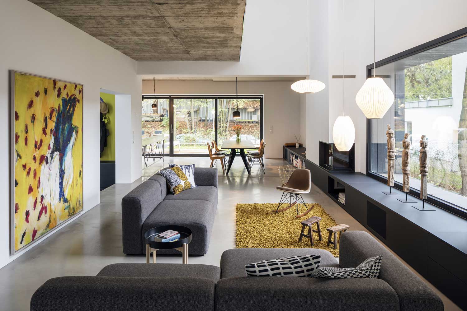
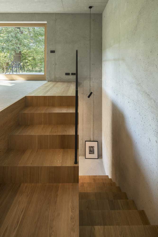
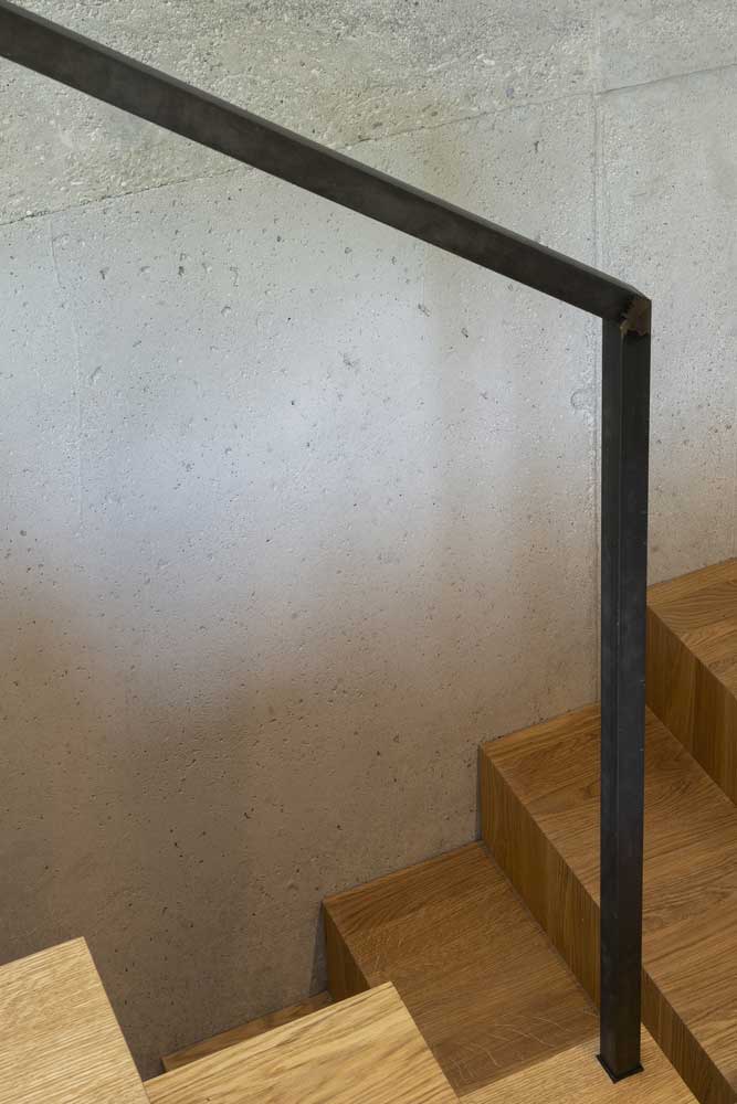
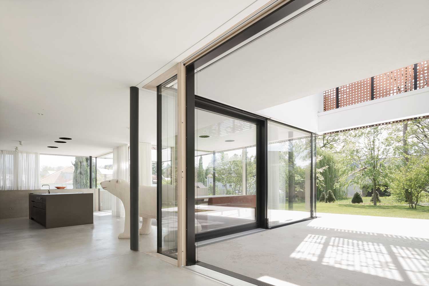
What German Home Interiors Actually Look Like Behind the Concrete Walls
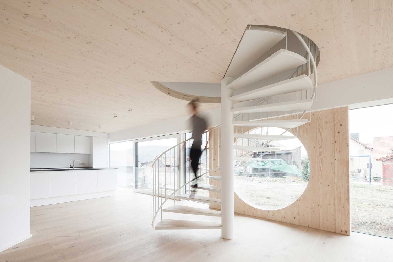
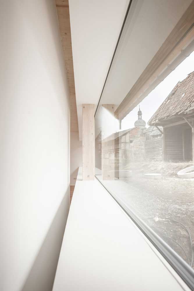
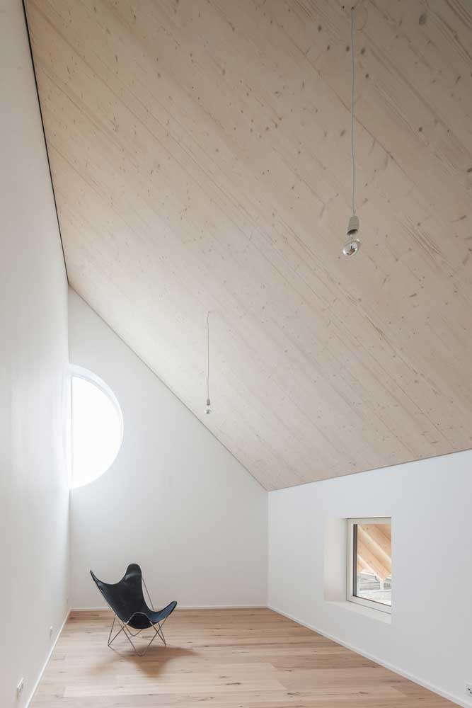
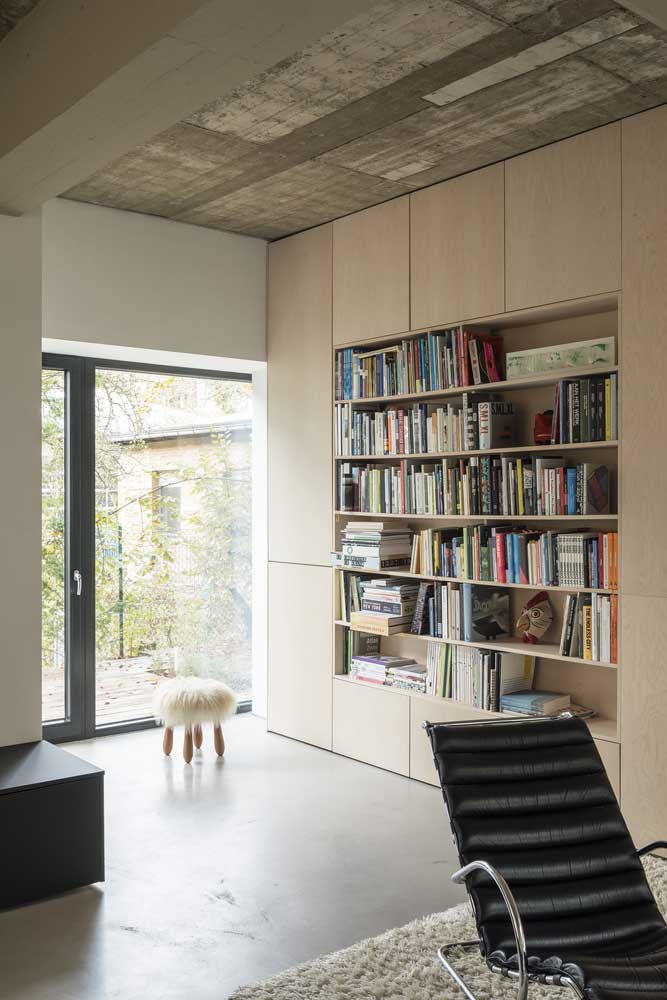
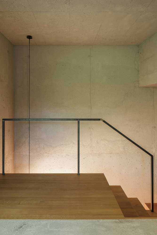
The interior logic of modern German homes follows directly from the exterior. Concrete structure visible overhead. Metal window frames from floor to ceiling. Stone or polished concrete underfoot. Does this sound cold? It photographs cold. In person — and I’ve visited two projects photographed by ArchDaily’s German architecture contributors — the spaces feel controlled rather than harsh. The key variable is ceiling height. Rooms below 2.8 meters feel clinical with exposed concrete. Above 3 meters the same material reads as loft-adjacent warmth.
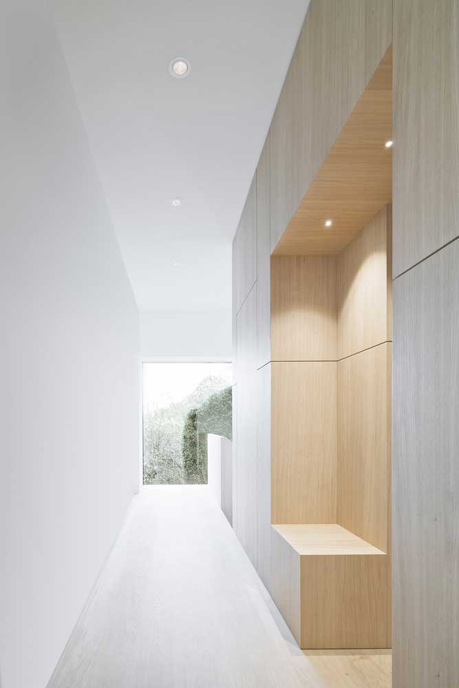
What’s the fix when an interior reads too austere? Not more furniture. German homes that go wrong at the interior stage usually went wrong by adding things. The correct answer is a single large-format rug, one wall of warm-toned plywood or larch paneling, and lighting at 2700K rather than the sterile 4000K that architects often specify. I’ve bought the 4000K version of fixtures and replaced every one of them within a year. The warm version costs the same and does the opposite to the room.
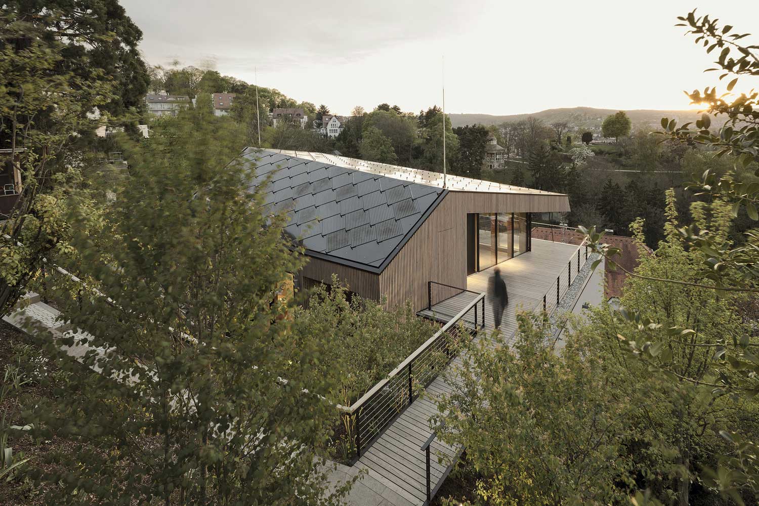
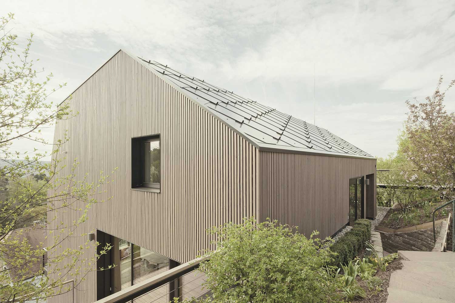
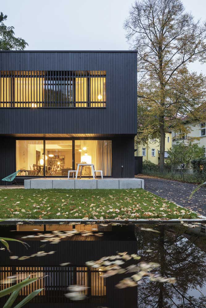
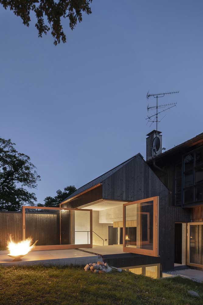
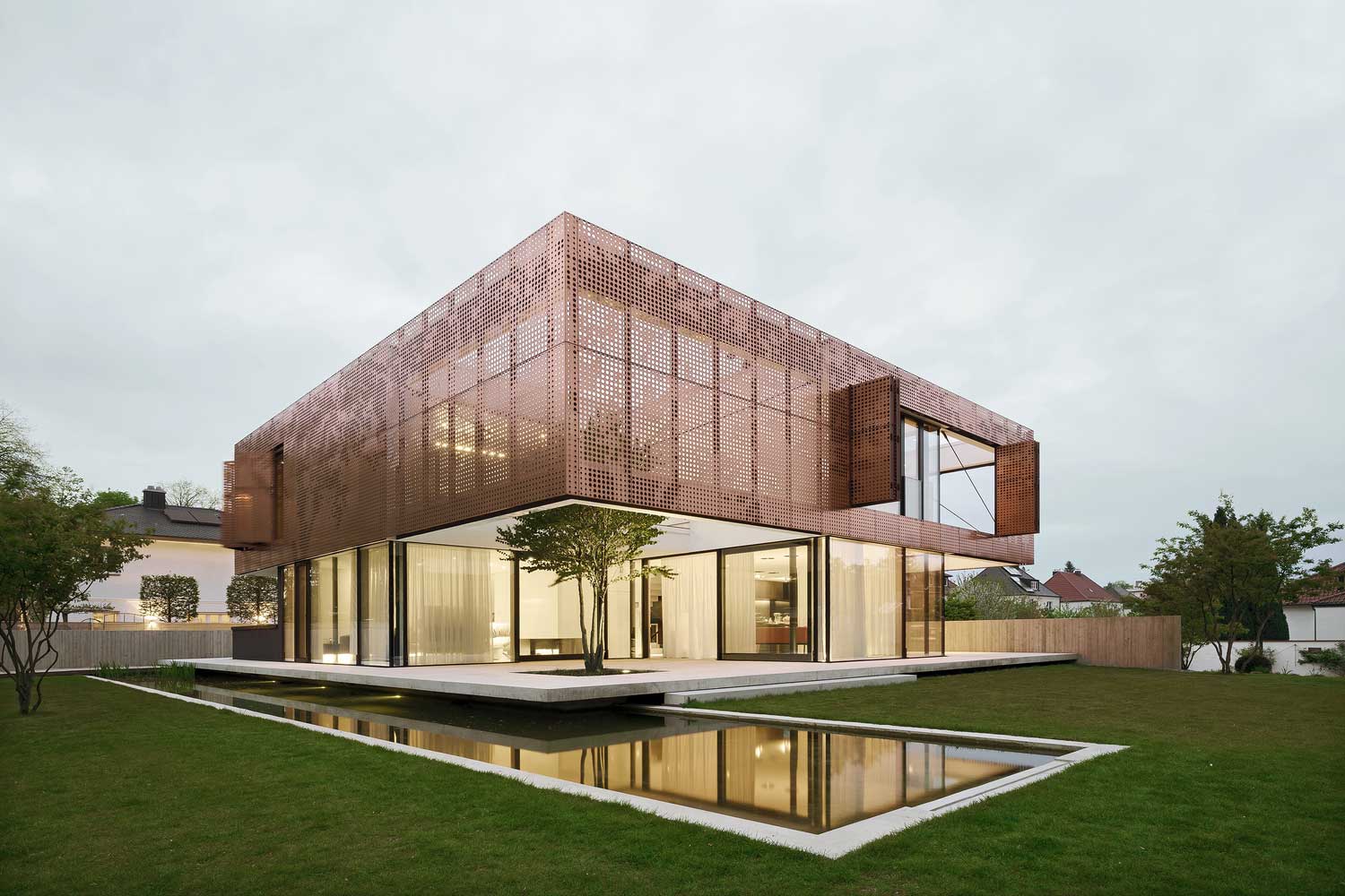
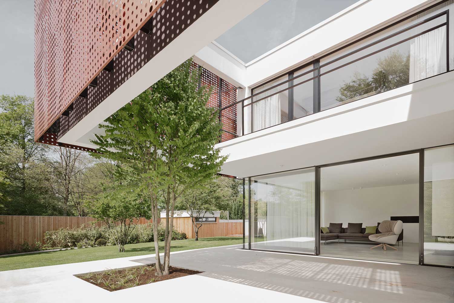
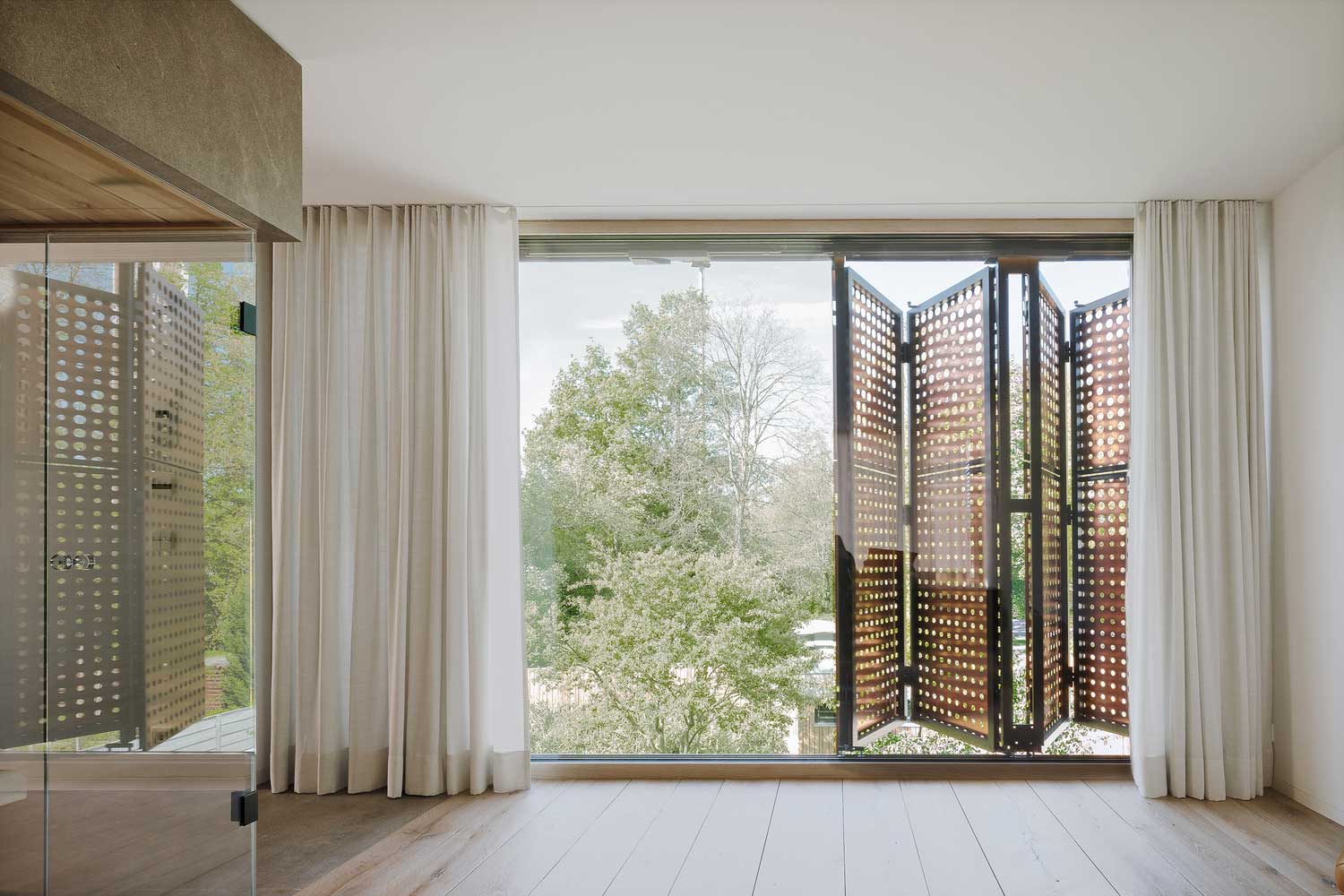
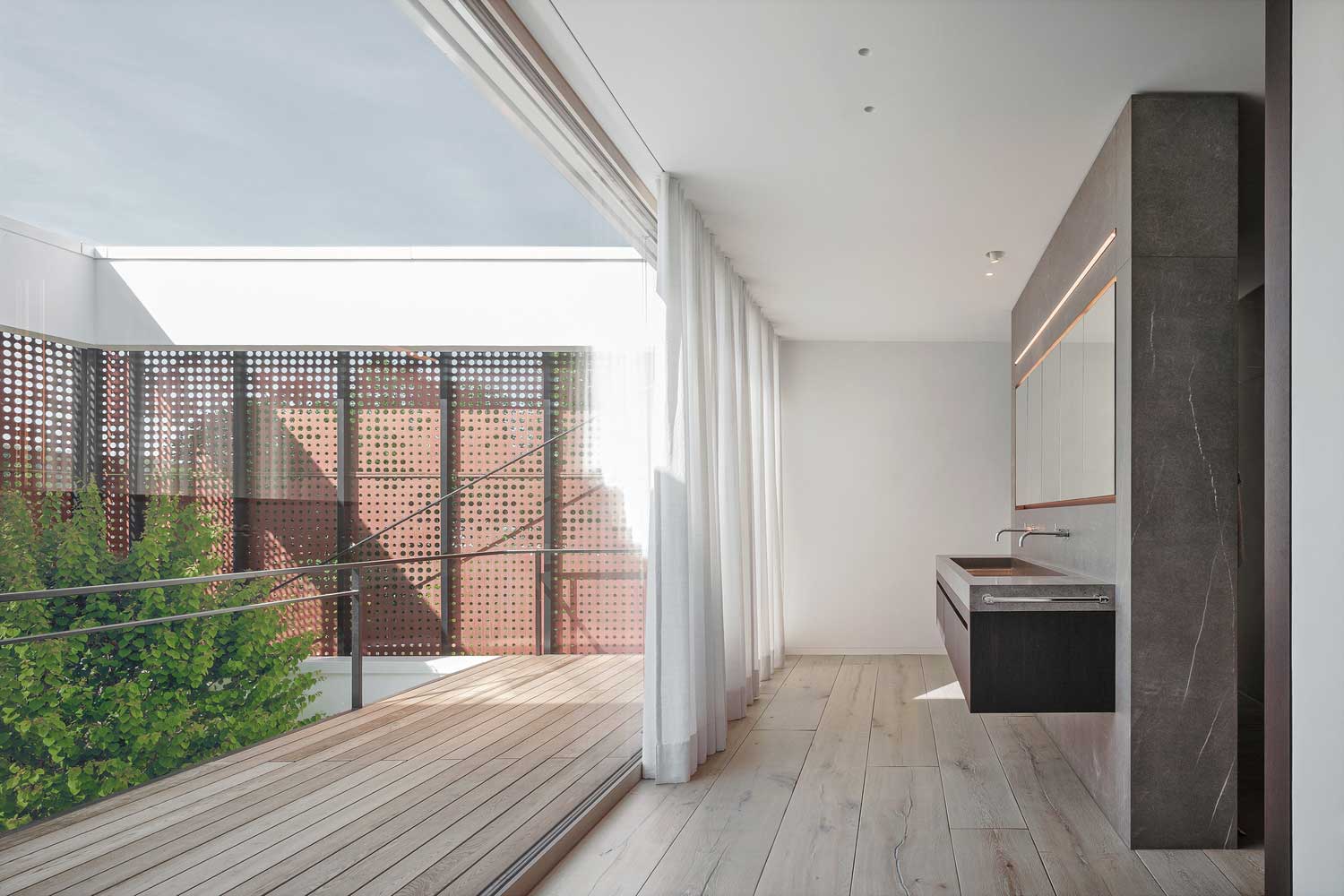
German Wood Frame Houses — Buero Wagner’s Copper Screen and What It Actually Solves

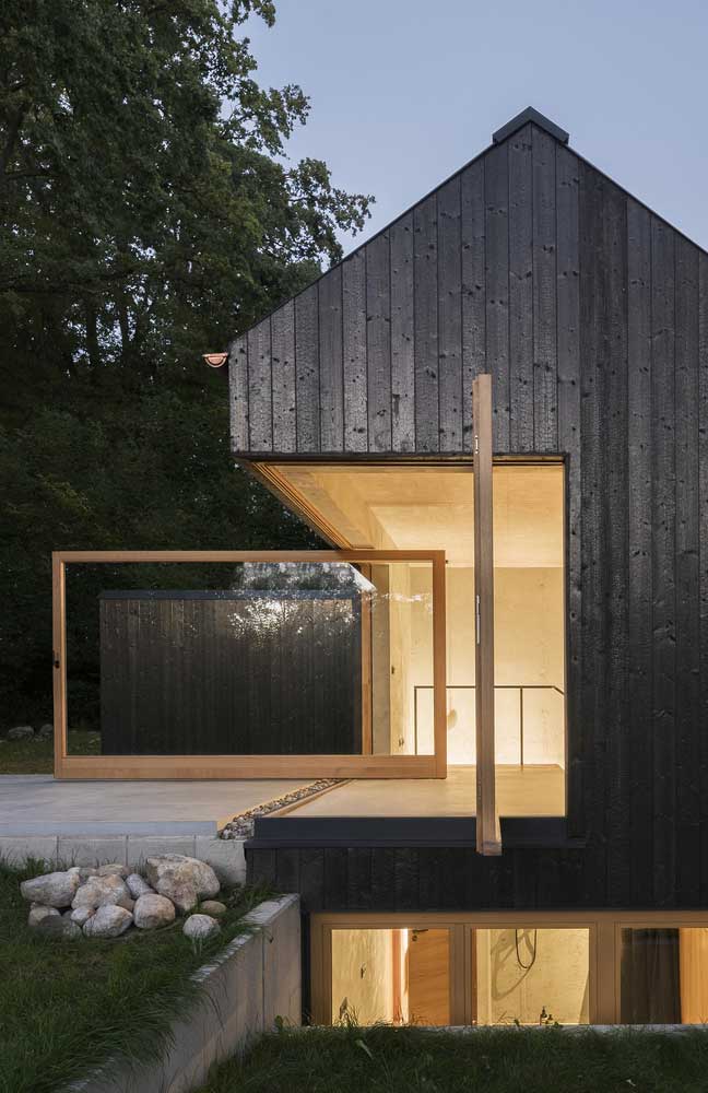


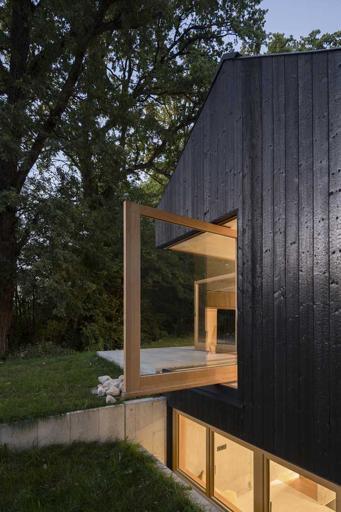
| Architects | Buero Wagner |
| Photo | Florian Holzherr |
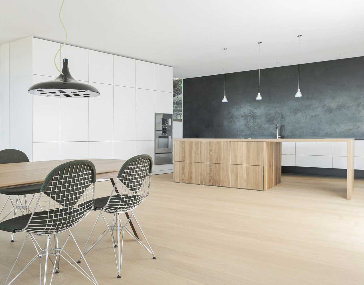
To soften the glass-concrete abundance of houses with a predominance of techno-style will help the wooden parts in the interior and bright colors. For projects of German houses, providing a monophonic palette, fine contrasting details and decoration elements are ideal.
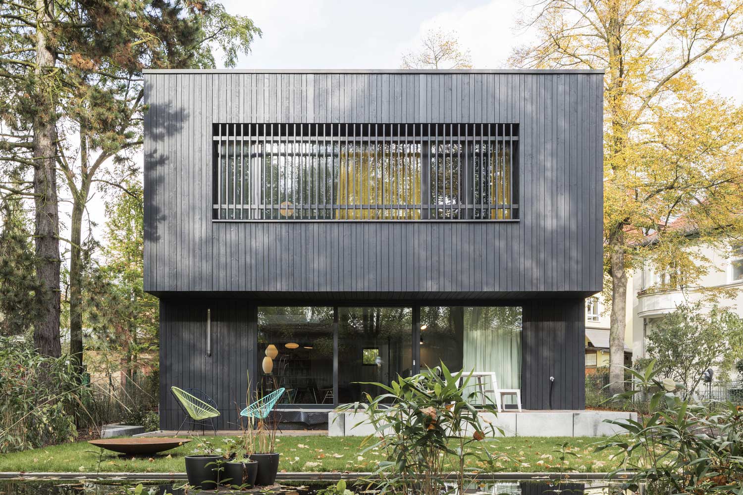
Buero Wagner built a two-story house on the outskirts of Starnberg that solves a problem you’ll find in roughly 40% of suburban German house projects: the upper floor bedrooms need privacy but the lower floor needs to read as open. Their solution — a copper openwork screen across the upper facade — does three things simultaneously: it shields the windows from street view, it reduces direct solar gain, and it makes the building almost invisible from ground level. Florian Holzherr’s photography is worth studying here. The house costs more with the screen than without. Don’t omit it. The screen is the idea.
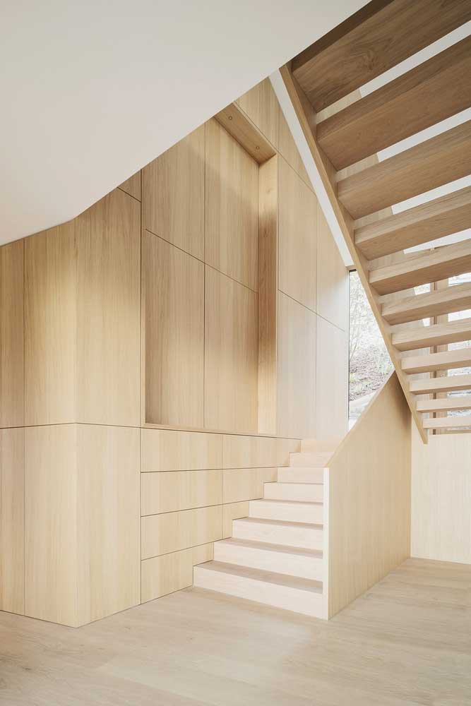
What fails in wood-frame German houses is varnished pine. I stole this observation from a Buero Wagner interview — their word for varnished pine interiors is “cabin.” You want raw or lightly oiled larch, Douglas fir, or oak. The price range is €80–€140 per square meter installed, with larch at the lower end. Contrasting details work exactly as the Buero Wagner quote above describes: a single dark element against the light wood palette — a steel handrail, a black kitchen island, a charcoal tile floor — resolves the composition without overcomplicating it. See more on how exterior cladding decisions follow the same logic at artfasad.com’s modern exterior cladding guide.
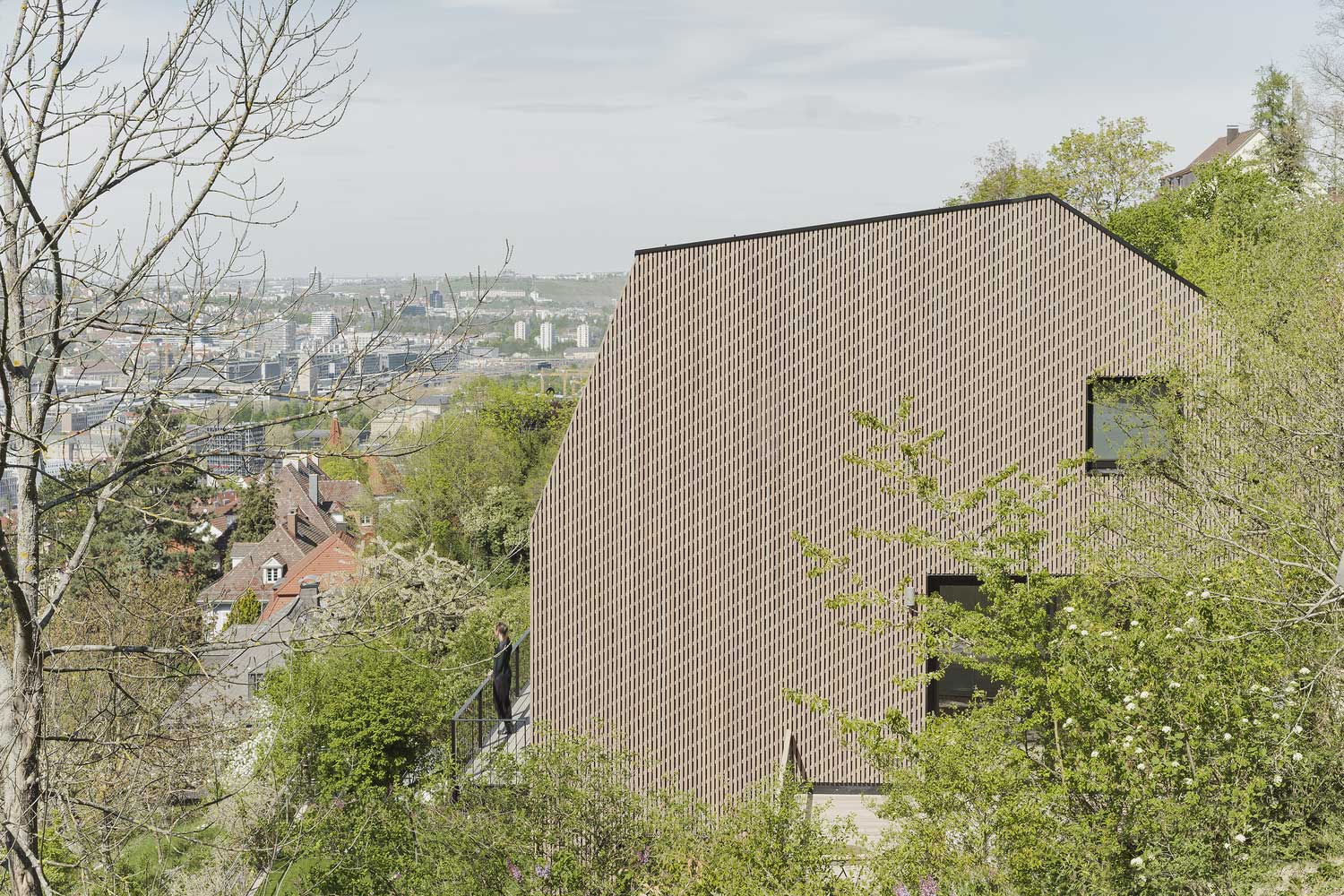
With dense urban plots, building upward is the standard response in German cities. Concrete exterior walls shift their design register at each floor level, and the combination of varied window proportions between stories means the street elevation looks like a single composition rather than a stack of floors. You’ll notice this most in Frankfurt and Munich projects from the past decade where the plot ratio pushed architects toward three and four storeys — the building reads as one object, not a series of identical slabs placed on top of each other. The trick is a consistent floor-to-ceiling height across every level, which costs more in structure but pays back in visual coherence.


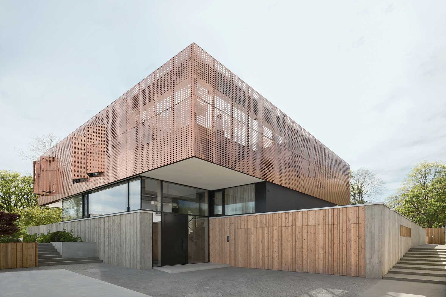
The constructivist compact house on the Starnberg outskirts is the most transferable project in this section for anyone building at a suburban scale — a sub-200sqm footprint, a two-story section, an open basement floor, and private upper rooms sealed by the copper screen. The proportions are almost domestic-sized, not villa-sized. That matters because most German house architecture projects you’ll encounter online sit in the €1.5–3 million build range. This one speaks to a €600,000–€900,000 budget and delivers the same level of material intelligence. That ratio is worth paying attention to. Explore more on how black exterior finishes interact with these material choices at artfasad.com’s black exterior house feature.
German House Architecture
Restraint Is a Decision. These German Houses Made It Deliberately.
Every project here — Laubrich, SEHW, de Ruiter, Biehler Weith, Buero Wagner — chose one material logic and held it through the whole building. That’s why they read. Copy the material, not the budget.
The copper screen, the black timber, the glass-and-concrete villa: each of these is a one-sentence idea applied without deviation. Deviations are where the projects you haven’t seen in this collection went wrong.
Save this post before you start talking to an architect about your facade material.
Related Topics