Siding ideas for split level homes fail most often not from bad taste but from ignoring the geometry. Split level siding has to do something regular houses don’t: it has to thread visual continuity across volumes that sit at different heights, different depths, and sometimes face different directions. I’ve pulled apart dozens of exterior makeovers to figure out which four strategies actually hold together at street level — and which ones look like a contractor ran out of material and improvised. What you’ll find below is specific: materials with real cost ranges, color pairings that photograph cleanly, and at least one thing per section that I watched go sideways on a real job.
Split level exterior color schemes matter more than the siding material itself. You can put the most expensive fiber cement on a split level and still end up with a facade that reads as cluttered if the color logic isn’t working. The four approaches here — contrasting palettes, mixed materials, monochrome, and bold accents — are not interchangeable. Each one suits a different footprint, budget, and neighborhood context. Pick the wrong one for your roofline and you’ll spend $15,000 finding out.
Quick Scan
Contrasting Color Palette — Dark upper, light lower (or reverse). Works on any split level. Cost: paint only, $2,000–$5,000.
Mixed Materials — Wood, stone veneer, fiber cement on different volumes. High impact, higher budget: $12,000–$30,000+.
Modern Monochrome — Tonal shades of one color. Cleanest result. Minimal risk. Budget: $8,000–$20,000.
Bold Accents — Neutral field, bright door and trim. Lowest cost entry point. Paint and hardware: $1,500–$4,000.
Dark Upper Level, Light Lower — the Color Pairing Most Split Levels Are Built For
Split level exterior paint ideas that use contrast between levels work because the architecture already divides the facade for you. You’re not forcing a decision — you’re following the geometry. The approach I keep returning to: deep charcoal or navy on the upper volume (Sherwin-Williams Iron Ore SW 7069 or Benjamin Moore Hale Navy HC-154), and a warm greige or sand on the lower (SW Accessible Beige SW 7036 reads particularly clean against dark upper levels in afternoon light). You’ll notice the upper portion visually recedes while the lower grounds the structure. That’s the goal.
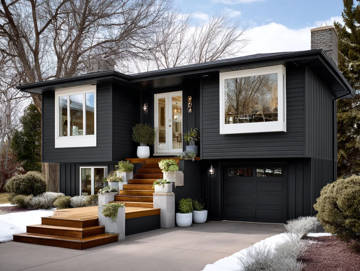
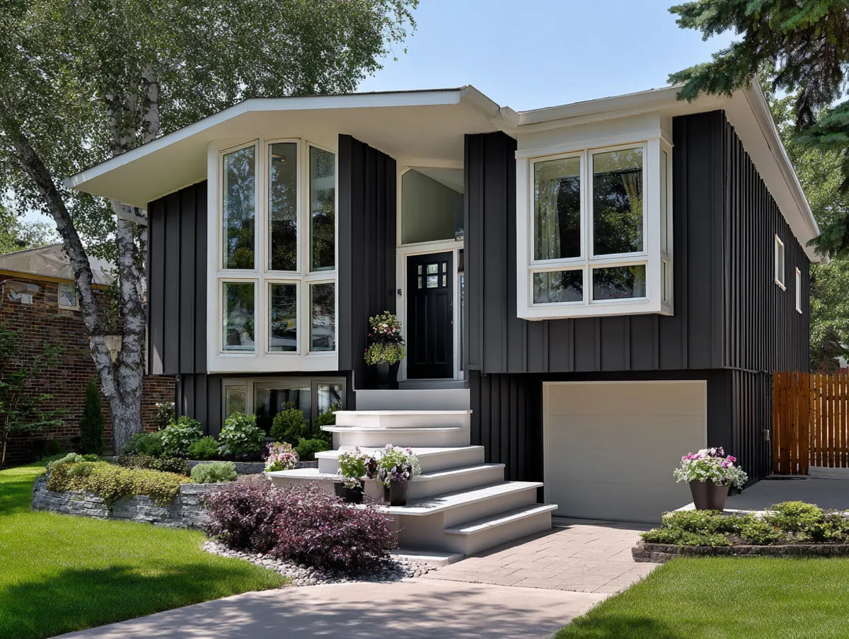
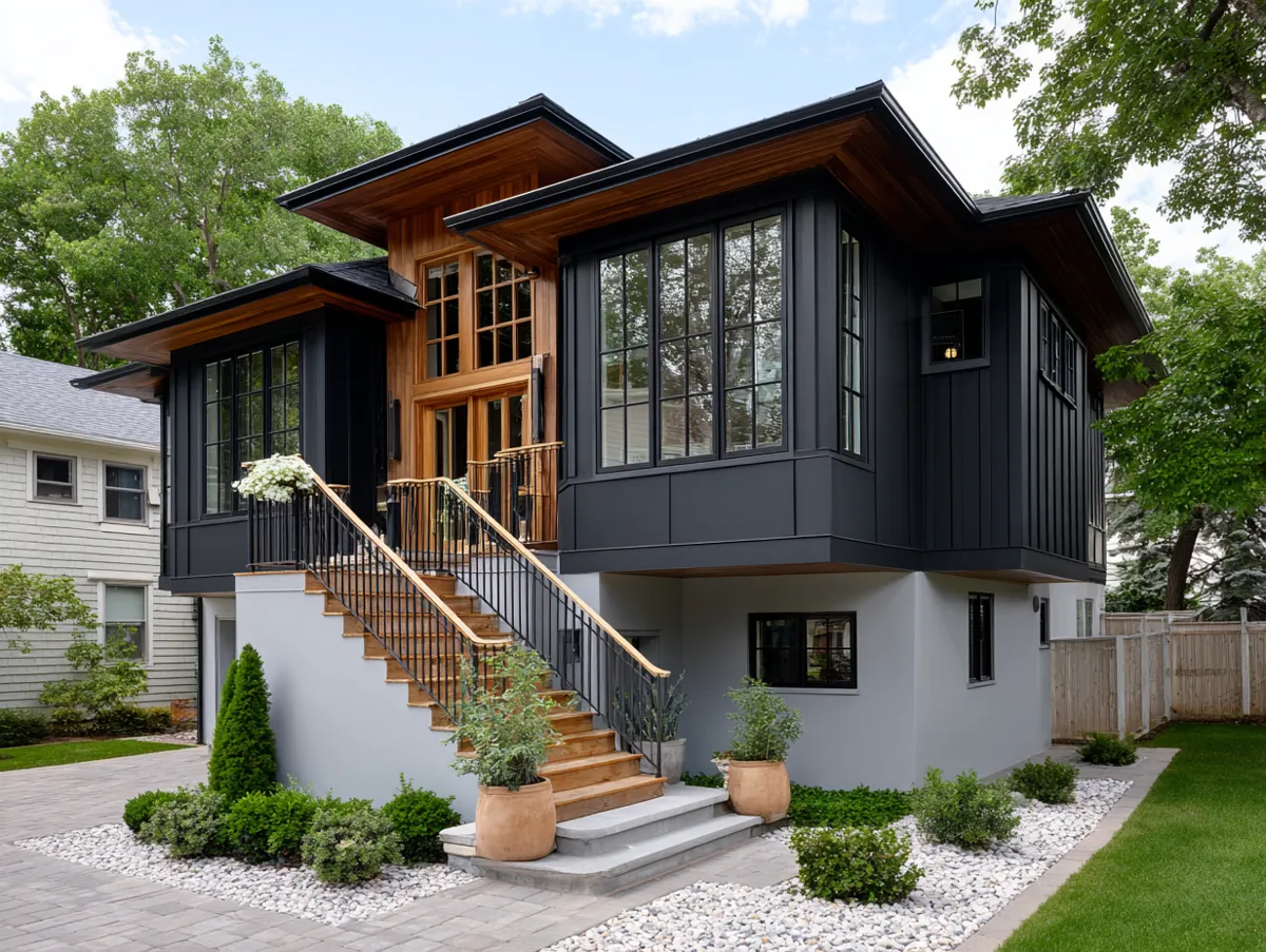
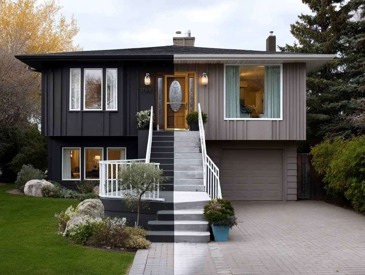
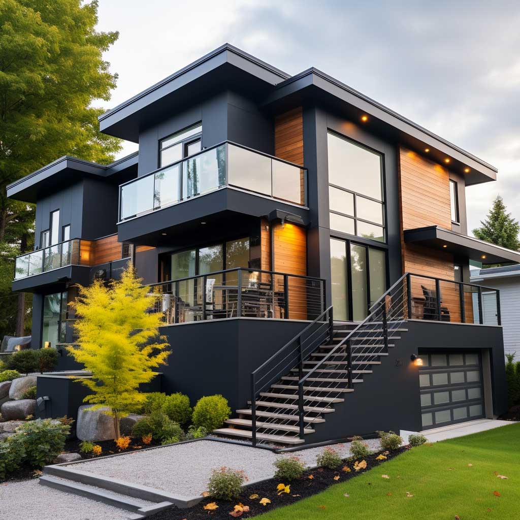
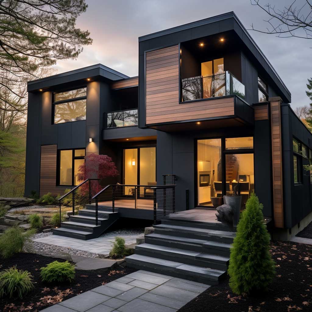

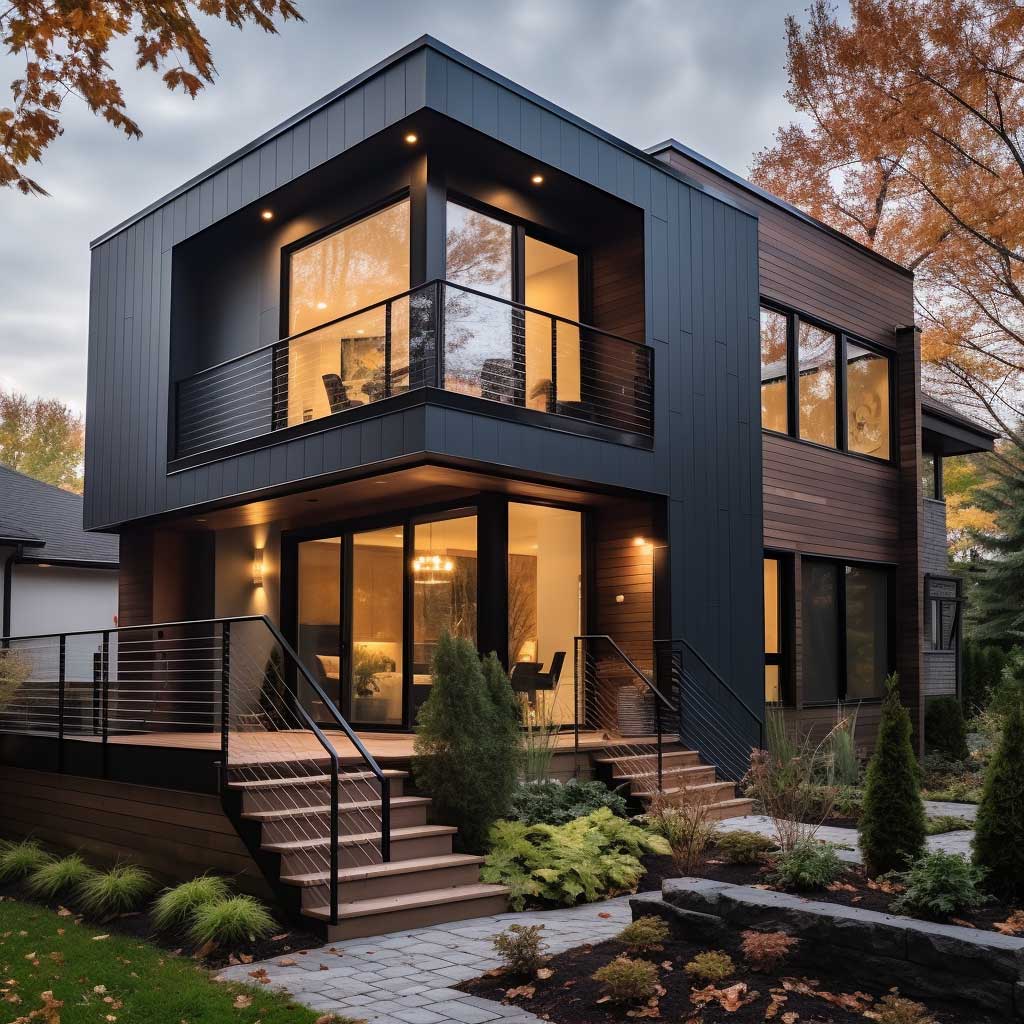
What kills this approach? Picking colors that are too close in value. I’ve watched homeowners order a “dark” and a “light” that, in full sun, look identical. Get actual paint samples and hold them against your roofline material in both morning and afternoon light before committing. Your roof color is the third color in this equation — and it has to play nice with both siding tones or the whole facade looks accidental. Dark roofs pair cleanly with the dark-upper-light-lower scheme. Light roofs need more care.
The split line between the two colors matters more than most tutorials admit. It should sit at a natural architectural break — the floor line, the roofline of the lower volume, or a band of trim. Don’t paint the color change mid-wall with no horizontal anchor. That’s the single move that makes a contrasting split level look cheap instead of intentional. A crisp white trim band at the transition costs maybe $300 in materials and turns a DIY paint job into something that reads as deliberate design. Two-tone exterior paint strategies for traditional homes cover the trim logic in more detail if you want the full breakdown.
Don’t Do This
Reversing the contrast — light upper, dark lower — sounds logical but reads wrong on most split levels. The dark lower visually sinks the whole structure into the ground. I’ve seen this mistake made on three different houses on the same street, all within a year of each other, all repainted within two years. The eye wants mass at the bottom to feel grounded, but dark color at the bottom is not the same thing as visual weight. Keep the drama on top.
Fiber Cement Lap on One Volume, Board-and-Batten on Another — Material Contrast That Earns Its Price Tag
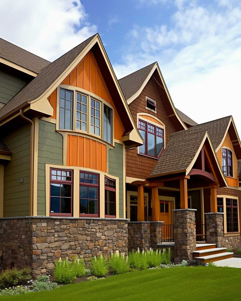
Mixed material siding on split levels works like layering in an outfit — the trick isn’t variety, it’s that each material has a reason to be where it is. James Hardie’s HardiePlank lap siding ($10–$15 per square foot installed) on the main living volume gives you the workhorse. Then vertical HardiePanel board-and-batten on a secondary wing or upper volume creates a direction change that your eye reads as two distinct but related elements. I stole this layout from a Craftsman renovation in the This Old House archive and it’s probably the most architect-y move you can make without paying an architect.
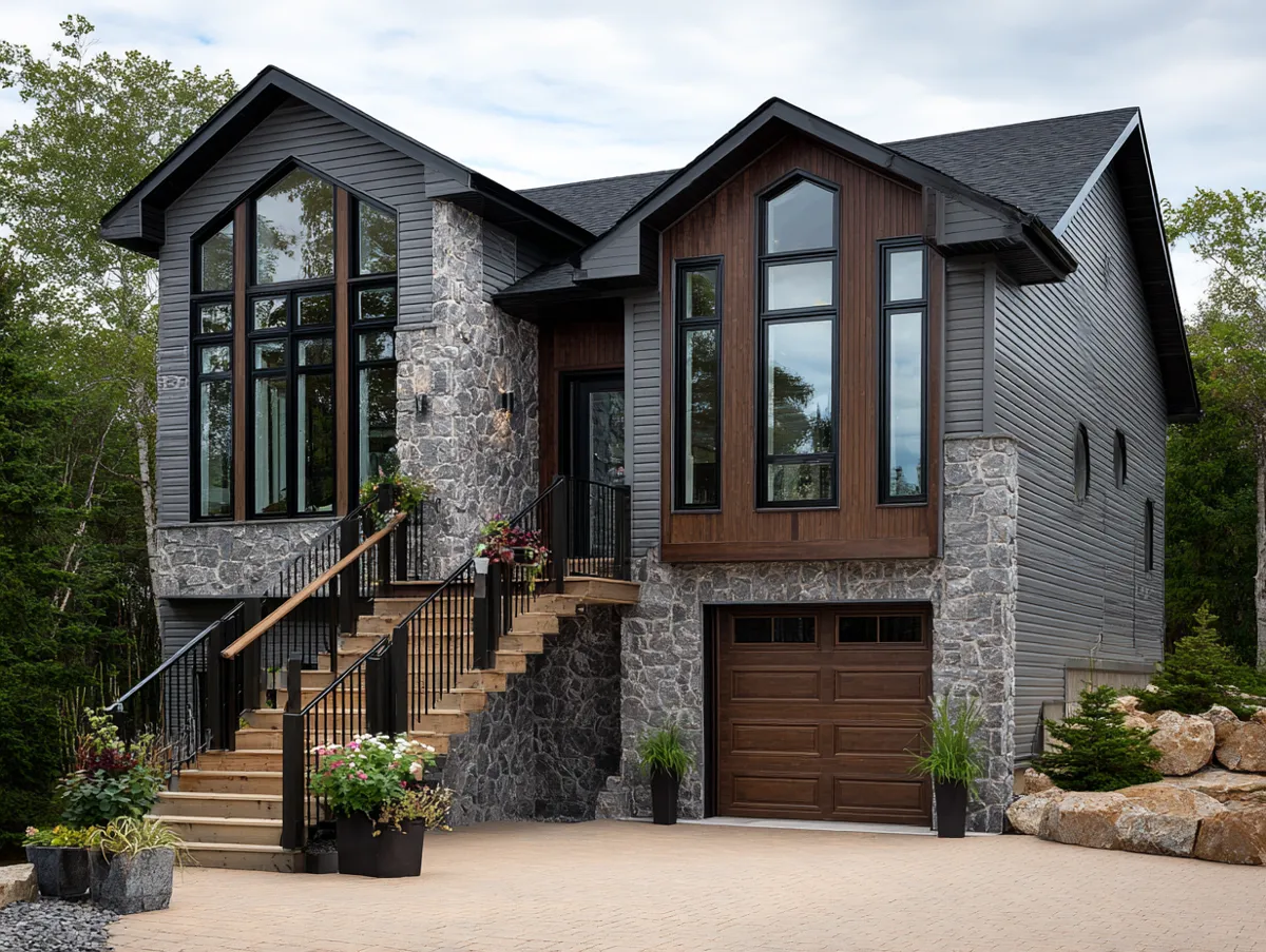
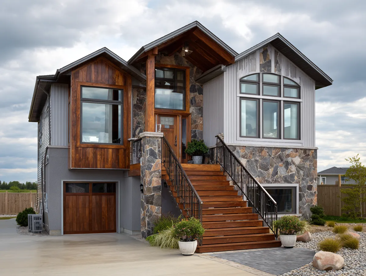
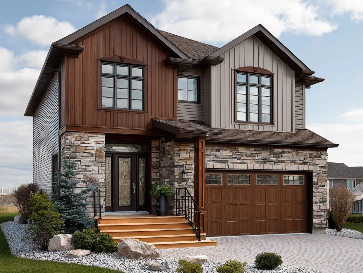
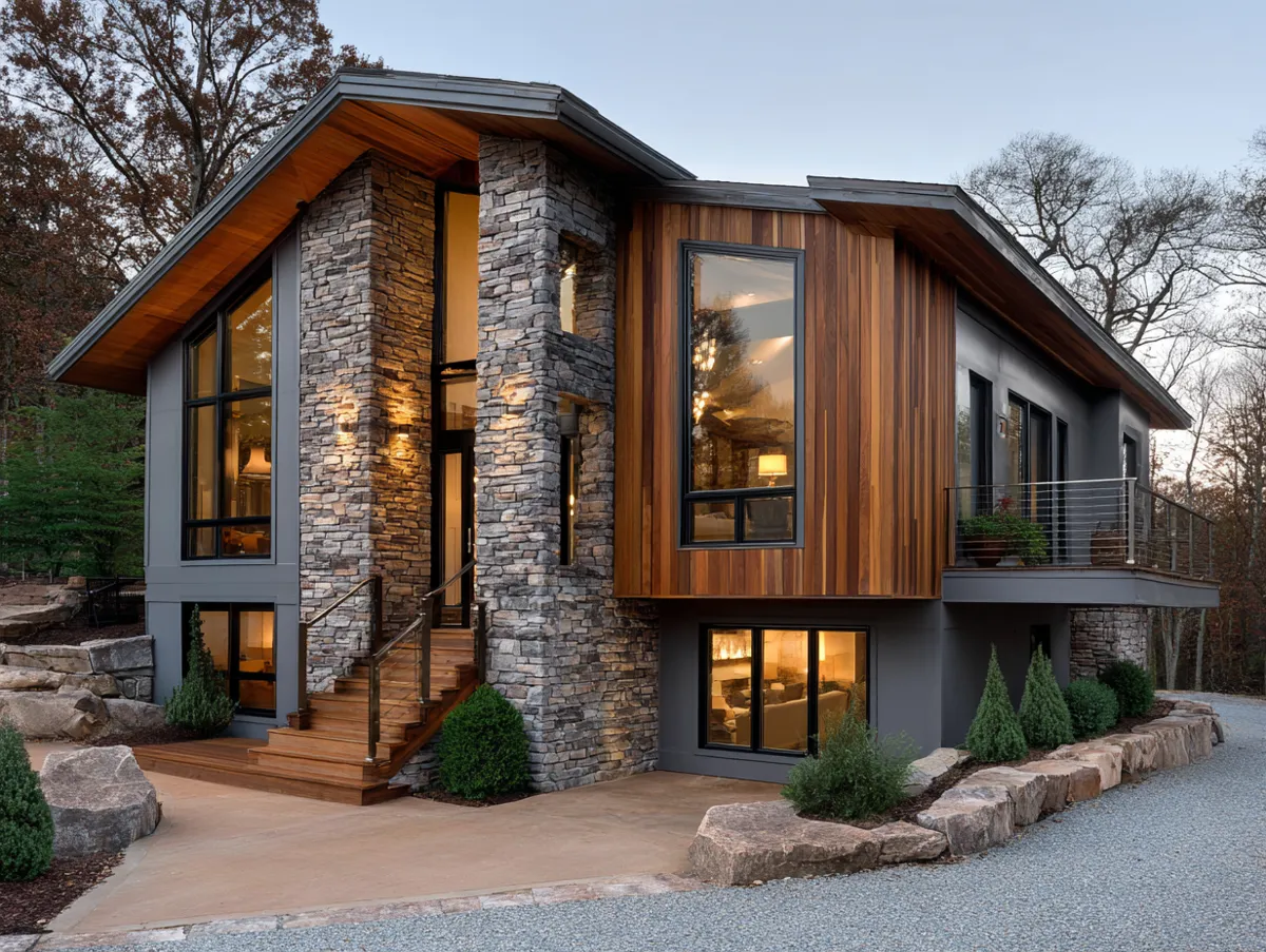
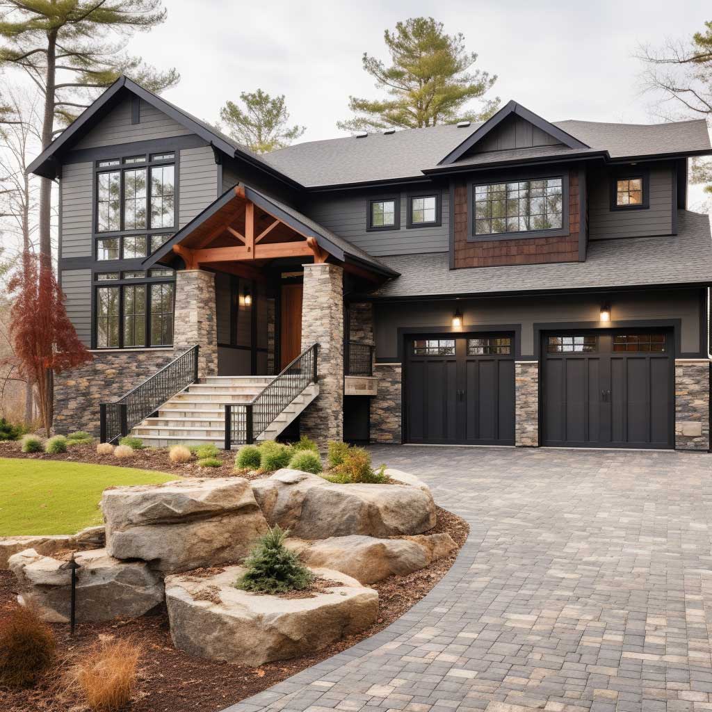
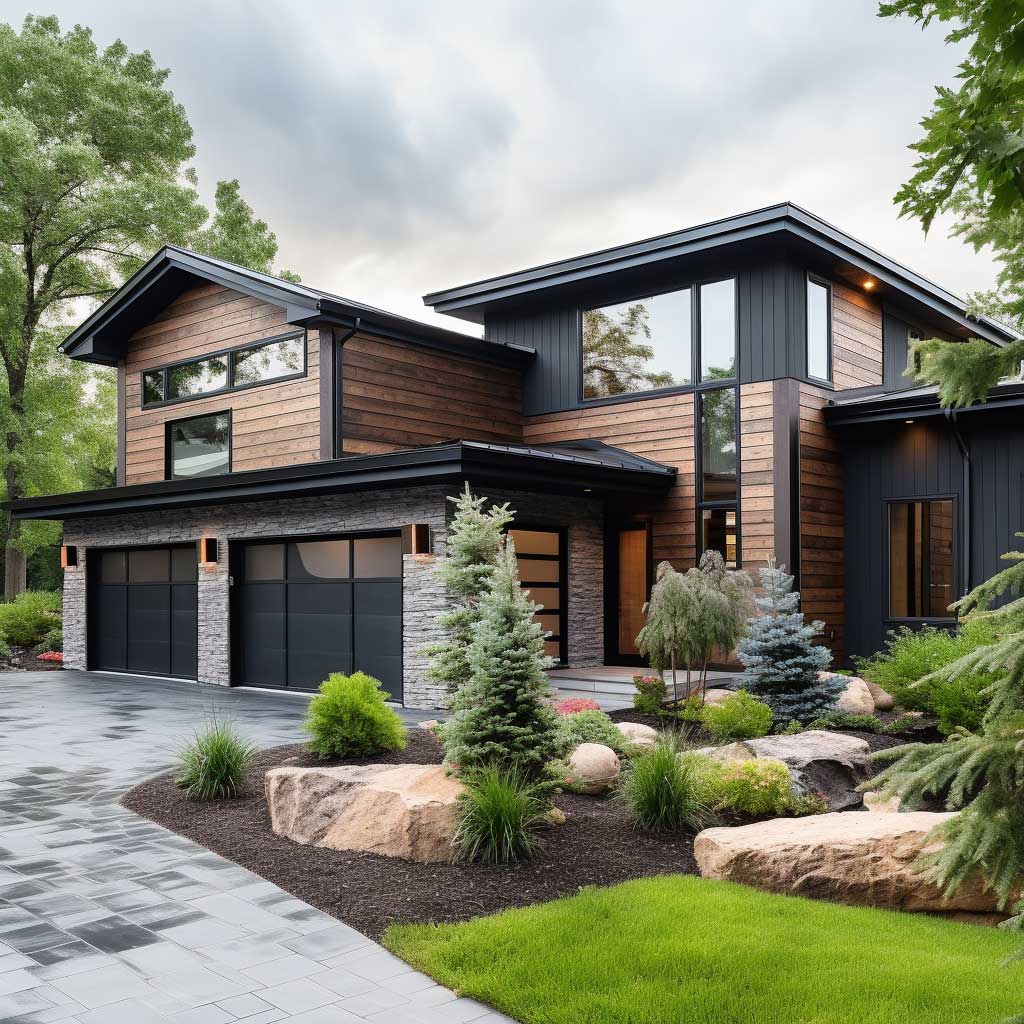
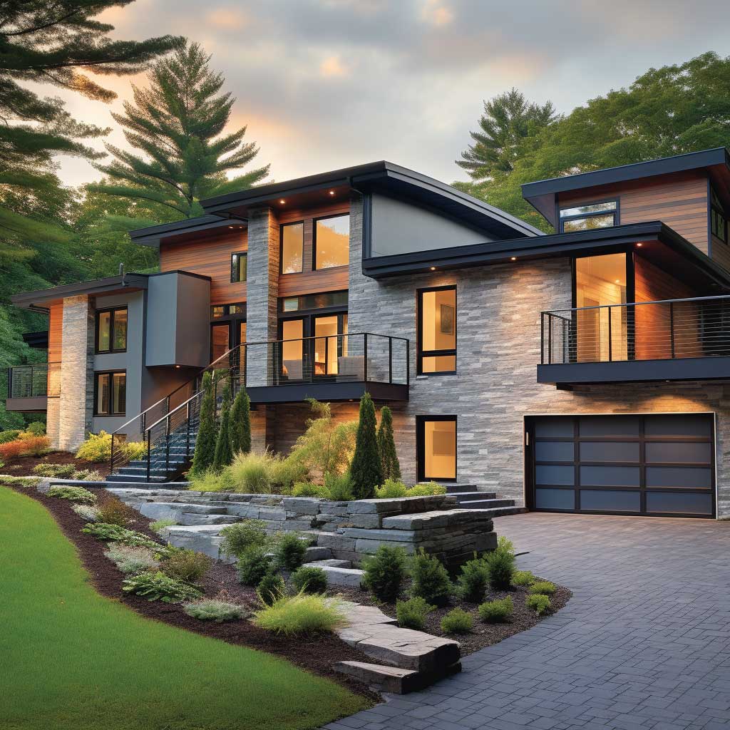
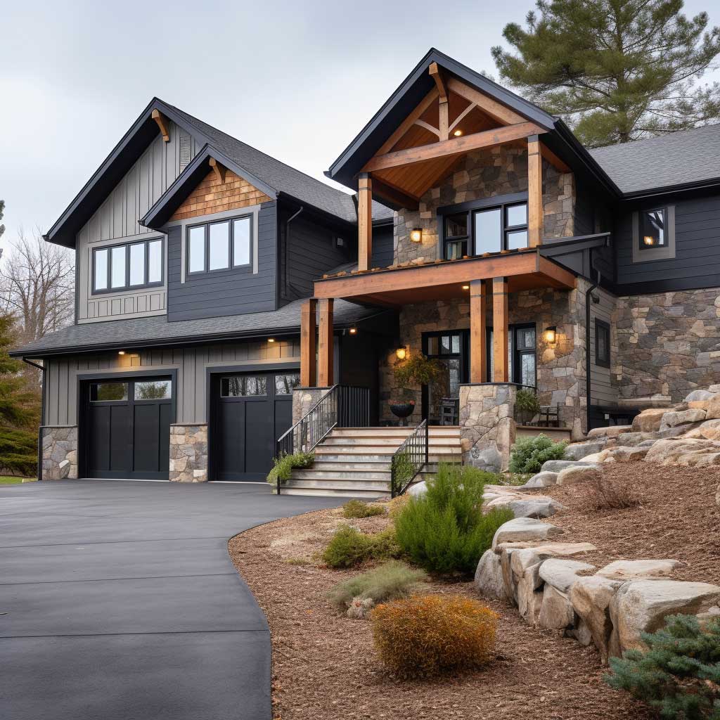
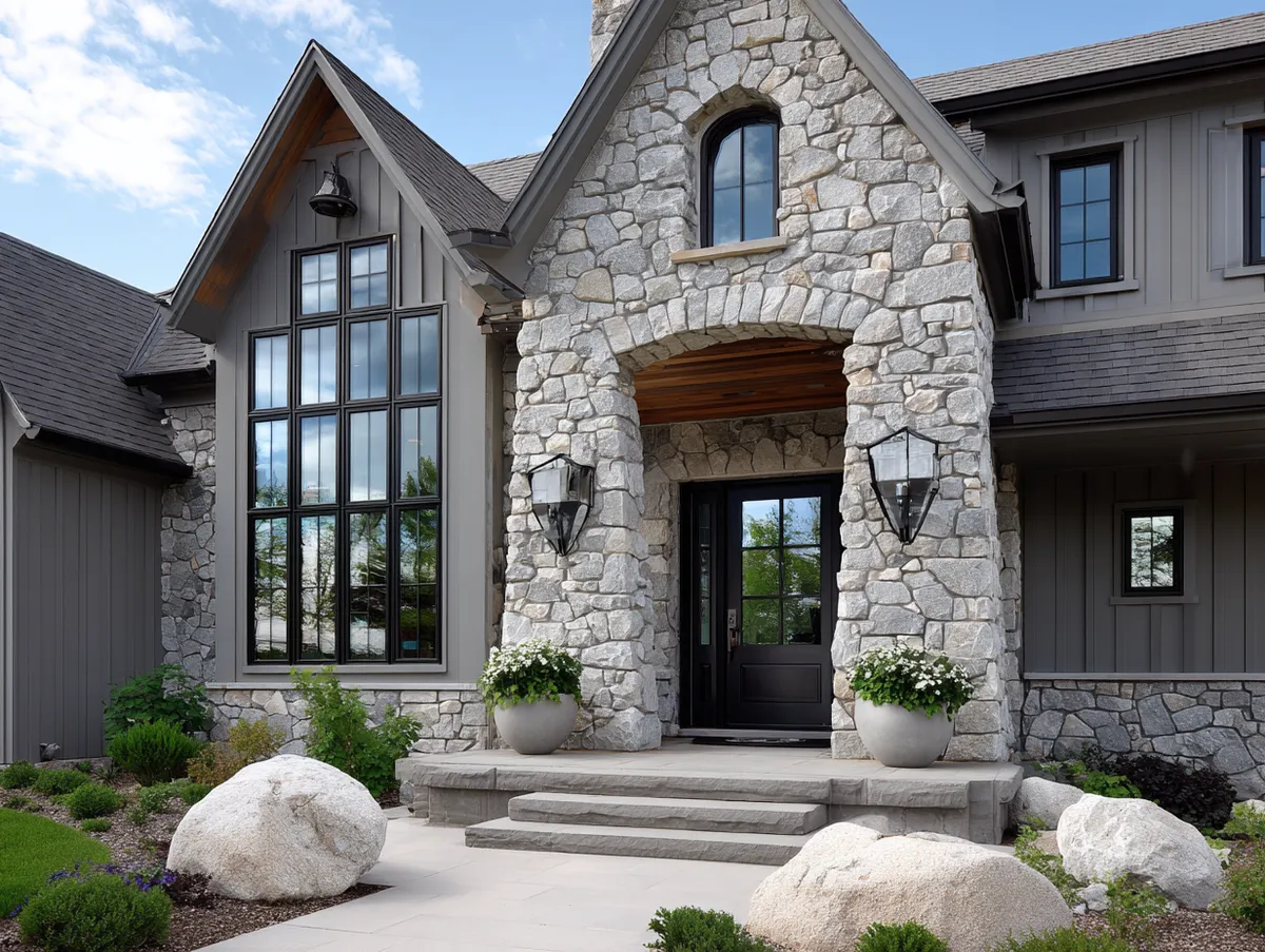
Stone veneer on the lower level is the most popular upsell in this category, and honestly it earns the premium. Natural stone veneer panels from manufacturers like Eldorado Stone run $15–$30 per square foot installed, but you’re typically only covering 200–400 square feet on a lower split volume — so the total lands around $4,000–$8,000 for a very high-impact element. That’s not nothing, but it’s far less than re-siding the whole house in stone. The trick: keep the stone to the recessed lower volume or entryway surround. Use it as a grounding element, not a statement that runs the full perimeter.
What’s the real maintenance risk here? Real cedar, even on a small accent section, needs staining every 3–5 years. That’s a ladder, a Saturday, and $400 in materials on a rotating schedule. Cedar looks extraordinary. I own two properties with cedar siding elements and I’d make the same choice again — but I budget for it. If that sounds like a commitment you won’t keep, Hardie’s primed-for-paint panels or LP SmartSide engineered wood give you 80% of the visual warmth at half the maintenance frequency. Don’t let a contractor talk you into real cedar on a high-exposure upper volume unless you genuinely love ladders. Two-tone siding combinations that use material contrast rather than color are worth reviewing before you finalize your material list.
All-Grey Split Level Siding — Why a Single Color Family Reads as More Expensive Than It Is
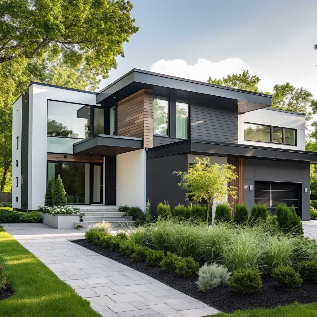
Monochrome exterior color schemes on split levels are the architectural equivalent of wearing head-to-toe camel — it looks effortless but the editing is brutal. Get it right and the house looks like it cost twice what it did. The formula: three values of one hue, assigned to the three volumes by depth. Lightest color on the volume that projects furthest forward. Darkest on the most recessed. Mid-tone carries everything between. On a grey split level, you’re looking at something like Sherwin-Williams Mindful Gray SW 7016 (mid), Light French Gray SW 0055 (forward), and Urbane Bronze SW 7048 (recessed) — and yes, Urbane Bronze is technically a dark olive-brown, but in the grey family it reads as a deep charcoal anchor.
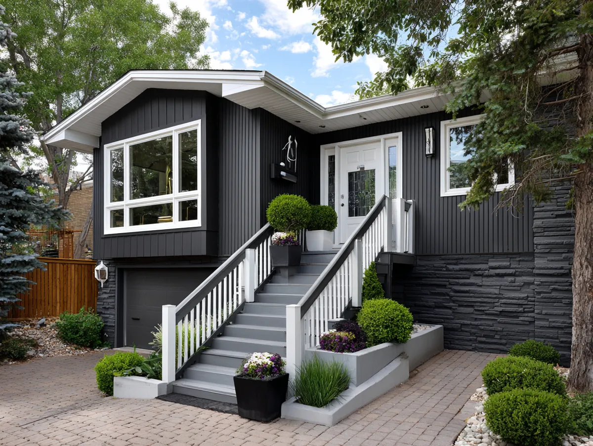
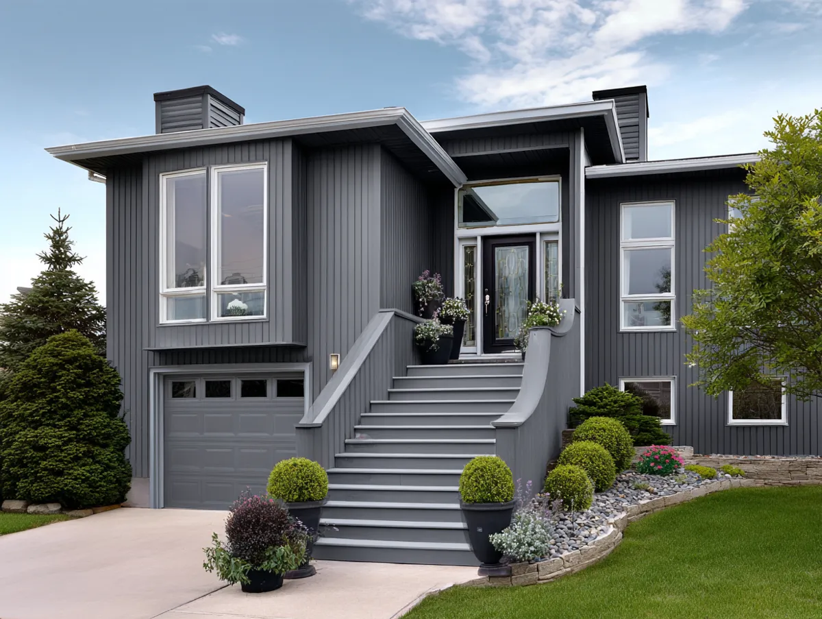
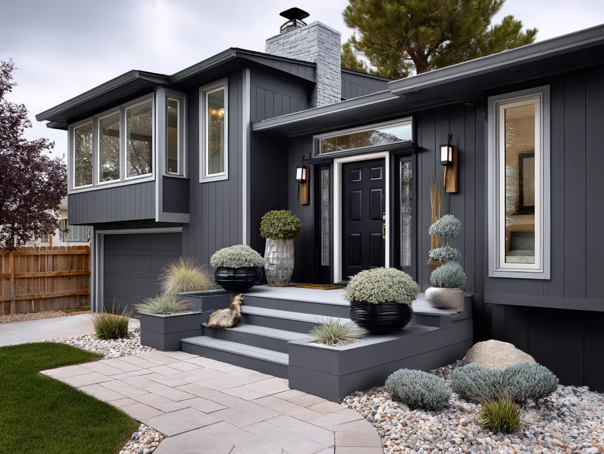
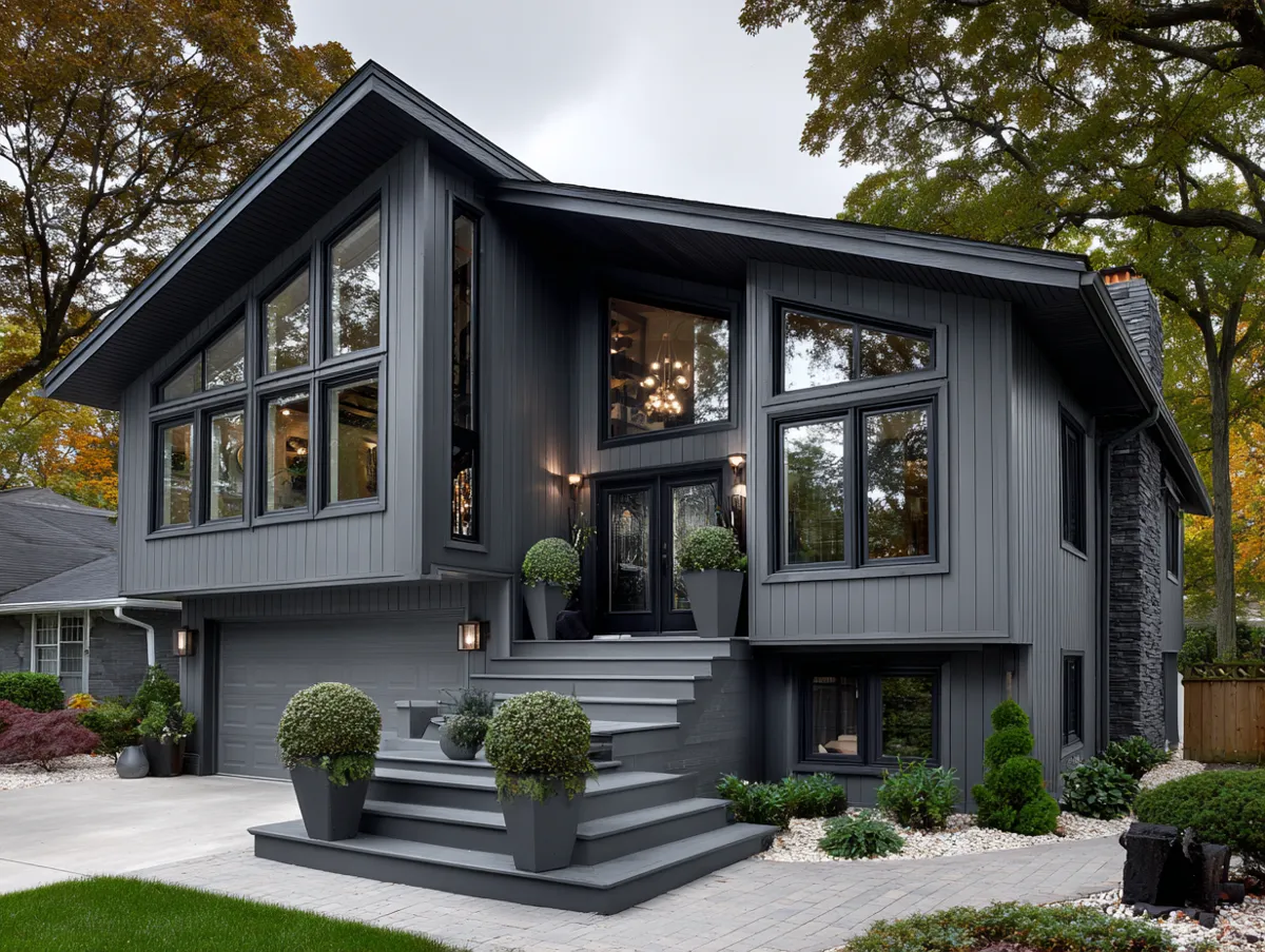
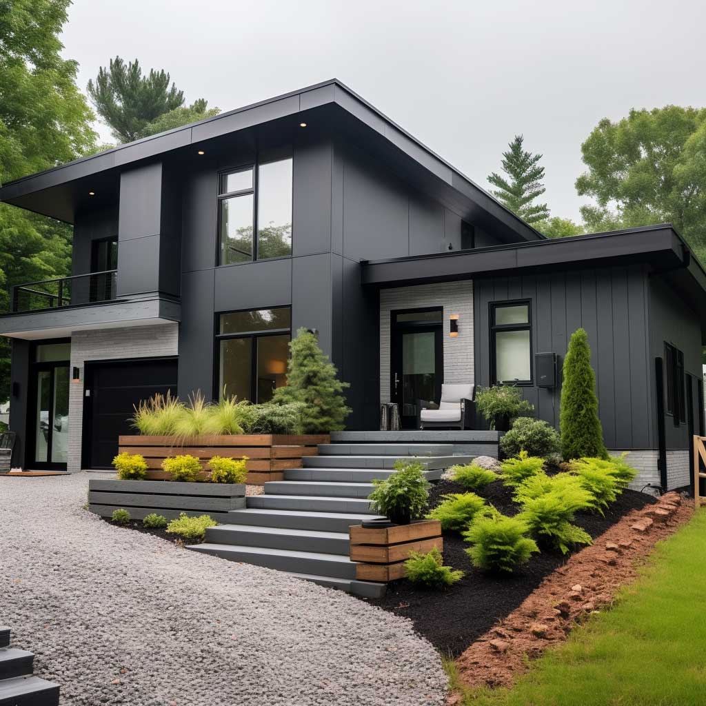
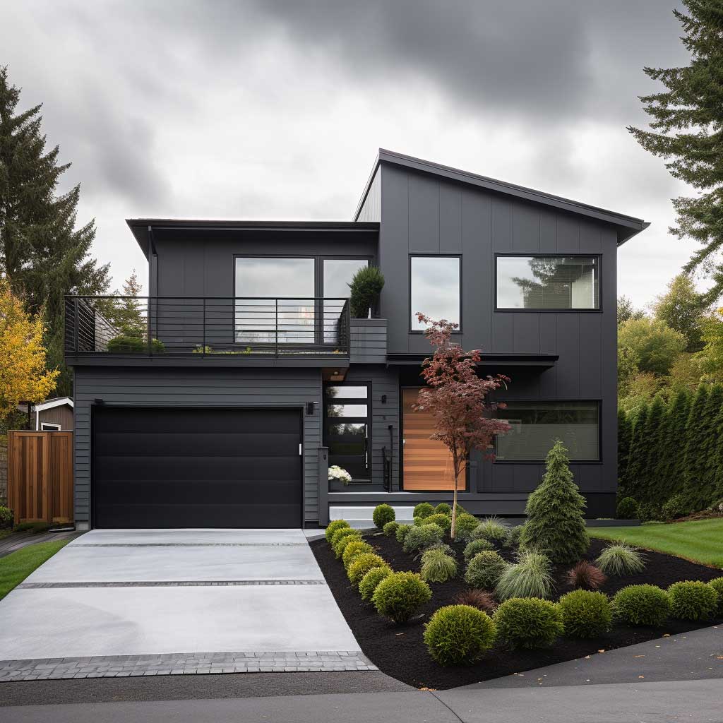
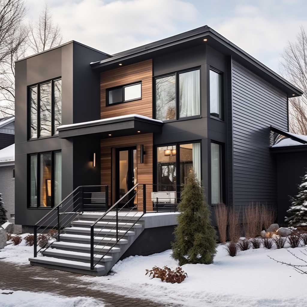
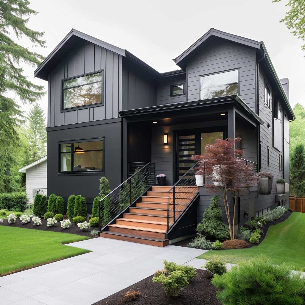
Does monochrome work for every split level? No. Homes with awkward asymmetry — where one volume is clearly tacked on — get exposed by monochrome because there’s nothing else to look at. A contrasting color palette in that situation at least gives you something interesting to focus on. You’ll notice monochrome performs best on split levels with clean, intentional geometry: consistent window sizing, rooflines that relate to each other, volumes that look like they were designed together rather than added in phases. Honest assessment before you commit: stand across the street and photograph the house. If the silhouette looks right, monochrome will work. If it looks like a question mark, add contrast.
White trim is not optional in a monochrome grey scheme. I’ve tried skipping it on a client’s insistence — matching grey trim on grey siding — and the windows disappeared into the wall. Crisp white fascia boards and window casings are the punctuation that makes the tonal body copy legible. Budget $800–$2,000 for trim paint on a typical split level and don’t treat it as a line item to cut. The trim is the reason the whole scheme works.
Neutral Field, One Loud Door — the Accent Strategy That Costs 0 and Changes Everything
Bold and bright accents on split level siding are the lowest-commitment, highest-ratio return move on this list. The formula hasn’t changed in thirty years because it keeps working: neutral body, white trim, one saturated accent color on the front door and potentially the garage door trim. Benjamin Moore Caliente AF-290 is my go-to red — it reads as red without tipping into fire-engine. Farrow & Ball’s Hague Blue No.30 at roughly $130 per 2.5L is the expensive option that photographs beautifully. Dutch Boy’s Nautical Night if you need the same navy at $35 a gallon.
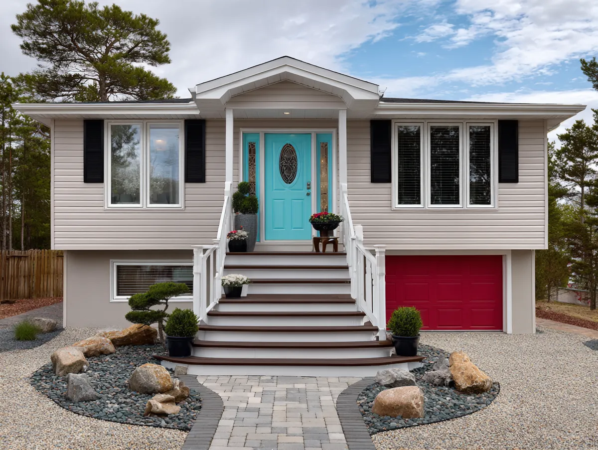
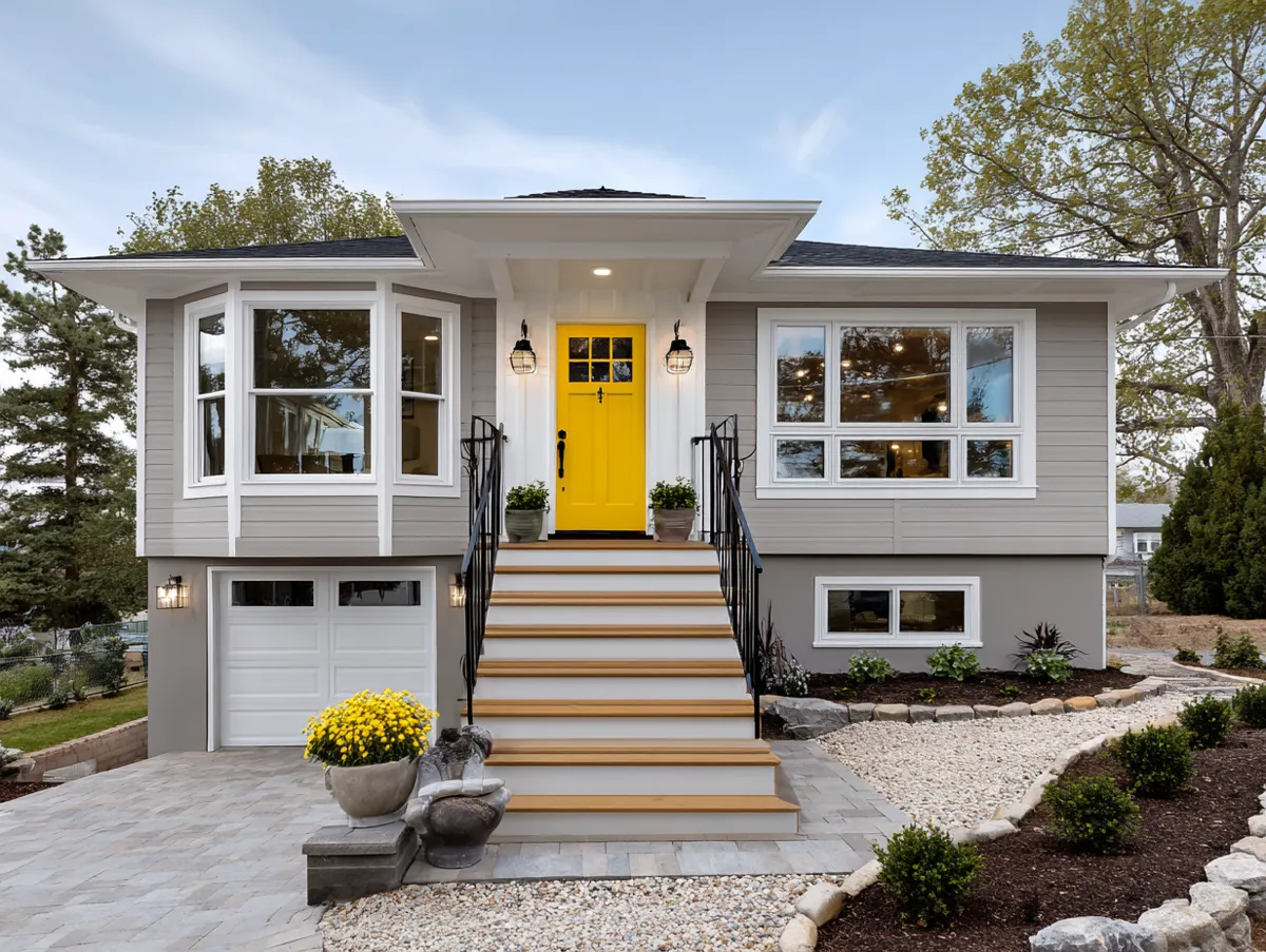
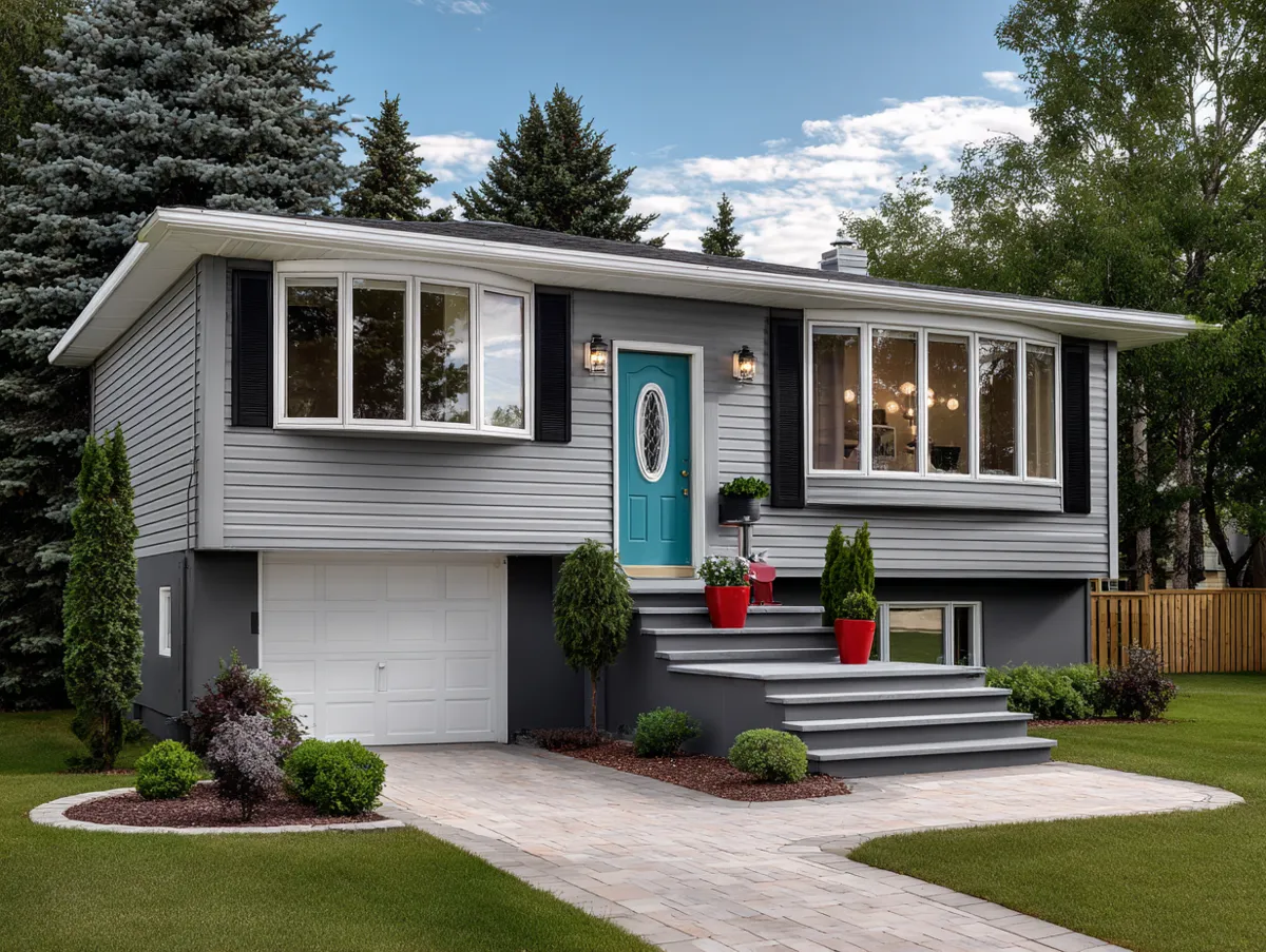
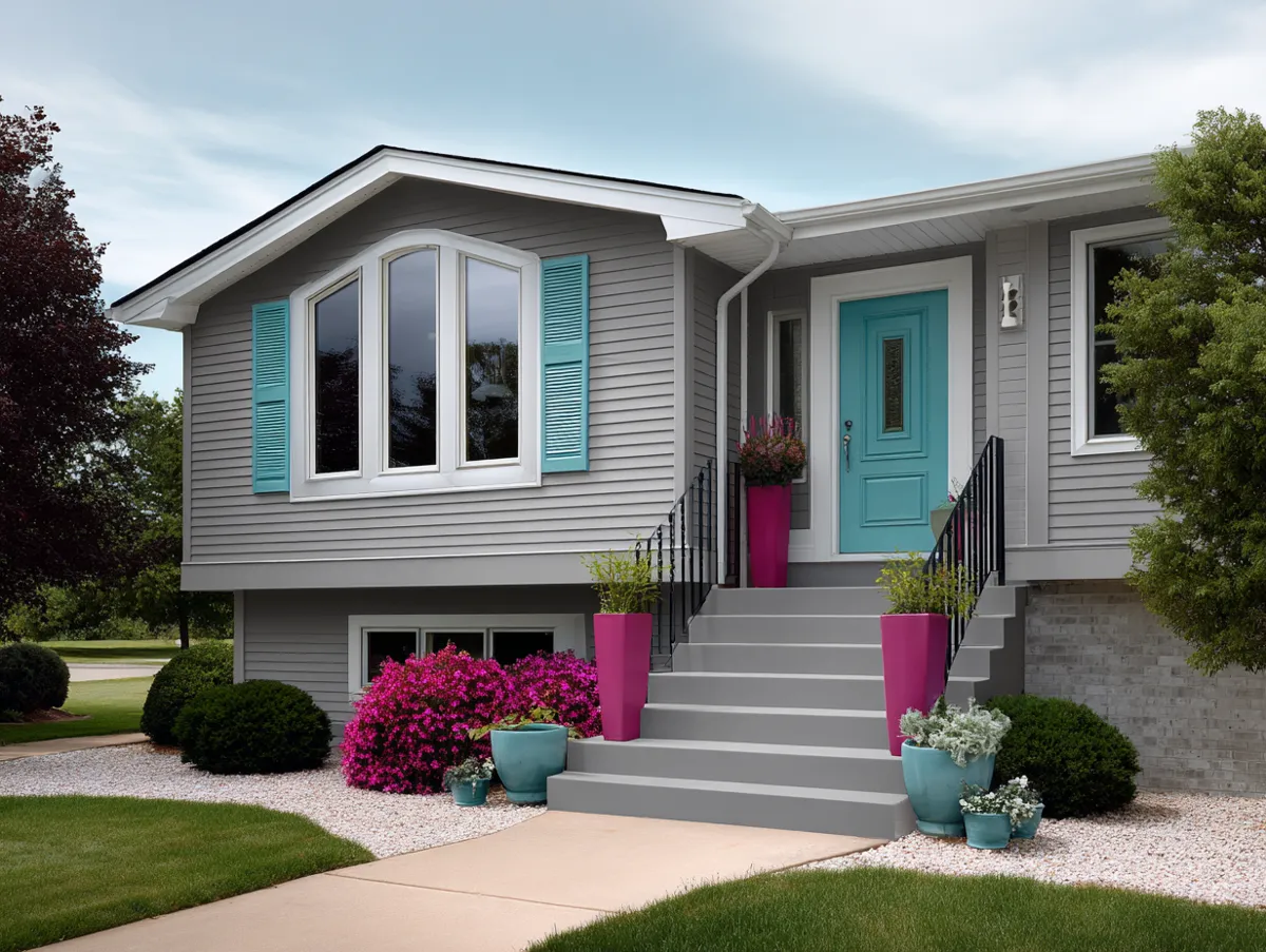
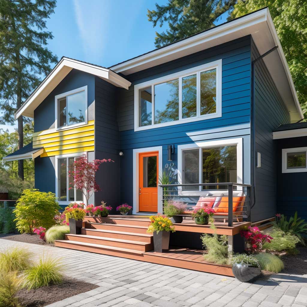
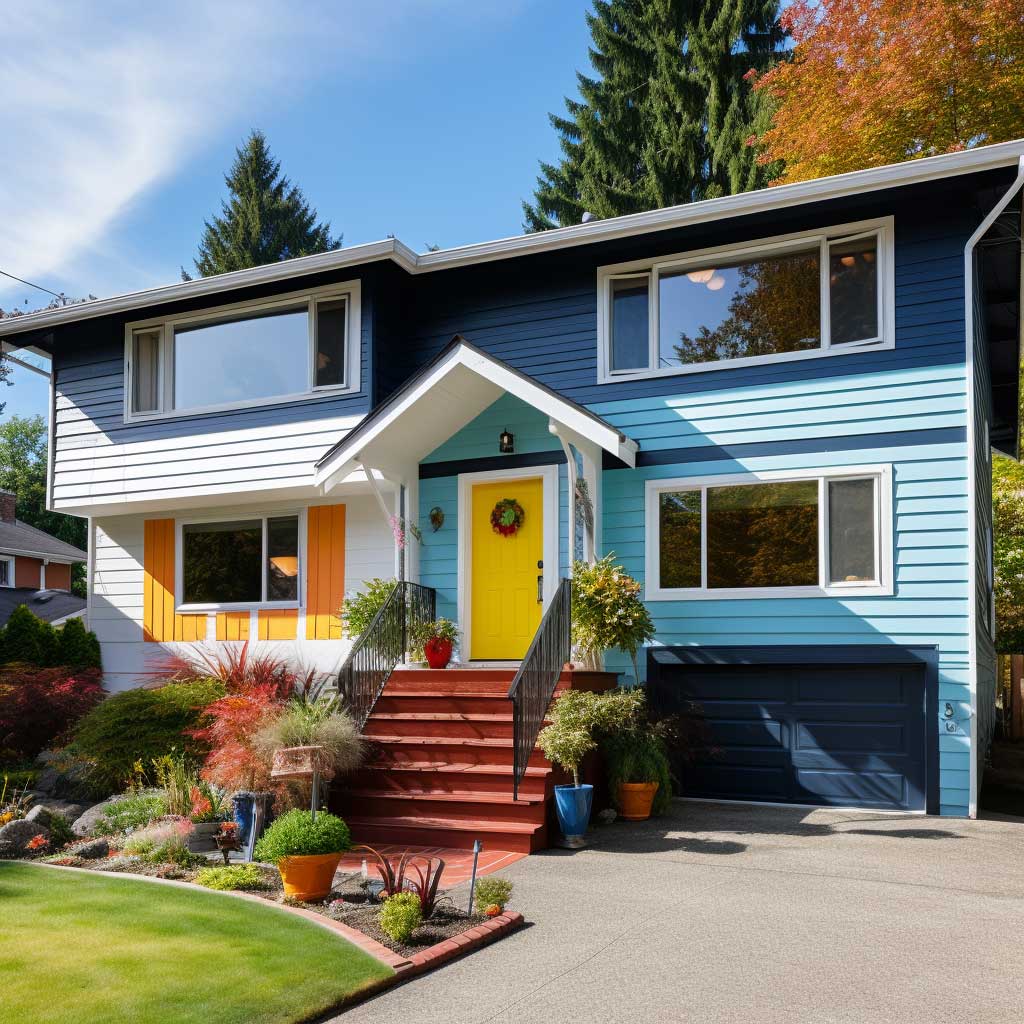
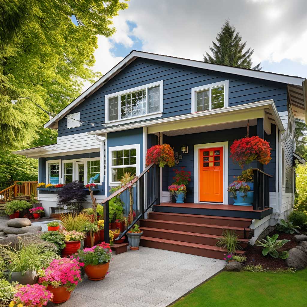
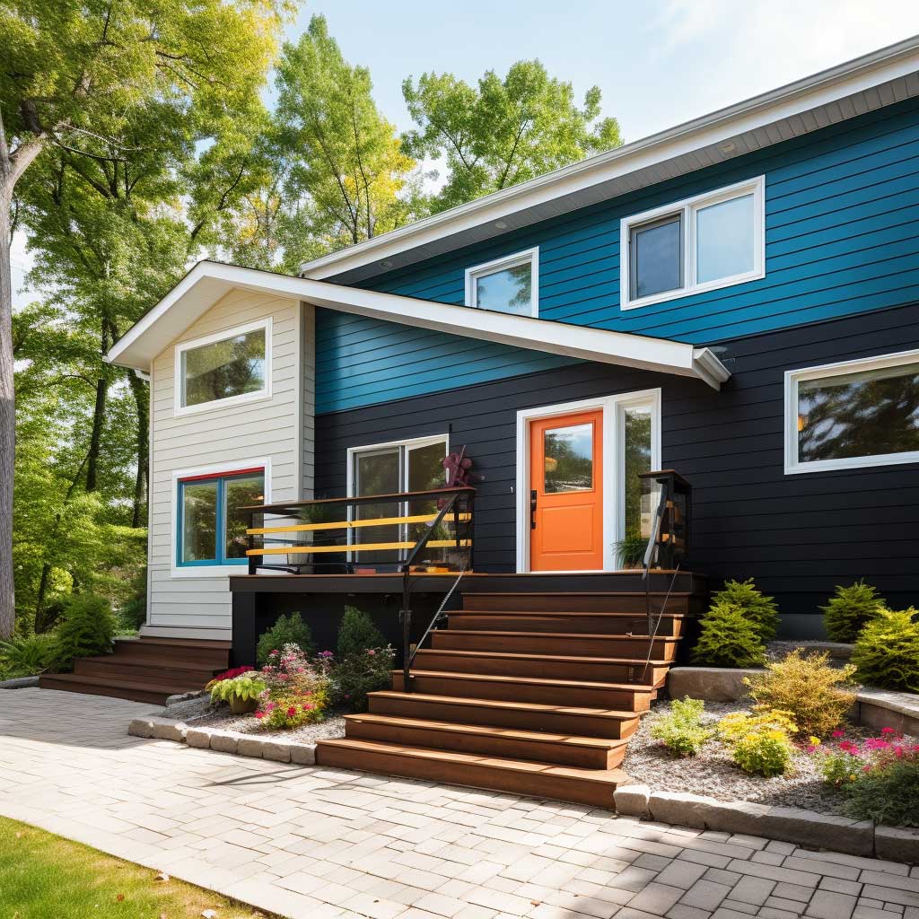
The one mistake I keep seeing with this strategy on split levels specifically: homeowners put the accent color on the upper-level window trim in addition to the front door. That’s two focal points instead of one, and on a split level where your facade is already visually complex, two competing accents cancel each other out. Pick the door. Let everything else be quiet. The door is always the right choice because it’s centered in the pedestrian sightline at street level — which is where your curb appeal actually lives. Upper-level trim details read from the second-story windows of the neighbor across the street, not from the sidewalk.
Siding material still matters when you’re running a neutral-plus-accent strategy. Smooth HardiePlank in SW Antique White SW 6119 is my base recommendation — it’s warm enough not to read clinical, neutral enough to accept almost any accent color without conflict. The mistake is using a stark cool white base, like SW Extra White SW 7006, and then wondering why your Benjamin Moore red door looks orange in photos. Warm base, saturated accent, white trim between them. That’s the whole formula. For more accent siding strategies at different price points, the accent siding ideas roundup breaks down material and color combinations across fifteen different exterior styles.
Split Level Siding — Material Comparison
| Material | Installed Cost / sq ft | Maintenance | Best For |
|---|---|---|---|
| Vinyl siding | $5–$11 | Very low | Budget makeovers, full re-side |
| James Hardie fiber cement | $10–$15 | Low (30-yr warranty) | Mixed material, contrasting color |
| Cedar wood siding | $12–$20 | High (restain every 3–5 yrs) | Accent volumes, warm texture |
| Stone veneer panels | $15–$30 | Very low once installed | Lower level grounding accent |
| LP SmartSide engineered wood | $8–$13 | Low (paint every 10–15 yrs) | Cedar look, lower maintenance |
Before You Close This Tab
Split level siding fails at the transition lines, not the color choice
The four strategies here — contrasting palette, mixed materials, monochrome, bold accents — all work when the color or material change happens at a real architectural break: a roofline, a floor plate, a trim band. Move that transition point to the middle of a wall and even a $20,000 fiber cement job looks like a mistake.
James Hardie fiber cement at $10–$15 per square foot installed is the material I’d recommend for any split level where the siding is coming off anyway. The 30-year warranty, the paint retention, and the fact that it accepts any color strategy on this list without complaint makes it the lowest-regret choice at mid-budget.
Save this post — come back when you’re standing in front of paint swatches at 7pm wondering why nothing looks right.