Two tone siding ideas keep circling back to the same principle: contrast needs structure, and structure means putting your darker color low and your lighter color high. I’ve stood in front of enough reversed schemes — white lap on the foundation, dark fiber cement on the gable — to know it reads as a mistake, not a choice. The right sequence does something a single-color facade can’t: it makes a house look like it was deliberately designed, not just painted. You’ll notice the difference from the end of the driveway.
Vinyl and fiber cement are the two materials worth considering here. James Hardie’s ColorPlus line runs $6–$9 per square foot installed and holds color for 15 years without repainting. LP SmartSide costs slightly less at $5–$8 installed. Skip natural wood unless you’re prepared to repaint every five to seven years — I’ve seen pristine-looking two-tone cedar schemes look chalky and patchy by year four.
Quick Scan
- Best color split: Dark tone on lower level, light tone on upper — grounds the structure visually
- Top vinyl combos 2025: Slate gray + crisp white · Warm brown + cream · Light blue + white
- Board-and-batten pairing: Use it on the upper zone for texture contrast against smooth lap below
- Trim rule: White or cream trim separates both colors cleanly — skip colored trim on two-tone schemes
- Cost range: $5–$9/sq ft installed for fiber cement; $3–$6/sq ft for vinyl
- What to avoid: Matching siding color to trim color — it erases the two-tone effect entirely
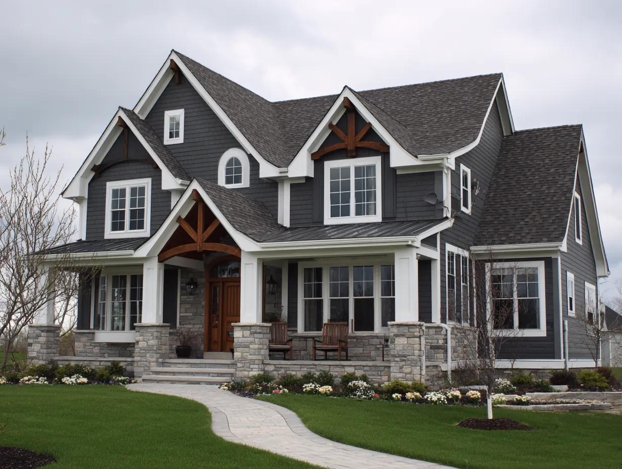
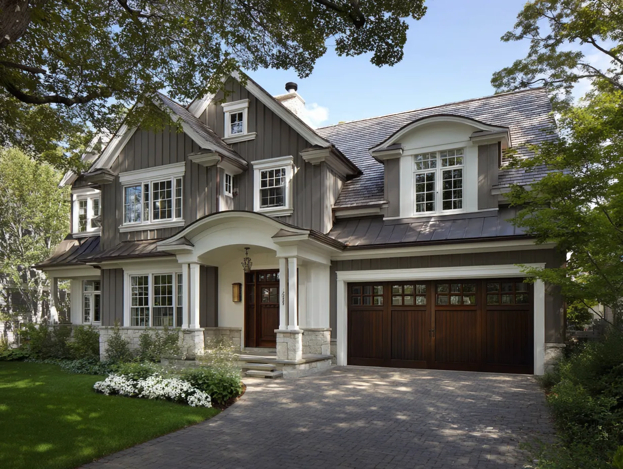
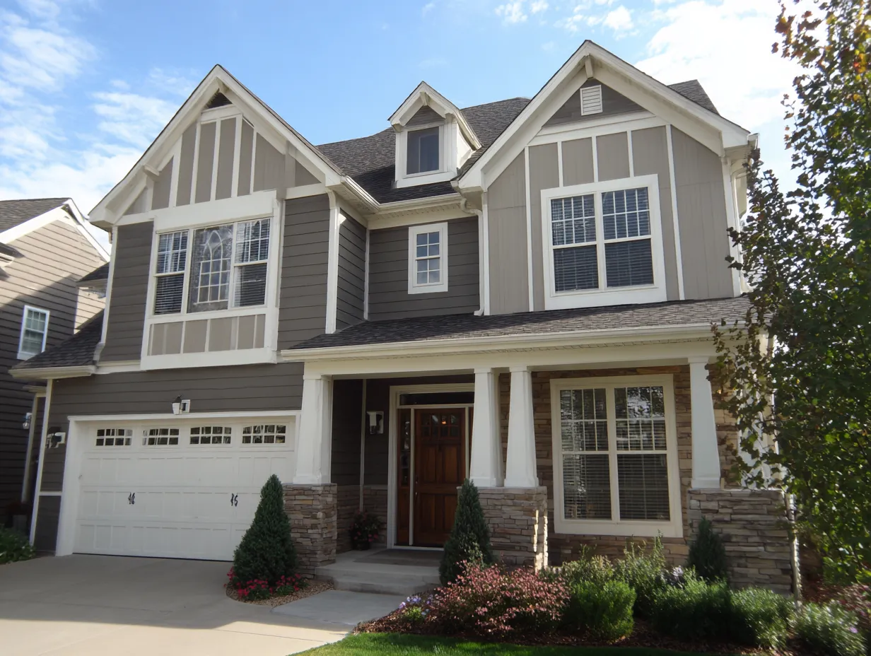
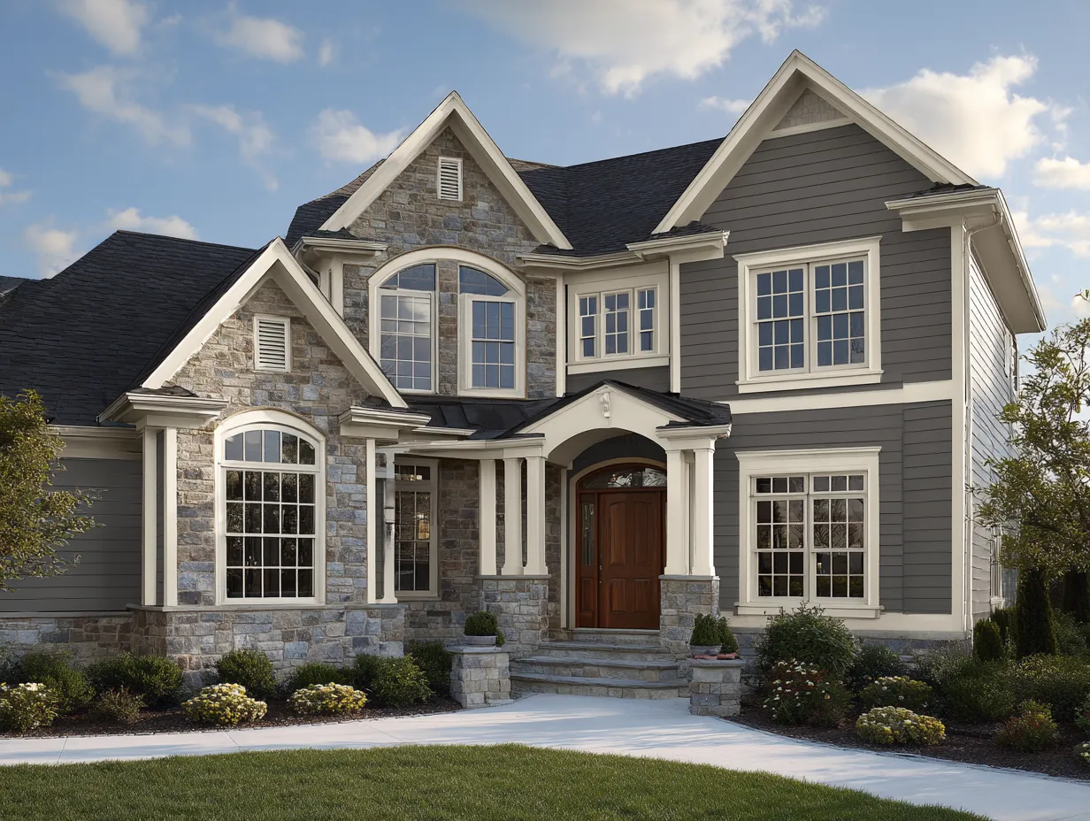
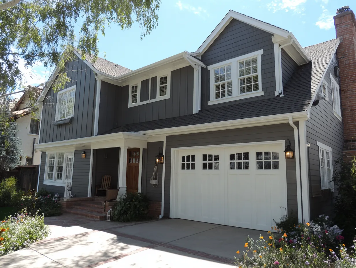
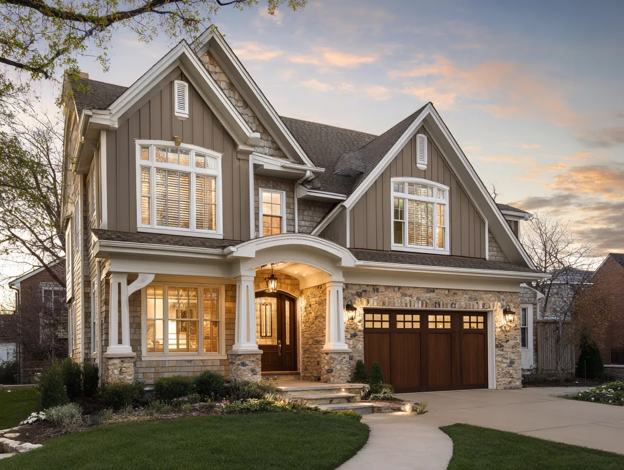
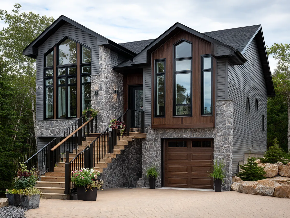
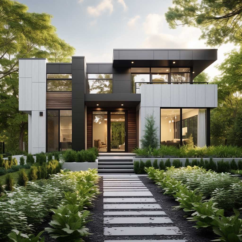
Gray and White Two Tone Siding Has a Structural Logic Most People Miss
Gray on the lower level acts like a visual anchor — the same way a dark baseboard grounds a room. I own two houses that went through exterior renovations, and the one where we tried pale gray up top and darker gray below looked unstable, like the house was floating. Switching it fixed everything. You’ll notice instantly that the darker tone reads as weight, and weight belongs at the foundation.
Sherwin-Williams Intellectual Gray (SW 7045) on the lower level paired with Extra White (SW 7006) on the upper is my go-to recommendation for this combination. Both are in the same undertone family — slightly warm — so they don’t fight each other in afternoon light the way a cool gray and a stark blue-white will. James Hardie’s Arctic White and Monterey Taupe ColorPlus pairing runs about $8,200 installed on a 2,000 sq ft colonial and holds up without chalking for over a decade.
The texture split matters as much as the color split. Smooth fiber cement lap on the lower level, board-and-batten on the upper — that’s the combination that makes this scheme feel considered rather than painted. Think of it like a suit where the jacket fabric differs from the trouser weave: same palette, entirely different character. Don’t use the same panel profile on both zones or the two-tone effect collapses into something that looks like a paint job gone wrong.
What doesn’t work: charcoal gray paired with bright white on a house with a brown or tan roof. The contrast is so sharp it makes the roof look like an afterthought. I’ve seen this combination on three houses in the same neighborhood and each one looks like two separate renovation projects that happened to collide. Match your gray’s undertone to the roof material before you commit.
For vinyl budgets, CertainTeed’s Monogram line in Charcoal Gray paired with their White Dover panel runs about $4.50 per square foot installed — roughly half the cost of fiber cement with 80% of the visual impact. See more gray and white siding combinations for a full breakdown of profile options and color pairings that work across different architectural styles.
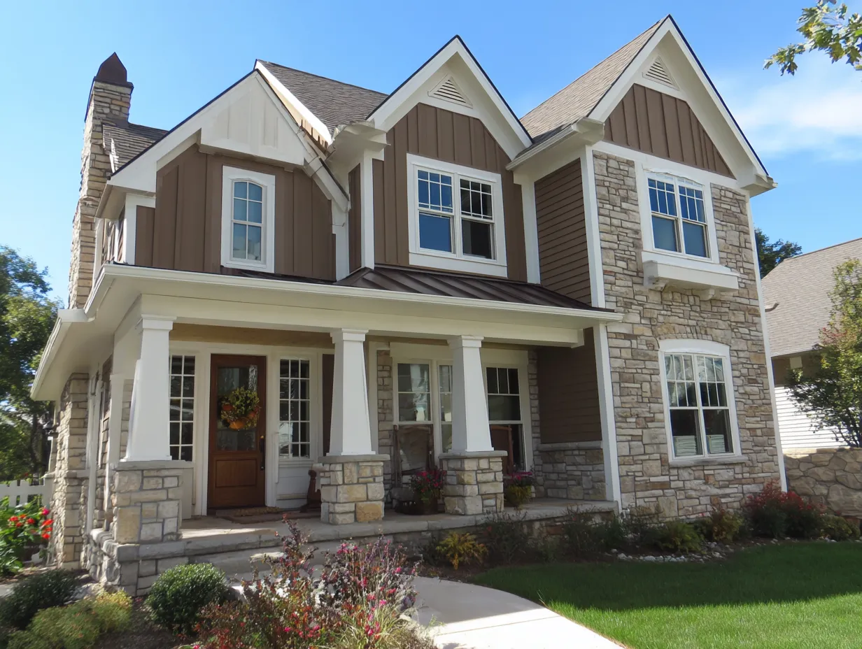
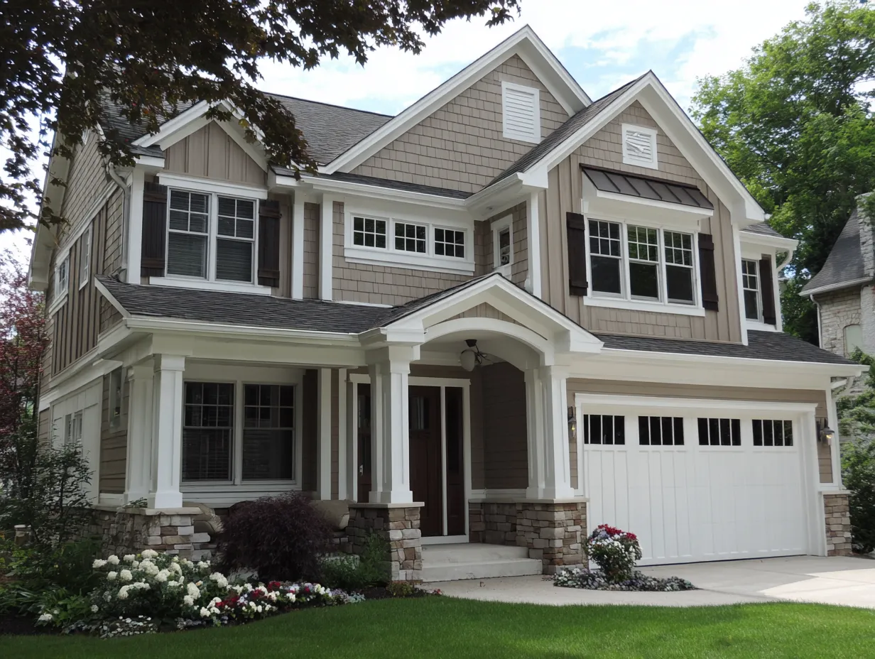
Warm Brown and Cream Siding Reads as Expensive — Until You See the Wrong Texture
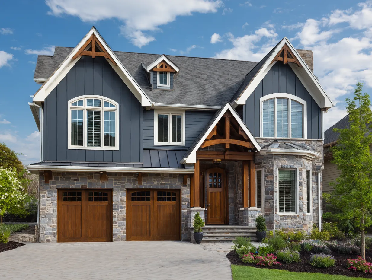
Brown and cream is the combination that ages best on wooded lots, rural properties, and anything within sight of a tree line. My go-to here is Benjamin Moore’s Carrington Beige (HC-93) for the upper body and their Coffee Brown (2107-20) for the lower — both warm-undertoned, neither fighting the other. The earthy palette works like camouflage: the house looks like it belongs rather than arrived.
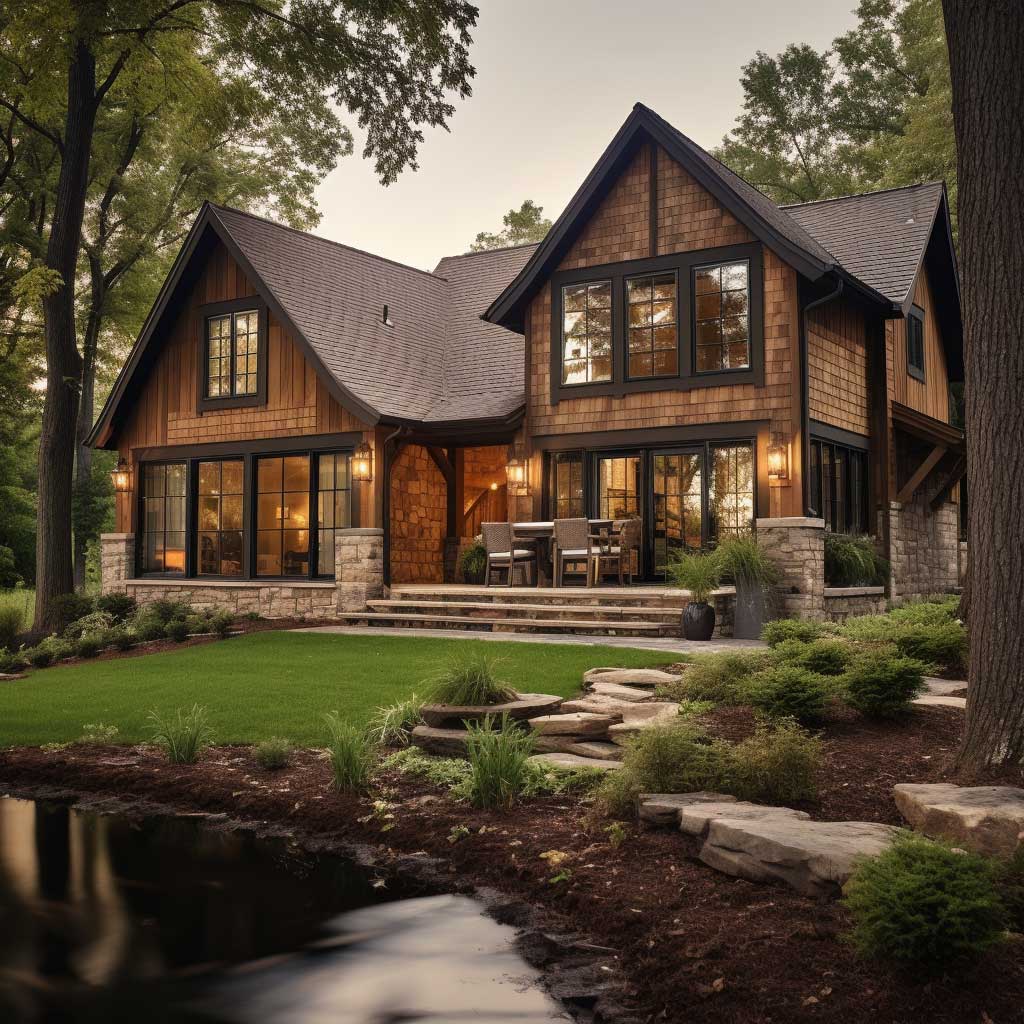
Texture is where this combination earns or loses its credibility. Rough-sawn cedar or a shake-profile vinyl on the lower level reinforces the warmth of the brown. Smooth lap cream on the upper level provides the contrast without going cold. Where people get this wrong is using a vinyl product with a plasticky, shiny finish on the brown zone — it immediately reads as fake, and suddenly your house looks like a manufactured home from 2003, not a craftsman.
The architectural detail placement changes everything. Use the cream siding on the main body of the house and reserve the brown for rooflines, window surrounds, and the door frame. You need that dark accent to pull the eye toward the details you want highlighted — gable vents, a covered porch beam, an oversized front door. Flip the placement and the house loses all its visual hierarchy.
LP SmartSide’s Cedar Shake Panel in Russet Brown paired with their smooth panel in Heritage Cream runs about $6.80 per square foot installed and mimics the look of actual cedar without the repainting cycle. That’s the product line I’d specify if the budget is mid-range and the homeowner isn’t interested in five-year maintenance commitments. For natural wood purists, stained cedar costs $9–$13 installed but requires resealing every four to six years — budget accordingly.
Don’t Do This
Don’t use a tan or beige cream on the upper level with a cool-toned brown below. Warm browns need warm creams — the moment you introduce a gray-cream, the combination looks muddy and unresolved. I’ve seen homeowners spend $14,000 on fiber cement siding and hate the result because the cream they chose had a green undertone that clashed with their warm-brown lower zone in morning light. Test swatches for 48 hours in direct sunlight before you order. Also avoid using matching window trim color to either siding tone — trim should be a distinct third element, usually white or very light cream.
The siding color palette also needs to account for the roof. A dark brown asphalt shingle pairs naturally with both tones here. Where this scheme falls apart is on houses with black or very dark gray roofs — the brown siding competes with the roofline instead of complementing it, and the overall effect reads heavy rather than grounded. Exterior colour combinations that hold up over time consistently show brown-and-cream as one of the most durable pairings in terms of both resale appeal and visual longevity.
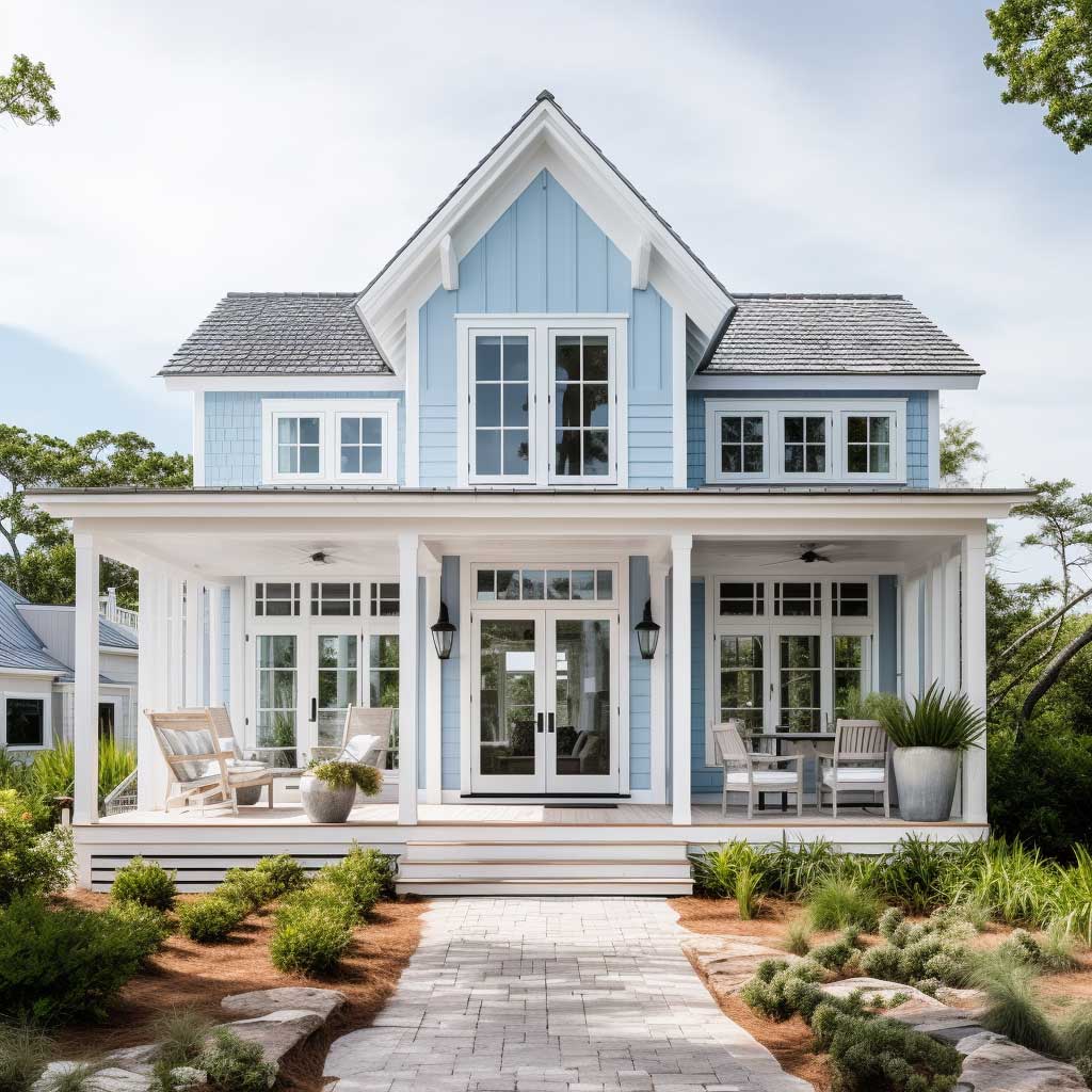
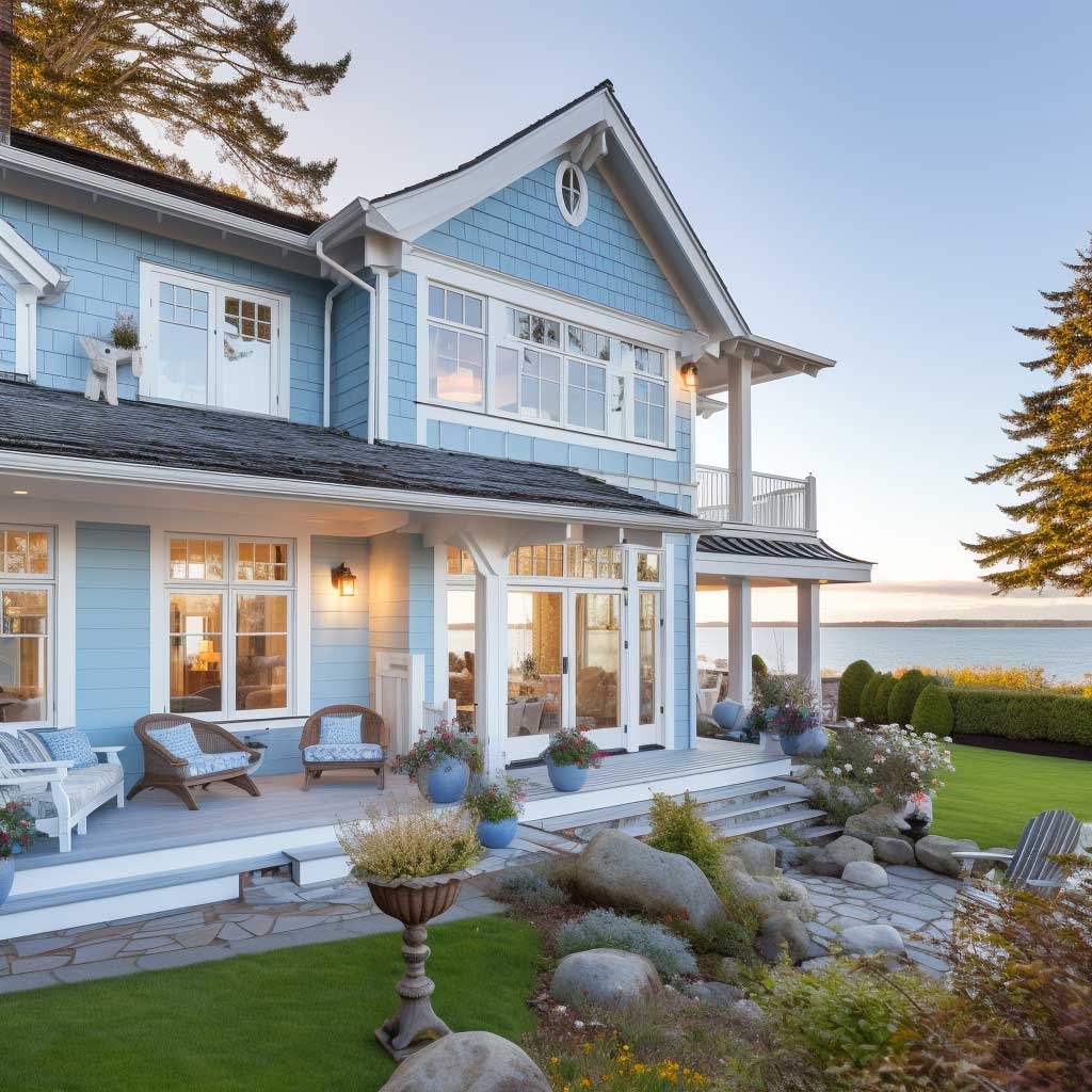
Light Blue and White Two Tone Vinyl Siding Works Far From the Coast
Light blue and white is the combination most people assume only works on actual beach houses. Wrong. I’ve seen it pull off on a craftsman in suburban Ohio and a colonial in upstate New York, both because the color split followed the structure: white body, blue accent on window frames and door. The blue doesn’t need the ocean nearby — it needs good architectural lines to highlight.
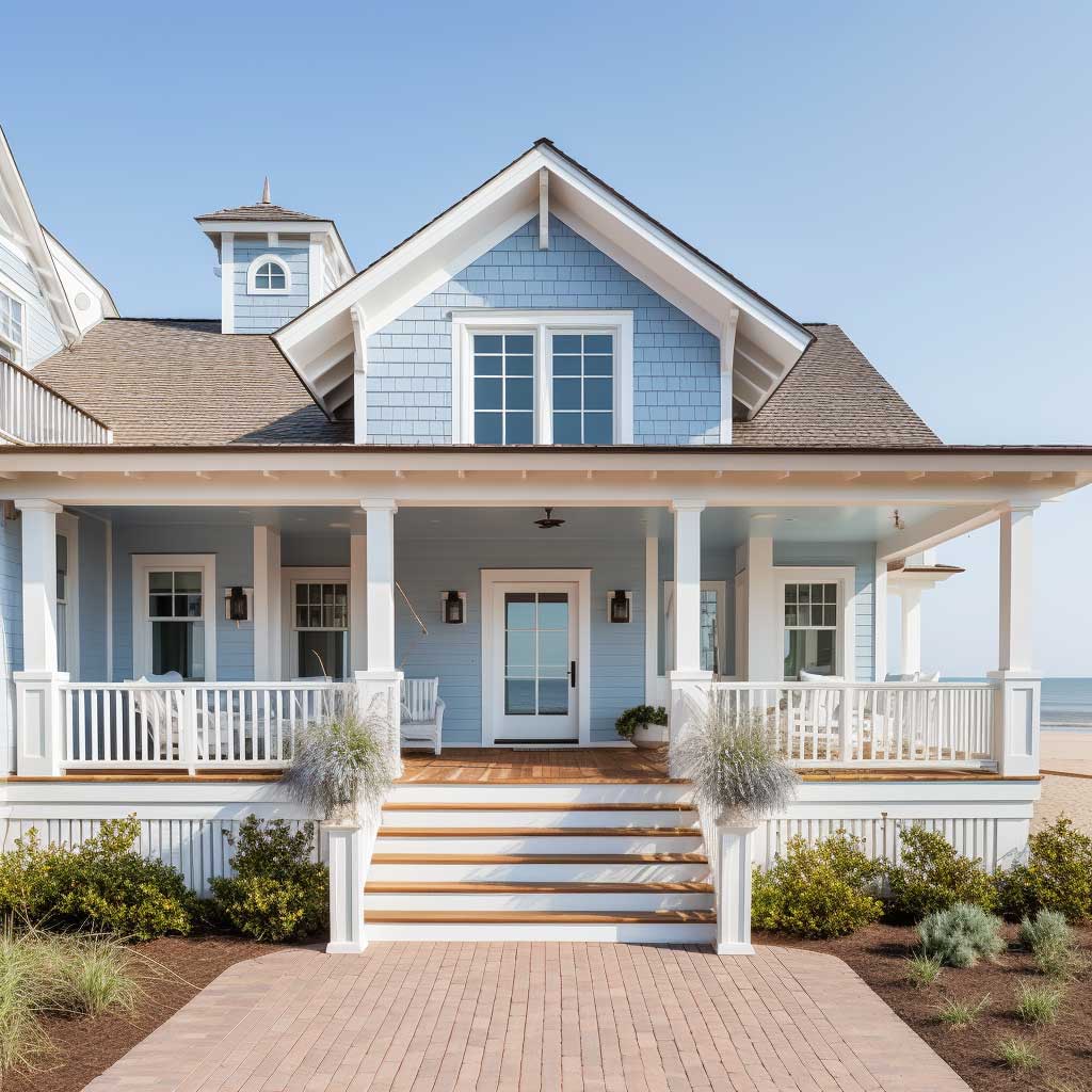
Sherwin-Williams Watery (SW 6478) is the blue I’d use here — it reads as muted aqua, not toy-store blue, and it photographs warm in afternoon light rather than garish. Pair it with Alabaster (SW 7008) for the main body and you get a combination that works twelve months a year without looking seasonally themed. The mistake I see constantly is using a saturated robin’s-egg blue with a stark bright white — it reads like a nursery, not a house exterior.
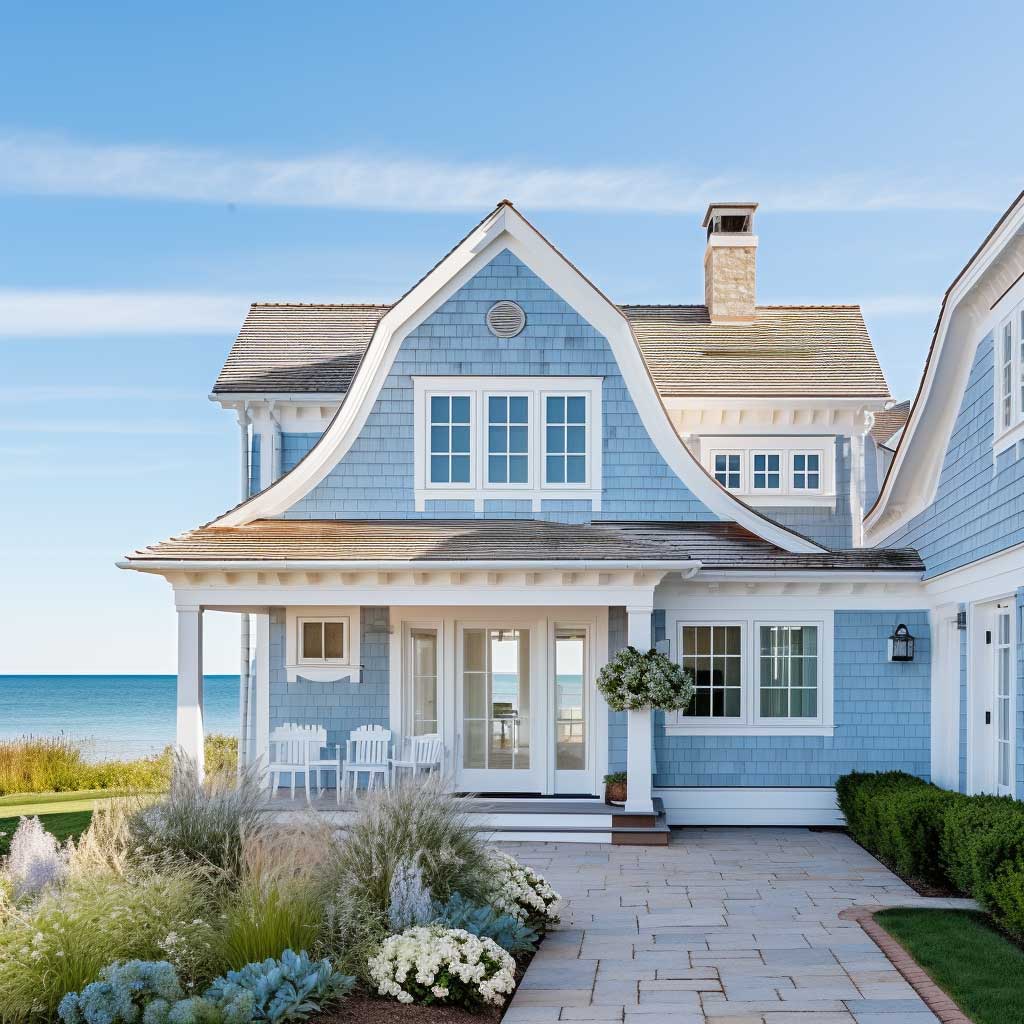
The weathered finish profile on both panels is what sells the coastal look inland. CertainTeed’s Aged Cedar texture in Colonial White with a muted blue trim hits about $5.20 per square foot installed. The weathered profile softens the contrast between the two tones, making the color split look intentional and relaxed rather than sharp and commercial. Avoid high-gloss vinyl in this combination — the sheen amplifies the blue into something aggressive on overcast days.
Blue siding on the main body with white only on accents is a harder scheme to pull off and requires a more confident architectural footprint — clean gables, symmetrical windows, minimal ornamentation. On a complex roofline with dormers and multiple angles, blue on the body reads busy rather than bold. Reserve that inversion for simple ranch or cape cod profiles where the volume of wall surface is large and uninterrupted.
For a deeper look at how siding color combinations interact with architectural style and surrounding landscape, this breakdown of vinyl siding color combinations from CPG Roofing covers roof undertone matching and trim selection in specific detail worth bookmarking before you make any final call.
The siding contractor link from the original content has been preserved here: if you’re in the Pacific Northwest, siding contractors in Seattle familiar with regional moisture conditions are worth consulting specifically for board-and-batten installation where improper flashing causes the most expensive failures in two-tone schemes.
Where the Color Split Lives Decides Everything About the Two Tone Effect
The horizontal break point — where one siding color stops and the other begins — is the single most consequential decision in a two-tone siding project. Most contractors default to splitting at the floor line between stories. That works on colonials and two-story traditionals. On ranch homes, split at the window sill height of the first course of windows instead, and the house gains a visual floor line it architecturally lacks.
Vertical splits are riskier and I’d avoid them on anything other than a very specific contemporary design. You need a strong architectural element — a chimney, a change in plane, a protruding garage volume — to justify a vertical color boundary. Without that anchor, a vertical split reads as a mistake rather than a decision. Two tone siding house designs that use vertical splits and fail do so because there’s nothing structural to explain why the color changes at that point.
The siding design ideas that work best in 2025 use the color split to reframe proportions. A wide, low ranch looks taller when the upper third gets a lighter color. A tall, narrow colonial looks less severe when the lower two-thirds go dark and only the gable zone goes light. Color is doing architectural work here, not decorative work — that’s the mental shift worth making before you pick any palette. Accent siding ideas for curb appeal covers this proportion technique across a wider range of material combinations.
Two Tone Siding
Dark on the bottom. Light on the top. That’s the only two-tone siding rule worth memorizing.
Gray-and-white, brown-and-cream, or blue-and-white — the palette matters less than where you place each tone. Get the weight distribution right and the color almost picks itself.
Match undertones before you commit. Warm browns need warm creams. Cool grays need cool whites. Mixing temperature families at the split line is the fastest way to spend $12,000 on a result you’ll repaint in three years.
Save this post and reference it before your contractor call — most of these decisions get made at the job site without you.
Related Topics