Soft pastel colors do something in a beach house that full-saturation paint simply can’t — they absorb the salt-air light without bouncing it back as glare. Researchers in color psychology have documented that short-wavelength hues like blue and green measurably lower heart rate and blood pressure, which is why stepping into a well-chosen pastel bedroom feels less like a decor choice and more like a physiological reset. That’s the science behind the serenity.
Pale blues, soft lavenders, mint greens, and blush pinks all share one technical trait: they are created by mixing a vivid hue with a high proportion of white, which drops their saturation without killing the color entirely. That low saturation is what allows them to shift across different light conditions — warm morning gold, cool afternoon overcast, the amber glow of a bedside lamp — without fighting with the room. A beach house gets all of those light qualities in a single day.
The common mistake is treating pastels as a background and stopping there. Stylists recommend layering at least three pastel tones — a dominant, a secondary, and an accent — across textiles, furniture, and art within each room. A single pastel wall with white everything else reads clinical, not coastal. The rooms that actually work carry the palette through bedding, throws, upholstery, and small ceramics in a way that feels considered rather than coordinated.
- Short-wavelength pastels (blue, green) lower blood pressure — research-backed, not just aesthetic preference
- Bedroom: anchor with linen bedding in soft blue or lavender, then match with whitewashed wood furniture
- Reading nook: start with the chair upholstery color, build every other element to support it
- Living room: pastel art works harder than pastel walls when the sofa is already light-neutral
- Avoid mixing more than one warm and one cool pastel in the same room — the palette starts fighting itself
Soft Pastel Colors in the Bedroom Start at the Bedding, Not the Wall
Soft pastel colors in a beach house bedroom have the most impact when they enter through the textiles first — specifically the bedding — rather than through paint. Paint is permanent; bedding is adjustable. Starting with a duvet cover in soft blue or pale lavender lets you calibrate the intensity before committing to anything structural. Pottery Barn’s Belgian Flax Linen collection offers duvet covers in ocean-adjacent neutrals like Dusty Blue and Oyster that perform exactly this function — the Belgian flax weave has an inherent texture variation that makes a single-color piece read as layered without any effort. For modern pastel bedroom approaches across different styles, the principle holds: the bedding is the room’s most visible textile surface and sets the temperature for everything else.


Whitewashed wood furniture is the right partner for blue-lavender bedding because it holds a neutral value without going gray or cold. The whitewash process leaves enough wood grain visible to add warmth, which keeps the pastels from reading as sterile. What doesn’t work: glossy white lacquer furniture next to pale lavender bedding. The high-contrast sheen pulls focus away from the textile and makes the color appear washed out rather than intentional. Stick to matte or distressed finishes in the bedroom for this reason.

A lavender throw placed at the foot of the bed adds a third dimension without introducing a new color family — lavender is already adjacent to the cool blue palette but shifts toward purple enough to register as a distinct layer. Try this: fold the throw in thirds lengthwise and drape it loosely rather than tucking it flat. The slightly disheveled fold reads as lived-in coastal rather than hotel turndown service. Finish the walls with framed ocean photography in the 8×10 or 11×14 range — prints this size add presence without requiring a gallery wall that fragments the calm the bedding is working to build.
Don’t layer multiple competing pastel hues across your bedding set without a unifying neutral. Mixing pastel pink shams with a mint duvet and a soft yellow throw sounds cohesive on paper, but the three warm-cool signals fight for dominance and the bed looks chaotic. Pick one dominant cool pastel — blue or lavender — and let crisp white be the separator between any accent tones. The palette needs one color to lead.
The Reading Nook Gets the Pastel Treatment Last — and Wins Hardest
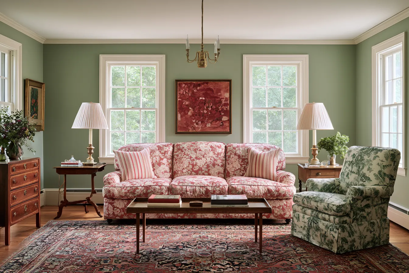
A pastel ocean aesthetic finds its most concentrated expression in the reading nook, precisely because the space is small enough that every color decision shows immediately. The upholstered armchair is the starting point — not the window treatment, not the rug. Choose a chair in a single pastel tone, and let that choice govern everything placed within arm’s reach. A soft pink armchair priced around $83 (like the Better Homes & Gardens reading accent chair at Walmart) demonstrates that the entry point for this look is genuinely accessible; the money is better spent on the textile layers around it anyway.


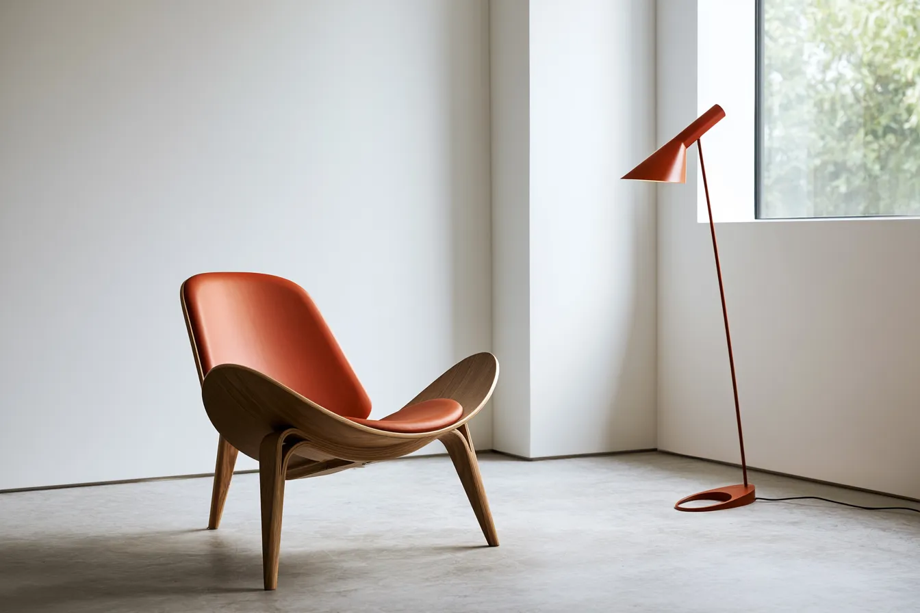
A mint-green lamp on a light wood side table introduces the second pastel tone without competing — mint and pink sit far enough apart on the color wheel that they contrast mildly, but both are cool-leaning enough to stay in the same family. The lamp’s role isn’t just decorative: diffused lamplight at reading height reinforces the enclosed, retreated quality that makes a nook feel genuinely separate from the rest of the house. Does the lamp have to be mint? No. But it should be a pastel that isn’t also the chair color — the point is the contrast, not the specific hue.

Sheer or pale linen curtains framing the window are non-negotiable in this setup — they filter the direct beach light into something diffused and flattering to both the pastels and the person sitting there. Solid blackout curtains kill the coastal quality entirely, and patterned curtains compete with the chair upholstery. A woven basket at floor level adds a natural texture that prevents the nook from becoming too precious: the roughness of jute or rattan grounds the softness of the pastels in something real-world.
Pastel Art Anchors a Living Room When the Furniture Plays It Safe
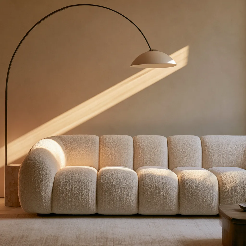
Pastel living room decor works best when the sofa is already in a neutral — beige, cream, or white — because the art and accessories then carry the color story without any single piece doing too much. Large abstract canvases in light pink, pale yellow, and soft blue function like a tuning fork for the room: they establish the temperature and let everything else align to it. Color research consistently shows that humans make subconscious judgments about a room within the first 90 seconds, with up to 90% of that assessment based on color — which is why getting the statement piece right matters more than matching every throw pillow. See also how modern coastal living room design navigates the balance between pale furniture and bolder coastal accents.


Cushions in pastel green placed on a light beige sofa introduce color without the commitment of reupholstering anything, and green specifically pulls in the biophilic connection that coastal interiors need — it mimics the sight of vegetation near the shoreline, not just the water itself. What to avoid: placing pastel accessories directly against a dark sofa. Charcoal or navy upholstery absorbs the softness of pastels rather than reflecting them, and the cushions read as color swatches rather than as part of a coherent palette. The neutral sofa is doing real work here.
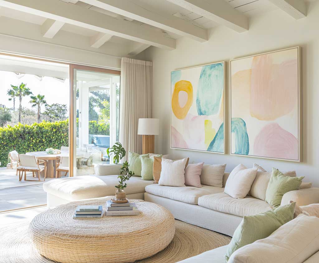
A round pastel rug — soft blue, pale yellow, or a blended coastal weave — does the structural work of pulling the seating arrangement into a unified zone. Round rugs in particular work better in beach living rooms than rectangular ones because they soften the geometry of furniture legs and corners, which tend to be more angular in modern coastal pieces. The light wood furniture accents — a coffee table leg, a media console frame, a floating shelf — add the warmth that keeps the pale palette from feeling cold, acting like the sand does relative to the water: a grounding reference point.
Lighting in this room should come from multiple low sources rather than a central overhead fixture. A single bright overhead light on pastels at night is roughly equivalent to flash photography: it flattens the colors and removes the atmospheric quality that makes the room worth being in. Position floor lamps or table lamps at two or three points around the seating area, choosing bulbs in the 2700K–3000K warm range. The color psychology behind this is documented — the Color Institute’s research on color and wellbeing confirms that warm amber evening lighting paired with cool-toned daytime pastels supports a genuine psychological shift toward rest, not just an aesthetic preference.
SOFT PASTELS AT HOME
Three rooms, one palette — and the whole beach house holds together
Blue and lavender bedding sets the tone for sleep before the walls do anything at all. A single pastel armchair transforms a window corner into the room everyone competes for. And pastel art in the living room settles the neutral furniture into something with a clear point of view.
The rule that connects all three: let one pastel tone lead per room, use white as the separator, and bring in warm-toned lamp light after dark. The palette stays coherent across the whole house without every room looking identical.
Save this post before your next beach house refresh — the layering order matters more than the specific hues.
Complete guide
Furniture Decor Ideas for Every Room in Your Home
Living room, bedroom, dining, kitchen, outdoor — all in one place
Complete guide
Coastal Home Style Ideas That Actually Feel Like the Shore
Kitchens, bedrooms, bathrooms, exteriors, palettes, outdoor — all in one place