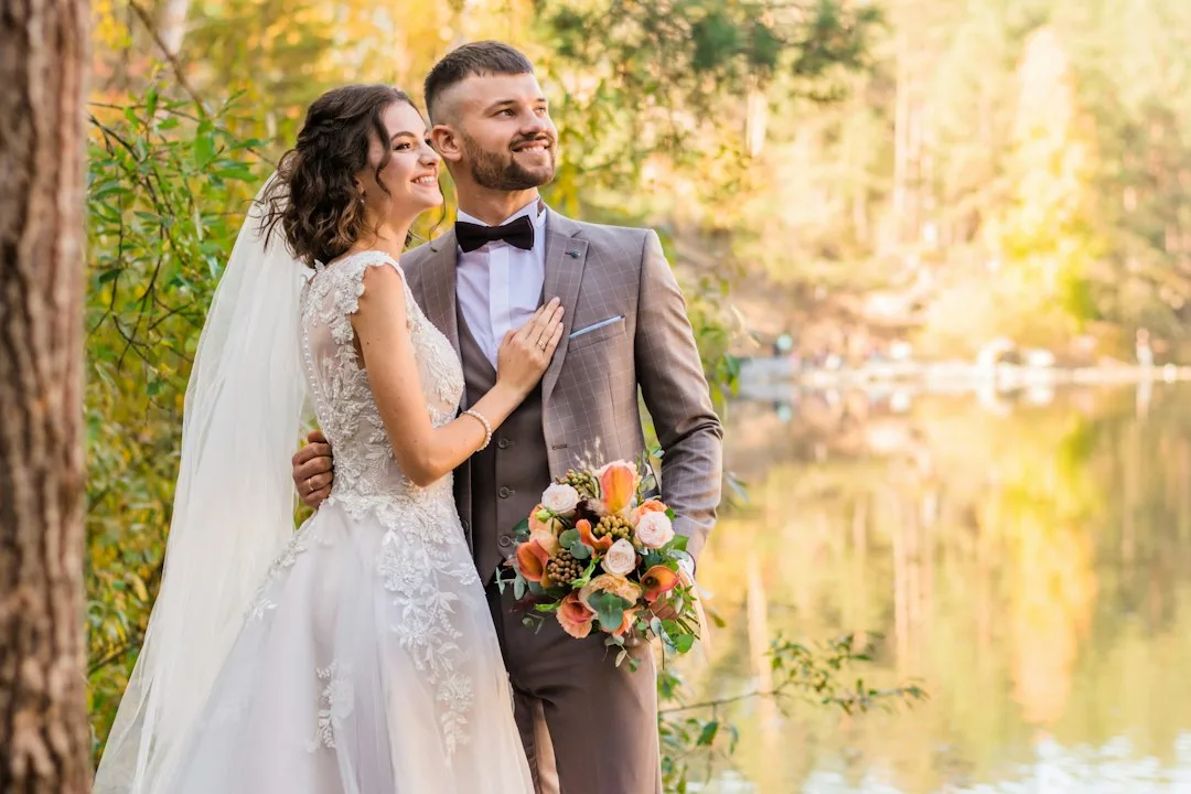
A rose gold black and white wedding theme pairs the soft shimmer of blush metallics against hard black-and-ivory contrast instead of the usual pastel filler. Art Deco design supplies the structure for that pairing: sharp geometric lines, symmetrical patterns, and materials built to catch light rather than absorb it. Put rose gold foil against matte black card stock or onyx-toned accents and the metallic reads warmer, not colder — the dark tone gives the pink-gold hue something to push against. Skip the contrast and rose gold on its own tends to slide toward soft, generic blush; add the black-and-white structure and it snaps back into something that photographs like a 1920s supper club instead of a bridal shower.
The theme moves through three places on a wedding day: the paper guests hold before they arrive, the table they sit at once they’re there, and the headpiece the bride wears through both. Each one uses the same rule — geometric shape plus metallic shine plus a hard dark or bright white anchor. Skip any one of the three and the palette starts to look like leftover rose gold party decor rather than a considered theme.
What follows breaks down each of those three elements, plus the swaps that quietly wreck the contrast once the budget gets tight. Real prices are included for every element, pulled from current stationery, floral, and bridal-accessory pricing rather than guessed at. A short comparison of related color families — old rose, pink gold, and rose gold mixed with straight gold — is covered separately below.
Quick Scan
- Core contrast: rose gold metallic plus true black or onyx plus crisp white — not pastel blush on its own.
- Invitations: rose gold foil on black or cream stock runs $4–$8 per card.
- Centerpieces: calla lilies in geometric rose gold stands, $5–$15 per stem, with black feather and black-plate accents.
- Headpiece: rose gold hair combs start around $33; full crystal tiaras run $89–$118.
- What to skip: pastel blush as a third color, mixed metallics on one surface, or plain florals with no dark accent.
- Related palettes — old rose, pink gold, and rose gold plus straight gold — are covered in the FAQ below.
Ivory Cardstock Does the Black and White Work Before the Rose Gold Foil Shows Up
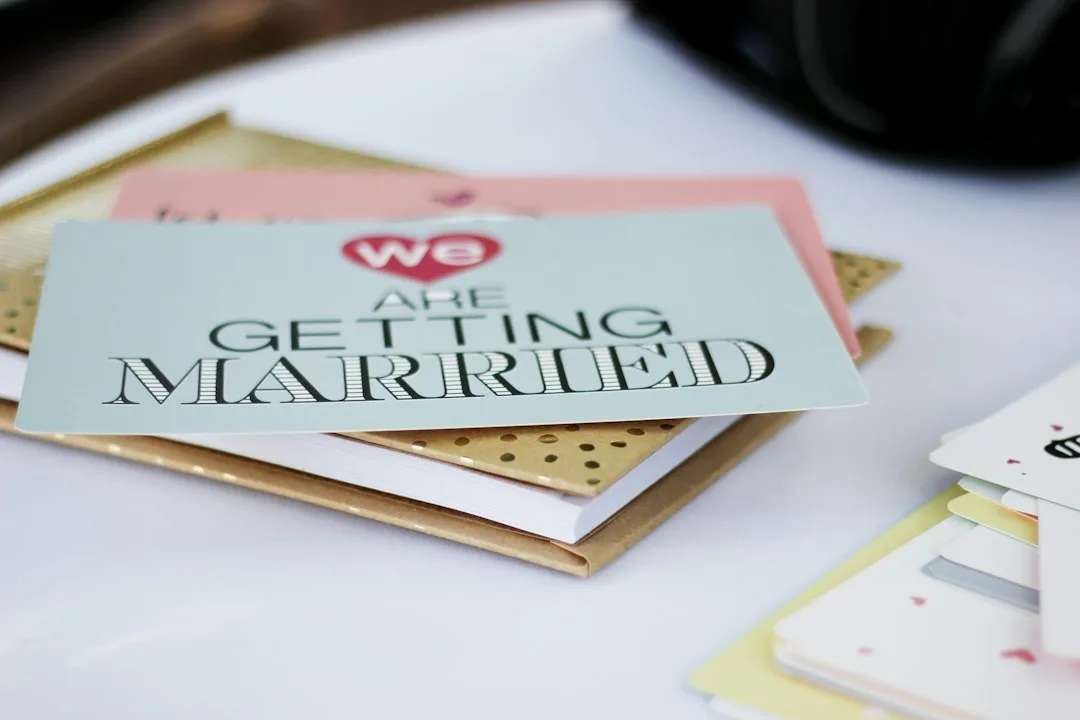
A wedding rose gold theme starts working before any guest reaches the reception, and the invitation suite is where that first impression gets made or lost. Cream cardstock holds a sharper photograph than bright white, because it lets rose gold foil read as warm metal instead of flat pink ink. Sharp chevron and triangle motifs in foil do the geometric heavy lifting, while a thin black border or black wax seal supplies the contrast that keeps the card from reading as soft and pastel. Rose gold metallic foil printing on custom stock runs $4 to $8 per card according to Paperlust’s 2026 print pricing, noticeably more than plain digital print, but the die-stamped depth is the detail guests actually notice when they hold the card.


Typography carries as much weight as the foil. A structured serif with small caps — something like a bold Art Deco display face — signals formality the way a monogram alone can’t. What happens if the invitation skips the black accent entirely? It reads as a standard rose gold wedding suite rather than the black-and-white variation, and loses the visual cue that tells guests this isn’t a pastel spring wedding. A marble surface under the flat-lay photo does the job a spotlight does on a stage — it isolates the invitation as the one thing worth looking at.
One thing undercuts the look fast: pairing rose gold foil with a baby-pink envelope liner. That combination photographs as soft party-store pink, not the metallic-on-dark contrast the rest of the wedding is built around. A black-striped or plain black envelope liner does more to set expectations than a second round of foil ever would, and it costs next to nothing extra to add at the printing stage.
Not every couple wants the hard-edge version. A softer boho rose gold wedding theme with brown, earthy textures swaps onyx for walnut wood and reads considerably warmer in photographs than the black-and-white version. Choosing between the two comes down to venue: a ballroom or hotel space suits the sharp black-and-white pairing, while a barn or garden setting leans naturally toward the softer palette instead.
Rose Gold Stands Hold a Black and White Centerpiece Together
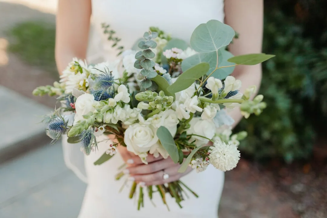
A rose gold black and white wedding theme earns its name at the reception table, where geometric rose gold stands hold the centerpiece above eye level and give the arrangement actual architecture instead of just height. Calla lilies do more work here than any other flower — their sculptural, unfussy shape reads as pure line rather than soft petal mass, which is exactly what a black-and-white palette needs. Calla lilies cost $5 to $15 per stem, and a modest three-stem cluster in a rose gold stand covers the visual ground that would otherwise take a dozen cheaper blooms. They also happen to suit modern and Art Deco wedding themes specifically, since their shape mirrors the same clean lines running through the invitations and headpiece.


Black feathers tucked among the calla lilies work the way charcoal shading works in a pencil drawing — they don’t add color, they add depth by giving the eye somewhere dark to rest between the metallic stand and the white flowers. Does the arrangement need actual black flowers to read as black and white? No — the contrast lives in the vessel, the feathers, and the linens, not in dyed florals, which tend to look artificial sitting next to natural white blooms. Silver-rimmed plates are the one swap that quietly ruins this table, since silver photographs as a cool mid-gray next to rose gold and the two metallics compete instead of complementing each other.
The same contrast principle drives an entire separate wedding aesthetic — how a black and white wedding theme is built for photography — and borrowing its rules for reception decor keeps this hybrid palette from drifting into muddy gray once the photos come back. True black over charcoal, and matte finishes over metallics on every non-rose-gold surface, are the two habits worth carrying over directly.
Don’t Do This
Don’t mix metallics at the reception table. Silver chargers, gold candle holders, and rose gold flatware in the same frame read as visual clutter rather than intentional layering. Pick rose gold as the only metal in the room and let black and white carry the rest of the contrast.
A Bridal Headpiece Borrows Its Geometry From 1920s Ateliers, Not Pinterest
Rose gold bridal headpieces built for this theme lean on the same design vocabulary as the jewelry the whole aesthetic borrows from — symmetrical lines, stepped geometric cuts, and pavé-style detailing rather than loose floral clusters. A rose gold hair comb with that angular structure runs about $33 from independent studios like Green Alaska Decor, while a full crystal tiara in the same finish lands between $89 and $118. That range is wide enough that the headpiece rarely has to be the line item that blows the accessories budget.
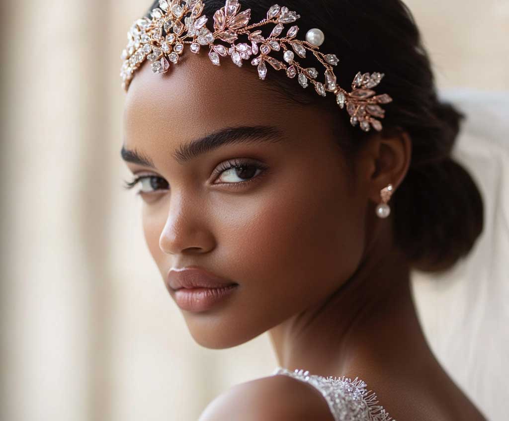


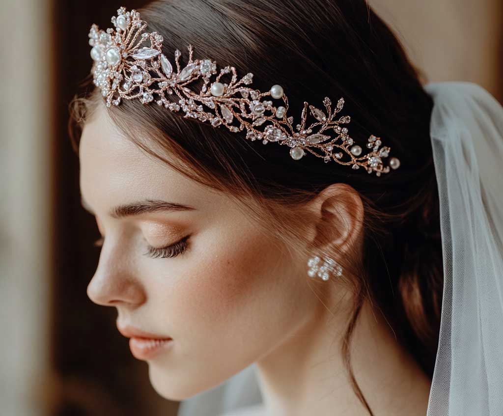
Design historians trace that geometric vocabulary to Cubism and the Machine Aesthetic movements of the 1920s, when jewelers replaced round, soft settings with sharp step-cuts and symmetrical patterns almost overnight. 1stDibs’ Art Deco jewelry guide breaks down exactly which cuts and settings define the look, and that same step-cut, symmetrical logic is what separates an Art Deco-inspired headpiece from a generic bridal hair accessory.
Pearl-heavy headpieces without any geometric structure undercut the theme fast — a loose scattering of pearls reads as classic bridal, not Art Deco, no matter how much rose gold gets mixed in. The fix isn’t more pearls, it’s fewer of them, set along a defined angular line instead of scattered at random. Does the headpiece need to match the invitation’s exact foil tone? Not exactly — a slightly warmer or cooler rose gold is fine as long as the geometric shape language matches; tone mismatches are far less noticeable in person than shape mismatches are.
Pair the headpiece with a low, structured updo rather than loose waves — soft, undone hair undercuts the sharp lines of the piece the same way a wrinkled shirt undercuts a tailored suit. A vintage-inspired gown with minimal beading lets the headpiece stay the focal geometric detail instead of competing with embellishment placed elsewhere on the bride.
THE TAKEAWAY
Rose gold works harder when it has something dark to push against.
Onyx accents, true black linens, and crisp white flowers turn a soft metallic into a photograph-ready contrast instead of leaving it to fade into generic blush.
The three anchor points — invitations, centerpieces, headpiece — all use the same rule: geometric shape, metallic shine, hard dark or white anchor. Skip the contrast on any one of them and the rest starts to look accidental.
Save this post before you lock in vendors — the invitation, floral, and headpiece choices only line up if the black-and-white contrast is decided early, not added on afterward.