The entryway has become the most ignored room in residential design. Homeowners pour budgets into kitchens and primary bedrooms while stuffing coats, shoes, and mail into a narrow hallway that guests see first. By August 2026, minimalist entryway design is reversing that logic entirely—proving that the smallest threshold holds the most power to reset how people feel inside a home.
Why is minimalist entryway design trending now? Neuroscience research shows that visual clutter triggers low-level stress responses within seconds of entering a space. A cluttered entry creates cognitive load before someone has taken three steps inside.
When done with intention, minimalist entryway design does something different: it signals control, welcomes guests into calm, and gives the brain room to settle. This isn’t asceticism. This is strategy.
The entry ritual replaces the coat rack
The mistake most homeowners make: they buy a standalone coat rack and expect it to absorb a household’s daily friction. Within weeks, that rack becomes a sculpture of hanging chaos—scarves tangled with work bags, yesterday’s jacket wedged behind today’s.
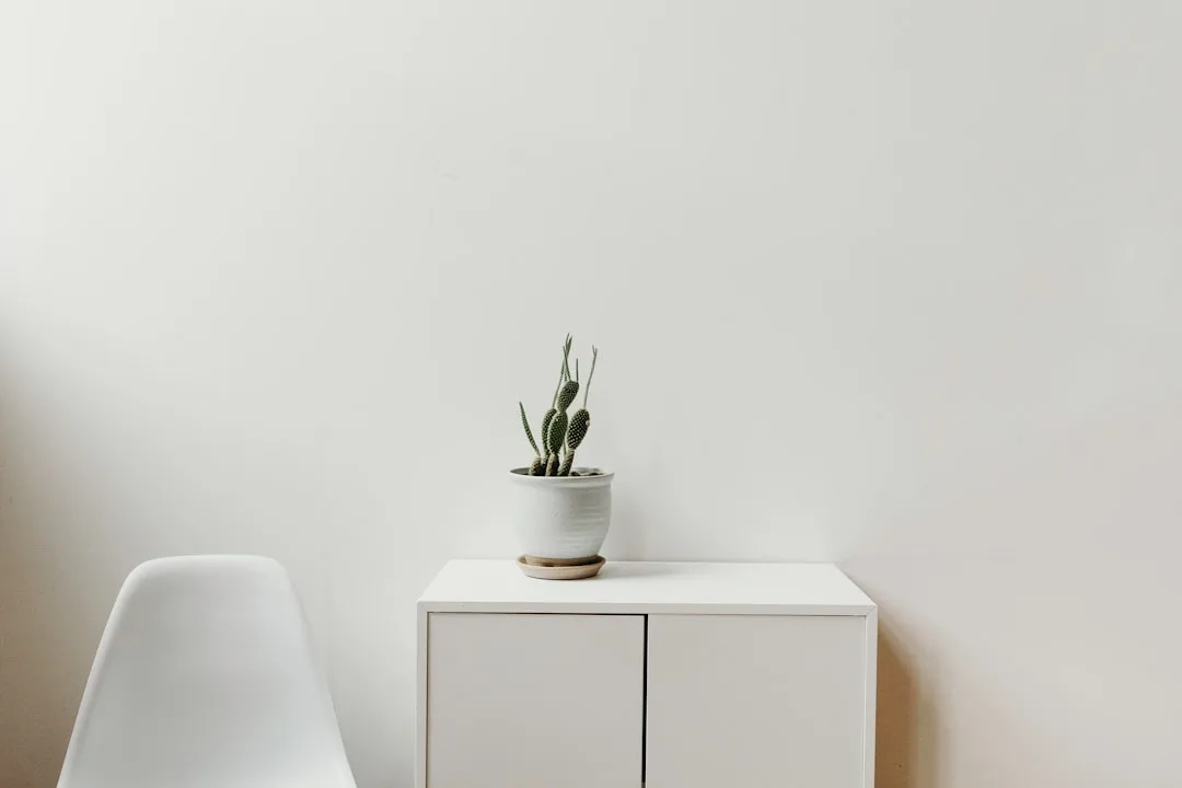
Minimalist entryway design inverts this by building the entry ritual into the room itself. The Dutch design firm Norm Architects, known for Scandinavian residential work, embeds coat storage as a recessed wall cabinet rather than freestanding furniture. The result: coats vanish into the wall the moment you cross the threshold.
Real material choice matters here. Norm uses oiled oak or white-lacquered plywood for these built-ins, materials that feel warm despite their simplicity. A coat stored in a cabinet becomes invisible; a coat hung on a rod stays visually present all day.
Functional storage is not optional in minimalist design—it is the design. Storage IS the aesthetic.
Quick Tips
- Install one wall-mounted cabinet for coats and bags instead of multiple hooks scattered across the wall
- Choose a single material for your entry—white lacquer, natural wood, or plaster—rather than mixing five finishes
- Locate the shoe storage below knee height, paired with a single floating bench above it
- Leave wall space between elements; negative space is the hero of minimalist entryway design
- Add one brass or blackened-steel detail—a single mirror frame, a single hook—rather than layering different metals
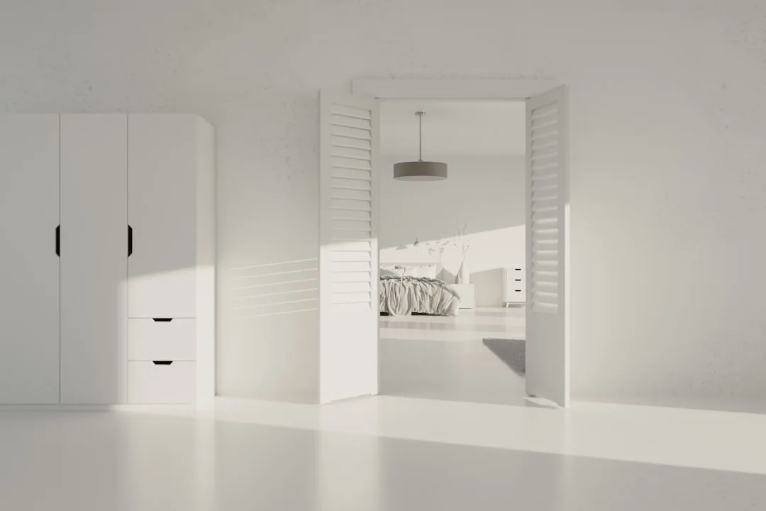
Flooring anchors minimalist entryway design with texture
The first element your eye lands on when entering is not a coat; it is the ground beneath your feet. Minimalist entryway design recognizes this psychological fact and treats flooring as the primary gesture.
Two material choices lead the trend in 2026: polished concrete and large-format porcelain tile. Both require minimal visual break. Polished concrete, popular in London and Berlin residential projects, eliminates grout lines that fragment the floor visually.
| Flooring Material | Visual Impact | Minimal Look |
|---|---|---|
| Polished concrete | Seamless, monolithic | High—no grout grid |
| Large-format porcelain tile (120x240cm) | Minimal grout lines | High—fewer interruptions |
| Terrazzo (speckled stone) | Subtle texture | Medium—pattern adds detail |
| Small-format tile or wood planks | Multiple grout joints | Low—creates visual noise |
Polished concrete costs roughly $8–12 per square foot to install, making it economical compared to specialty stone. Concrete also accepts epoxy coatings that can shift tone without replacing material.
Texture matters even in minimalism. A blank concrete wall becomes cold without dimensional relief. One Parisian design studio, Atelier Cécile Lefebvre, applies a single pass of plaster finish to entryway walls—just enough texture to catch light without reading as patterned.
Storage strategy hides the daily burden
Minimalist entryway design’s real innovation is invisible: what you don’t see. A wall-mounted shoe cabinet designed by the Swedish brand String holds up to 40 pairs of shoes behind a single lacquered door, 70 centimeters wide by 60 centimeters tall. The door closes and the problem vanishes.
This is the psychology shift. Traditional entryways ask you to manage visible clutter; minimalist design absorbs that burden into the wall itself.
The number-one failure point: adding storage that duplicates existing closets. A family already has a coat closet inside the front door—adding another coat station in the foyer creates twice the friction. Instead, minimalist entryway design consolidates: one unified storage wall handles shoes, outerwear, bags, and one category of seasonal items.
Everything else lives in the hall closet or stays in bedrooms. The entryway becomes about transit, not inventory.
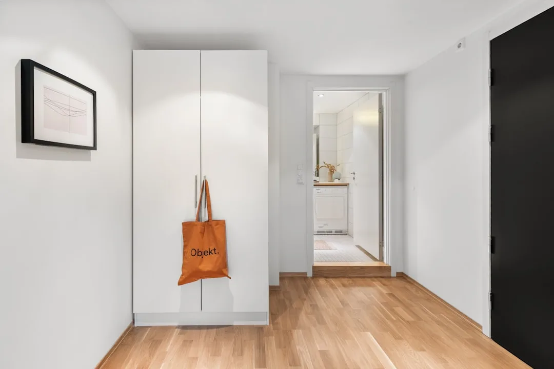
Lighting creates the psychological shift
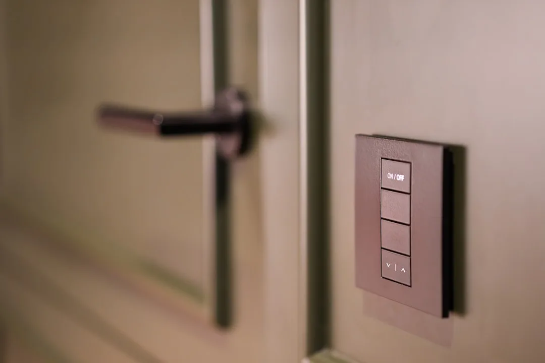
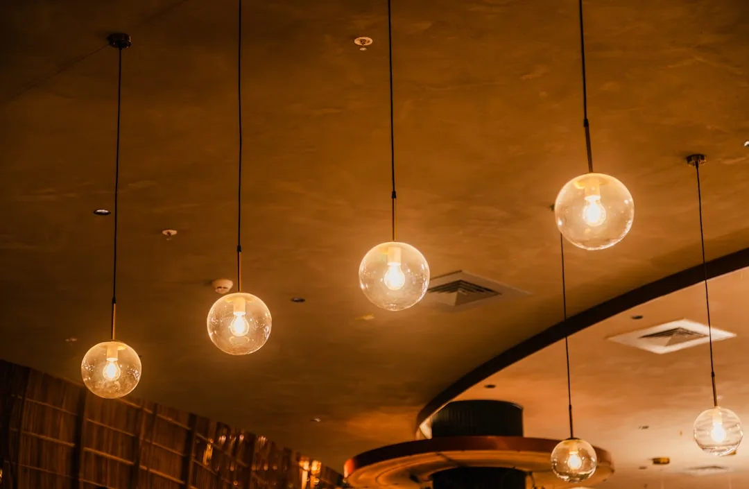
A minimal entryway without proper lighting reads as dark and unwelcoming. Strategic lighting does not mean a chandelier; it means a single, recessed light source embedded in soffit or ceiling—or a slim, blackened-brass wall sconce, positioned at 160 centimeters high, that casts warm light downward.
The London design practice Kinnersley Kent Design uses motion-sensor recessed lighting in minimalist entries, so light activates only when someone enters. The effect: the room feels intelligent, not staged.
Natural light matters more than artificial light in daytime entries. A glazed interior door—frosted or clear—allows light from deeper rooms to activate the entry without cluttering the view with interior life.
One statement material unifies minimalist entryway design
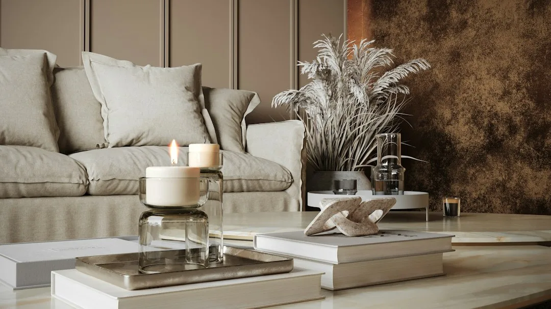
The most coherent minimal entries commit to a single dominant material from floor to wall to storage. White-lacquered plywood. Natural oak. Charcoal plaster. Concrete.
The Dutch interior architect Piet Boon practices this ruthlessly in residential work: one material runs from built-in shoe bench to wall panels to ceiling soffit, creating a single unified gesture. A coat of the same color paint binds everything visually.
A single material also solves the decision fatigue that paralyzes design. Once you commit to one surface—say, oiled oak—every future choice becomes obvious: wood shelves, wood doors, natural light. The aesthetic narrows and clarifies.
Read more about Discovering Japandi Bedroom Design for Zen Interiors to understand how minimalist principles extend into deeper rooms of the home. You can also explore How to Build a Beautiful Home with Stylish Interiors by Designing With a Purpose for holistic approaches to residential calm.
Minimalist entryway design is not about deprivation. It is about removing every visual decision except the ones that matter—the ones that welcome, orient, and settle. When you walk through a truly minimal entry, you feel that restraint immediately. Your nervous system relaxes because there is nothing to process, nothing competing for attention. That is the trend that is winning.
Tools for Planning Your Minimalist Entryway
These three resources let you act on the decisions the article raises — checking furniture safety, testing wall colors in your own space, and choosing the right floor material — before anything gets purchased or installed.
How do I check whether a storage cabinet or lighting fixture I’m about to buy has been recalled?
Is there a way to test wall colors in my actual entryway before buying paint?
What should I actually look for when comparing large-format porcelain tiles for a high-traffic entryway floor?