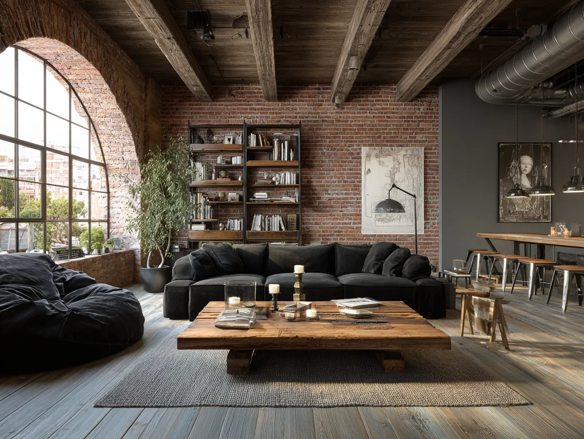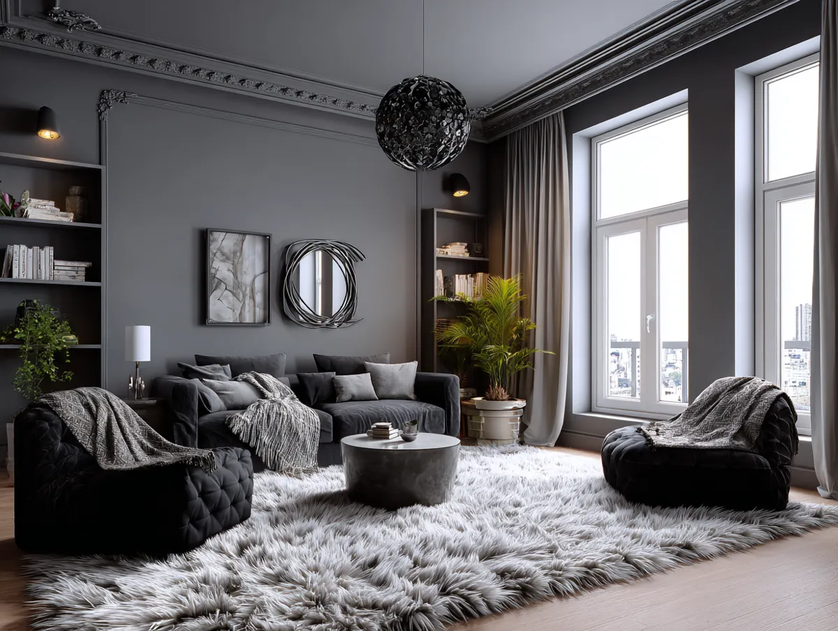
You’re standing in an open-plan room that feels visually uncertain. The bones are good, but something needs to anchor the space and signal that you’ve made intentional design choices. Two approaches compete: introducing roman columns or choosing a black-and-cream palette.
One adds physical volume and classical structure. The other uses restraint and contrast to define zones through color and tone. Roman columns suit rooms where you want visible architectural presence and vertical emphasis.
Black-and-cream palettes work when you prefer to organize space through surface and hue instead.

What roman columns and black-and-cream schemes actually do
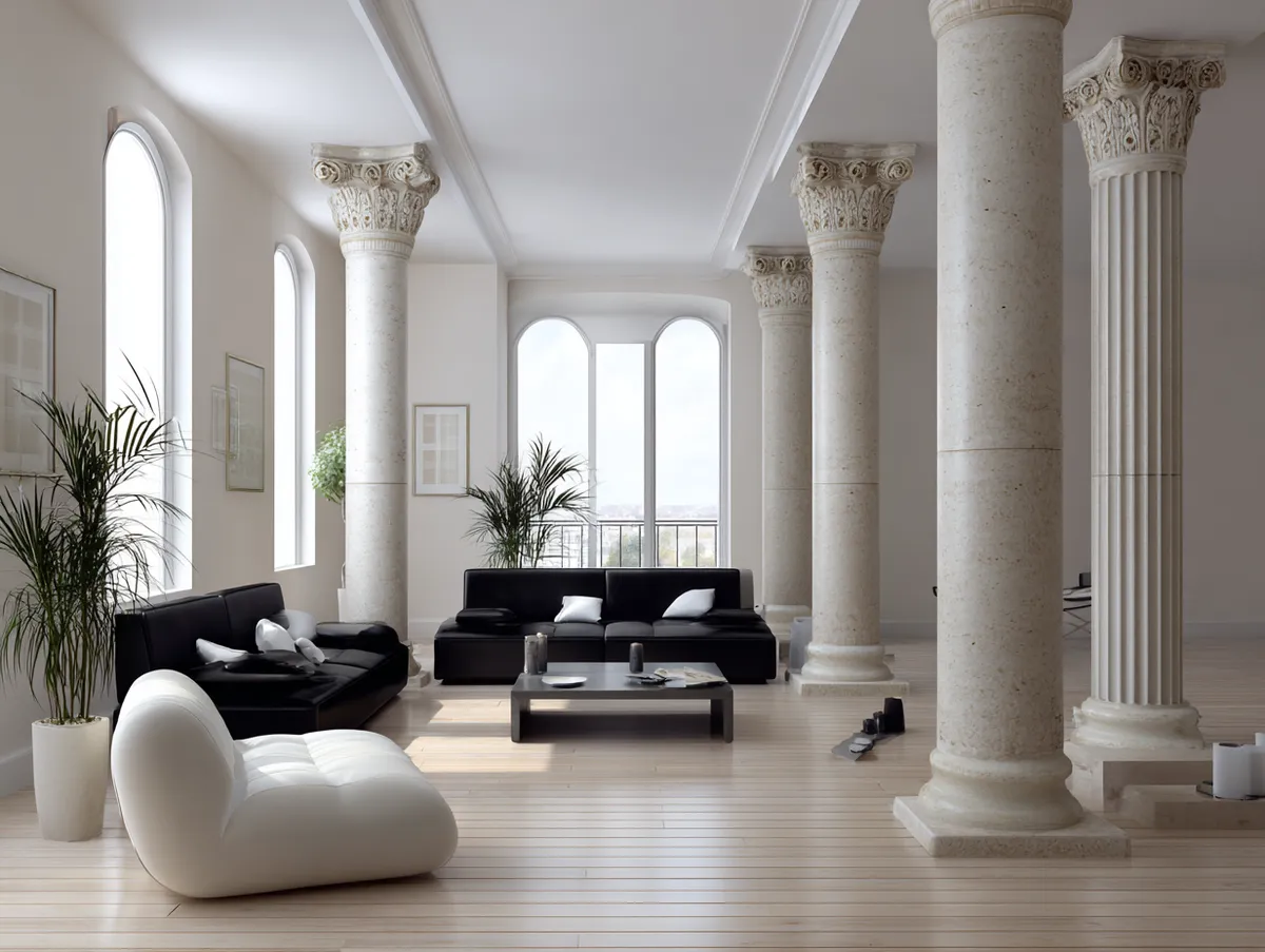
A roman column design is a three-part system: base, shaft, and capital. The capital—the topmost detail—signals which classical order you’re using, whether Tuscan, Doric, Ionic, Corinthian, or Composite. In modern interiors, columns don’t pretend to support the ceiling; instead, they frame zones, separate living and dining areas, or create a visual axis without adding structural weight.
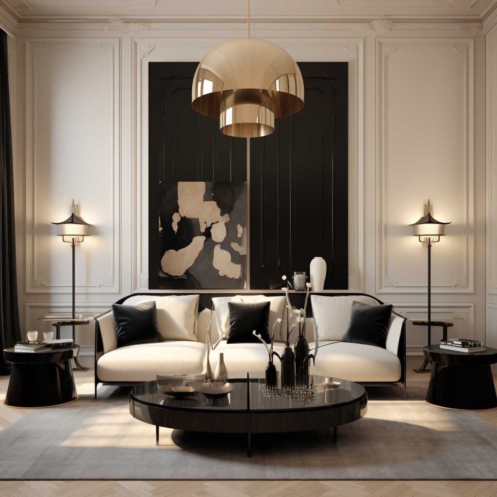
A black and cream living room scheme relies on proportional balance. The working ratio is cream dominant (walls, large rugs, primary upholstery) with black as accent (furniture legs, frames, accents, one or two textiles). The cream does the heavy lifting by preventing black from making the room feel closed. The finish choice matters: matte black reads heavier and more permanent; gloss reads lighter and more contemporary.
Quick Verdict
- Choose Roman Columns if you want a visible architectural statement and have adequate ceiling height and floor space to give them breathing room.
- Choose Black and Cream if you prefer optical balance over physical structure and want flexibility in furniture without committing to permanent architectural changes.
- Choose Roman Columns if you’re defining open zones and need vertical rhythm to separate areas without walls.
- Choose Black and Cream if you have a small room and want intentional restraint—cream prevents the palette from feeling heavy.

Visual impact, material presence, and how they change a space
Roman columns introduce physical volume and vertical rhythm. They command attention because they occupy actual floor-to-ceiling space. The proportions matter: a Tuscan column sits at roughly 1:7 in height-to-diameter ratio, while a Corinthian reaches 1:10, making it feel more slender and upward-reaching. This tangible presence transforms how people move through and perceive a room.
Black-and-cream schemes work through optical balance and surface finish rather than three-dimensional form. The cream walls recede; the black accents advance. This contrast creates perceived depth without adding any physical structure. The room gains definition through color psychology and careful ratio management, not through architectural elements you can touch.
| Criteria | Roman Columns | Black and Cream Living Room |
|---|---|---|
| Physical Presence | Strong vertical form, occupies floor-to-ceiling space | Optical only, no added volume |
| Cost Level (rough) | Moderate to high depending on material and detailing | Variable based on furnishings and textiles |
| Maintenance | Requires dusting and cleaning; finish affects appearance over time | Cream shows marks; black hides dust but shows fingerprints |
| Visual Effect | Creates vertical rhythm and classical presence | Creates optical depth through color contrast |
| Flexibility | Works best when it defines a specific zone or framing | Works everywhere but requires careful furniture selection |
| Small-Room Suitability | Risk of visual weight if proportion is wrong | Cream dominant prevents black from shrinking the space |

Where roman columns win
Columns excel when the room needs defined spatial structure. Pairs of columns can frame an opening like architectural brackets. Four columns create rhythm in an open-plan layout. This is something no color scheme can replicate; the physical presence organizes foot traffic and sight lines in ways that purely optical contrast cannot match.
Columns also anchor a room with unmistakable intentionality. When proportion is correct—shaft thickness matched to ceiling height, capital detail matched to surrounding molding weight—the classical reference reads as educated restraint rather than theming. The room feels architecturally finished in a way that pure color cannot deliver.

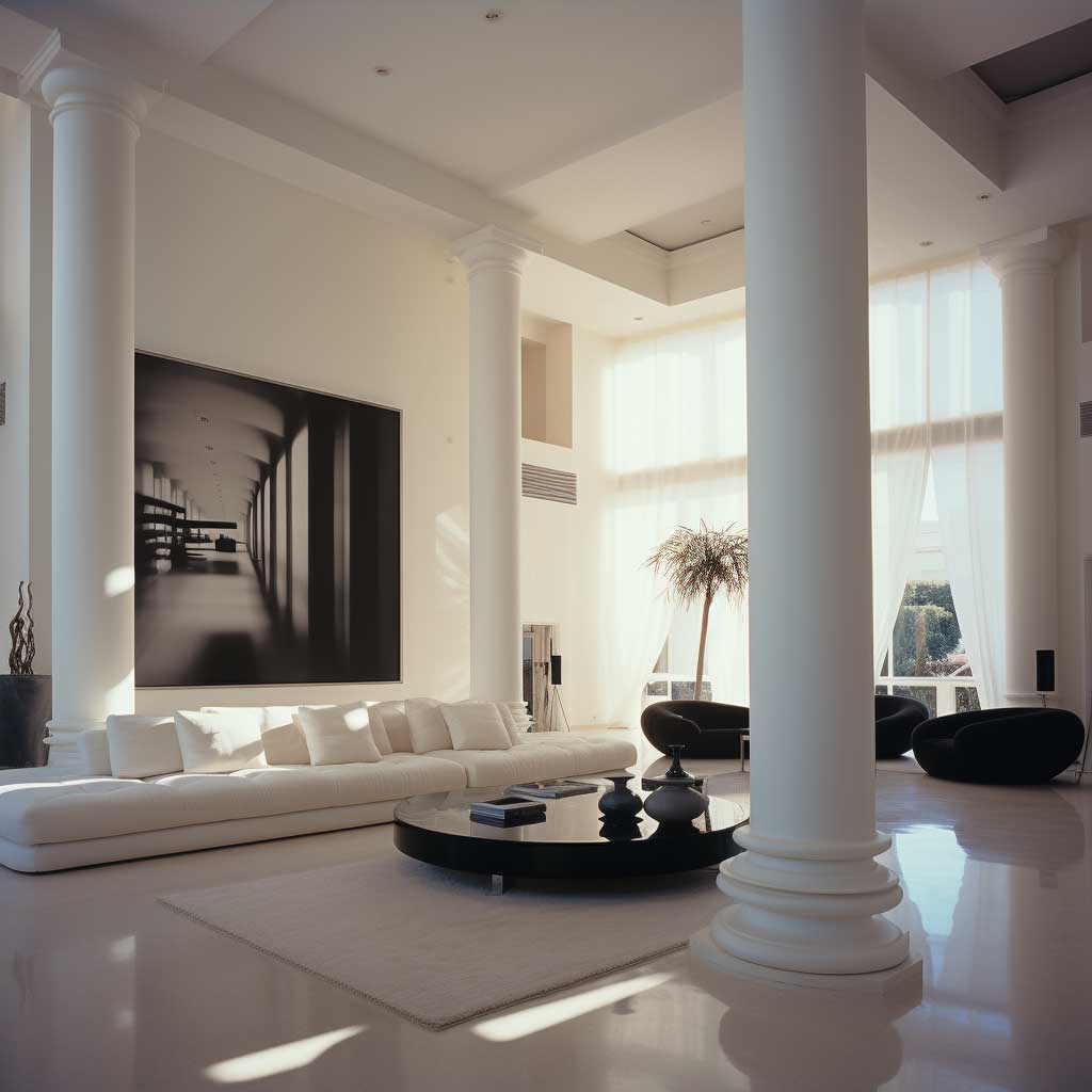
Where black-and-cream living rooms win
A black-and-cream scheme demands no permanent installation and adapts to almost any existing architecture. You can shift the balance by swapping a throw pillow or reupholstering furniture. Roman columns are fixed once installed. If your tastes evolve or you rent, a color scheme offers freedom that a structural element does not.
The scheme also works in smaller spaces without risk of visual overload. When cream dominates, black accents read as intentional punctuation. A roman column in a tight room with low ceilings can feel cramped.
Proportion is unforgiving. A cream-dominant palette is forgiving by design.


The biggest mistake when choosing between them
The most common error: treating them as if they’re competing for the same job. Someone adds a pair of roman columns to frame a living area, then also paints an accent wall black and buys black upholstery, trying to make both strategies work simultaneously. The result is visual conflict—the columns demand attention, the black competes for dominance, and the cream disappears.
The solution is to choose one dominant strategy. If you’re using columns, let them be the architectural anchor and keep the color palette quiet. If you’re using black and cream, skip the columns and let surface and tone carry the design weight. Hybrid approaches fail because each strategy needs permission to breathe.

Which approach suits your room
Choose roman columns if you have a tall, open floor plan and want unmistakable classical reference. The room must have the scale to justify their presence. A column that looks undersized feels apologetic. Choose a black-and-cream palette if you prefer optical sophistication, need the flexibility to change your mind, or are working with a small or rented space.
Roman columns signal permanence and refinement through architectural vocabulary. Black-and-cream signals the same through proportion and restraint. Neither is objectively superior; the choice depends on whether you want your room’s identity to come from visible structure or from surface and color discipline.