Scorpio interior design gravitates toward something most decorators avoid by instinct — the full, unapologetic dark end of the color spectrum. Midnight black kitchens, deep indigo bedrooms, and vibrant teal workspaces aren’t accidents for this sign; they’re deliberate choices that match a personality built around intensity and psychological depth. The rooms here aren’t decorated so much as inhabited.
Color works differently in dark spaces than most people expect. Rather than closing a room down, deep hues dissolve its edges — ceilings disappear, corners recede, and what’s left is an atmosphere you move through rather than observe. For the person who spends energy thinking at ten layers deep simultaneously, this kind of room is rest.
What separates a room that feels moody and magnetic from one that just feels cave-like usually comes down to two things: lighting and contrast. Every room below addresses both. Get those two variables right, and a space painted in Tricorn Black or deep indigo will read richer and more intentional than any beige room in a two-block radius.
– Black + scarlet kitchen — the darkest kitchen you’ll actually want to cook in
– Indigo + gold bedroom — Benjamin Moore Aura range ~$99/gallon; this pairing earns every cent
– Teal + charcoal office — the color combo color researchers back for focus work
– Paint finish matters as much as color: matte on dark walls, satin on cabinetry
– Under-cabinet and pendant lighting make or break every dark-wall kitchen
– One accent metal per room — mix brass and chrome and the whole thing falls apart
Midnight Black Kitchen with Scarlet That Doesn’t Apologize
A midnight black kitchen transforms from bold experiment to flat mistake depending almost entirely on one decision: what you put against the black. Scarlet red cabinetry is the move that holds its nerve. The contrast reads as drama rather than heaviness, which is exactly the distinction that separates a room that photographs well once from a room you actually want to spend time in. Sherwin-Williams Tricorn Black SW 6258 earns its status as a go-to here precisely because its LRV of 2.45 makes it about as close to true black as residential paint gets — no warm undertones pulling toward chocolate, no cool drift toward charcoal. What you see on the card is what you live with.
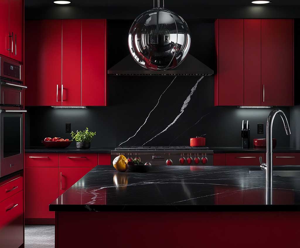
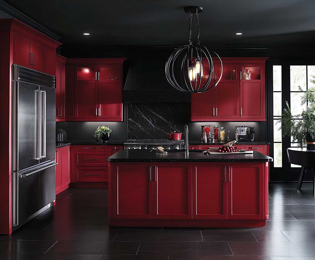

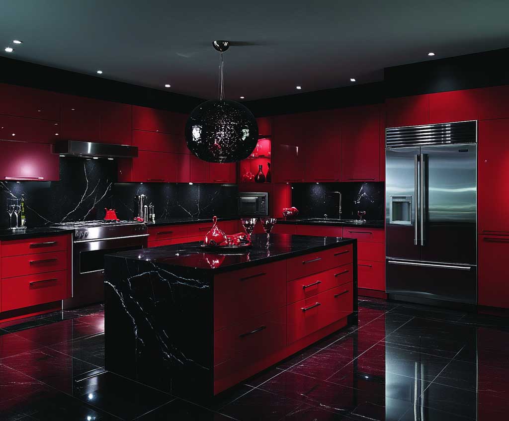
Black marble countertops extend the palette without fighting it — the veining provides enough movement to keep the surface visually interesting. Stainless steel appliances earn their place not as a style choice but as a functional contrast: the cool metallic surface sits differently against black than brass does. Here the stainless reads clean and slightly industrial, which is exactly the right counterweight to the heat of the scarlet. Does stainless show every fingerprint on a dark kitchen? Yes. The fix is a matte panel finish wherever you have solid cabinet faces, and fingerprints become invisible.
Under-cabinet LED lighting is what separates a black kitchen that feels like a corridor from one that feels like a destination. The beam hits the inside of the scarlet cabinet face and bounces warm light back into the room, which creates the impression that the scarlet is lit from within. Pendant lighting over the island needs to go large — the typical scaled-down pendant disappears against a black ceiling. Aim for something with real visual weight, ideally a raw metal or dark cage style that reads as a sculptural object. Benjamin Moore Heritage Red HC-66 at around $85 per gallon is worth calling out as the paint match for the scarlet cabinets if you’re specifying colors — it holds its red without drifting orange under artificial light, which cheaper reds reliably do.
The mistake to avoid is treating all four walls as equal. Pick one wall as the primary black feature — usually the one behind the range — and take the remaining walls to a very dark charcoal rather than full black. You’ll still read the same palette, but the room won’t feel sealed. For more on how black and red room design works across living, sleeping, and working spaces, the 70/25/5 ratio covered there applies directly to kitchens too.
Glossy black walls in a kitchen — every steam mark, grease splatter, and fingerprint shows up in reflected light. Matte or eggshell finish only on dark kitchen walls. Save gloss for the cabinet hardware and fixtures where the shine is intentional.
Matching the red in too many places — red cabinets plus red bar stools plus red pendant shades plus red fruit bowl. Pick the cabinets as your one red hero element and let everything else be black, steel, or stone. Three red elements in a room is a visual argument; one is a statement.
Cold daylight bulbs (5000K+) — they turn scarlet into a muddy orange-brown under artificial light. Stick to 2700K warm white throughout.
Deep Indigo Bedroom Where Scorpio Interior Design Takes Its Most Personal Form
Deep indigo on bedroom walls does something that most paint colors don’t: it makes a room feel like it has temperature. Not warm exactly, not cool — something more like pressure, the specific atmospheric quality of being in a space late at night. Benjamin Moore’s Midnight Navy 2067-10 has an LRV of 5, meaning it reflects almost no light — a gallon in the Aura line runs around $99, and the coverage on dark walls often demands two full coats over primer. The upfront cost is real; so is the result. Indigo carries a slight violet cast at certain light angles, which is why gold reads so warmly against it — the yellow in gold sits directly opposite the blue-violet on the color wheel, and the opposition creates the same optical contrast as sunlight breaking through a night sky.
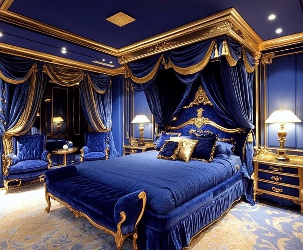
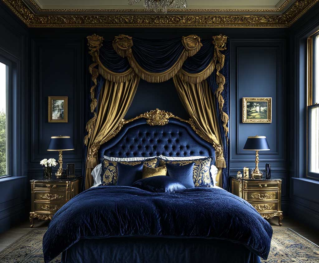


Gold-threaded curtains accomplish two things that solid curtains don’t. When drawn, they diffuse any light source — morning sun through gold threads becomes ambient rather than harsh, which matters enormously when the walls are absorbing rather than reflecting. When open, the vertical panels of fabric break the wall into sections, preventing the indigo from reading as flat. Does velvet on the headboard compete with the curtains? Not if you keep the headboard in a matte or slightly structured velvet rather than high-sheen — the difference in texture keeps the materials distinct even when they’re close in tone. A high-pile velvet headboard in a charcoal or near-black reads as grounding rather than competing.
Gold bedside lamps solve a specific lighting problem in indigo rooms: the room needs warm point sources low in the space, not overhead flooding. Overhead light in a dark bedroom creates a flatness that erases all the atmosphere the walls are working to build. Table lamps at nightstand height create pools of warmth that let the walls stay dark. What material for the nightstands? Light oak or glass. Dark wood nightstands disappear against indigo walls — you lose the visual separation that makes each element read independently, and the room starts to feel undifferentiated rather than layered.
The common mistake here is adding too much gold in the same tone. Gold lamp, gold curtain rod, gold picture frame, gold hardware on the dresser — by the fourth gold element, the accent reads as a theme rather than an accent, and the indigo starts to feel like a backdrop rather than the protagonist. Stick to two gold elements with different textures: one matte (lamp base) and one reflective (curtain threading). Everything else in the room should be dark, near-dark, or natural material.
Vibrant Teal Workspace with Charcoal That Color Science Actually Backs
Teal workspaces land differently than any other wall color for a reason researchers have documented directly — a University of Texas study found that bland gray and white offices increased sadness by 25% and reduced energy levels by 30%, while cool low-wavelength colors like blue-green teal improved focus and efficiency. Teal sits precisely at the intersection of blue’s clarity and green’s restoration, which makes it unusual among saturated colors: you can sustain concentration in it for hours without the fatigue that red walls or full-intensity yellow would produce. Farrow & Ball’s Dix Blue is a widely-cited choice in the teal-for-workspace conversation — it carries just enough gray in its base to read as sophisticated rather than tropical.
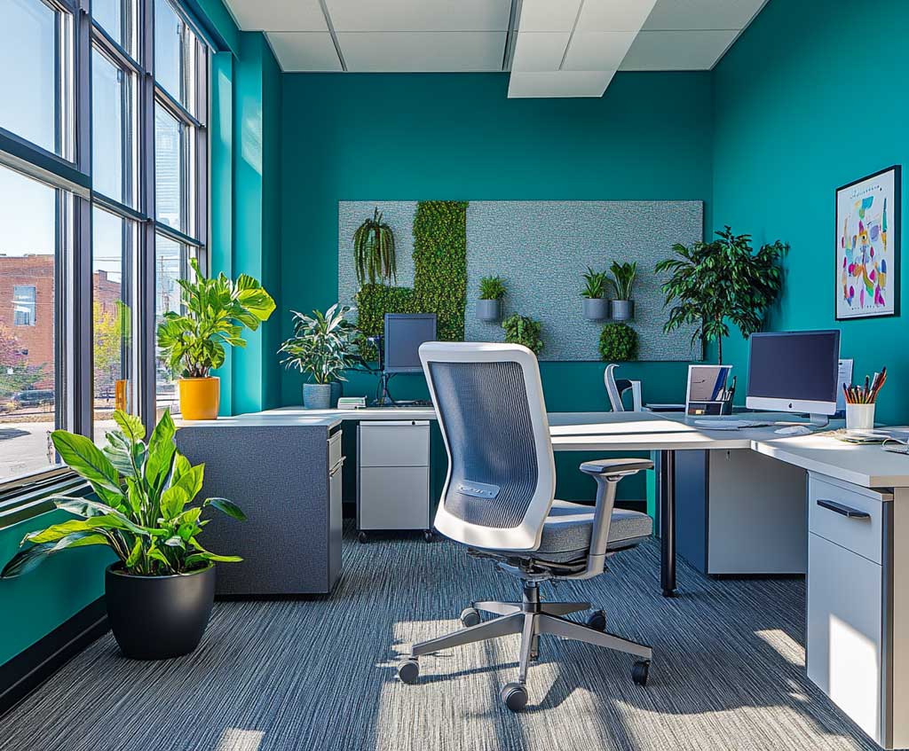
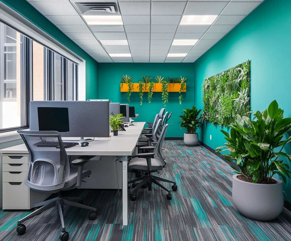
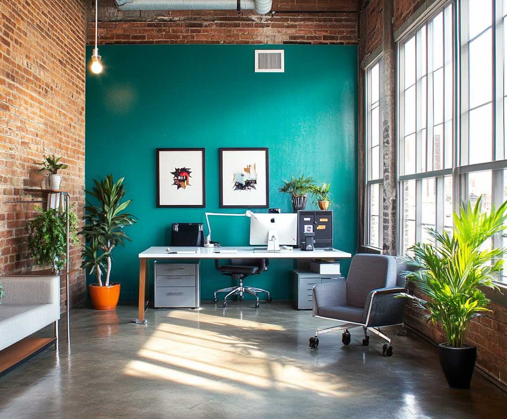
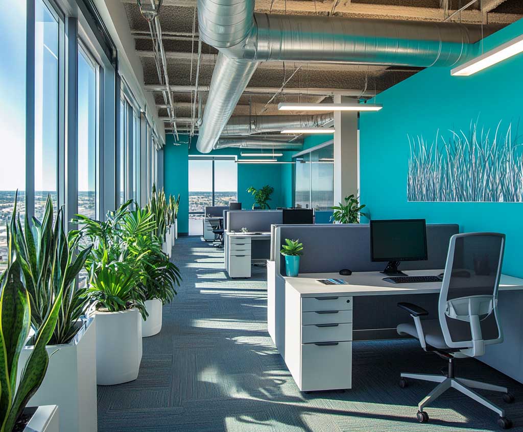
Charcoal accents ground the teal without flattening it. The relationship is similar to how charcoal works next to navy — it darkens the overall palette without introducing a competing hue, which lets the teal stay visually dominant. Minimalist furniture in charcoal or near-black lets the walls do all the work. The trap is furniture that matches the teal — same-family colors at different intensities create a blurred reading where nothing has clear hierarchy. Contrast between the furniture and walls is what gives the room its sense of intention. Think of teal walls as the painting; charcoal furniture as the frame.
Green potted plants in a teal office look redundant on paper and work exactly right in practice. The logic: living green plants sit in a completely different value range and texture family from teal paint. The paint is flat, saturated, and artificial; the plant is varied, organic, and three-dimensional. That difference in material quality is what makes them complement rather than compete. A medium-sized Monstera deliciosa — available at most garden centers for around $25–$60 depending on size — gives you the right scale of organic material without getting precious about the plant selection. For the external research on how workspace color affects output, Entrepreneur’s color psychology piece covers the University of Texas findings in useful detail.
The mistake most people make in a teal office is choosing a teal that reads too bright or too green — the turquoise range rather than the blue-teal range. Turquoise is energizing but fatiguing over a full workday. The right teal for a workspace has enough blue in it to carry the focus-supporting quality of blue while the green component prevents the coldness that all-blue rooms can produce. Test any teal paint under artificial light before committing — teal shifts dramatically depending on bulb temperature, and some that read rich at noon read murky by evening.
| Room | Wall Color | Key Accent | Critical Detail |
|---|---|---|---|
| Kitchen | Midnight black (SW Tricorn Black, LRV 2.45) | Scarlet red cabinets | Under-cabinet LED at 2700K; matte finish walls only |
| Bedroom | Deep indigo (BM Midnight Navy, LRV 5) | Gold threading + lamps | Two coats over primer; avoid glossy gold |
| Workspace | Vibrant teal (Farrow & Ball Dix Blue) | Charcoal furniture | Blue-dominant teal only; test under artificial light |
A teal workspace with charcoal furniture doesn’t need much else to read as complete. The color combination carries its own visual weight — adding too many accent colors splinters the focus the palette is designed to support. If you need a third element, keep it in the charcoal-to-black range and let texture do the work. The room referenced in our dark interior color breakdown covers the underlying rule that applies here: dark colors work as backdrops when they control the value, not when they fight with every other element for attention.
SCORPIO INTERIOR DESIGN
Three rooms. Three colors. Zero beige.
Midnight black with scarlet accents turns a kitchen into the most commanding room in the house — matte finish, warm LEDs, one hero red element only.
Deep indigo with gold in the bedroom works because yellow and blue-violet are opposites on the color wheel — the contrast reads rich, not clashing. Two coats minimum, always.
Teal in a workspace has color science behind it: University of Texas research links blue-green environments to measurable improvements in focus and energy. Charcoal furniture keeps the hierarchy clear. Save this post.
Related Topics