Loft paint ideas do more than cover walls — they shift the entire character of an open, high-ceilinged space. I’ve stood in lofts where a single color choice made the exposed beams feel like an asset and others where the wrong shade made $400/sq ft feel like a parking garage. You’ll notice the difference the moment you walk in. This is about four approaches that consistently work, why each one holds up in real loft conditions, and the one mistake most people make with each.
Lofts are not apartments. The volume of space, the raw materials, the lack of defined rooms — all of it changes how paint behaves. A colour that reads moody in a standard bedroom can disappear entirely against twelve-foot ceilings and concrete floors. Get the scale right first.
Quick Scan
- Industrial chic: Leave raw brick unpainted, add one metallic or charcoal accent wall. Works in spaces with south-facing light.
- Calm neutrals: Benjamin Moore Pale Oak or Edgecomb Gray — best for loft rooms doubling as offices or sleep spaces.
- Multi-colour zones: Assign each activity area a distinct hue. Anchor the floor and ceiling in white or concrete grey.
- Monochrome grey: Layer warm-undertone greys from Benjamin Moore’s Chelsea Gray family — ceiling lighter, floor darker, walls mid-tone.
- Finish matters: Use eggshell on loft walls, flat on ceilings. Semi-gloss on anything structural you want to highlight.
Industrial Loft Paint Colors That Use the Building Against You
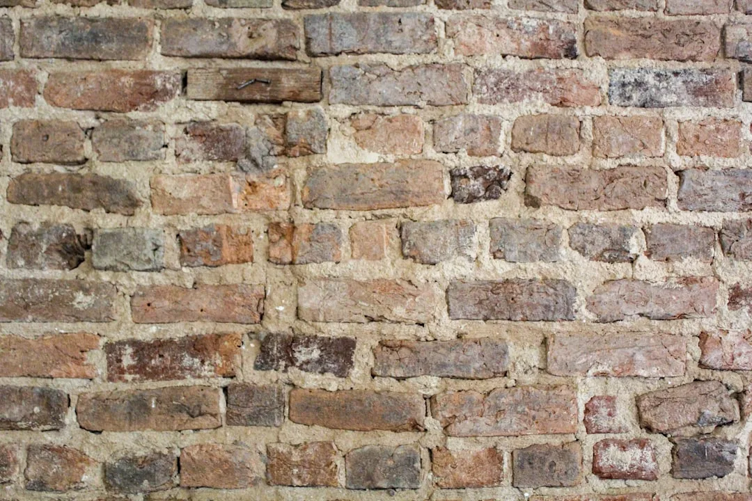
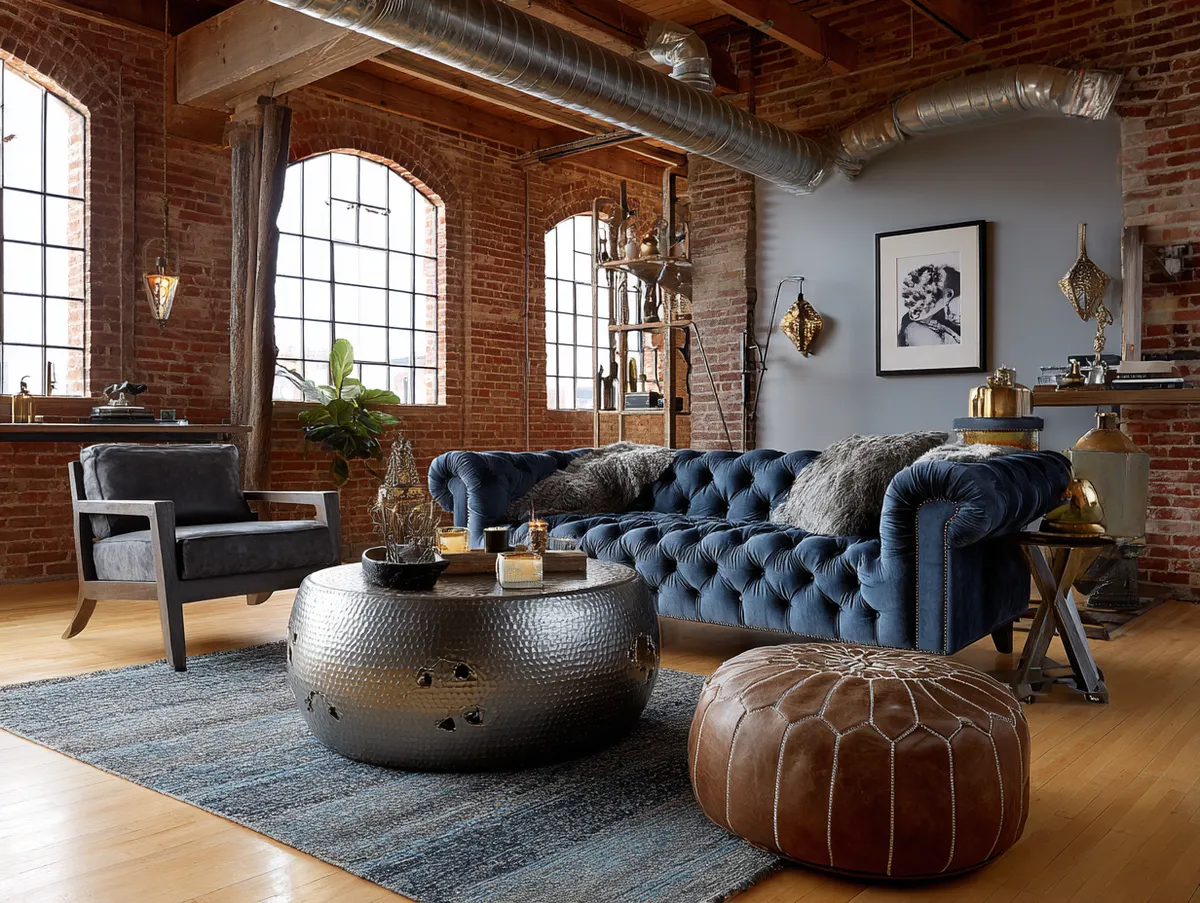
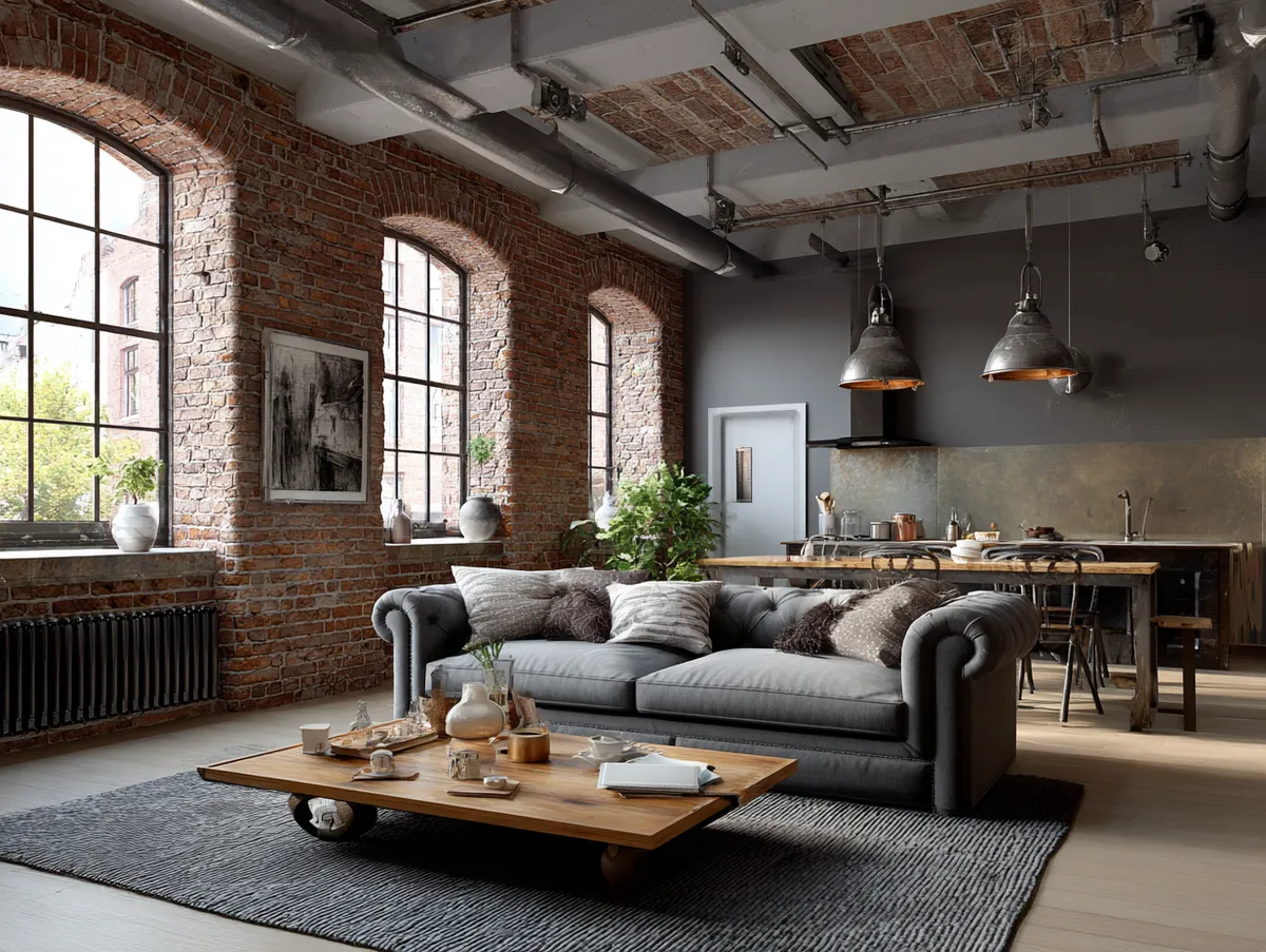
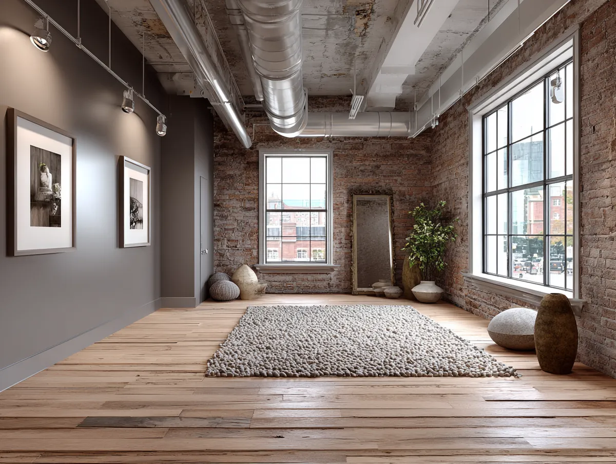
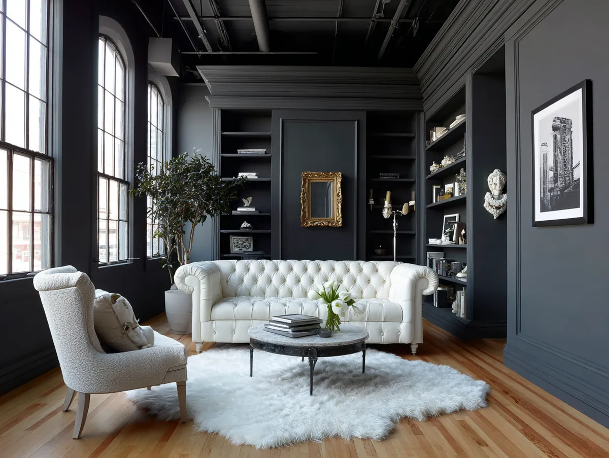
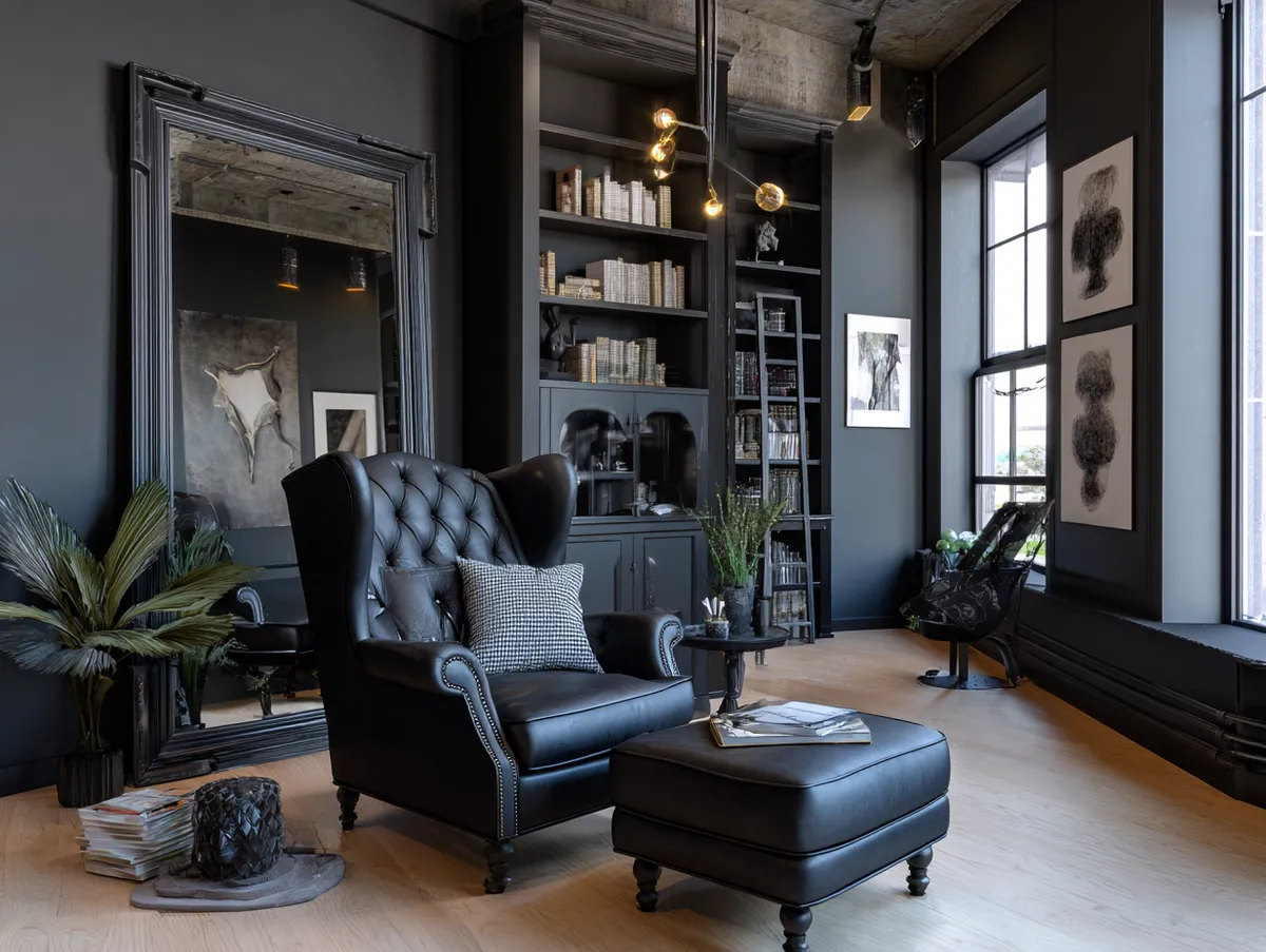
Raw brick doesn’t need paint. I keep saying this and people keep not believing me until they see the alternative — a loft where someone rolled white latex over original 1920s brick and produced something that looks like a damp basement. Leave the brick. It’s doing structural and visual work simultaneously. The exposed surface reads as texture, warmth, and history all at once, and no $80 accent colour competes with that.
The real loft paint color decision in an industrial space is the accent wall opposite the brick. Flat charcoal like Benjamin Moore’s Kendall Charcoal HC-166 at around $70/gallon sits opposite exposed brick without fighting it. Metallic finishes — specifically Rust-Oleum’s Metallic Accents line in Aged Steel, roughly $25/quart — do something different: they catch the loft’s changing natural light and produce a surface that looks different at noon versus 8pm. I own two cans of the Aged Steel and used them on a beam feature wall. The effect is worth it. What doesn’t work is going full copper or gold metallic. It reads as a hotel bar, not a considered home.
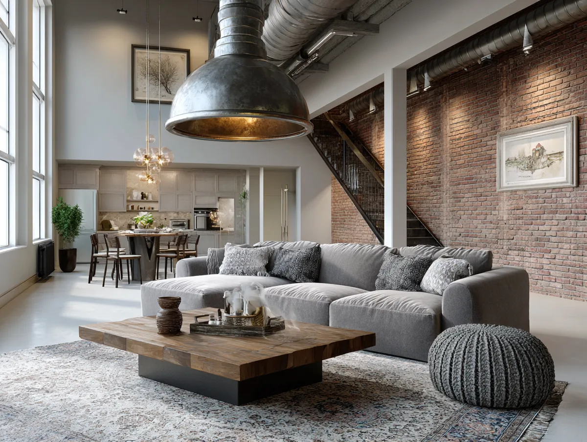
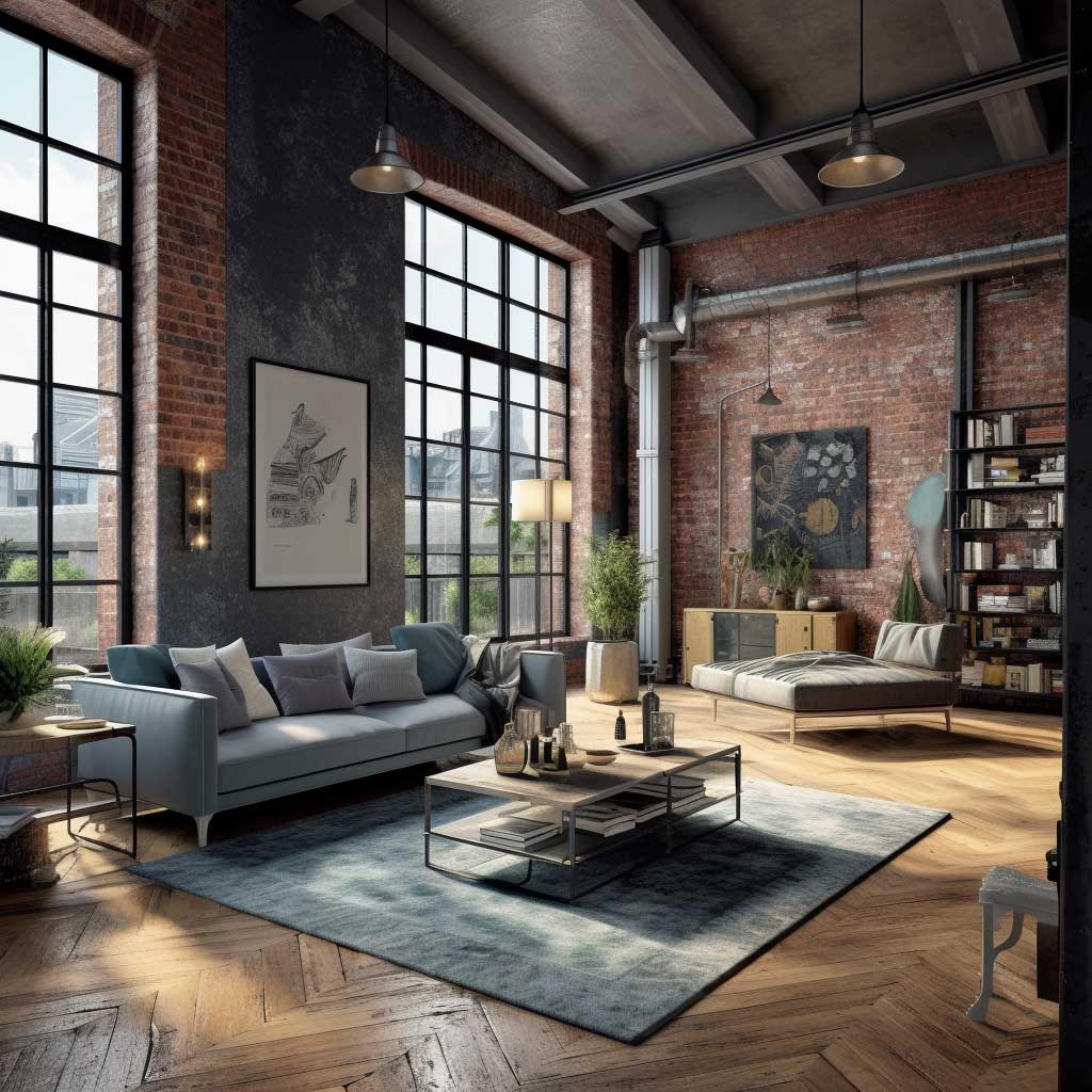


The functional argument for using paint to zone an industrial loft: the metallic or dark wall naturally pulls attention toward the kitchen or dining side, while the unpainted brick anchors the living area. You don’t need a partition wall or a rug to communicate “this area is for eating.” The paint does it. That’s $70 of Benjamin Moore versus a $1,200 area rug, and the paint wins the argument every time.
My go-to specification for this look: Benjamin Moore Kendall Charcoal HC-166 in eggshell on the accent wall, Benjamin Moore Chantilly Lace OC-65 flat on the ceiling, and the brick left completely untouched. Do not add a second accent colour. Two feature walls in an open plan loft look like a mood board that escaped containment.
Don’t Do This
- Don’t paint over original brick. Once it’s gone, you’re looking at three coats of stripper and a ruined texture. It cannot be undone cleanly.
- Don’t use high-gloss metallic on more than one wall. Two metallic surfaces in an open plan produce a disco effect — flattering to no one after 10am.
- Don’t choose warm-toned metallic if your existing hardware is cool steel. The undertone clash reads as an error, not a choice.
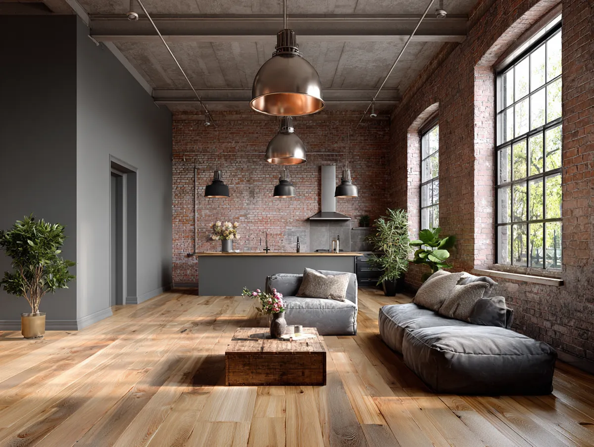
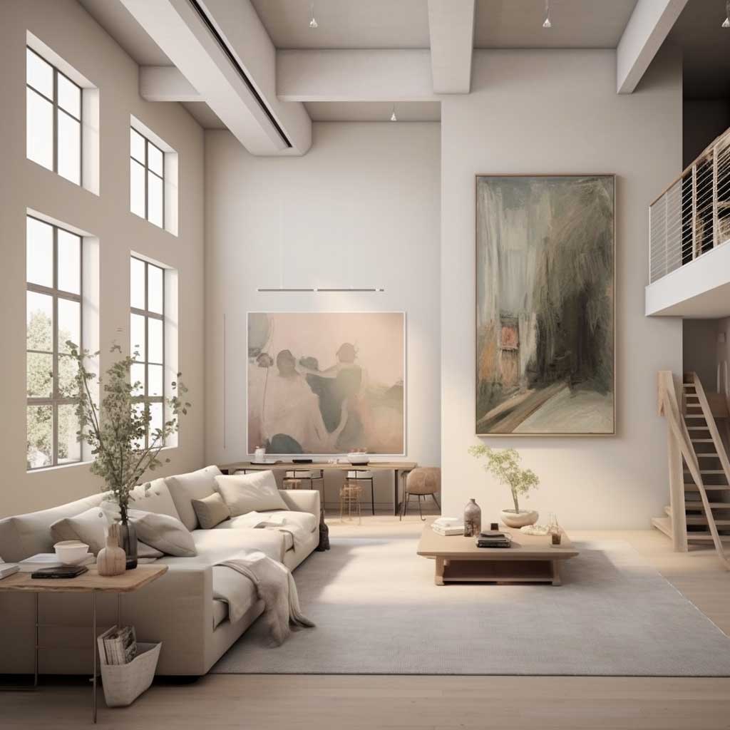
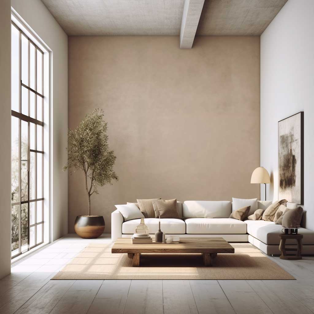
Neutral Loft Paint Colours That Don’t Disappear at Scale
Soft beige reads completely differently at loft scale than it does on a sample card. This is the single most common expensive mistake in loft painting: choosing a neutral that photographs beautifully in a standard-height room and turns washed-out and institutional across twelve feet of open wall. You need weight. Not drama — weight.
Benjamin Moore Pale Oak OC-20 is my go-to for loft neutrals — it has a warm undertone that reads as cream in direct light and as a proper greige in shadow. At $75/gallon for Regal Select, it covers in two coats on drywall and one and a half on concrete-skim plaster. Edgecomb Gray HC-173 is the cooler alternative for spaces with south-facing windows. I’ve bought both repeatedly. The difference matters based on which direction your biggest window faces — Pale Oak handles north-facing light better, Edgecomb Gray handles harsh southern light without bleaching out. Ask yourself that question before you commit.
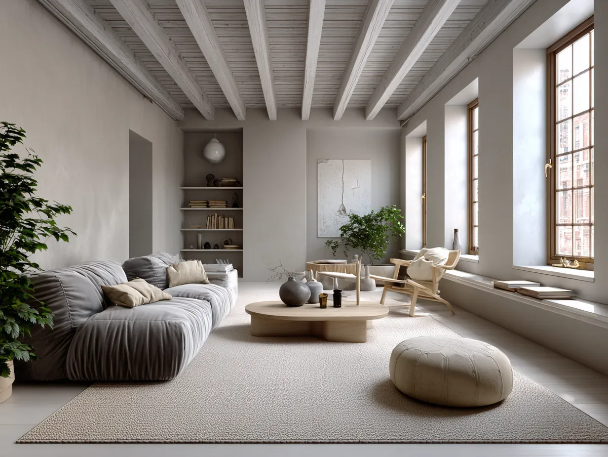


The ceiling and floor matter here. White ceiling on a neutral-walled loft is standard advice that mostly holds — use Benjamin Moore Chantilly Lace OC-65 flat for this, not bright white. The psychological effect of soft neutrals in a large open space is real: it reduces the visual noise that comes from having your kitchen, bedroom, and living area in the same room. The loft starts to feel like a considered space rather than a storage unit with furniture in it.
Floor paint or stain in a similar light tone pulls everything together. I stole this trick from a designer who painted concrete floors in Farrow & Ball’s Drop Cloth — the same warm greige logic, just on the ground plane. The entire space reads as one continuous surface. Maintenance is harder but the visual result is worth two extra hours with a mop. For more ideas on loft room paint and how colour interacts with architecture, this breakdown of industrial chic colour schemes covers the specific undertone choices in detail.
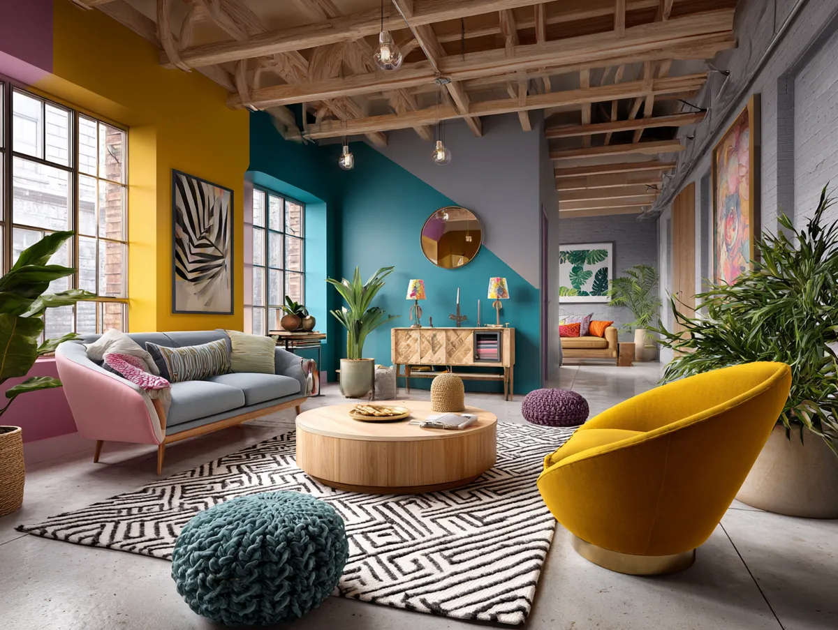
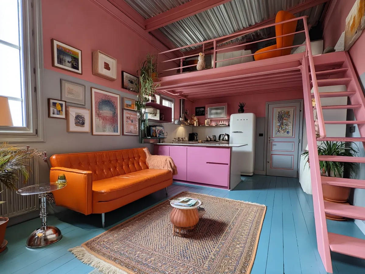
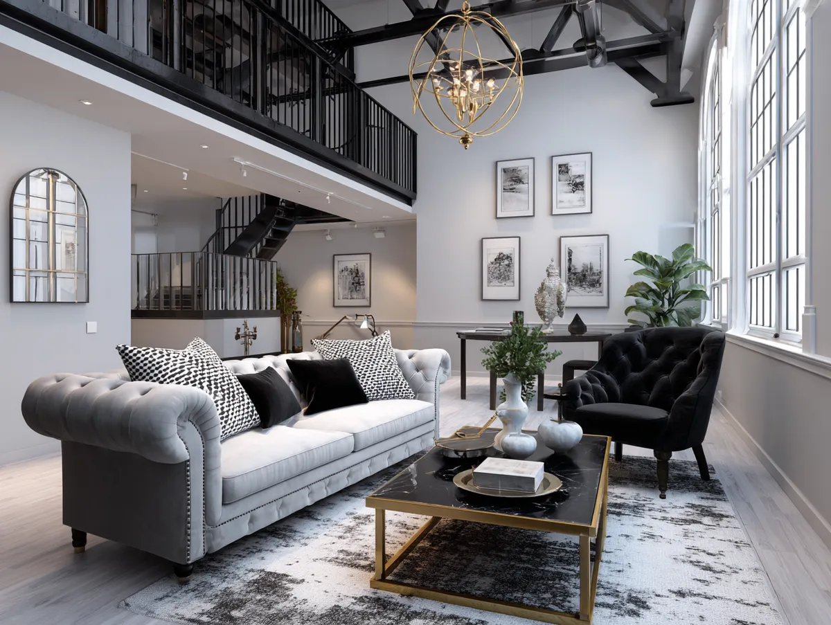
Multi-Colour Loft Painting That Zones Without Walls
Paint zones work in open-plan lofts the way furniture arrangement works — they communicate territory without physical division. Sunshine yellow for the work corner. A calming dusty blue for the sleeping area. A confident terracotta for the kitchen wall. Done correctly, you walk through the loft and each area registers immediately. Done wrong, it looks like a preschool classroom that got a budget renovation.
The rule I follow: four colours maximum in one open space, and the ceiling and floor eat none of them. White ceiling and concrete or light wood floor are the anchors — they’re the dish the rest of the palette sits in. Sherwin-Williams Accessible Beige SW-7036 ceiling with bright zone walls is a combination that manages to hold everything together without looking like a Formula 1 pit wall. You’ll notice the zones without feeling corralled by them.
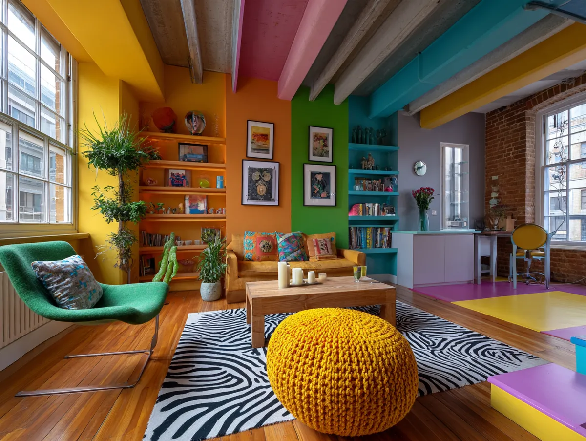
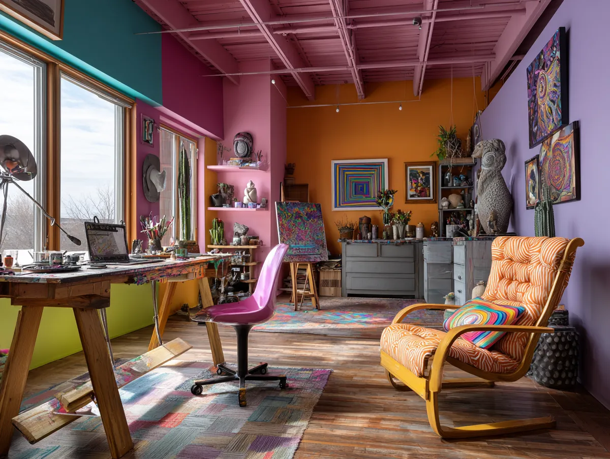


Colour psychology is real but overstated in most interior content. The actual impact: bright hues like yellow and green genuinely accelerate visual processing — you scan the room faster and feel more awake. Not because of some obscure science, but because high contrast colours make the eye move. In a loft where you work, sleep, and cook in the same room, that movement can either energise or exhaust you depending on placement. Put the stimulating colours near the work area, not near where you sleep.
The anti-advice here: resist the urge to use five colours because you “can’t decide.” More than four zones in a single loft space produces visual chaos that no amount of white trim fixes. Pick your zones first, then pick your colours. These loft living room designs show how the open-plan zone logic translates specifically to the living area section of a larger loft.
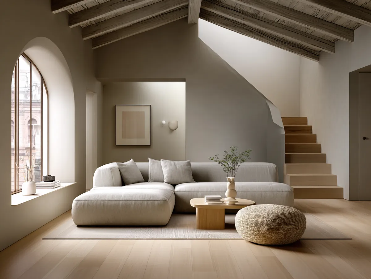
Monochrome Grey Loft Paint Colours Where the Shades Do the Work
Grey loft paint is the answer most people give when they don’t know what they want — and it’s also genuinely correct for loft spaces with strong architectural bones. The difference is in how you use it. A flat mid-grey across all surfaces is depressing. A layered system of three grey tones, graduated from floor to ceiling, is something else entirely.
My specification: Benjamin Moore Chelsea Gray HC-168 on the walls, Benjamin Moore Gray Owl OC-52 on the ceiling, and a darker charcoal stain on the concrete floor. The gradient reads like a built-in dimmer — the light ceiling pushes visual height, the mid walls hold the eye at human level, and the dark floor grounds the whole composition. Chelsea Gray costs around $75/gallon in Regal Select finish. Worth every cent. What I’ve tried that didn’t work: Benjamin Moore Stonington Gray HC-170 in a north-facing loft. Grey undertones turned actively green in winter light. Not recommended.
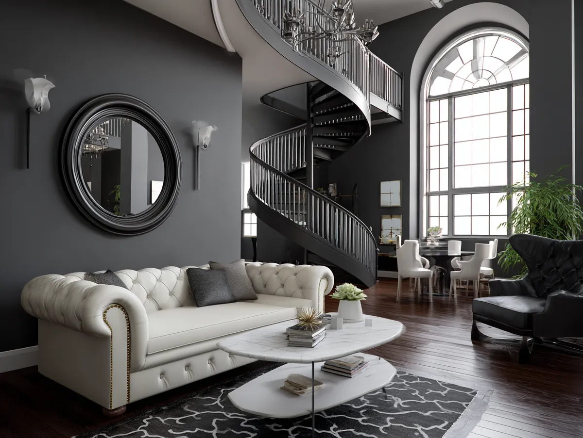


The warmth concern is real. Grey with cool blue undertones in a loft with concrete floors reads as cold no matter how much furniture you add. Warm-undertone greys — Chelsea Gray, Revere Pewter HC-172, Stonington Gray only in south-facing spaces — hold warmth because they borrow it from the light rather than fight it. The metallic and structural elements of the loft (pipe runs, window frames, radiators) actually complement warm grey better than cool grey. They read as deliberate when the grey is warm, and as an afterthought when it isn’t.
For loft rooms used for focused work, grey monochrome outperforms both neutral beige and multi-colour. The reduced visual information means fewer distractions. Think of it as the interior design equivalent of switching your phone to greyscale mode — the room stops competing with what you’re trying to do. According to Benjamin Moore’s colour guidance for large spaces, pairing saturated neutral greys like Chelsea Gray HC-168 with off-white ceilings is among their most recommended combinations for open-plan rooms with high ceilings.
Final Word
Loft paint isn’t decoration. It’s the one decision that changes every other decision in the room.
Get the foundation colour wrong and $3,000 of furniture looks like it doesn’t belong there. Get it right and the space organises itself. The four approaches here cover every loft typology — industrial with original structure, calm and functional, zoned and energised, or monochrome and focused.
Choose based on light direction first, style second, and personal preference last. In that order. Not the other way around.
Save this post before you buy a single sample pot.
Related Topics