WPC interior design is the reason rooms with nothing on the walls still manage to feel finished — wood-plastic composite panels carry the visual weight of a feature wall without requiring paint, art, or a decorator on speed dial. I’ve seen the same 12×9 living room look flat with cream emulsion and look intentional the moment a light-oak WPC panel goes up behind the sofa. The material doesn’t ask for much. It asks for the right tone, the right room, and directional light that isn’t an afterthought. Get those three things right and the wall does the rest.
Standard WPC panels run 19mm to 30mm thick and up to 6 meters long — meaning a single bedroom accent wall can often be paneled without a single visible seam. Installed cost runs $8–$18 per square foot depending on profile, versus $30–$60 for real carved hardwood. The composite core — wood fiber pressed into polyethylene or PVC at high temperature — resists moisture, scratches, and the slow warping that kills solid timber in any room with seasonal temperature swings. You’ll notice the maintenance difference within the first winter.
What’s on this page
- Light wood-tone WPC panels for living rooms — the exact furniture pairing that works
- Dark WPC panels in bedrooms — why contrast is the whole job
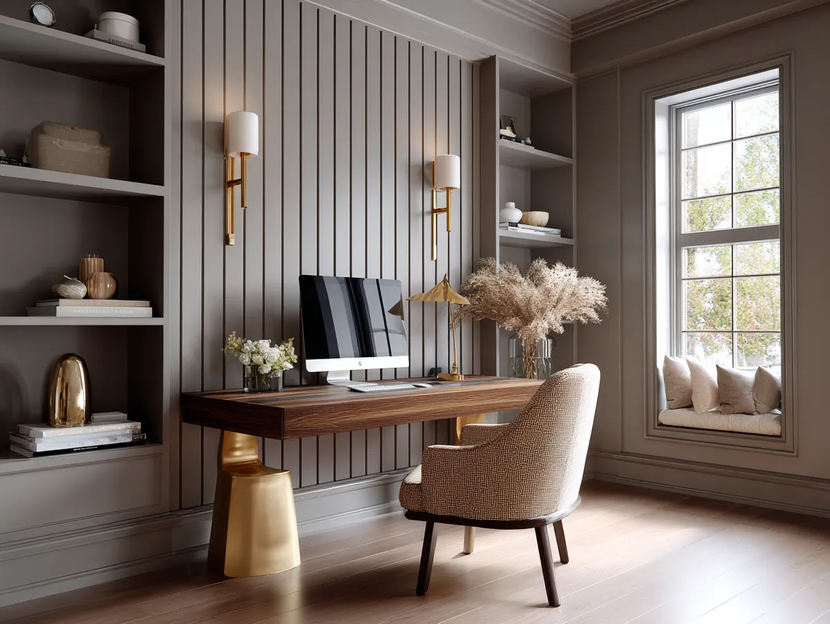
- Vertical gray WPC panels in office spaces — orientation and lighting rules
- The one installation mistake that makes any WPC panel look cheap
- Material comparison: WPC vs solid wood vs PVC vs MDF
Light Wood Tone WPC Panels Absorb Natural Light Without Competing With It
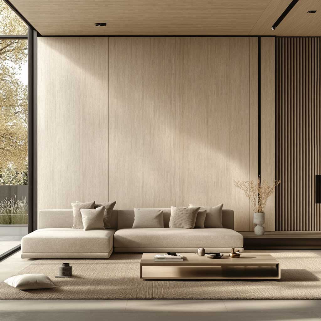
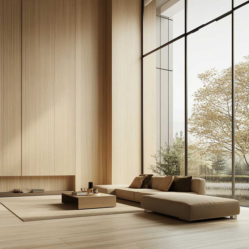
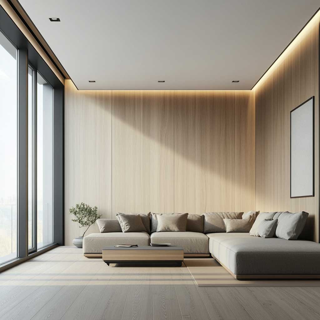

Light wood-toned WPC panels work in living rooms because they add surface depth without adding visual weight. My go-to profile for this is a 120mm-wide flat slat in an ash or birch composite — the narrow slat reads as texture from across the room, but when you sit beside it, you notice the slight shadow between each run. That shadow is doing more design work than the color. Rooms with large windows are the ideal setting: natural light catches the panel’s subtle grain pattern at different angles throughout the day, giving the wall a quality that paint literally cannot replicate.
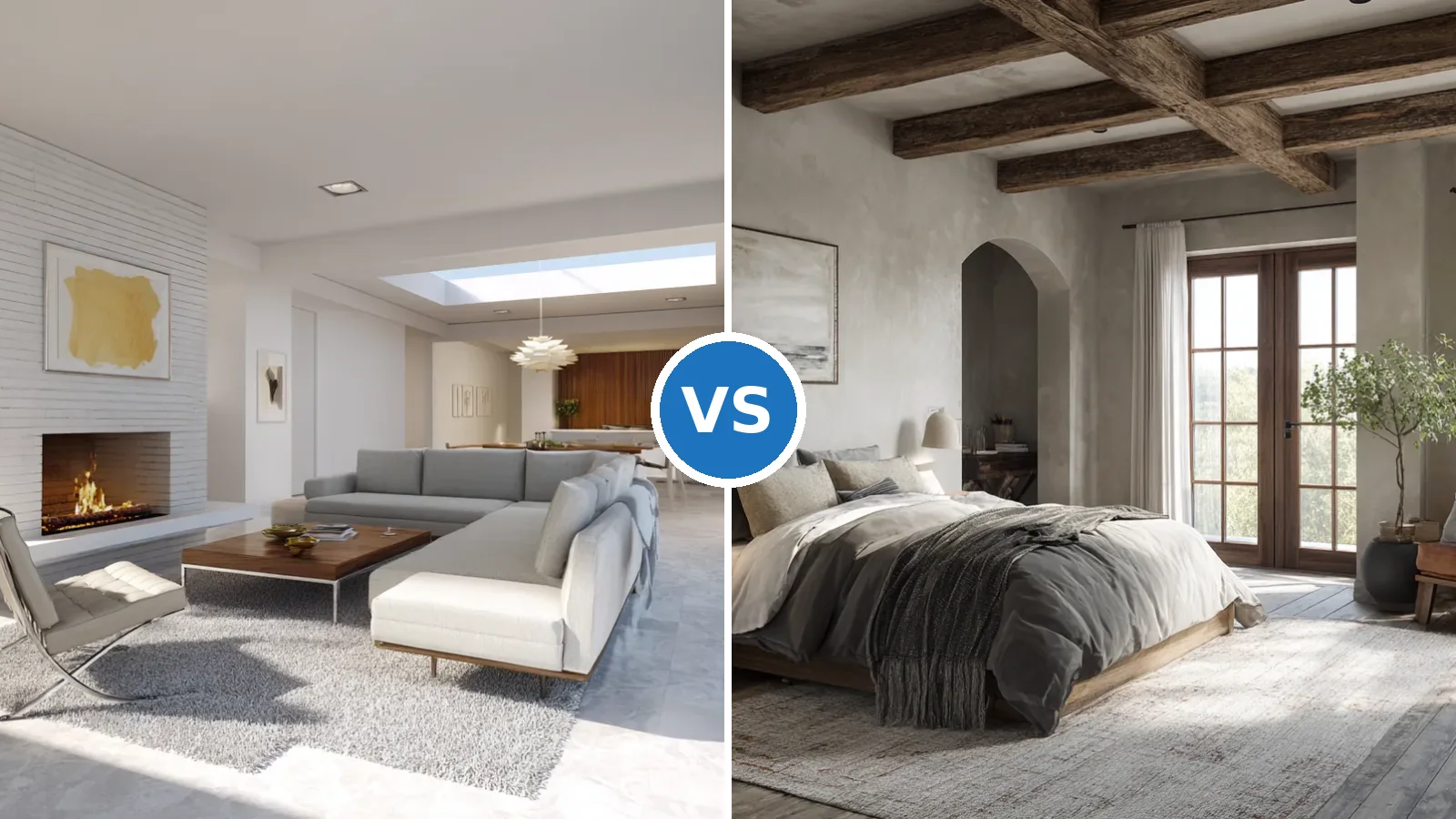
The furniture pairing matters more than most renovation articles admit. A low-profile sofa — the Muuto Rest at around $2,800 or an IKEA KIVIK at $799 — keeps the eye traveling horizontally, which reinforces the calm register the light panels establish. Avoid tall, dark upholstered pieces that compete with the panel’s warmth. What I’ve found looks genuinely bad: a chocolate-brown leather sofa against a honey-toned WPC wall. The two warm tones fight each other into muddiness. Go stone gray or cream upholstery and the wall wins.
Accessories are where people overdo it in minimalist WPC interiors. One plant. One piece of abstract art, framed in natural wood. That’s the ceiling. I’ve watched clients crowd a beautifully paneled living room with side tables, floor lamps, and stacked books within six months of installation — the panel disappeared. The panel is the decor. Resist the instinct to fill the silence it creates. Minimalist living room layouts that pair well with textured panels follow the same discipline — the panel is furniture, not backdrop.
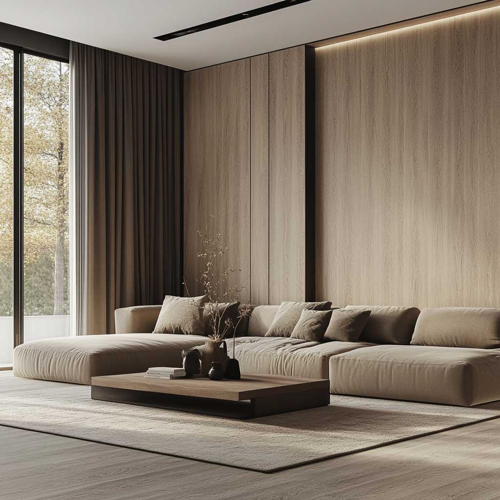
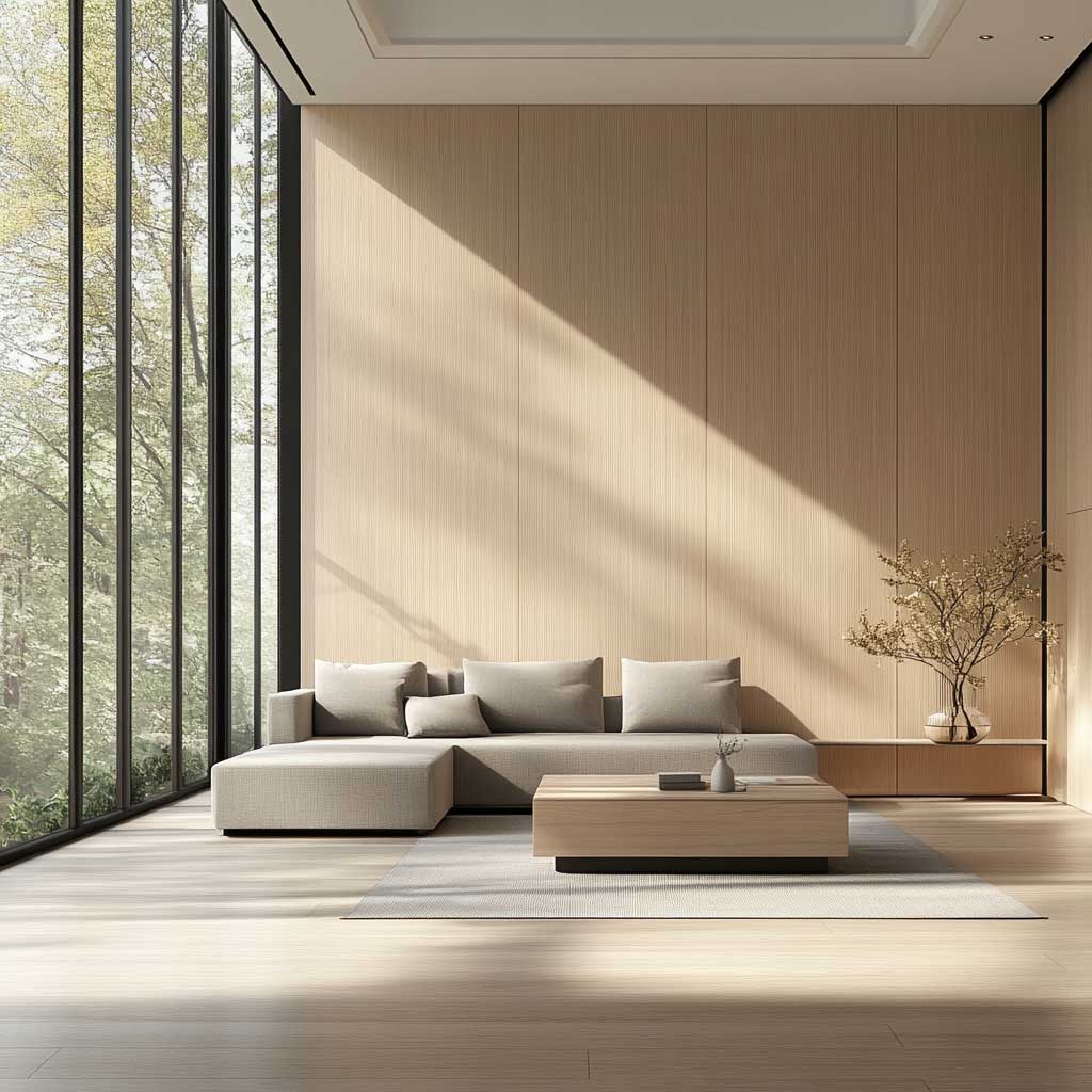

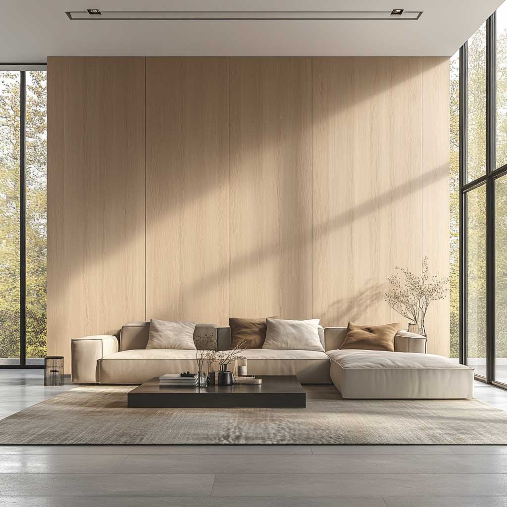
Durability is the reason WPC panels make financial sense in high-use living rooms — and why solid timber doesn’t. The composite core won’t swell near patio doors, won’t split where a radiator sits below the panel run, and cleans with a damp cloth. Trex and NewTechWood both offer light-tone interior panels with UV-stabilized coatings; expect to pay $10–$15 per square foot installed for standard slat profiles. Solid timber equivalent? At least $35 per square foot and a refinishing contract every seven years.
One anti-advice worth repeating: don’t install light WPC panels on a wall that gets zero natural light. Under artificial ceiling-wash lighting, light wood-tone panels read as beige wall cladding — flat, institutional, expensive. The material needs raking light to activate the grain. North-facing rooms with no window adjacent to the panel wall are the wrong location for this investment. Move the panel to the wall opposite the window instead, where it catches reflected light all day.
Dark WPC Panels in a Bedroom Work Because Contrast Is the Whole Job

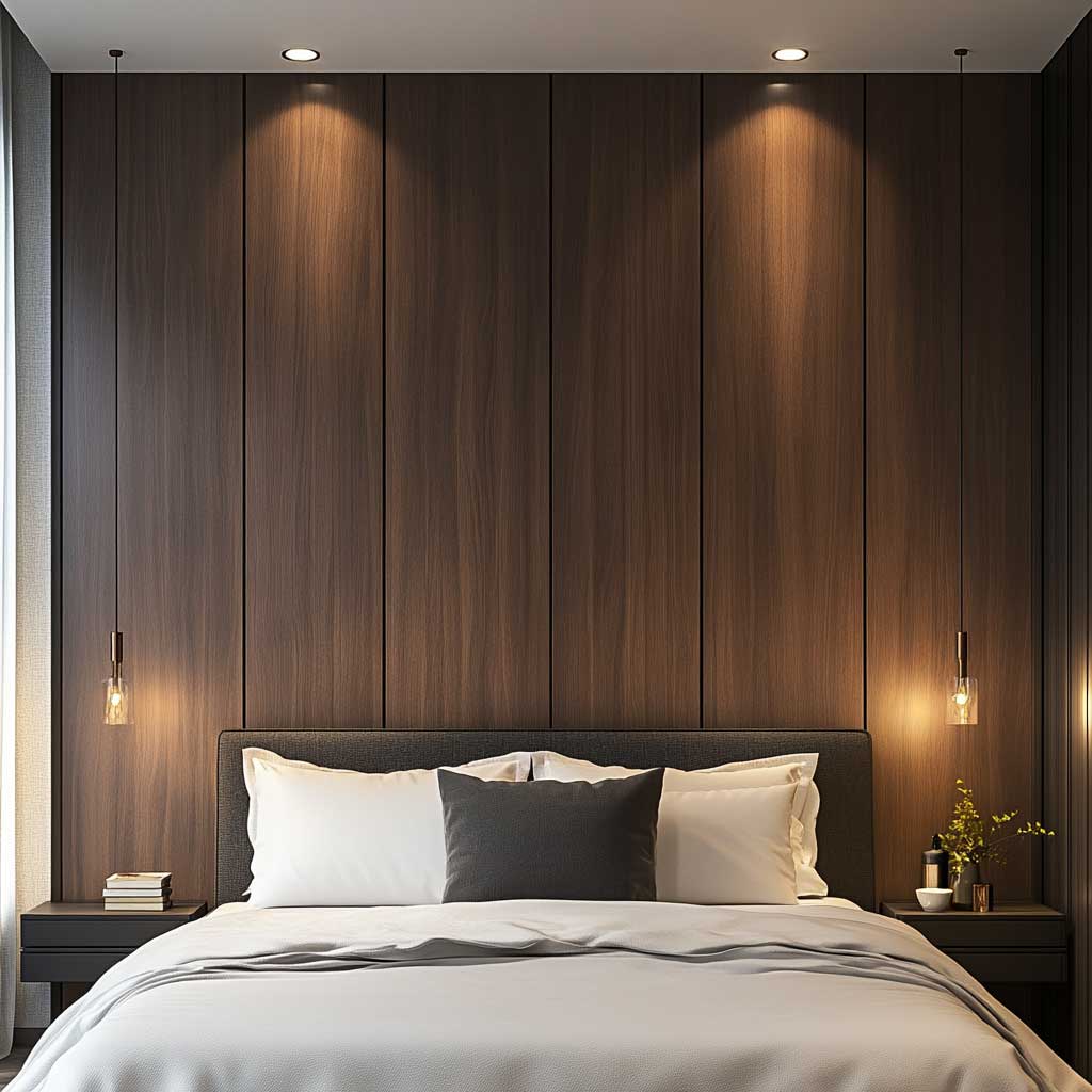
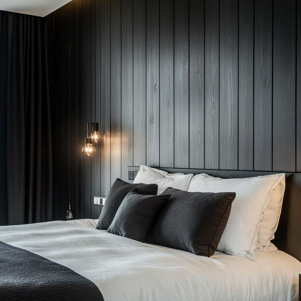
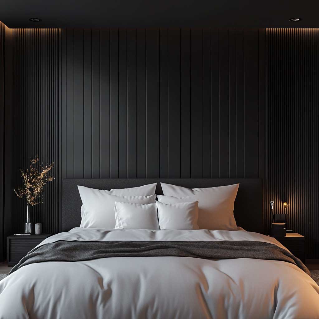
Dark WPC panel designs earn their place on a bedroom headboard wall through contrast — the dark panel and white bedding do the work that a dozen decorative pillows can’t. I’ve bought and returned more throw cushion sets than I care to admit before I understood this: the visual interest in a minimalist bedroom comes from one sharp tonal opposition, not from layering neutrals. A dark walnut-finish WPC panel behind a platform bed with Boll & Branch ivory cotton bedding ($260 for a queen set) creates that opposition in under 10 minutes of styling. It photographs cleanly and looks right in person without effort.
The matte finish is non-negotiable for dark bedroom panels. Satin or semi-gloss finishes pick up light from every angle in a room designed for low lighting — you’ll see the sheen from the doorway and it reads as a smear, not a surface. Pre-finished matte dark panels from manufacturers like Hosung or INTIGE come with UV-stabilized coatings baked in. Ordering raw dark panels and painting them on-site almost always results in uneven sheen inside the grooves between slats. The roller edge catches. Order finished.
Furniture selection here follows one rule: flat upholstery, single tone. A platform bed with a low headboard height keeps the WPC panel visible above the bed frame — if the headboard is taller than 30 inches, it covers the panel profile and defeats the purpose. Sleek nightstands without ornate hardware, a single small potted plant, one wall sconce per side. That’s the complete kit. I stole this layout from a hotel room in Copenhagen and have recommended it to six different clients; none of them have changed it since installation.
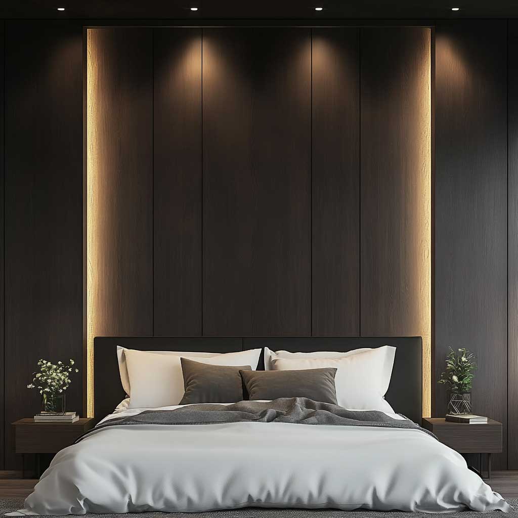
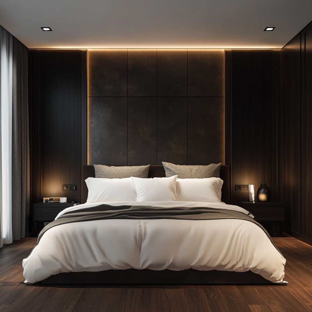
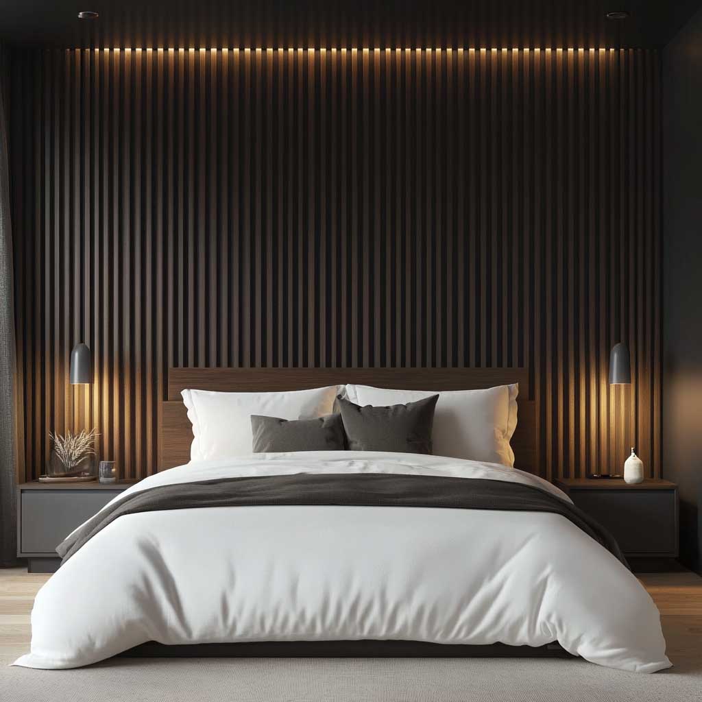

Lighting for dark panels deserves its own paragraph because most people get it backwards. Overhead ceiling-wash lighting kills dark WPC panels — the flat illumination removes the shadow between slats and turns the wall into a uniform dark rectangle. You need grazing light from the sides: wall sconces mounted at roughly 60 inches from the floor, 6 to 8 inches out from the panel surface, running on dimmable bulbs. Philips Hue White Ambiance E26 at $20 each gives you adjustable color temperature and brightness. At 10% brightness with a 2700K warm setting, the panel comes alive. Harsh direct overhead light makes even a $4,000 installation look like a painted surface.
Dark WPC panels in bedrooms also perform practically — the material’s density adds modest sound-dampening, which matters in apartments where a shared wall runs behind the headboard. Nothing dramatic; don’t expect acoustic panels. But you’ll notice the difference against a plain plastered wall. The composite is also rated for humidity ranges typical of bedrooms, unlike MDF which will swell along cut edges within two years in a room with steam from an adjacent bathroom. Seal every cut edge with silicone caulk regardless of what the manufacturer says about moisture resistance.
Don’t Do This
Don’t install dark WPC panels on every bedroom wall chasing a “cocoon” effect. I’ve seen this in three separate renovations and all three felt oppressive within a month — the room shrinks visually and any natural light from windows gets absorbed rather than reflected. Dark WPC belongs on one wall: the headboard wall. The other three stay light — white plaster, pale paint, or nothing. The contrast between the dark panel wall and the lighter surrounding surfaces is the design. Remove the contrast and you remove the point. Two of those three clients repainted adjacent walls within six months. The third moved a mirror to solve it and it helped, but only partially.
Vertical Gray WPC Panels Read as Office Architecture, Not Decoration
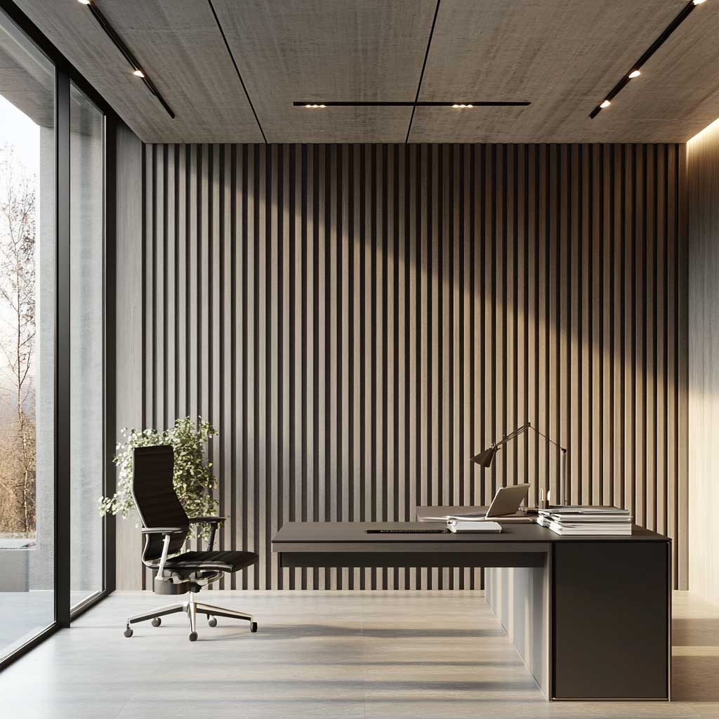
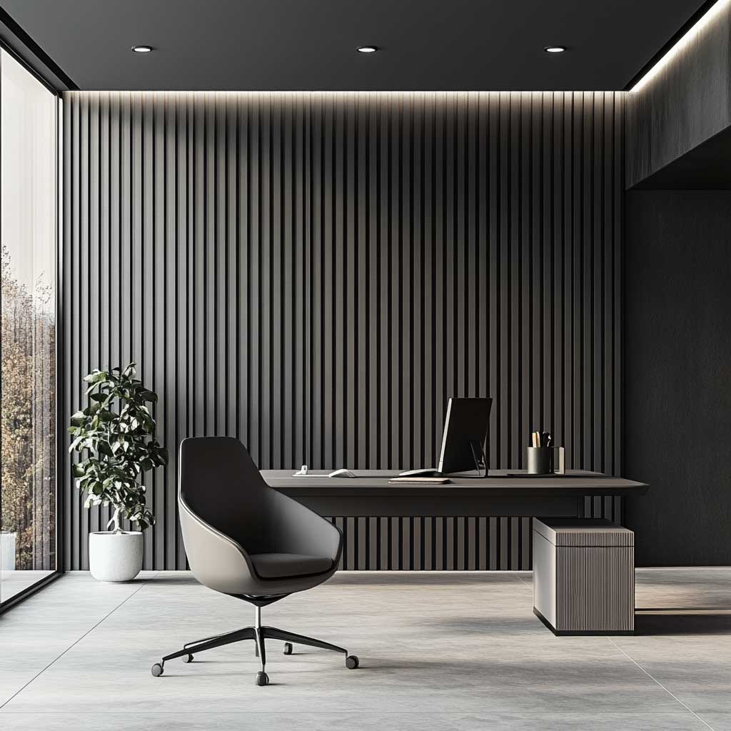
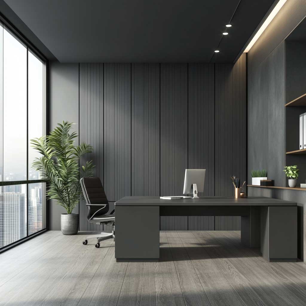
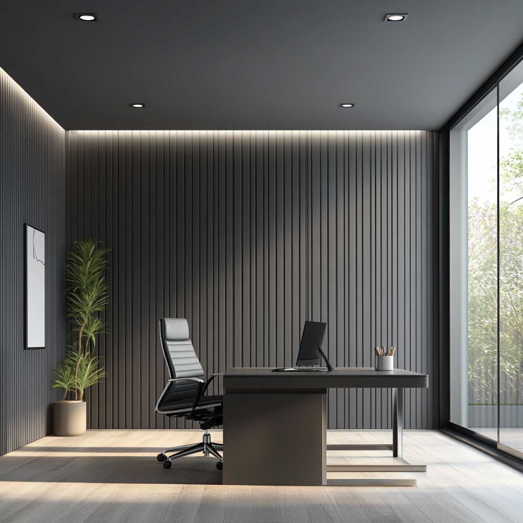
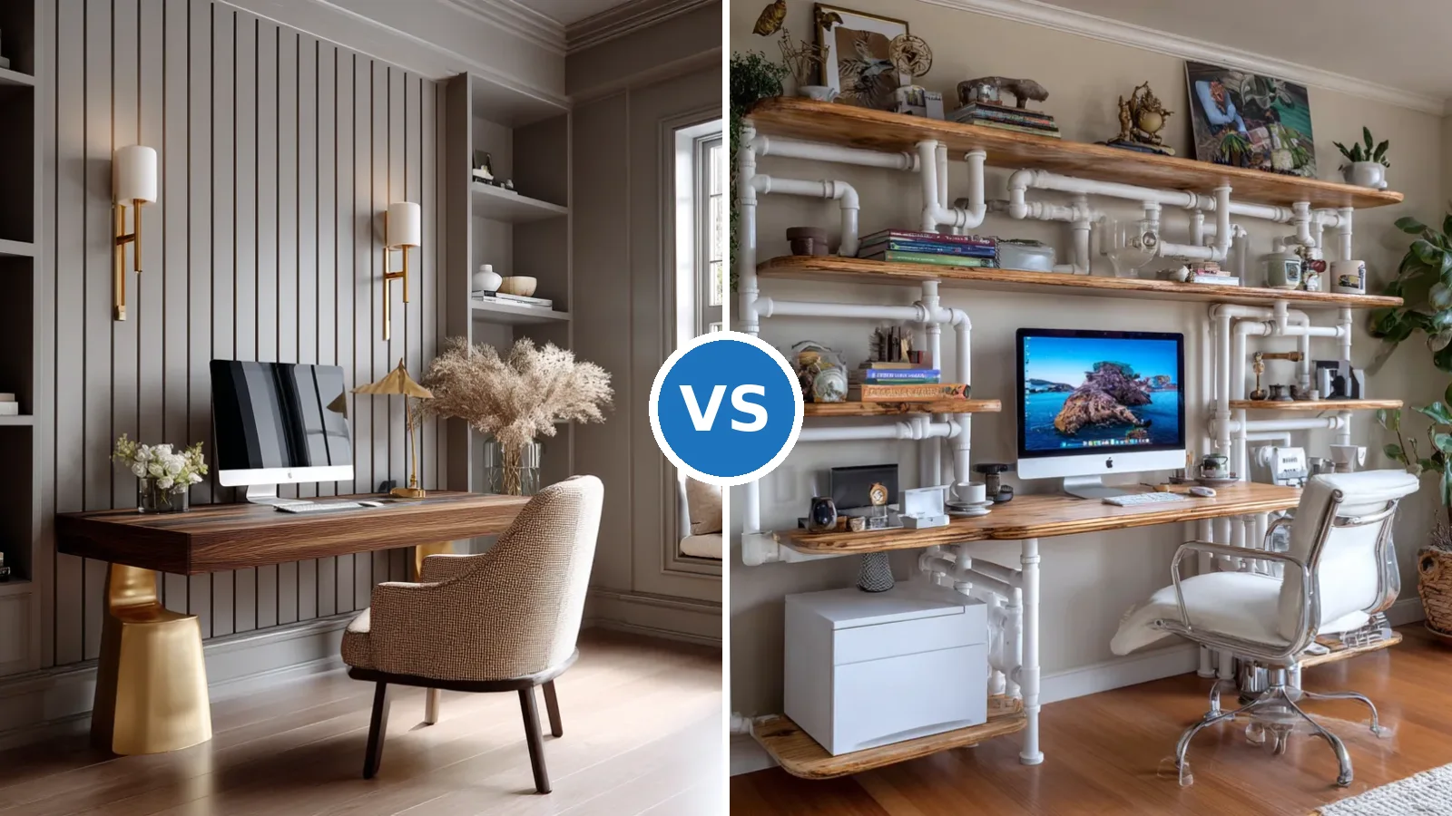
Vertical gray WPC panels do something specific to a home office that horizontal panels and paint can’t: they make the wall read as architecture. The vertical orientation draws the eye upward and creates a sense of ceiling height even in rooms with standard 8-foot ceilings. Gray is the right color here — not because it’s neutral, but because it sits back. The wall’s job in a workspace is to disappear from conscious attention so the work in front of you takes over. A warm-toned wood panel in an office environment keeps pulling the eye. Gray doesn’t. It’s the backdrop that earns its keep by being boring.
Furniture against a vertical gray WPC panel should be minimal and functional without being cold. A light-colored desk surface — pale ash laminate or white MDF — reads warmly against the gray panel behind it, preventing the workspace from tipping into corporate-lobby territory. The Ikea LAGKAPTEN tabletop at $79 on ALEX drawer units at $149 is the setup I’ve used in my own home office and never questioned. An ergonomic chair in black or mid-gray completes it. Avoid wood-tone chairs against a gray WPC wall — the warm wood against cool gray creates a low-level visual tension that’s exhausting over an 8-hour workday.
Accessories at the desk level stay minimal: one adjustable task lamp, one small plant, nothing else on the wall. The vertical panel is the visual anchor — adding framed prints, shelves, or pin boards beside it fractures the panel’s structural authority. You’ll notice this the moment you put something on the wall next to the panels: the panels stop reading as a feature and start reading as wallpaper. Keep the panel wall clear. WPC panel designs deliver maximum visual impact when the surrounding surfaces stay plain and uninterrupted — the same principle applies to office walls as it does to living room statement walls.
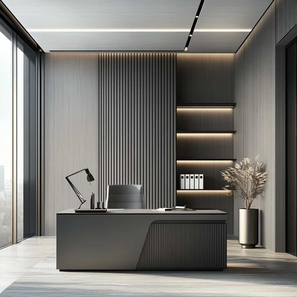
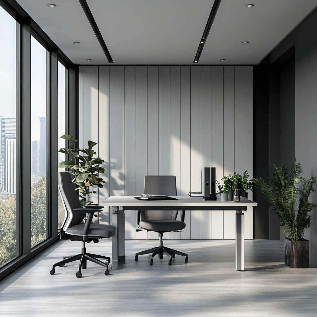
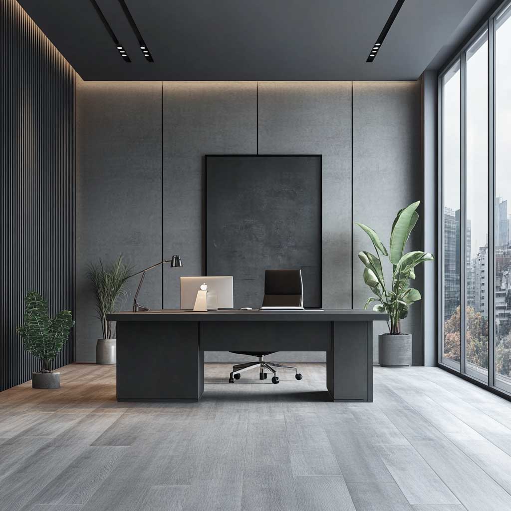
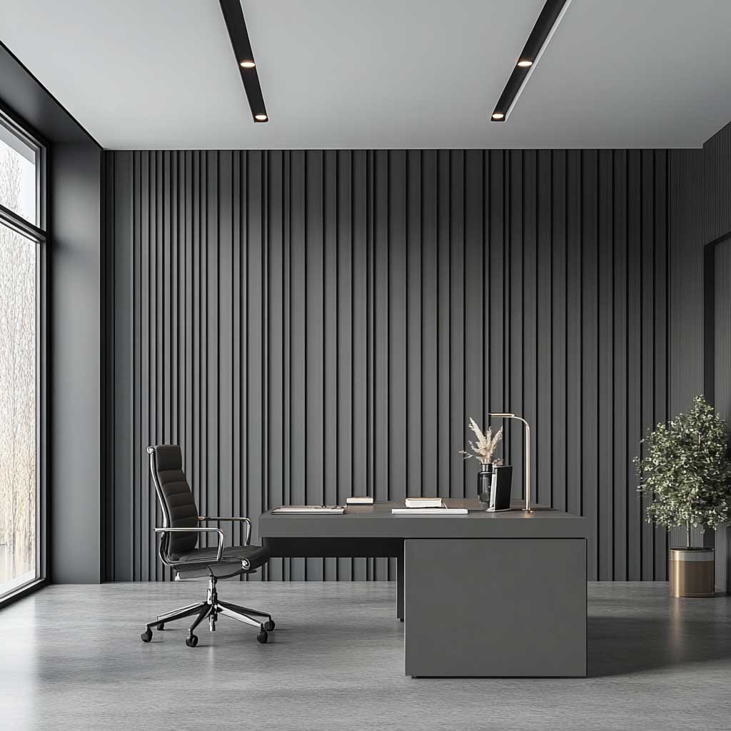
Natural light is the asset that makes gray WPC panels worthwhile in an office. Large windows adjacent to the panel wall let changing light quality shift the gray tone across the working day — cooler and sharper in morning light, warmer and slightly softer by afternoon. This is a material that actually benefits from day-to-day variation rather than requiring controlled artificial light to look right. For artificial-only settings, use adjustable color-temperature task lighting at 4000K for daytime work — the cooler CCT complements the gray panel without turning the room clinical. Warmer bulbs at 2700K against gray WPC panels make the room feel like a cloudy waiting room.
Practical durability is where gray WPC panels justify themselves in office spaces. Unlike timber paneling, WPC panels resist moisture from open windows during rain, stains from coffee splashes against the wall, and the minor scratches that accumulate when chairs roll against a nearby surface. The composite surface wipes clean. No refinishing, no annual treatment, no special product. Proper installation technique — including batten spacing and cut-edge sealing — is what determines whether WPC panels last 20 years or start lifting at the edges within three.
| Material | Installed Cost (per sq ft) | Moisture Resistance | Custom Profile | Expected Lifespan |
|---|---|---|---|---|
| WPC Panel | $8–$18 | Excellent | Yes — no grain split | 25–30 years |
| Solid Hardwood | $30–$60 | Poor — warps | Limited by grain | 15–20 years with upkeep |
| PVC Panel | $4–$10 | Excellent | Yes | 20+ years |
| MDF + Veneer | $12–$22 | Poor — swells | Good | 8–12 years |
Final Take
WPC interior design delivers on its promise only when the room is chosen before the panel profile.
Light wood tones belong in well-lit living rooms. Dark finishes belong on single bedroom headboard walls. Gray vertical panels belong in offices where the wall needs to do nothing except stay out of the way.
Every one of these setups collapses if the lighting is wrong — raking and directional for textured panels, grazing sconces for dark finishes, adjustable color-temperature tasks for gray office installs.
Save this post before you quote a contractor — the material comparison table alone will save you an uncomfortable conversation about why MDF with veneer isn’t the same thing.
Related Topics
FAQ
What is WPC interior design and how is it different from standard wood paneling?
Which rooms work best for WPC paneling in a living room installation?
What is the average cost to install a WPC panel feature wall in a bedroom or office?
Can WPC panels be used in both living rooms and home offices?
How do I choose between dark and light WPC panel tones for a minimalist bedroom?
What furniture pairs best with a WPC interior design scheme?
Complete guide
The Minimalist Style Guide That Covers Every Room, Surface and Outfit
Interiors, exteriors, kitchens, bedrooms, fashion, hair — all in one place