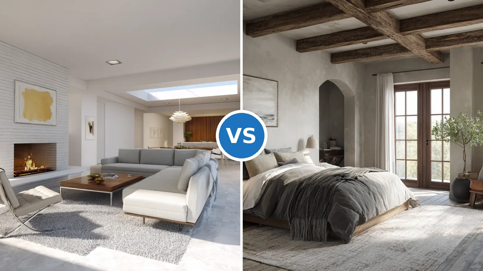
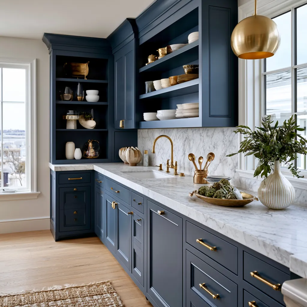
Minimalist wall paint design for home is the single decision that either holds the whole room together or quietly ruins it. I’ve repainted the same living room twice because I underestimated how much the color shifts between noon and 4 PM — and the second coat finally got it right. The palette isn’t decoration; it’s structure, the way a well-cut blazer makes everything else look intentional.
Most people grab the safest white off the shelf and call it minimalism. That’s not it. A true minimalist wall paint design for home is a deliberate choice between finish, undertone, and light behavior — not just the absence of color. You’ll notice the difference immediately when you walk into a room where the walls have been chosen rather than defaulted to.
This covers three proven directions — soft white, neutral gray, and monochrome — with specific paint names, prices, and the mistakes that cost people two extra gallons and a weekend.
– Benjamin Moore Chantilly Lace OC-65 (~$61/gallon) is the closest thing to a universal soft white for minimalist interiors — no yellow pull, LRV of 90.
– Soft white walls need one warm texture counterbalance (jute, oak, linen) — not three.
– Sherwin-Williams Repose Gray SW 7015 (~$55/gallon) is the greige that reads modern without dating to 2016.
– Never test gray paint in the morning — afternoon light shows you the real undertone.
– Monochrome works only when black covers less than 30% of visible vertical surfaces per room.
– Matte finish on minimalist walls, always — satin starts reading as commercial above 60% sheen.
Soft White Minimalist Wall Paint Design for Home That Actually Has a Temperature
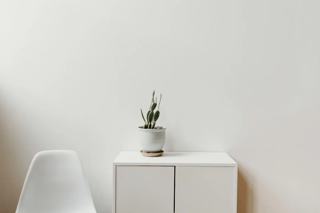
Soft white is the most misused option in minimalist wall paint design for home — everyone reaches for it, and most people pick the wrong version. Benjamin Moore Chantilly Lace OC-65 costs about $61 a gallon and has an LRV of 90.04, which puts it high enough to bounce light without tipping into stark gallery white. The gray undertone is subtle enough that you won’t see it directly, but it keeps the room from feeling like a dental office. My go-to rule: if the room faces north, skip warm whites like Alabaster entirely — they pull yellow fast, and you’ll spend the next year wondering why the room feels off.


The finish matters as much as the shade. A matte surface absorbs light rather than bouncing it, which gives the wall a quiet authority — like a good piece of linen, you notice the texture before you notice the color. Satin starts reading commercial at higher sheens, so I keep all minimalist walls in matte or eggshell. Does this mean the walls mark more easily? Yes. Worth it. Sherwin-Williams Pure White is the closest alternative if you’re locked into Sherwin paint at your local store, but test them side by side — Pure White reads slightly warmer under artificial light in the evening.
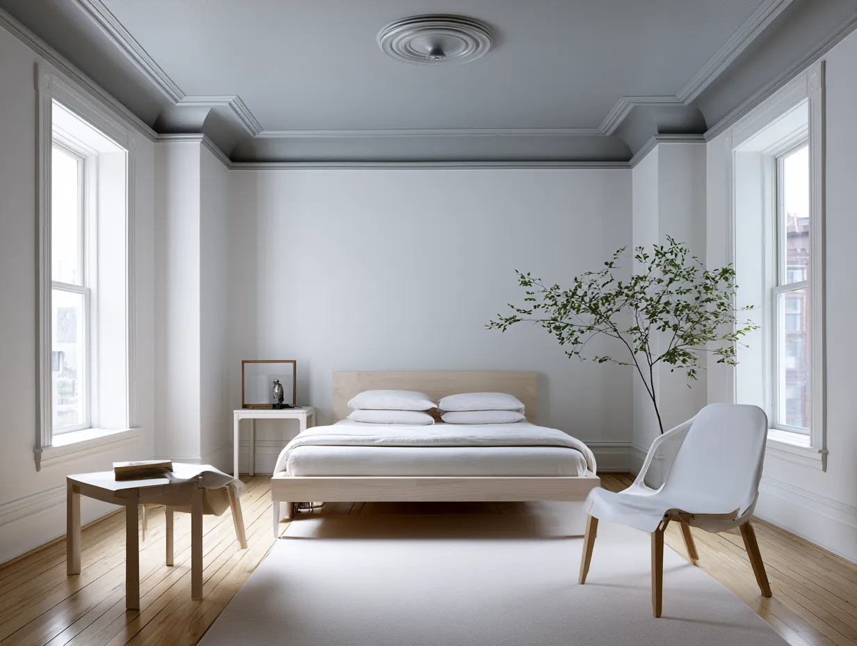
The one trap with soft white minimalist rooms: boredom. Every surface reads the same, and the eye has nowhere to land. I stole this fix from a designer I follow: one warm texture, not two, not four — a jute rug or an oak side table. Two warm textures look intentional. Four look like panic. The soft white wall becomes a backdrop that makes whatever sits in front of it look chosen rather than accumulated. Don’t ceiling-match the walls with the same white either; go a half-shade warmer on the ceiling (Benjamin Moore White Dove OC-17 works well) and the room suddenly feels like it has height it didn’t have before.
For more on pairing white walls with the right interior palette, this breakdown of the three best colors for minimalist home interiors goes deeper into the white versus greige versus black decision at the room level.
Neutral Gray Minimalist Wall Paint — Where the Undertone Either Saves or Kills the Room
Neutral gray is the color most people get wrong in minimalist wall paint design for home, and the reason is always the undertone. Cool grays with heavy blue shifts dominated interiors from 2014 to 2019 and now read as dated the moment natural light hits them in the afternoon — that’s the test, by the way. Don’t sample gray in the morning. Morning light flatters everything. Come back at 3 PM and watch what the undertone does. I’ve seen full bedrooms painted in what the swatch showed as cool gray turn lavender by late afternoon.


Sherwin-Williams Repose Gray SW 7015 runs about $55 a gallon and sits in greige territory — warm enough to avoid the dentist-office feeling, cool enough to hold a clean line next to white trim. That balance is what gives it staying power. Avoid the $40 alternatives that bill themselves as “warm gray” — I’ve watched two of those fade to something that reads more purple than gray within a year of direct sunlight. Two sample patches, two walls, two times of day is the non-negotiable test before committing to a full room.
Texture is what separates interesting gray walls from flat ones. A smooth plaster application adds depth without visual clutter — think of it like the difference between a matte silk and a standard cotton, same color, completely different presence. A lime wash finish goes further, creating a surface that shifts as the light moves through the day. What doesn’t work: adding warm wood tones throughout to “balance” the gray. Two warm textures are enough. More than that and the minimalist interior slides toward Scandinavian farmhouse, which is a different project.
Gray walls pair naturally with contemporary contrasts — a black coffee table, white sofas, metal-framed shelving. The gray acts like a volume control for the room: everything present, nothing shouting. For a sleep space specifically, match linens one shade lighter than the walls. Not white — that contrast is too sharp for a room meant for rest. Ikea’s DVALA sheet set in light gray costs about $15 and lands closer to a $300-a-night hotel room than you’d expect, purely because it echoes the wall shade without fighting it.
Don’t test gray paint once, in the morning, and order five gallons. Morning light flatters every shade. The undertone shows at 3–4 PM, especially near west-facing windows. Paint two sample patches on different walls. Check both in afternoon light. A color that looks like “warm greige” at 9 AM can read as lavender by 4 PM — I learned this the expensive way.
Don’t match the ceiling to the wall in white-white when walls are a cool gray. The contrast reads harsh. Step up to something like Benjamin Moore White Dove OC-17 on the ceiling for a softer transition.
Don’t use a high-sheen finish on minimalist walls. Satin and semi-gloss reflect imperfections and make the surface look commercial. Matte or eggshell, always.
Monochrome Minimalist Wall Paint Design — How Far You Can Take Black Without the Room Closing In
Monochrome is the most misunderstood minimalist wall paint design for home decision — people think it means painting everything black, and then they paint everything black and wonder why the room feels like a shoebox. The actual rule: keep black under 30% of visible vertical surfaces per room. Black on door frames, cabinet fronts, light fixtures — that’s where it does structural work. A single full black feature wall functions only in rooms with large windows or ceilings above nine feet. Below that, you’re just creating a dark corner.


Color blocking is the more livable approach — one black wall against crisp white surfaces everywhere else, with light tones on horizontals (countertops, shelving, floors) to keep the vertical black from pulling the eye down. Benjamin Moore Onyx 2133-10 is the flat black I’d start with; at around $61 a gallon in the Aura line, it holds its depth without shifting warm at dusk the way cheaper options do. Against it, furniture I’ve owned for years suddenly starts looking architectural rather than accumulated. That’s the monochrome effect when it works correctly.
Geometric line work and two-tone divisions are where this gets genuinely interesting. A horizontal divide — black below at chair-rail height, white above — creates proportion that makes standard 8-foot ceilings read taller. Abstract line work in the same matte black as the wall is a detail you notice from across the room before you can name what it is, which is the best kind of detail. What doesn’t work: gradients between black and white, soft blends, or any technique that adds visual complexity. Minimalism needs hard edges or nothing. A soft-gradient monochrome wall reads like an unfinished art project.
You’ll notice the room functions differently once the monochrome is in place — the walls recede and the objects in front of them come forward. A white sofa against a black wall reads like a display, not furniture. This is the same logic museums use for hanging dark paintings on pale walls: the contrast does the framing, so nothing else has to. For ideas on what to place against monochrome walls, this look at black and white interior color design for home covers the furniture and textile decisions in detail.
The Takeaway
Pick the finish before you pick the color — minimalist walls live and die by surface, not shade.
Benjamin Moore Chantilly Lace OC-65 (~$61/gallon) is the soft white that holds across lighting conditions without pulling yellow or blue. Sherwin-Williams Repose Gray SW 7015 (~$55/gallon) is the greige that avoids the dated-2017 trap. Black works only when it stays below 30% of visible verticals.
Test every shade on two walls at two times of day. Matte or eggshell finish only for minimalist interiors — satin reads commercial. Add exactly one warm texture to soft white rooms, not three.
Save this post before your next paint consultation — the color names and price checkpoints here will cut your decision time in half.
Related Topics
FAQ
What is the best minimalist wall paint color?
What minimalist wall paint design works in a small room?
What is a minimalist wall paint color for a bedroom?
How do I make a monochrome minimalist room work without it feeling dark?
What finish should I use for minimalist wall paint?
What is the difference between minimalist wall paint ideas and minimalist wall paint design?
Complete guide
The Minimalist Style Guide That Covers Every Room, Surface and Outfit
Interiors, exteriors, kitchens, bedrooms, fashion, hair — all in one place