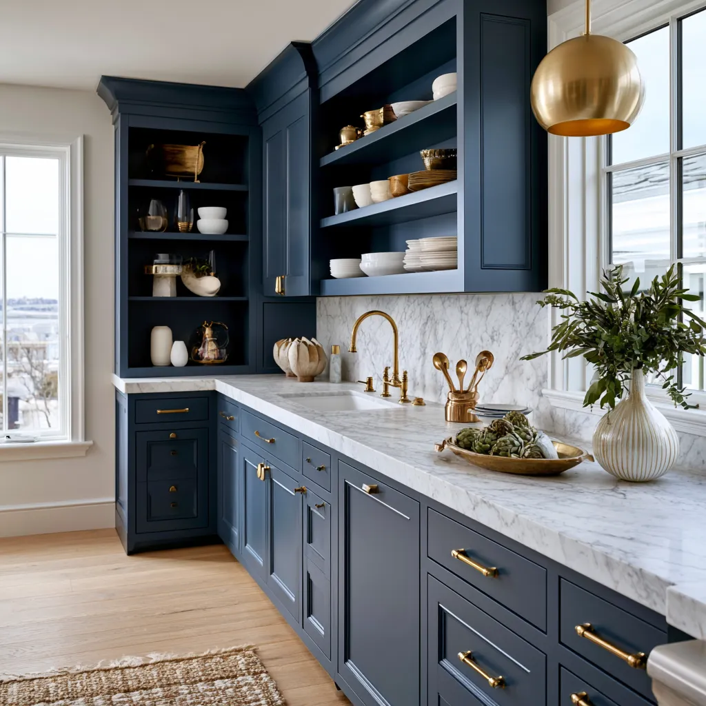
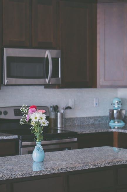
Art deco kitchen cabinets deliver high-gloss contrast, geometric clarity, and metallic sparkle that instantly shift a plain cooking zone into a glamorous stage. Two-tone layouts—deep lower cabinets against luminous uppers—work because they ground the room while bouncing light upward, exactly the balance Art Deco favored in the 1920s and 1930s.
The combination succeeds in both open-plan and compact kitchens when finishes stay consistent: lacquer or high-gloss paint, brass or chrome hardware, and repeating geometric motifs on backsplash or floor. Skip mismatched sheens or oversized ornaments; the style thrives on clean planes and sharp edges rather than clutter.
Most homeowners achieve the look with semi-custom or refinished cabinets rather than full custom builds, keeping the visual drama without ballooning the budget. The result feels luxurious yet practical for daily use.
- Two-tone art deco kitchen cabinets pair dark bases with light or metallic uppers for instant depth.
- High-gloss lacquer finishes remain the signature surface; expect $120–$200 per linear foot for quality options.
- Geometric backsplashes and brass hardware lock in the period feel without overpowering modern appliances.
- Nearly a quarter of recent renovations choose contrasting upper and lower cabinet colors.
- Black-and-gold, velvet-blue-and-champagne, and emerald-and-pearl combinations rank among the strongest pairings.
- Avoid mixing matte and gloss in the same run—uniform sheen keeps the glamour coherent.
Black and Gold Foundations That Define Art Deco Kitchen Cabinets


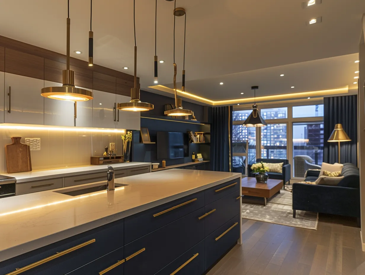
Black lower cabinets form the solid base that art deco kitchen cabinets rely on, while gold or silver uppers catch and multiply light exactly as period designers intended. The contrast acts like a tuxedo—structured, formal, and ready for performance. Why does this pairing still dominate mood boards? Because the dark tone hides daily wear and the metallic tone lifts the entire wall plane.
Think of the kitchen as a theater stage: the black grounds the actors, the gold frames the proscenium. Geometric tile on the backsplash and floor reinforces the rhythm without needing extra ornament. Hardware in matching brass or polished chrome finishes the set. Don’t apply a flat matte black next to high-gloss gold; the sheen mismatch breaks the illusion.
Modern appliances slide into the same plane when panel-ready fronts match the lower cabinet color. Average semi-custom runs for a standard 10×10 kitchen fall between $5,000 and $9,500 installed, according to recent industry ranges. Keep the palette tight and the geometry sharp, and the room reads as intentional rather than themed.


Lighting completes the picture. Period-inspired pendants or wall sconces with angular metal frames throw highlights across the glossy surfaces the way theater spots do. The effect multiplies when the upper cabinets carry a metallic finish. For more compact applications of the same geometry, explore Art Deco kitchen island ideas that keep bold shapes workable in tight footprints.
Velvet Blue and Champagne Pairings for Soft Deco Drama


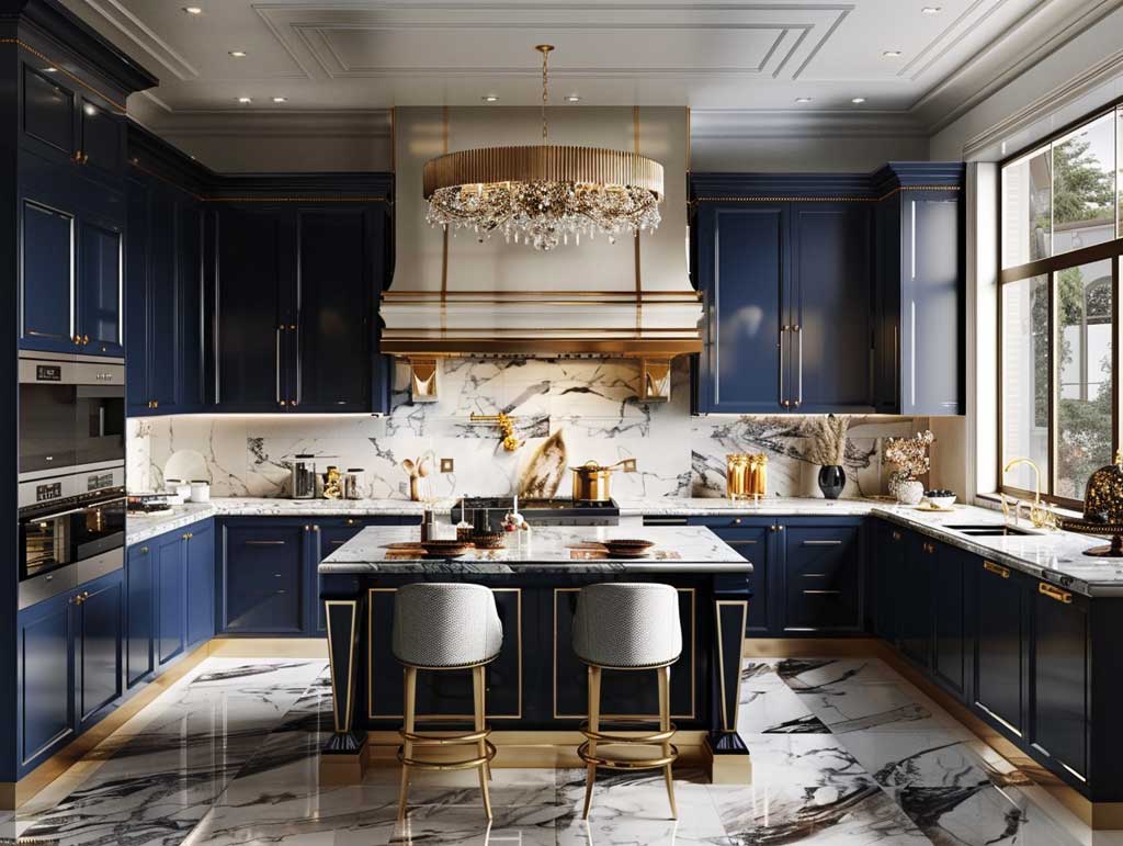
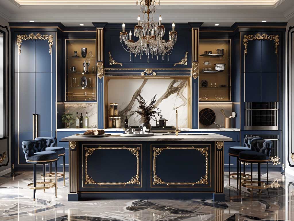
Velvet blue lower cabinets introduce calm depth while champagne uppers keep the ceiling plane light, a softer take on classic art deco kitchen cabinets. The blue behaves like midnight sky; the champagne catches every available ray and softens the geometry. How does the pairing avoid feeling heavy? By limiting the dark tone to the base run and letting the lighter finish dominate the upper third.
Marble countertops with subtle veining act as the quiet intermediary between the two colors. Geometric backsplash tiles continue the Art Deco language without competing. Brass or chrome pulls function as jewelry—small, precise, and repeated. Don’t choose a blue with strong green undertones if the champagne leans warm; the clash reads as indecision rather than contrast.
High-gloss lacquer remains the preferred surface for both tones because it reflects light the way polished metal and glass did in original Deco interiors. Industry data shows nearly a quarter of renovating homeowners now select different colors for upper and lower cabinets, confirming the two-tone approach has moved from novelty to mainstream option.
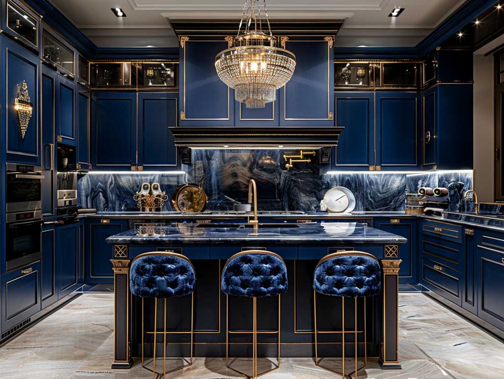
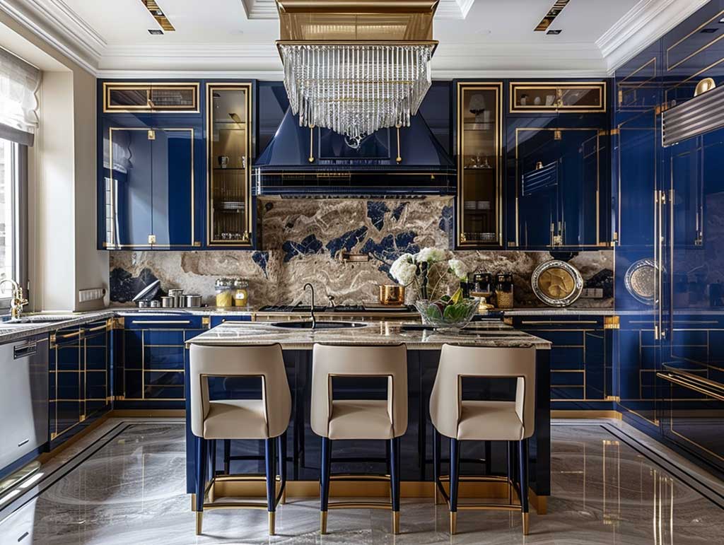


Statement art or a single sculptural object on an open shelf can echo the metallic notes without crowding the counters. The same principle of restrained glamour appears in related gray schemes that borrow Deco geometry; see how gray kitchen ideas absorb Art Deco accents while staying calm for additional color strategies.
Emerald and Pearl Combinations That Channel Deco Opulence


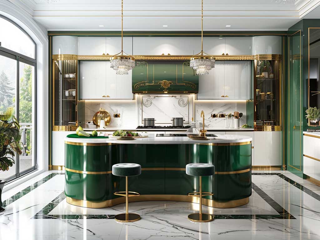
Emerald green lower cabinets paired with pearl white uppers deliver the jewel-tone drama that defined many original Art Deco interiors. The green supplies richness and a quiet nod to nature; the pearl keeps the upper volume airy and reflective. What keeps the scheme from tipping into excess? Strict control of secondary metals and a single geometric motif repeated sparingly.
Gold hardware, faucets, and light fixtures act as the consistent thread that ties the two tones together. Black-and-white marble or geometric tile floors reinforce the period geometry without introducing new colors. Don’t scatter multiple metals across the same run; mixed finishes dilute the focused opulence the style demands.
High-gloss lacquer finishes on both the emerald and pearl surfaces maximize light bounce, a practical advantage in kitchens that receive limited natural light. Full custom cabinets for a typical 10×10 layout often land between $11,000 and $21,000 installed, while quality semi-custom options stay closer to the mid-range. The investment pays off in visual impact that still supports everyday cooking.


Custom geometric tiles on the backsplash can echo the stepped profiles or fan motifs common in Deco architecture. Keep the scale modest so the cabinets remain the primary actors. The same disciplined approach to color and metal appears in other two-tone schemes that favor industrial materials; the contrast principle travels well across styles.
Finish and Hardware Choices That Lock in the Deco Look
High-gloss lacquer or acrylic finishes remain the clearest path to authentic art deco kitchen cabinets because they deliver the mirror-like reflection period rooms prized. Quality lacquer typically ranges from $120 to $200 per linear foot, while premium acrylic can climb higher. Matte or soft-touch surfaces mute the glamour and should be reserved for secondary spaces.
Hardware functions as the jewelry. Brass, polished chrome, or nickel pulls with geometric or stepped profiles reinforce the era without requiring carved doors. Soft-close mechanisms and integrated lighting keep the modern function intact. Don’t install oversized contemporary bar pulls on flat Deco fronts; the scale mismatch breaks the historical rhythm.
Panel-ready appliances maintain the continuous plane of color and finish. When the lower cabinets run in a deep tone, matching the appliance fronts to that tone keeps the visual weight consistent. The result feels intentional rather than assembled from mismatched catalogs.
Practical Layout Moves for Two-Tone Deco Kitchens
Place the darker tone exclusively on base cabinets and islands so the eye travels upward to the lighter or metallic finish. This vertical progression mirrors the way Art Deco architecture used base, shaft, and capital. Open shelving in a matching metallic frame can replace a short upper run without losing storage.
Work triangles stay efficient when the geometric floor pattern does not fight the circulation paths. Keep the triangle legs between four and nine feet so cooking remains fluid. Don’t let a busy chevron or fan pattern on the floor compete with the cabinet contrast; one strong geometric statement is enough.
Lighting layered at three heights—ceiling, under-cabinet, and task—reveals the full depth of the gloss finishes. Warm-white LEDs around 3000 K flatter both deep jewel tones and metallic surfaces. The same layered approach appears in compact Deco schemes designed for smaller footprints.
Color Comparison for Art Deco Two-Tone Cabinets
| Pairing | Lower Tone | Upper Tone | Best Hardware | Lighting Effect |
|---|---|---|---|---|
| Classic Glamour | Glossy black | Gold or silver | Brass or chrome | Strong reflection, high drama |
| Soft Deco | Velvet blue | Champagne | Brass | Warm glow, calm depth |
| Jewel Opulence | Emerald green | Pearl white | Gold | Rich color with bright lift |
Common Mistakes That Break the Illusion
Mixing matte and high-gloss finishes on the same cabinet run destroys the reflective continuity that makes art deco kitchen cabinets convincing. The same rule applies to metals: one primary finish across handles, faucets, and lighting keeps the palette disciplined. Over-scaled geometric patterns on both floor and backsplash create visual noise rather than rhythm.
Don’t treat the style as pure costume. Hidden soft-close hardware, durable countertops, and practical storage remain non-negotiable. The glamour works best when it supports real cooking rather than competing with it. A single Don’t Do This reminder covers the whole approach: never sacrifice daily function for pure surface effect.
- Keep sheen consistent across upper and lower cabinets.
- Limit metals to one primary finish plus a quiet secondary accent.
- Choose geometric motifs at a scale that reads clearly from doorway distance.
- Match appliance panels to the dominant lower cabinet color.
- Test paint or lacquer samples under both daylight and evening lighting before ordering full runs.
Timeless Contrast Still Delivers
Two-tone art deco kitchen cabinets succeed because they balance weight and light the same way the original period architecture did. Dark bases anchor the room; luminous or metallic uppers lift it. The geometry stays crisp, the metals stay focused, and the finishes stay reflective.
Start with a clear pairing—black and gold, blue and champagne, or emerald and pearl—then lock every secondary decision to that choice. Hardware, tile, and lighting all answer to the same palette. The kitchen then feels deliberate rather than decorated.
Quality high-gloss lacquer in the $120–$200 per linear foot range already delivers most of the visual return. Semi-custom construction keeps the investment realistic for most remodels. The result is a working kitchen that still carries the confident glamour of the Deco era.
Choose one strong contrast, keep the finishes uniform, and let the geometry do the rest. The space will perform every day and still look ready for an audience.
Complete guide
Every Modern Kitchen Design Idea Worth Stealing Right Now
Layout, cabinets, islands, materials, color, lighting — all in one place