House interior paint ideas for Taurus work best when they stop trying to look collected and start trying to feel rooted. Moss green, warm terracotta, and rustic clay aren’t just aesthetic choices — for a Taurus-influenced space, they’re the difference between a room that photographs well and one that actually lets you exhale when you walk in.
My go-to test for whether an earthy hue is working: does the room feel like a place that already existed, or does it feel like something was applied to it? Terracotta on a living room wall at around $60–$75 per gallon with Benjamin Moore’s Audubon Russet hits the first category hard. The second category is every landlord-beige apartment you’ve ever rented. Taurus interiors belong in the first.
You’ll notice something specific when you commit to earthy tones across multiple rooms: the transitions stop feeling designed and start feeling inevitable, like the wall color was always going to be that shade. That organic quality is exactly what Taurus energy is after — stability that doesn’t announce itself.
– Warm terracotta on living room walls pairs best with walnut furniture and brass hardware — not chrome, not black
– Moss green bedrooms need a warm undertone to avoid reading cold; Benjamin Moore October Mist (1495) is the moss-adjacent shade that holds up in low light
– Rustic clay dining rooms lose all their richness under cold LED bulbs — swap to 2700K before you blame the paint
– Avoid flat finish on terracotta; roller marks read like scars on warm earthy colors — go eggshell or satin
– One wrong move kills all three looks: mixing too many wood tones in one room breaks the grounded feeling these colors create
Warm Terracotta on Living Room Walls Earns Its Price Tag
House interior paint ideas for Taurus living rooms don’t get more direct than warm terracotta — a color that functions like a campfire, pulling everything in the room toward it. Benjamin Moore’s Audubon Russet runs about $70–$75 per gallon and lands squarely in the soft terracotta range without tilting orange. I’ve bought it twice. The first time was for a friend’s apartment; the second was for my own living room after watching how it aged over six months — terracotta deepens slightly as it cures, growing richer rather than fading. That is not something cheap paint does.


Pair it with walnut furniture — medium to dark finish, clean silhouette — and you get the kind of room that feels finished without effort. Oak in a lighter tone works too, but here’s what doesn’t: mixing both. You’ll have picked two different warm tones that fight instead of building on each other. Stick to one wood species throughout the room. The grounded quality terracotta creates relies on fewer decisions, not more.
Textured rugs in beige or camel pull the floor into the palette without competing with the walls. Think Beni Ourain-style flatweave around $150–$300 from Rugs USA, layered under a coffee table. Large-leafed tropical plants in ceramic pots — a split-leaf philodendron in a matte terracotta pot costs about $45 total at any garden center — do something a decorative object can’t: they read as living texture rather than styling choice. Does a ficus in a glossy white pot work here? It does not. Wrong vessel, wrong finish, wrong temperature for this palette.
Brass hardware and fixtures add just enough formality to prevent the room from sliding into rustic territory. A $65 brass adjustable floor lamp from CB2 or a Wayfair equivalent reads as intentional against terracotta in a way that matte black never quite does — matte black sharpens the contrast too much, turning a warm room into a graphic one. For evening lighting, aim for 2700K bulbs maximum. You built this warmth with paint; cold LEDs will dismantle it in one switch.
Skip high-gloss finish on terracotta — every roller lap mark and wall imperfection becomes visible under sheen. Go eggshell. Also resist the urge to accessorize with multiple warm metal finishes at once; mixing antique brass, satin brass, and gold in one room turns a coherent palette into a thrift store prop collection. Pick one metal finish and own it. And never paint terracotta in a room with no natural light — without daylight correction, it turns a murky orange-brown that no amount of warm bulbs rescues.
Moss Green Bedrooms Shift Mood Before You Notice Why
Moss green bedroom walls create the closest thing to sleeping outdoors that interior paint can offer — minus the insects, plus about eight hours of better sleep according to anyone who’s tried it. My go-to reference for this look is Benjamin Moore’s October Mist (1495, around $75 per gallon), which sits at the moss-adjacent end of sage without going fully gray. I stole this trick from a hotel room in Portland where I slept unusually well, then noticed the walls on checkout. That particular shade absorbs morning light without glowing, and holds depth under evening lamps — the double performance is what separates it from cheaper green paint at $35 a gallon that looks flat by noon.
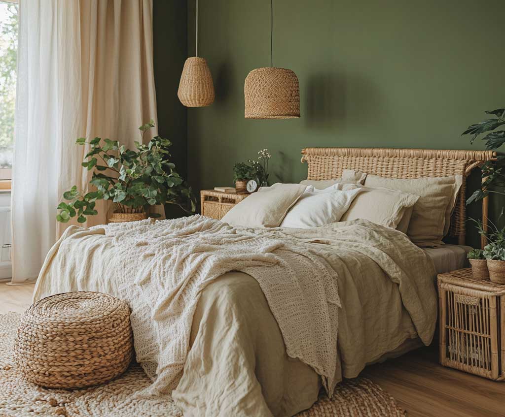


Linen bedding in cream or warm white keeps the room from feeling heavy. IKEA’s Puderviva duvet cover at $59 in off-white is genuinely hard to distinguish from linen sets three times the price once it’s been washed twice. A light oak bed frame — not honey oak, not orange-toned pine — anchors the room in warmth without competing with the green. Can you use a walnut bed frame here? You can, but you’ll find the room gets darker than intended; light oak reflects more ambient light and reads as part of the moss palette rather than separate from it.
Woven baskets for visible storage do dual work: they add a texture that neither the smooth walls nor the smooth bed frame provide, and they signal intention rather than clutter. Plants on the windowsill in simple clay pots — a trailing pothos at $8 from any plant shop — complete the link between the painted wall and the outdoors without requiring a green thumb. Sheer linen curtains in undyed natural fabric diffuse the light into something that looks editorial. What doesn’t work here: patterned curtains of any kind. They fracture the calm immediately. Learn more about choosing the right green paint for your bedroom before committing to a full gallon.
For lighting, wall sconces at 2700K in a matte ceramic or brushed brass finish add warmth without adding visual noise. I own two of the Threshold brushed brass wall sconces from Target at $35 each — they’ve been on moss-green walls for two years and still look correct. Avoid pendant lights with clear glass shades in a moss bedroom; they expose the bulb and push the room’s mood from calm into something more alert, which defeats everything the color was doing.
Rustic Clay in the Dining Room Pulls Meals Into an Event
Rustic clay paint on dining room walls does something terracotta and moss green don’t: it makes the room feel like it was built to hold food, conversation, and time — like a clay pot does. The color sits between warm brown and muted orange, and it benefits from a matte finish so the texture reads as pigment rather than plastic. Sherwin-Williams’ Rugged Brown (SW 6082, about $65 per gallon) lands in this territory. I’ve seen it used in three different dining rooms across different lighting conditions, and it consistently makes the food on the table look better — which is not something you can say about cool gray dining rooms, where every dish looks slightly under-lit.


A reclaimed wood dining table is the non-negotiable furniture choice here — not a reclaimed-look table from IKEA with a convincing photograph on the box, but actual reclaimed wood with grain variation and some evidence of prior use. Article sells solid wood dining tables starting at around $799 that arrive with genuine character. The table texture and the clay walls occupy the same register of “made by time,” and they confirm each other. Smooth, high-gloss furniture does the opposite: it looks borrowed from a different room.
Set the table with ceramic dishware — matte-glazed, handmade if possible, imperfect if inevitable. Joya ceramic sets from West Elm at around $80 for four pieces look expensive against clay walls because they share the same earthy-mineral quality. Natural linen napkins in undyed or oat-colored fabric complete the table without adding visual noise. A jute rug under the table at around $120 from Rugs USA adds warmth underfoot and a texture contrast to both the smooth chairs and the painted walls. Can you use a sisal rug instead? Yes, but sisal scratches chairs when they’re pushed back — jute is softer and quieter at the same price point.
A cluster of terracotta pots as a centerpiece — three different heights, same clay finish, filled with small-leafed herbs or succulents — ties the room’s color story back to the walls in a literal way. Overhead pendant lighting in a matte black or raw brass finish keeps the drama proportional. The one thing that destroys this room immediately: cold overhead lighting. You’ll experience the clay walls turning a color somewhere between pumpkin and sadness. The painting and the light are one system. Read more about how terracotta works across interiors and exteriors before choosing your exact shade.
Benjamin Moore’s color website is worth bookmarking for anyone navigating earthy interior shades — their green collection covers the full range from moss to sage to forest, with side-by-side comparisons that show how each shade shifts under different lighting conditions. Useful before committing to a gallon.
Final Word
Earthy Paint Colors Don’t Decorate Taurus Rooms — They Complete Them
Terracotta living rooms, moss green bedrooms, and clay dining rooms share one quality: they make decisions look inevitable rather than curated. That’s the Taurus-inspired interior working as it should.
Spend the $75 on a quality gallon from Benjamin Moore or Sherwin-Williams. The $35 big-box alternative will look different in six months and cost you more per year than the premium can ever would.
Match your lighting temperature to your wall color — 2700K, no higher — or you’ll spend money on paint and lose it all to the wrong bulb. Save this post.
Related Topics