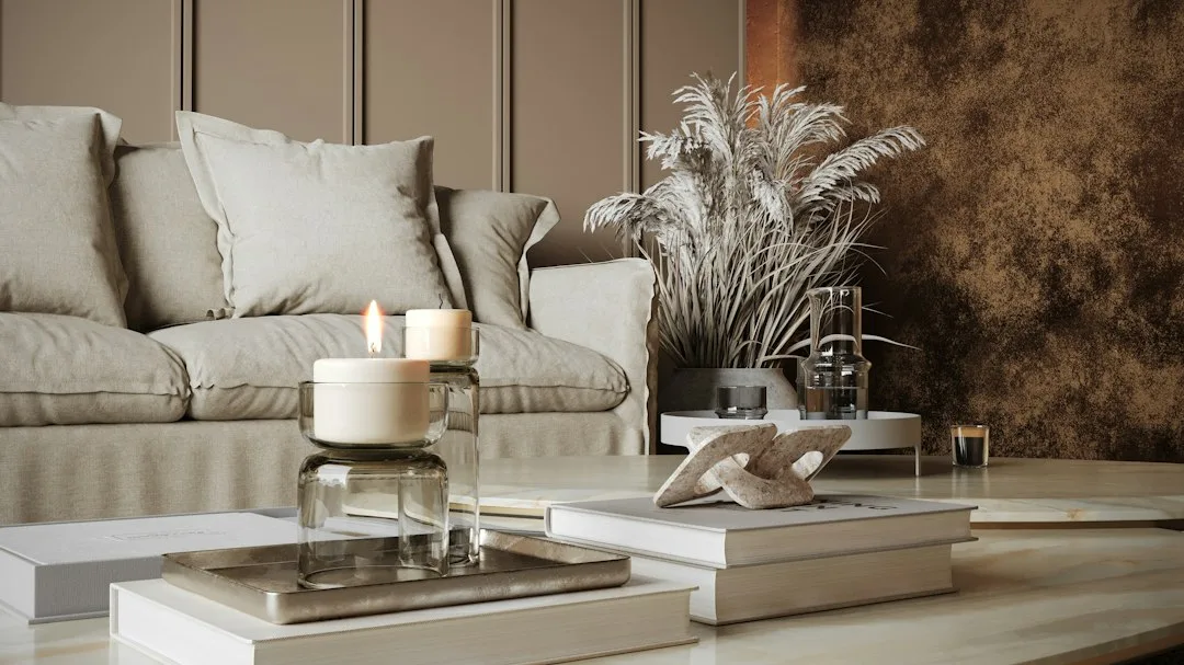
Grey wall living room ideas succeed or fail on one decision made before a single brush stroke: undertone. Pick a grey with blue undertones in a north-facing room and the whole space reads cold and vaguely sad by midday. Pick a greige — grey with a warm beige base — in the same room and it wraps around furniture the way a good sofa does. That single variable determines whether a grey living room feels like a spa or a municipal waiting room.
The three looks covered here — pale greige, soft blue-grey, and blush accent — each earn their place through different light conditions and different furniture profiles. None of them requires a full renovation. What they do require is picking the right paint first and building everything else around it, not the reverse.
Sherwin-Williams SuperPaint, the most commonly used mid-range option for these colors, runs about $60.49 per gallon at list price and covers 350–400 square feet per coat — enough for most living rooms in one gallon, two coats. That math matters because choosing a premium line just for the color name and then needing three coats erases the cost advantage immediately.
– Benjamin Moore Revere Pewter (HC-172, LRV 55) is the most reliable greige for a light grey living room — warm enough to stop a room reading cold, neutral enough to work with almost any sofa color.
– Sherwin-Williams Misty (SW 6232, LRV 64) reads blue-grey in bright rooms, pure grey in dim ones — use it in living rooms with east- or south-facing windows.
– Benjamin Moore First Light (2102-70, LRV 77) works as a blush accent for reading corners; the LRV is high enough that it never darkens a small space.
– Matte finish on grey walls reads warmer than eggshell; eggshell wipes clean but bounces light and can make cool greys look clinical.
– A one-gallon test pot before committing is non-negotiable — grey shifts more under artificial light than almost any other color family.
What Pale Greige Actually Does to a Grey Wall Living Room
The most searched grey wall living room ideas cluster around one shade: a warm, mid-light greige that goes by different names at different paint counters but behaves the same way everywhere. Benjamin Moore Revere Pewter (HC-172) has held its position as one of the brand’s top-selling neutrals for over a decade because its LRV of 55 sits exactly in the zone where a color has enough depth to feel deliberate but enough reflectance to stay livable. Rooms painted in Revere Pewter stop looking washed-out in sunlight and stop looking cave-like at night — which is rarer than it sounds in the grey family.
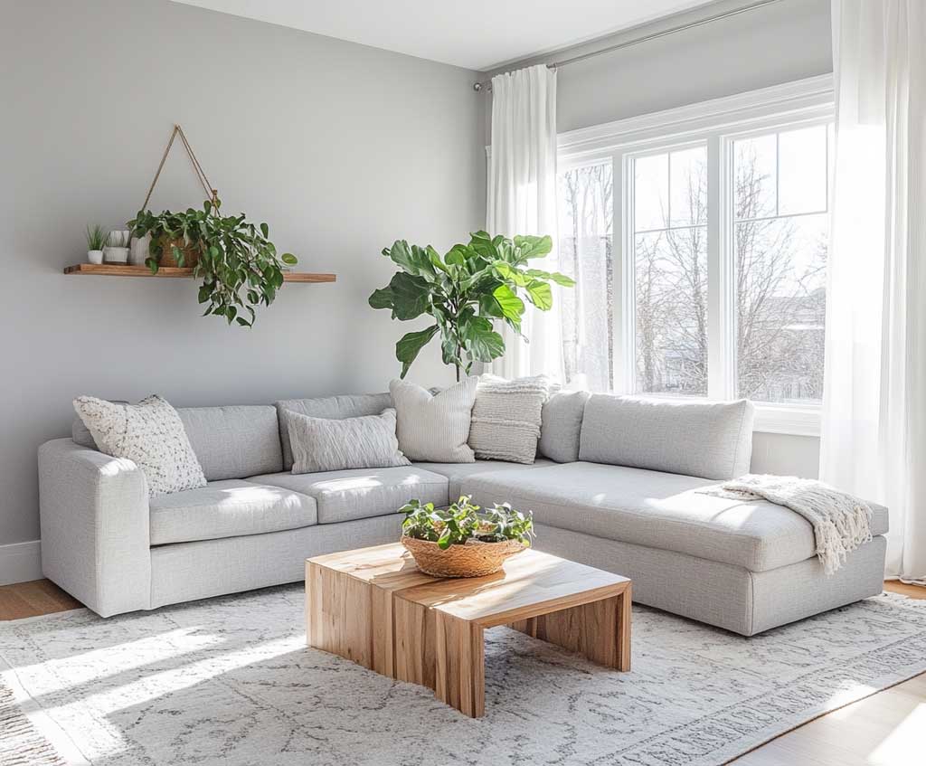


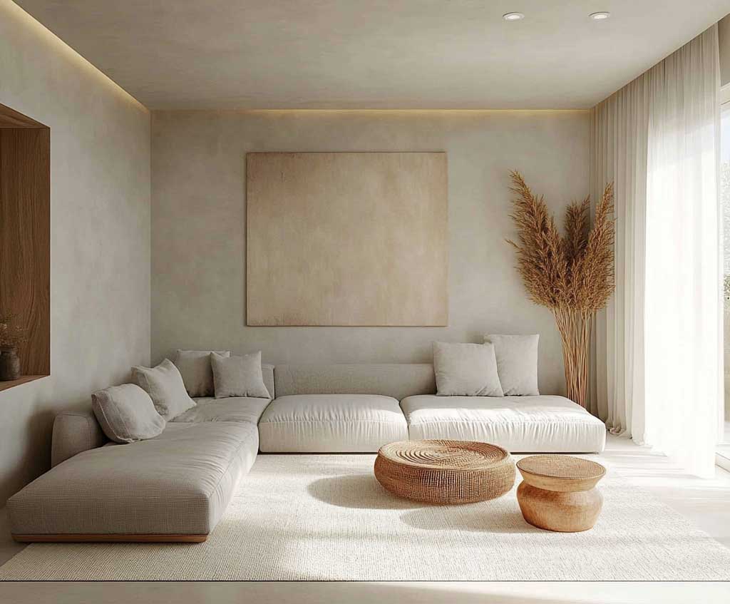
The trick with greige is that it reads differently against different flooring. Against honey-toned oak, Revere Pewter pulls warm and almost beige. Against grey-washed hardwood or concrete, the grey comes forward and the beige disappears. What does this mean practically? Hold the paint swatch against your largest floor surface in natural daylight at noon before ordering a gallon. The floor, not the sofa, is what greige fights with or cooperates with. Stylists who work with this color regularly recommend pairing it with Benjamin Moore White Dove on trim rather than a stark pure white — pure white next to greige can make the walls look muddy by contrast.
What doesn’t work: large grey sectionals in a cooler, blue-grey shade against Revere Pewter walls. The undertones clash and the room starts looking like two different greys that ended up in the same space by accident. Try this instead — match your largest upholstered piece to the warm side of the greige by choosing linen or warm taupe fabric, then let the walls anchor everything. A single neutral area rug in oatmeal or jute pulls the floor temperature up to meet the walls and the whole room settles. For more on pairing grey tones and textures across a living room, the approach laid out in these grey and white living room decor ideas applies directly to greige-forward schemes.
Painting all four walls in a mid-to-dark grey without testing the room’s light first. A grey with an LRV below 50 absorbs light and by 4 PM in a north-facing room the space reads closer to charcoal than the soft grey you saw on the chip. Use dark grey on a single accent wall maximum, keep remaining walls in a pale greige or white. The other common failure: buying grey paint on sale in the wrong finish. Flat hides texture but doesn’t clean; eggshell cleans but bounces light in a way that makes cool greys look clinical. For living rooms with kids or pets, eggshell is the practical call — just know your grey needs warmer undertones to compensate for the extra light bounce.
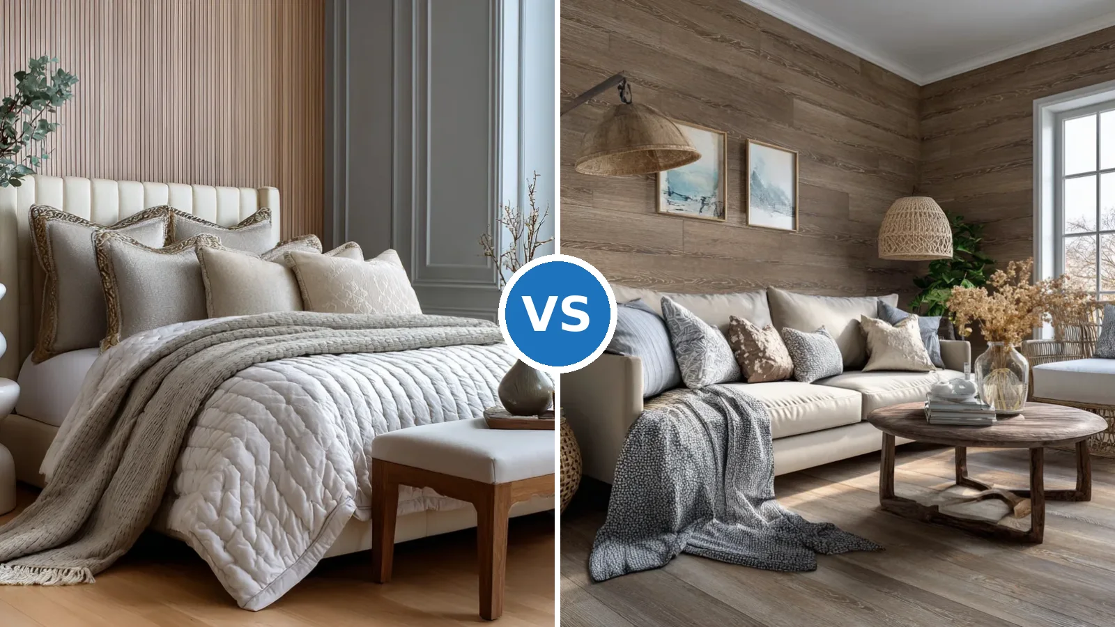
Soft Blue-Grey Walls for a Bedroom That Stops Feeling Like a Bedroom
Sherwin-Williams Misty (SW 6232) is the blue-grey that keeps stylists coming back because it refuses to commit fully to either color. With an LRV of 64 and a chroma of just 1.9, it reads as a quiet, composed grey in rooms with little natural light while the aqua undertone surfaces clearly in bright, south-facing spaces. That behavior — grey in dim light, coastal in bright light — makes it unusually adaptable for bedrooms where the morning and evening reads matter as much as the midday one.


Why does this shade work where bolder blues fail? Think of it like a watercolor wash rather than a block of color. Misty doesn’t announce itself the way a true periwinkle or slate does — it settles into the room and lets the furniture speak. The Sherwin-Williams color page for Misty SW 6232 positions it in the blue family, but experienced color consultants note it coordinates just as effectively with warm neutrals like SW Alabaster on trim as it does with cool whites. Pair it with SW Alabaster and the walls read soft and airy; pair it with a stark pure white trim and the blue undertone becomes noticeably more intense.
What kills this look is over-accessorizing with coastal decor. A few natural wood elements — a simple bed frame in light oak, a linen throw — let the wall color do the atmospheric work without tipping the room into beach-house territory. Stylists recommend keeping decorative accents to three items maximum per surface in a Misty-walled room; the color is quiet enough that clutter registers more loudly against it than against a warmer neutral. Wall sconces rather than overhead fixtures make a significant difference in the evening: warm-toned bulbs (2700K) neutralize the cool aqua edge and the room reads softer. For a broader look at how grey wall paint design performs across different room scales and lighting conditions, this piece on grey wall paint design covers the range from minimalist to layered.
Blush Pink Reading Corner — Where Grey Wall Living Room Ideas Get a Warm Edge
Benjamin Moore First Light (2102-70) is the grey wall living room idea that doesn’t look like one. Its LRV of 77 keeps it light enough to function as a near-neutral, but the warm blush base makes it behave like a color accent when placed against pale grey or white walls. A reading nook painted in First Light next to a grey main room doesn’t clash — it reads as the warm note in an otherwise cool composition, the equivalent of a single lit candle against a grey dusk. Stylists classify it as a 10R on the warm-red hue family, which means it carries actual warmth rather than the faint lavender-pink that shows up in cooler pink paints under certain lighting.


The pairing logic here matters. First Light works with grey-toned whites on trim — Chantilly Lace or Cloud White — but fights with warm creamy whites like Sherwin-Williams Creamy, which pulls too yellow against the pink base and reads discordant. What’s the risk with western-facing rooms? At sunset, warm orange-red light intensifies the blush and the color pushes from soft to flushed. Avoid using First Light in rooms with prolonged western exposure unless you only occupy the space in the morning, when the light stays cool and the color reads closer to the soft, muted shade on the chip.
An ivory armchair with a linen throw is the natural furniture match — it holds the warmth of the blush wall without fighting for attention. Light wood bookshelves, kept relatively uncluttered, let the wall color read as the room’s focal point rather than competing with stacked objects. A round rug in beige or warm oatmeal anchors the floor without introducing a new color temperature. Avoid cream-colored rugs with strong yellow undertones — next to First Light they pull muddy. The simplest lighting choice that makes this corner work is a floor lamp with a warm white bulb positioned behind or beside the chair, pointing upward so the blush wall catches the indirect glow.
| Paint Color | LRV | Best Room Orientation | Avoid Pairing With |
|---|---|---|---|
| BM Revere Pewter HC-172 (greige) | 55 | South or west-facing | Cool blue-grey upholstery |
| SW Misty SW 6232 (blue-grey) | 64 | East or south-facing | Stark pure white trim |
| BM First Light 2102-70 (blush) | 77 | North or east-facing | Warm yellow-cream whites |
INTERIOR PAINT
Grey wall living room ideas come down to undertone, orientation, and finish — not just the color chip.
Benjamin Moore Revere Pewter at LRV 55 is the reliable call for rooms that need warmth. SW Misty at LRV 64 handles light-filled spaces without going full-blue. Benjamin Moore First Light at LRV 77 brings a blush warmth to accent corners without overpowering the grey anchor.
Test each shade in the actual room, in natural daylight at noon and artificial light after dark. A paint that works at noon can read entirely different by 8 PM — and that’s the room you’ll actually live in.
Save this post before your next paint store visit.
Related Topics