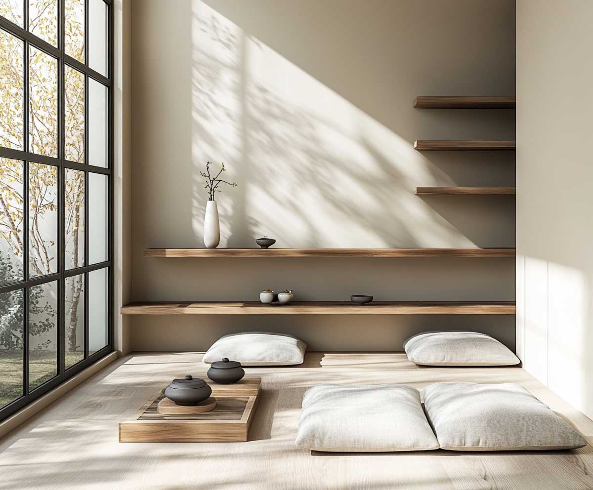
Japandi interiors merge the calm elegance of Japanese minimalism with the warm functionality of Scandinavian design. The result is a home atmosphere where peace, order, and simplicity reign. One of the most defining elements of this style is the thoughtful use of a soothing colour for room wall that fosters tranquility without dullness. Carefully selected hues support natural materials, soft textures, and an uncluttered flow of space. Below, we explore tones that embody this cross-cultural harmony—each option offering balance, subtle beauty, and understated strength in a modern home.
Muted Clay Colour for Room Wall with Light Wood Accents
Muted clay tones offer an earthy, gentle richness ideal for Japandi spaces. As a colour for room wall, this shade rests somewhere between terracotta and soft blush, carrying the warmth of raw materials without overpowering the serenity of the room. When combined with light wood accents—like bleached oak or ash—the result is a beautifully grounded palette that soothes the eye and quiets the mind.

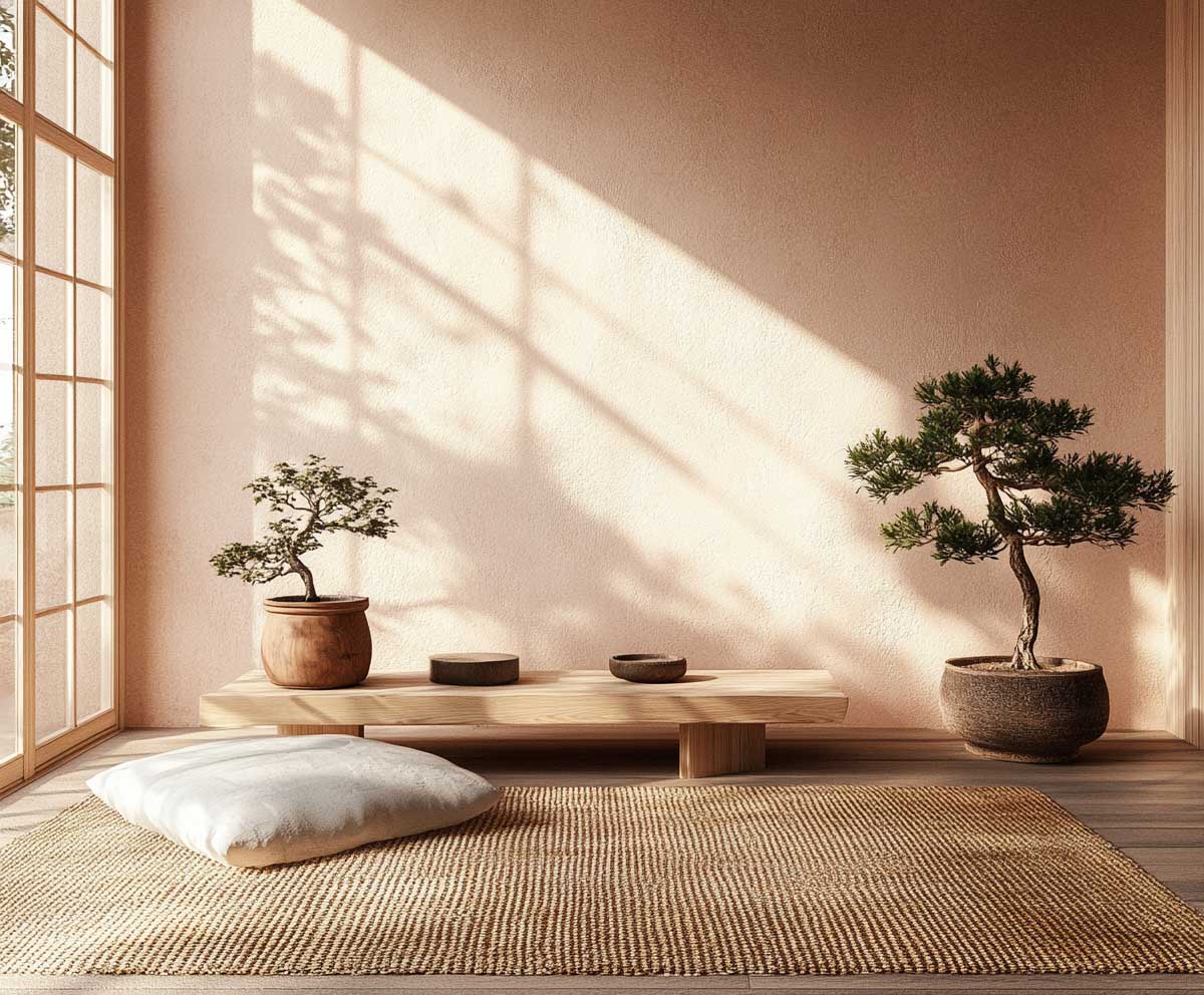

This hue pairs exceptionally well with the soft grains and textures of Scandinavian furnishings. It enhances the natural finishes often found in Japandi design—wood slats, handmade ceramics, linen throws, and paper lanterns. The clay color also recalls the natural pigments used in Japanese wabi-sabi aesthetics, where imperfection is embraced and simplicity is celebrated.
Lighting transforms this colour for room wall throughout the day. Morning sunlight brings out a peachy glow, while late afternoon shadows pull the color into a rosier warmth. At night, under warm white bulbs or candlelight, it becomes intimate and hushed. These subtle shifts invite mindfulness, making the room a perfect place for reflection or quiet conversation.
In practical terms, muted clay creates cohesion. Whether it’s the backdrop for a wooden bench, a handwoven rug, or a single wall shelf with a tea bowl and sprig of dried flowers, the color unifies. It’s not loud, but it has presence. It allows both Japanese and Scandinavian elements to breathe and shine without clashing.
Selecting this shade as a colour for room wall in Japandi interiors speaks to intentionality. It’s about crafting an experience, not just a look. Muted clay invites people into a space that feels tender and timeless. It’s contemporary yet ancient, minimal yet emotionally rich.
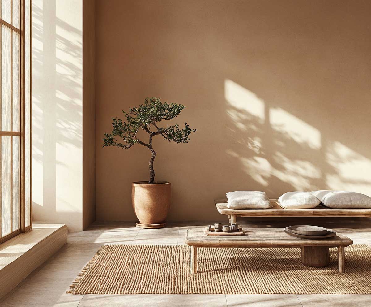
Soft Greige Colour for Room Wall in a Calm Sitting Area
Greige—where gray and beige meet in perfect stillness—is a subtle powerhouse in Japandi design. This calming colour for room wall supports the minimalist philosophy of “just enough,” offering a quiet background that enhances every intentional choice in the room. In a sitting area designed for peace and presence, greige plays a crucial role in setting the tone.


The magic of greige lies in its adaptability. It shifts gently depending on the light—appearing cooler when paired with gray-toned textiles or warmer alongside natural wood. In a Japandi context, it allows both clean Scandinavian lines and traditional Japanese motifs to feel at home together. Linen cushions in bone white or pale taupe pop softly against the walls, and open wood shelving becomes more sculptural in contrast.
This particular colour for room wall encourages visual and mental rest. It doesn’t demand attention, which is precisely the point. It lets everything else breathe. A ceramic tea set, a low floor cushion, a minimal paper lantern—each detail finds its own quiet place in the room. Greige offers emotional space, making the sitting area a retreat from the overstimulating world.
Another strength of this shade is its compatibility with layering. Add a rough-hewn bench in natural pine, a throw blanket in muted olive, or even a black stoneware planter, and the harmony remains. There’s no clash, only balance. It suits both modern and heritage pieces—everything feels curated but not curated to death.
As a colour for room wall, soft greige is timeless. It will not fall out of trend because it doesn’t chase trends. It exists to support, to soothe, and to quietly elevate. It embodies what Japandi design aims for—humility, grace, and warmth within restraint.
Fog Blue Colour for Room Wall Framing a Tatami Platform
Fog blue is like a morning mist—calm, cool, and endlessly elegant. In a Japandi-style room with a raised tatami platform, this soothing colour for room wall becomes more than decoration—it becomes atmosphere. It evokes stillness, grounding the space while offering a gentle contrast to the natural fibers and woods typical in such interiors.
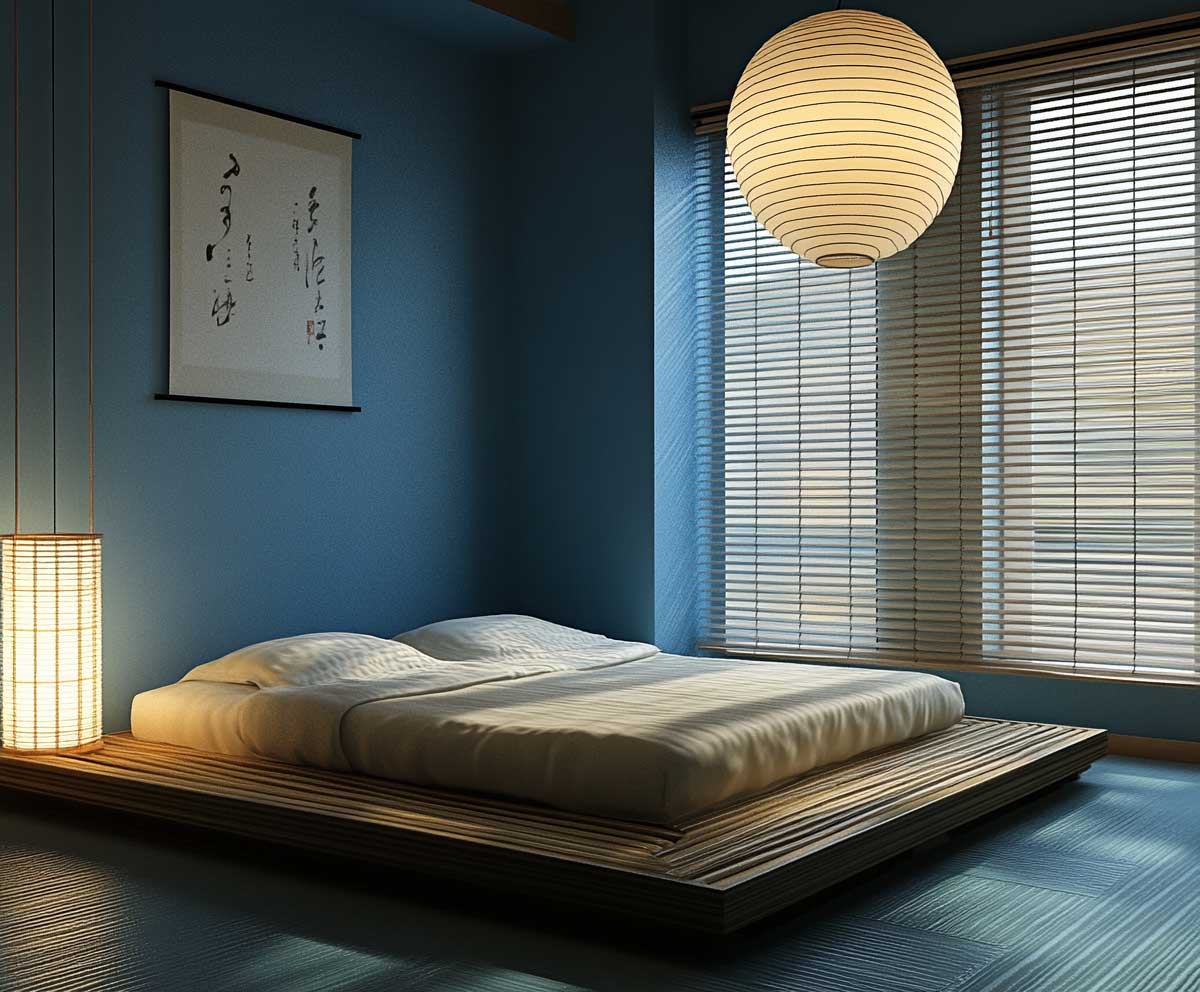

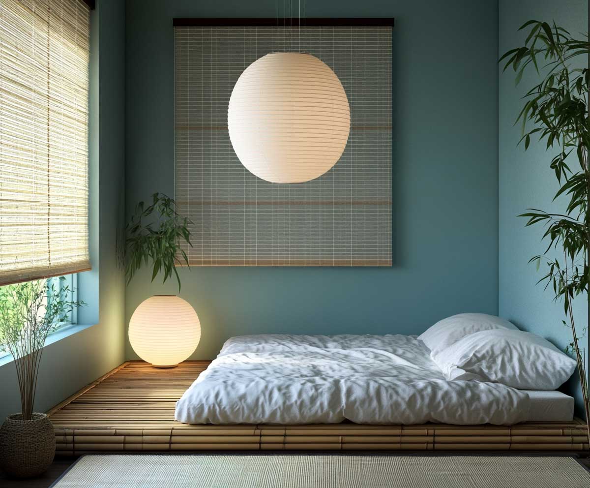

This muted blue pairs beautifully with traditional elements like tatami mats, rice paper lanterns, and bamboo accents. Against this backdrop, even minimal bedding or a plain shoji screen becomes a point of interest. The color lends itself to the meditative quiet central to Japanese interiors, while also playing nicely with Scandinavian clarity and light.
Fog blue reads differently in various light. During the day, it reflects soft daylight, giving the room a refreshing openness. In the evening, especially with indirect or candle-like lighting, it gains a moody serenity—perfect for winding down or engaging in quiet tasks like journaling or yoga. The effect is one of coolness, but never coldness.
This colour for room wall works as a frame for rituals. It marks the sleeping space, or tea-drinking space, or reading nook, without building physical walls. In Japandi homes that emphasize flow and openness, this kind of visual cueing is invaluable. It defines space subtly, not rigidly.
Furniture in pale woods, linens in cream or slate, and occasional touches of black or brass all sing against this hue. Fog blue supports minimal styling while allowing layers of texture. And because it’s so calming, it doesn’t tire the eye or dominate a room, even if used across all four walls.
Choosing this as your colour for room wall speaks to a desire for composure and softness. It’s the kind of tone that suggests still waters and open skies. It reflects Japandi’s belief that home should be a place of grounded beauty—never loud, always light.


Related Topics