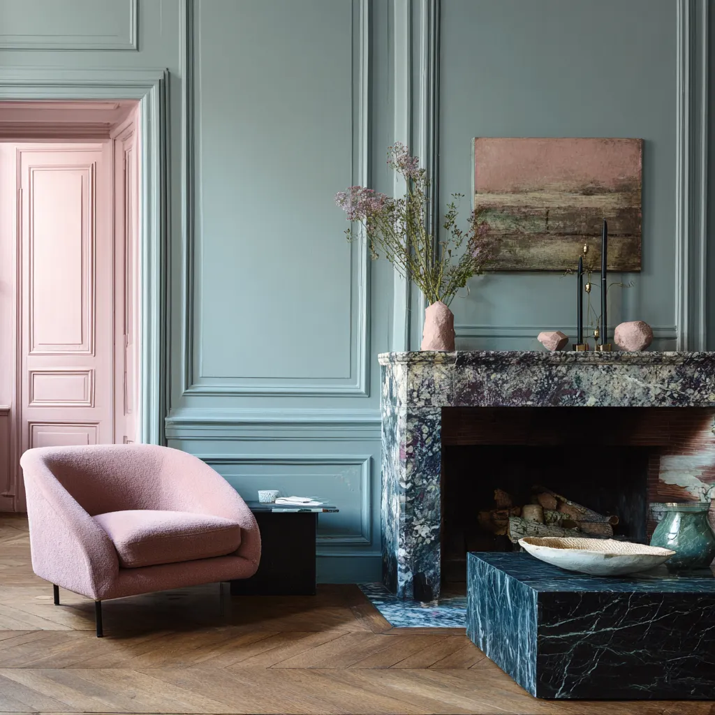
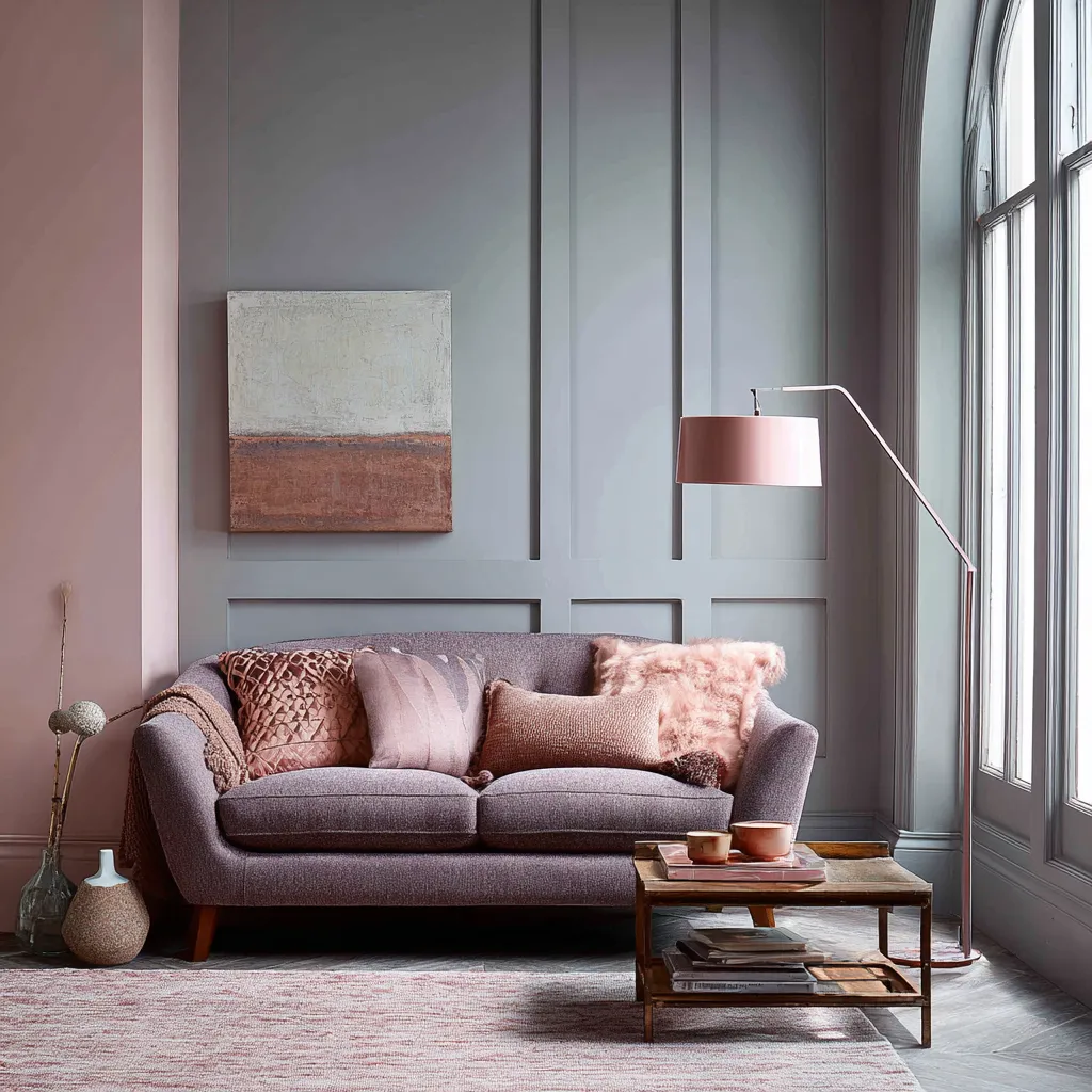
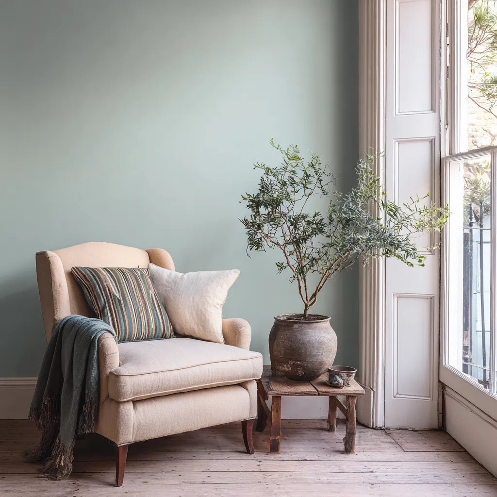
The world of interior design is currently experiencing a profound shift in how color is utilized to shape the atmosphere of our living spaces. For years, the industry was dominated by the crisp, sometimes clinical look of pure white walls, followed closely by an era of deeply saturated jewel tones that demanded attention. Today, homeowners and designers alike are seeking a middle ground that offers both character and tranquility. This search has led to a massive resurgence in the popularity of colors that feel grounded, nuanced, and effortlessly elegant. These softer, desaturated hues bring a sense of calm and maturity to a home, providing a subtle backdrop that enhances rather than overpowers a room. By stepping away from the starkness of bright whites and the intensity of primary shades, interior spaces are transformed into inviting, warm environments that feel both modern and timelessly appealing.
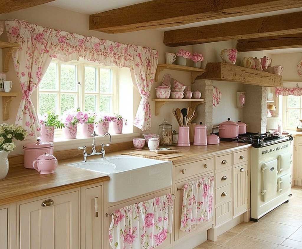
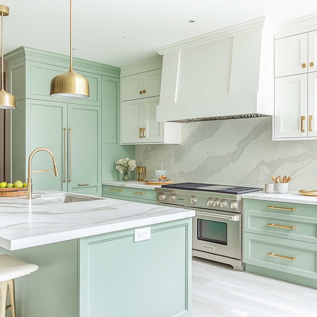
Elevating Culinary Spaces With Muted Pastel Kitchen Cabinets
The kitchen has long been considered the functional heart of the home, but its role has evolved dramatically over the past few decades. No longer just a utilitarian space meant strictly for food preparation, the modern kitchen is a central hub for entertaining, family gatherings, and daily living. Because we spend so much of our lives in this space, the visual environment profoundly impacts our daily mood and energy levels. While stark white kitchens have been the standard for projecting cleanliness and efficiency, they can often feel cold, sterile, and entirely devoid of personality. Moving toward softer, desaturated hues introduces a layer of warmth and character that completely redefines the culinary experience. Utilizing dusty pastels in the kitchen creates an environment that is both welcoming and remarkably chic, proving that functional spaces can still possess immense visual depth.
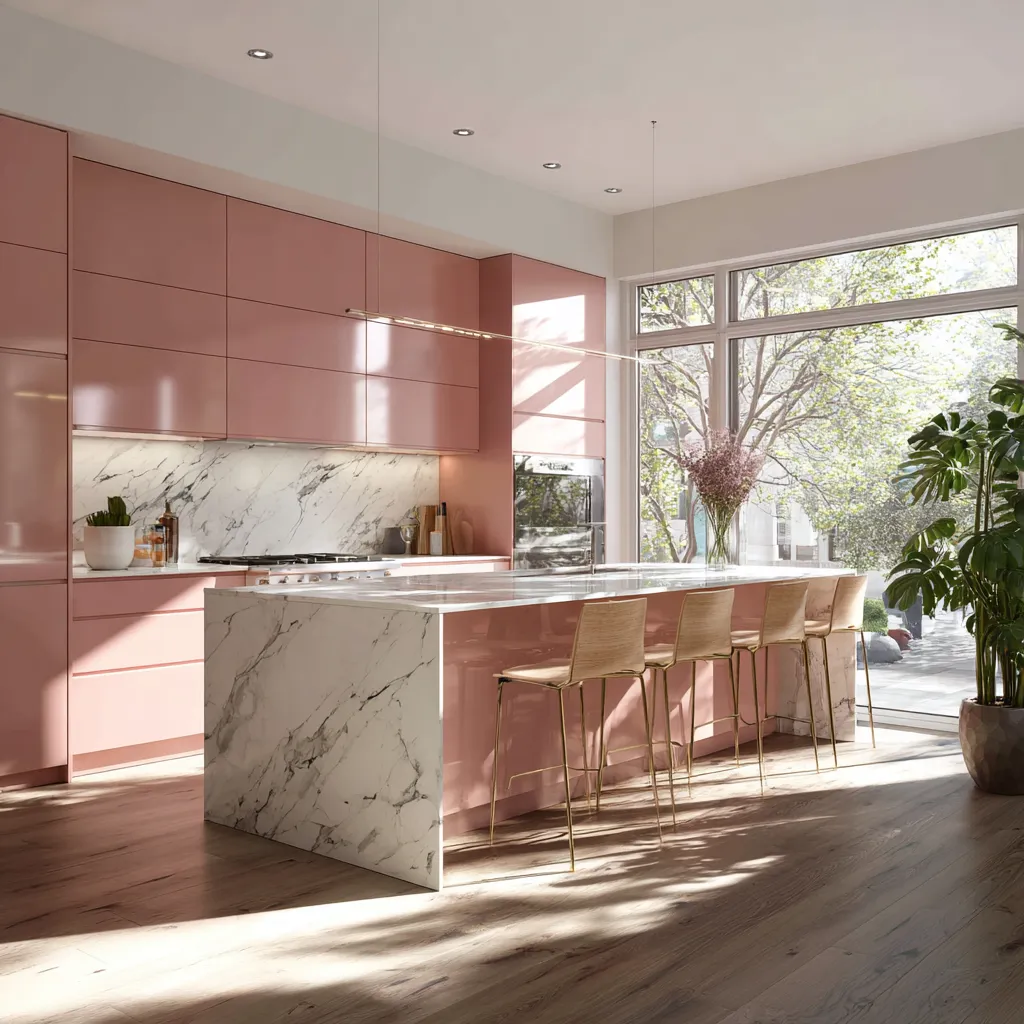
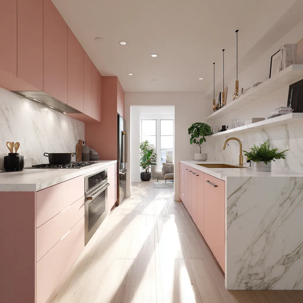
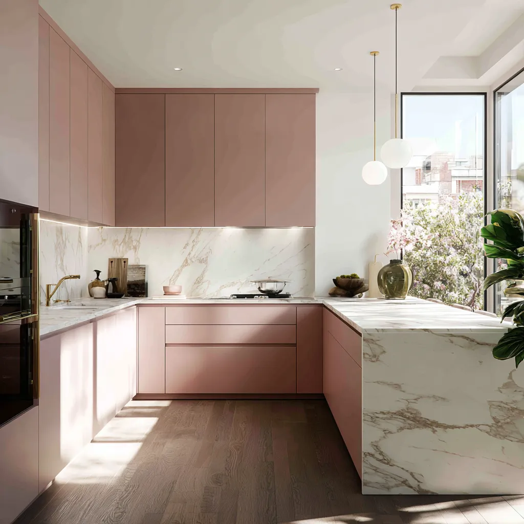
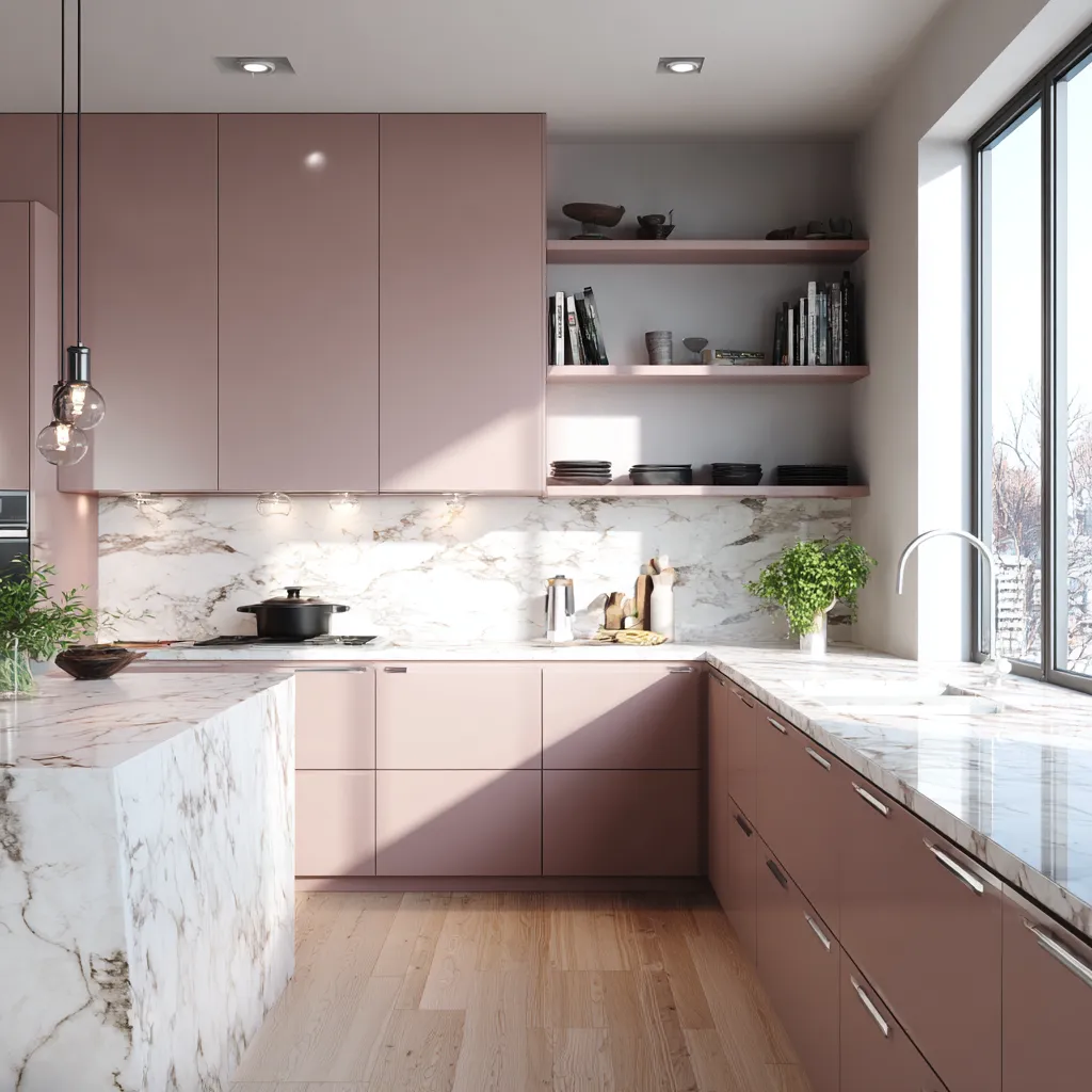
When designing a kitchen, the cabinetry often dictates the entire aesthetic direction of the room due to the sheer amount of visual real estate it occupies. Opting for dusty pastels on lower cabinets or a central island immediately establishes a grounded, earthy feel. A desaturated sage green or a muted terracotta acts as an incredible anchor for the room, drawing the eye without overwhelming the senses. This approach is a highly sophisticated paint choice because it bridges the gap between a neutral and a bold color. These shades possess enough pigmentation to add undeniable interest and personality to the room, yet their muted nature ensures they remain versatile and adaptable to various design styles, from rustic farmhouse to ultra-modern minimalism.
The interplay of lighting in a kitchen is incredibly complex, and dusty pastels respond to these lighting changes beautifully. During the morning hours, natural sunlight floods the space, interacting with these soft hues to create a vibrant, energizing atmosphere perfect for starting the day. As the sun sets and artificial lighting takes over, these same colors deepen and enrich, cultivating an intimate, cozy environment ideal for evening meals and relaxed conversations. Unlike pure whites that can look stark or shadowed under artificial bulbs, or dark colors that absorb too much light, muted pastel shades reflect light softly. This dynamic quality makes them an exceptionally sophisticated paint choice for a room that experiences such a wide variance in lighting conditions throughout the day.
Furthermore, integrating dusty pastels into your kitchen opens up a world of possibilities for hardware and material pairings. These colors serve as the perfect foundational canvas for highlighting luxurious textures and finishes. Imagine the striking contrast of polished marble countertops set against muted lavender lower cabinets, or the warmth of natural oak floating shelves complementing a soft, earthy plaster pink wall. Metallic finishes, in particular, shine beautifully against these backdrops. Unlacquered brass hardware takes on a rich, vintage elegance when paired with desaturated greens, while matte black fixtures create a sharp, contemporary edge against soft, chalky blues. The versatility of dusty pastels allows them to elevate the surrounding materials, making the entire kitchen feel more curated and expensive.
Beyond the immediate visual appeal, there is a strong psychological component to utilizing these specific hues in a culinary environment. Cooking can often be a stressful endeavor, especially when managing multiple tasks or preparing for a large gathering. Immersing oneself in a room painted in calming, nature-inspired tones can actively reduce stress and promote a sense of well-being. Dusty pastels evoke feelings of serenity and balance, transforming the kitchen from a place of frantic activity into a peaceful retreat. This emotional resonance is what truly elevates these colors beyond passing trends, cementing them as a fundamentally sophisticated paint choice for those who value both form and function in their home.
Ultimately, the decision to incorporate these soft, grounded colors into your kitchen architecture reflects a mature understanding of interior design. It moves away from the need to make loud, aggressive statements and instead focuses on creating a space that feels lived-in, loved, and deeply personal. By embracing the subtle charm of dusty pastels, homeowners can craft kitchens that are not only highly functional but also visually stunning works of art that will stand the test of time, proving that true elegance often whispers rather than shouts.
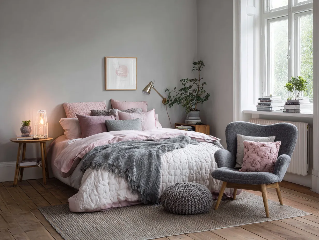
Designing Calm Nurseries Using Dusty Pastel Wall Colors
Designing a space for a child involves a delicate balancing act between stimulating their developing minds and providing a tranquil environment conducive to rest. Historically, children’s rooms and nurseries were often painted in highly saturated, primary colors—bright reds, intense yellows, and vibrant blues. While these colors are certainly playful, they can also be incredibly overstimulating, making it difficult for a child to wind down at the end of the day. A modern approach to nursery design recognizes the profound impact of color psychology on a child’s behavior and sleep patterns. Shifting away from aggressive brights and leaning heavily into the gentle embrace of dusty pastels creates a sanctuary that supports both imaginative play and peaceful slumber.
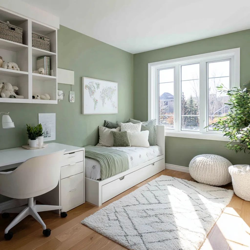
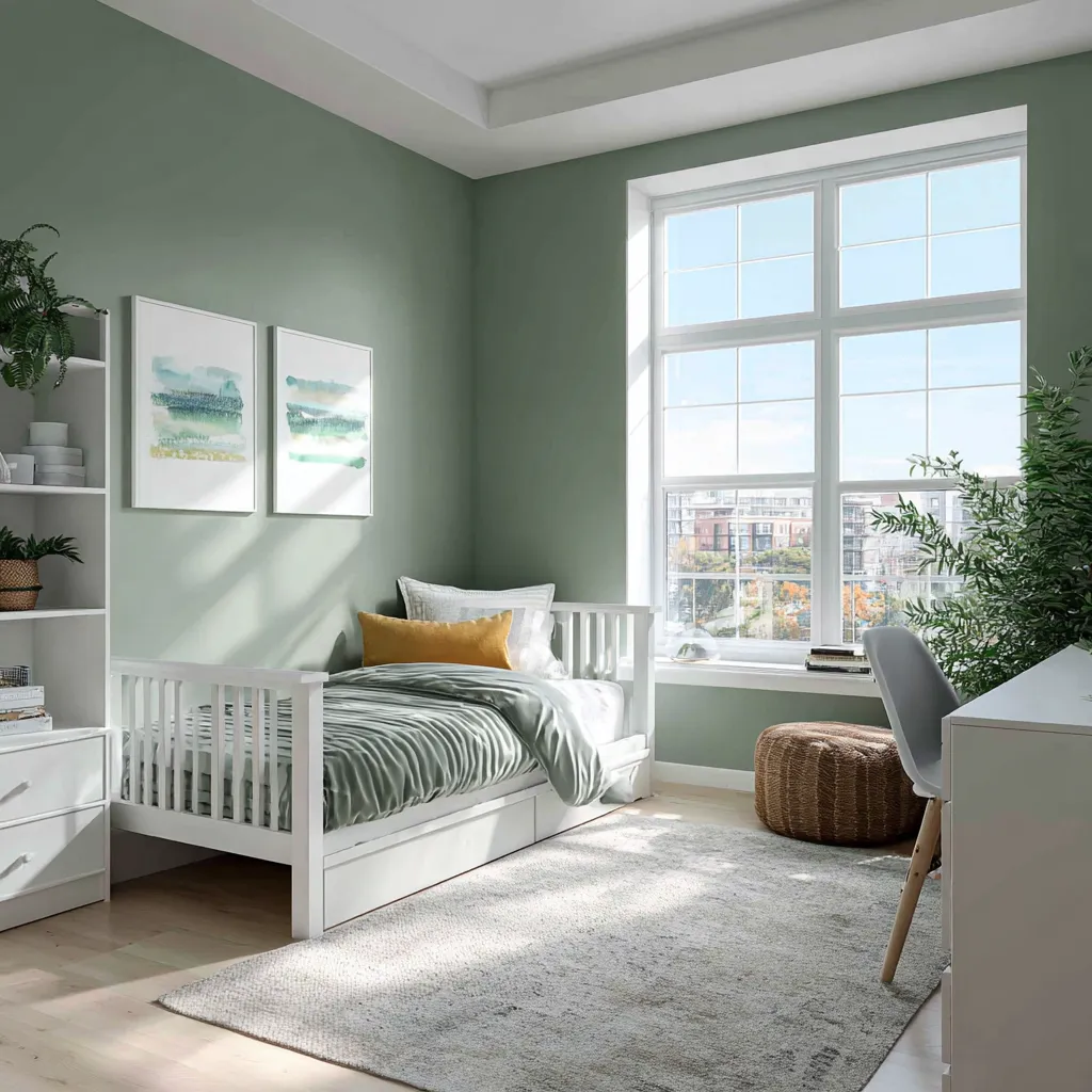
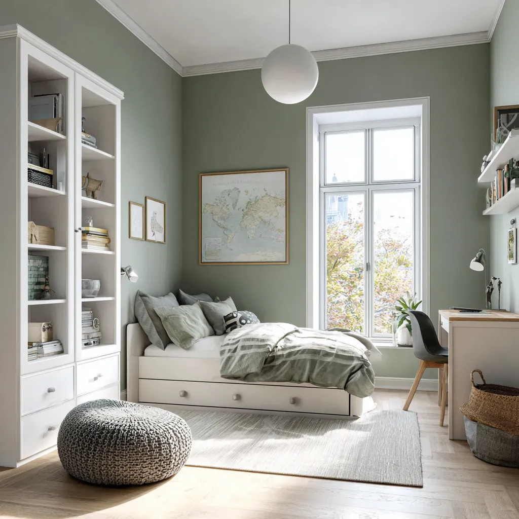
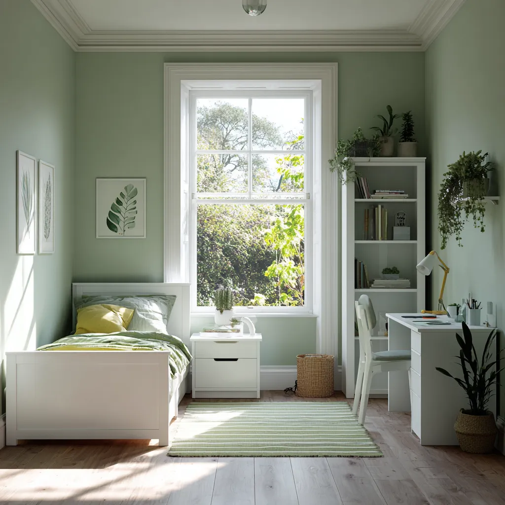
The primary advantage of using these muted tones in a child’s room is their inherent longevity. Children grow and change at an astonishing rate, and their tastes evolve just as quickly. A room painted in a glaringly bright cartoon theme will quickly feel outdated and juvenile as the child enters their toddler and school-aged years. Conversely, dusty pastels offer a highly sophisticated paint choice that grows effortlessly alongside the child. A soft, desaturated mint green or a gentle, earthy ochre provides a foundational palette that works just as well for a newborn’s nursery as it does for a teenager’s study space. This adaptability saves homeowners the time, effort, and expense of constantly repainting the room to keep up with their child’s changing developmental stages.
When we examine the visual landscape of a typical child’s room, it is almost always filled with a chaotic array of brightly colored plastic toys, multi-colored books, and patterned textiles. If the walls are also painted in loud, demanding colors, the entire room can quickly devolve into visual noise. Dusty pastels act as the perfect neutralizing backdrop. They possess enough warmth and character to prevent the room from feeling like a sterile hospital ward, yet they are subdued enough to let the child’s toys and artwork take center stage. By utilizing these soft hues, you create a cohesive, harmonious environment where the inevitable clutter of childhood does not feel overwhelming. This is why many top interior designers consider these tones to be the most sophisticated paint choice for family-centric homes.
Creating distinct zones within a child’s bedroom is crucial for their routine, and color plays a vital role in this spatial organization. A room needs to seamlessly transition from a vibrant play area during the day to a calming sleep environment at night. Dusty pastels handle this transition beautifully. During daylight hours, these colors feel fresh, airy, and inspiring, providing a cheerful setting for building blocks and reading stories. However, when the curtains are drawn and the nightlight is turned on, these same shades recede into the background, absorbing the dim light and creating a cozy, womb-like atmosphere that encourages deep, restorative sleep. The ability of these colors to regulate the emotional temperature of the room makes them an invaluable tool for parents.
Furnishing a room painted in these soft, desaturated shades is an incredibly rewarding design process. Because the walls act as a gentle, grounded neutral, you have the freedom to experiment with a wide variety of furniture styles and materials. Natural wood tones, from pale birch to deep walnut, look exceptionally beautiful against muted backdrops, bringing an organic, earthy element into the space. Crisp white cribs and dressers pop brilliantly against dusty pastels, creating a high-contrast look that feels modern and clean. Furthermore, textiles such as linen curtains, wool rugs, and cotton bedding in complementary soft shades add layers of comforting texture, transforming the room into a tactile wonderland for a growing child.
In essence, choosing to envelop your child’s space in these gentle hues is a testament to mindful parenting and thoughtful design. It is a deliberate choice to prioritize the child’s well-being and emotional regulation over fleeting design gimmicks. By embracing dusty pastels, you are not just painting a room; you are crafting an environment that nurtures calm, fosters creativity, and provides a stable, beautiful backdrop for the precious, fleeting years of childhood. It remains a sophisticated paint choice that honors both the child’s need for a peaceful retreat and the home’s overall aesthetic integrity.
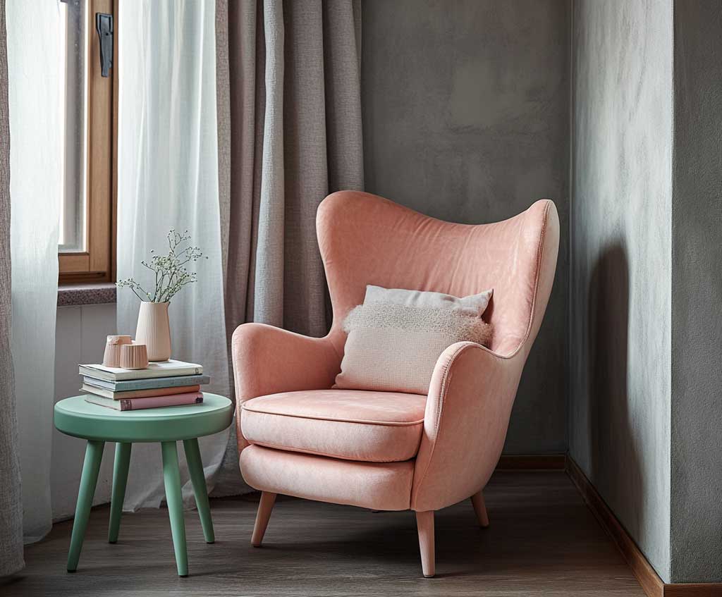
Creating Spa Retreats With Earthy Pastel Bathroom Tiles And Paint
The concept of the residential bathroom has transcended its purely functional origins to become one of the most important personal retreats within the home. In our fast-paced, constantly connected world, the bathroom often represents the only true sanctuary—a private space dedicated entirely to self-care, relaxation, and rejuvenation. To cultivate this spa-like atmosphere, the selection of wall color is absolutely paramount. For decades, the default design instinct was to utilize stark, clinical whites to project a sense of ultimate cleanliness and hygiene. However, this approach frequently results in spaces that feel cold, echoing, and entirely unwelcoming. To truly transform a standard washroom into a luxurious home spa, incorporating dusty pastels on the walls and surfaces is an incredibly effective and highly sophisticated paint choice.
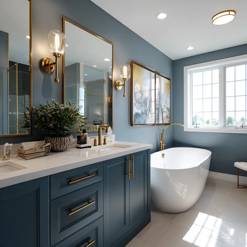
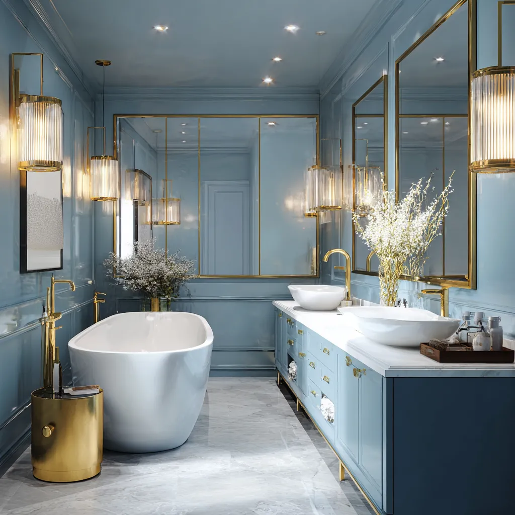
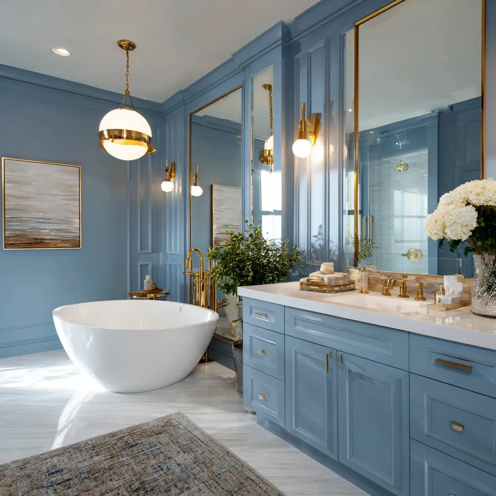
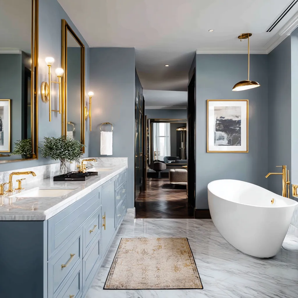
One of the most compelling reasons to utilize dusty pastels in a bathroom setting is their remarkably flattering effect on human skin tones. Bathrooms are where we begin and end our days, often standing in front of a large mirror to perform our grooming routines. Harsh whites and overly saturated cool colors can cast unflattering shadows and give the skin a washed-out, pallid appearance, starting the day off on a negative note. In stark contrast, wrapping a room in warm, muted tones like a soft terracotta, a desaturated blush, or a warm, dusty taupe reflects a beautiful, healthy glow onto the skin. This subtle color interaction instantly boosts confidence and makes the daily routine feel like a more luxurious, pampering experience.
Bathrooms are fundamentally filled with hard, cold surfaces—porcelain toilets, glass shower enclosures, ceramic tiles, and stone countertops. If the walls are also painted in a cold or stark shade, the entire room can feel incredibly harsh and uninviting. Dusty pastels act as the perfect visual counterbalance to these rigid materials. The softness and slight muddiness of these hues introduce a crucial element of visual warmth and softness that physical textiles alone cannot achieve. When you pair a crisp, modern, freestanding white bathtub with a wall painted in a gentle, dusty blue, the color softens the sharp lines of the tub, making the entire vignette feel more organic, relaxing, and grounded. This strategic balancing of hard surfaces with soft color is a hallmark of high-end design and a truly sophisticated paint choice.
Furthermore, these grounded colors interact magnificently with the various metallic finishes that are prevalent in bathroom design. The hardware you choose—from the sink faucets to the showerheads and cabinet pulls—serves as the jewelry of the room. Dusty pastels provide an exquisite, understated backdrop that allows these metals to truly shine without creating a jarring contrast. Polished nickel and chrome take on a softer, more refined elegance against muted pinks and warm greys. Conversely, brushed brass and unlacquered gold fixtures look incredibly rich and opulent when set against deep, dusty sage greens or muted navy hues. The color allows the hardware to stand out as deliberate design statements rather than functional afterthoughts.
Handling lighting and space constraints in a bathroom can often be challenging, particularly in smaller footprints or windowless powder rooms. While the old rule of thumb was to paint small spaces bright white to make them feel larger, this often just highlights the lack of natural light, resulting in a dingy, boxy feeling. Embracing dusty pastels in these challenging spaces is a deeply sophisticated paint choice. Instead of fighting the lack of light, these rich, muted tones absorb shadows gracefully, blurring the corners of the room and creating an enveloping, jewel-box effect. The depth inherent in these colors makes the walls recede, adding a profound sense of atmosphere and intimacy that pure white could never accomplish.
By deliberately selecting these complex, earth-toned hues for your bathing spaces, you are prioritizing your own sensory experience and mental well-being. It is about creating an environment that actively lowers your heart rate the moment you step across the threshold. Dusty pastels elevate the daily rituals of bathing and grooming from mundane chores into moments of genuine indulgence. Through thoughtful color application, the bathroom ceases to be merely a utilitarian necessity and blossoms into a deeply personal, restorative sanctuary right inside your own home.
Bringing It All Together
The movement toward softer, more grounded interior palettes is far more than a fleeting design fad; it represents a fundamental shift in how we want our homes to feel. By stepping away from the extremes of clinical starkness and overwhelming saturation, we open the door to spaces that are deeply calming, highly versatile, and effortlessly elegant. These nuanced shades possess the unique ability to adapt to any room, whether providing a durable, inviting backdrop for culinary creativity, fostering a peaceful environment for children to grow, or transforming a standard washroom into a luxurious personal retreat. Embracing these earthy, muted tones allows you to craft a home that is not only visually stunning but also emotionally supportive, proving that the most powerful design choices are often the most subtle ones.
Related Topics