The sky blue and yellow combination wall paint question comes up constantly — and for good reason. These two colors create one of the few truly cheerful palettes that holds up across different light conditions, room sizes, and times of day. Used well, sky blue brings the visual calm of open air indoors, while sunshine yellow charges the space with just enough warmth to stop the room from feeling clinical.
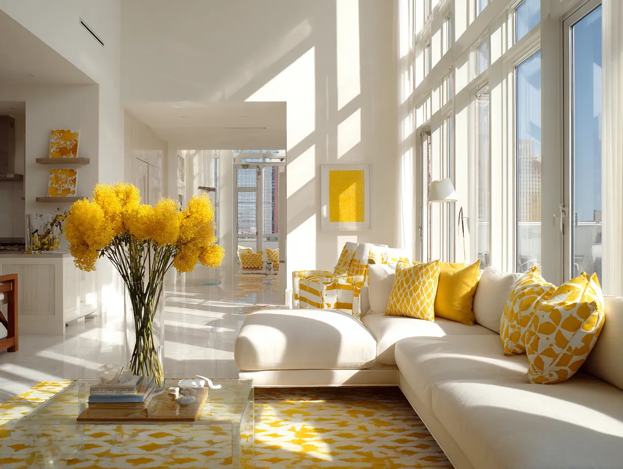
What most rooms get wrong is proportion. Yellow overpowering sky blue turns a room into a sunflower. Sky blue dominating without any warm counterpoint reads cold by 7 PM. The combination works when blue claims the walls and yellow earns its place through trim, furniture, or a single accent piece — not both at equal volume.
Interior paint in this palette typically runs $60–$90 per gallon for standard lines and covers 350–400 square feet per coat, which means a 12×14 room needs roughly two gallons for two coats. Skimping on quality here is a real mistake — sky blue shades are notoriously sensitive to coverage issues, and a thin application shows lap marks under natural light.
- Sky blue and yellow in a craft room: how to split color duties so the space stays energizing, not chaotic
- Hallway application: which wall gets which color, and why alternating works better than a single accent
- Reading nook setup: why sky blue walls with a yellow accent chair outperforms the reverse
- Specific paint references from Benjamin Moore and Sherwin-Williams, with price context
- One comparison table with the key differences across all three room types
- Common mistakes that flatten the palette before the furniture even arrives
Sky Blue and Yellow Combination Wall Paint in a Craft Room
A craft room running on the sky blue and yellow combination wall paint formula needs the blue on the dominant walls and yellow kept as a support color — not a co-star. Sky blue at full coverage, like Benjamin Moore Morning Sky Blue 2053-70, gives the room a light-reflective backdrop that keeps energy consistent without turning the workspace into a fairground. Yellow trim, shelf edges, or a single painted door reads as an accent rather than a shout.


Position the main work surface near the window. Sky blue reflects light cleanly, and in a room with a north-facing window the Morning Sky Blue 2053-70 reads crisp rather than cold — which is exactly what you want when you’re mixing colors or working with materials where color accuracy matters. A white or light-wood table in the center keeps the eye from competing with the walls. One crafting mistake stylists point out consistently: painting both storage bins and an accent wall yellow in the same room. The result is visual noise rather than contrast. Pick one application for yellow and commit.
For the ceiling, keep it white. Painting the ceiling sky blue in a craft room compresses the space and makes the color feel like a container you’re working inside of, not an open backdrop. Standard interior paint in this palette covers about 350 sq ft per gallon — plan on two gallons of sky blue and one quart of yellow for a 10×12 room with two coats. Interior paint in low-traffic spaces like craft rooms typically lasts 7–10 years before showing real wear. Invest in a quality line: Sherwin-Williams premium finishes run $90–$120 per gallon but deliver consistent hide on lighter blues in a single solid coat.
What brings a craft room to life faster than any extra coat of paint? A pinboard mounted on the wall in the sky blue zone, surrounded by yellow pushpins. Color-coordinated storage that you actually use daily — not decorative bins that look good on Instagram and hold nothing practical. Is this palette going to work in an interior-facing room without windows? Not at the same intensity. Sky blue washes out under fluorescent light; it needs daylight or warm-temperature LEDs at 2700–3000K to stay vivid.
Don’t paint both an accent wall and all your storage furniture yellow in the same room. The trick with sky blue and yellow is contrast — when yellow appears on every surface, the tension between the two colors disappears and the room just looks busy. Reserve yellow for one application per space: either the trim, or one piece of furniture, or a single accent wall. Not all three.
Don’t use a primary-tone, saturated yellow. Sunshine yellow that reads bright on a swatch looks aggressive at full-wall or even half-wall scale in any room under 150 sq ft. Look for muted, warm yellows with a slight amber base — they age better and hold the palette together without dominating.
What Yellow and Sky Blue Combination Walls Do to a Narrow Hallway
Yellow and sky blue combination walls work differently in a hallway than anywhere else in the house — because a hallway has no furniture to anchor the palette, the paint has to carry everything. The approach that consistently reads better than a single-color hallway: alternating walls, with sky blue on the longer runs and sunshine yellow on the short end walls. Think of it like a gallery corridor where the color rhythm guides you through rather than pinning you in place.
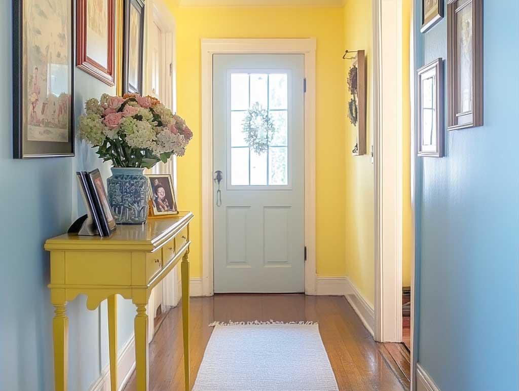

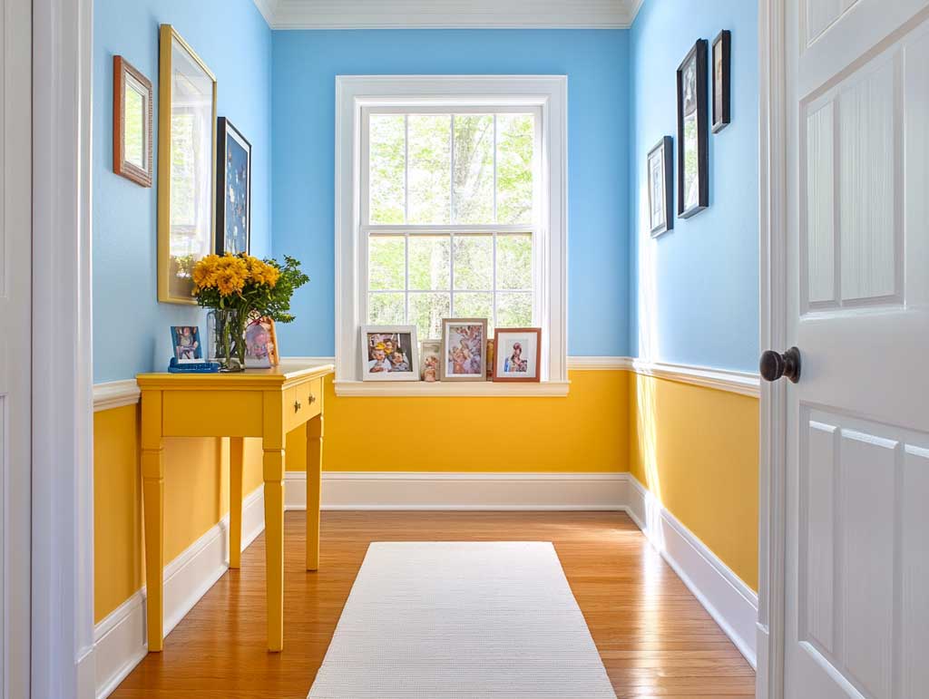

A white runner rug down the center is the single fastest way to ground this palette. Without it, the floor becomes a third competing element and the hallway reads as claustrophobic regardless of how good the paint is. Hallways see the most wear of any space in the house — professional painters recommend repainting corridor walls every 2–4 years, compared to 5–7 years for living rooms. That means the finish quality matters as much as the color: a washable eggshell or satin holds scuffs better than flat and is worth the extra cost at around $60–$90 per gallon for a standard Sherwin-Williams interior line. For a typical 4-foot-wide by 12-foot-long hallway, one gallon of sky blue covers all two long walls at two coats.
Functional pieces do the heavy lifting in a hallway because there’s nothing else. A yellow console table positioned against the end wall creates a visual landing spot and pulls the yellow off the paint and into three-dimensional space. Pair it with a blue ceramic vase or a small framed print that contains both colors. Can artwork make sky blue hallway walls feel cohesive? Yes — but only if the pieces contain at least one of the two palette colors. Completely unrelated artwork on a sky blue wall reads like a collision. What you want is a corridor that feels intentionally designed, not decorated by accident.
Lighting in hallways is where the palette lives or dies after dark. Warm-temperature LED fixtures at 2700K keep sky blue from shifting purple and yellow from turning greenish. Overhead fixtures with a soft downlight pattern maintain the vibrancy of both colors after sunset. Avoid cool-daylight bulbs in this palette — they flatten the sunshine yellow into something that reads institutional rather than inviting. For more on taking this palette into bedroom spaces, blue and yellow bedroom furnishing ideas covers how the same color combination translates across different furniture configurations.
Reading Nook Colors That Use Sky Blue Without Making It Gloomy
Sky blue walls in a reading nook work because they do the opposite of what most people expect from a bold wall color — rather than closing the space down, a well-chosen sky blue opens it up visually, like a window you can sit inside of. The reading nook becomes a room within a room, and the color boundary itself signals transition from the rest of the space into somewhere deliberate and quiet.
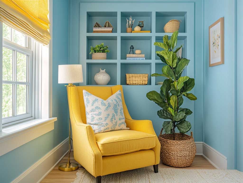


Place the nook adjacent to a window, not directly facing one. Direct sunlight on sky blue walls at midday can bleach the color visually and make the space feel overexposed. Natural side-light, coming in at an angle, is what keeps the blue dimensional. A sunshine yellow armchair becomes the color anchor here — not decoration, but the focal point that holds the palette together when you’re not sitting in it. Stylists consistently recommend the warm yellow against sky blue approach rather than the reverse, because yellow draws the eye to where you want it: the reading seat. Built-in shelves painted in the same yellow reinforce this without adding a separate element to the composition.
How do you keep a sky blue and yellow nook from reading as a child’s bedroom? Material selection. Linen throw blankets, matte ceramic planters, and books with varied spine colors shift the palette into adult territory. Avoid glossy yellow — satin at most on furniture, matte on walls. Benjamin Moore Morning Sky Blue 2053-70 has an LRV (light reflectance value) of 78, which means it stays genuinely light even in lower-light corners. That LRV is what makes it a better reading nook choice than deeper sky blues that hit the LRV range of 50–60 and start feeling heavier as the afternoon fades. A side table in a natural finish — oak or rattan — sits between the two palette colors without committing to either.
For evening reading, a warm-white floor lamp aimed upward, not directly at the page, flatters both colors. A reading lamp that aims at the page only illuminates the book and leaves the walls in shadow — which makes the nook feel smaller and less inviting past 8 PM. Interior paint in a low-traffic nook lasts toward the upper end of the 5–10 year range; this is one space where one full gallon of a premium paint line at $90–$120 is genuinely worth it because the color fidelity over time is better. If you want to carry this color palette into other spaces in the house, paint colours for modern living rooms covers the full range of what works across different room orientations and furniture styles.
| Room Type | Blue Application | Yellow Application | Key Risk |
|---|---|---|---|
| Craft Room | All four walls at full coverage | Trim, door, or shelf edges only | Too much yellow → visual noise |
| Hallway | Long walls (both sides) | End wall or console table only | No floor anchor → feels chaotic |
| Reading Nook | All nook walls as backdrop | One accent chair or shelf unit | Wrong LRV blue → gloomy after 5 PM |
Benjamin Moore’s Morning Sky Blue 2053-70 is a reliable starting point for any of these applications — its LRV of 78 keeps the color light without washing out, and it pairs cleanly with warm yellow tones without shifting green under evening light.
The Bottom Line
Sky blue backgrounds last. Sunshine yellow accents carry the energy. Use both at the same volume and neither survives.
Sky blue at LRV 78 stays light and clean across all three room types covered here — craft room, hallway, and reading nook. One gallon covers 350–400 sq ft per coat; budget two gallons for a standard room with two coats.
Yellow earns its place as a single application per room: one piece of furniture, one end wall, or one shelf. Not multiple surfaces at once.
Interior paint in low-traffic spaces lasts 7–10 years when applied correctly. Hallways need refreshing every 2–4 years regardless of palette. Save this post when you’re ready to buy samples.