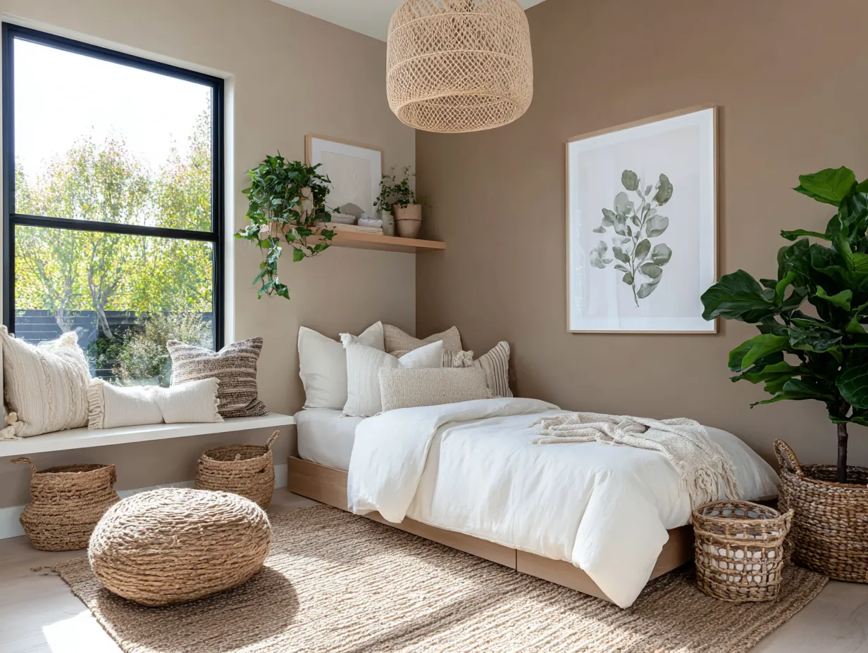
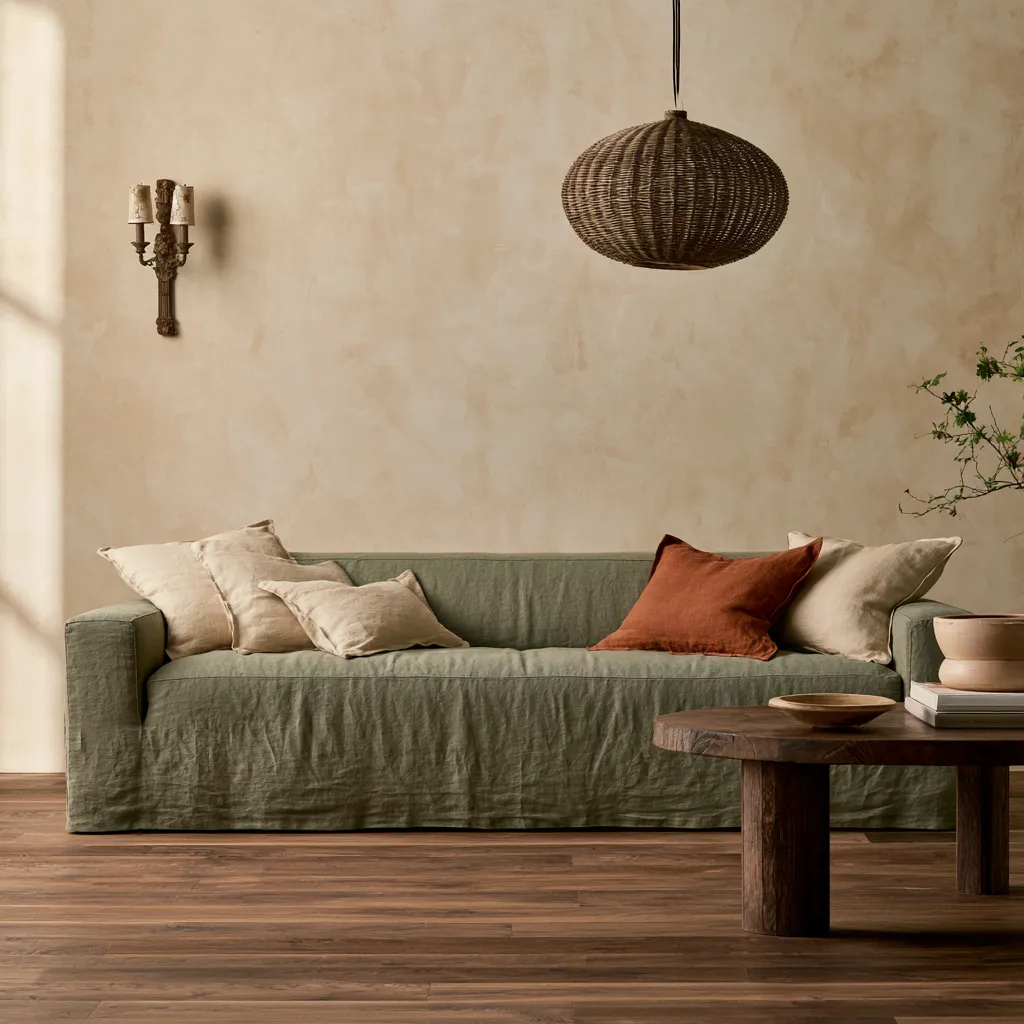
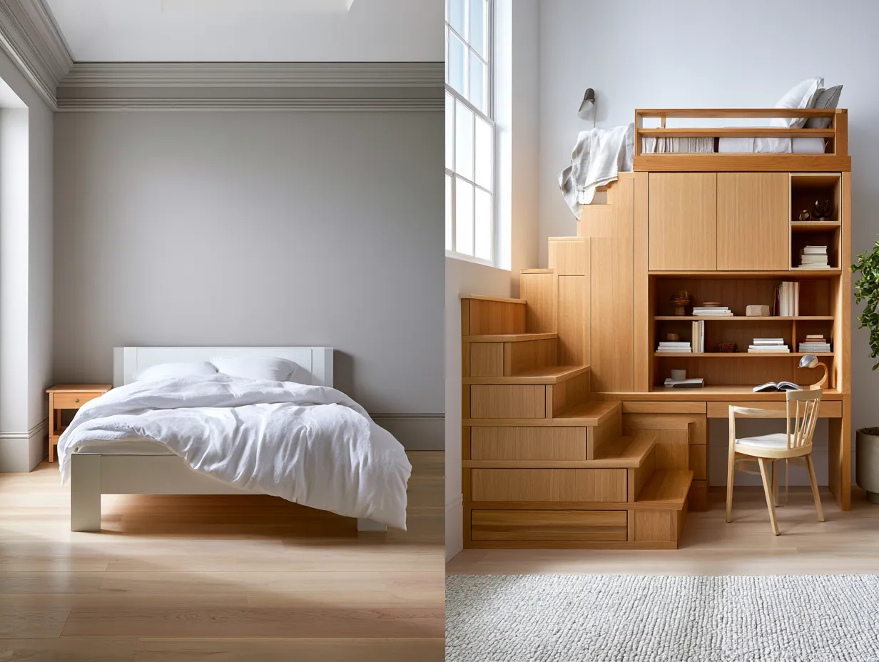
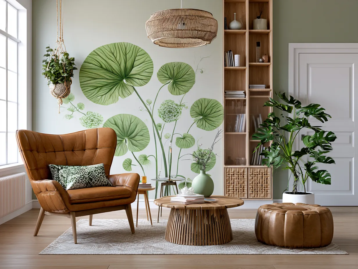
A yellow and green nursery hits a rare balance — bright enough to feel alive, calm enough that neither you nor the baby wants to leave. Color psychology researchers at Project Nursery note that subtle yellow promotes concentration and emotive thinking, while green is the single best color for a learning environment because it simultaneously calms and sharpens focus. Put them in the same room and you get a palette that works harder than any single-color scheme, without waving a gender flag in either direction.
The trap most parents fall into: choosing wall paint first and furniture second. Work it the other way around. Anchor the room with a natural wood crib — kiln-dried pine like Pottery Barn Kids’ Kendall collection, which runs around $600 — then build the color story outward from that warm neutral. Yellow walls read completely differently against honey oak than they do against white-painted MDF, and that difference determines whether you get a cheerful room or a headache-inducing one.
Three distinct directions work within this palette: woodland naturalism, vintage restraint, and clean minimalism. All three use yellow and green as the through-line, but each arrives at a completely different mood. The sections below show exactly how the ratios and material choices shift between them — and where each approach goes wrong when pushed too far.
Quick Scan
- Sherwin-Williams Daisy SW 6910 (bright yellow, LRV 68) and Rosemary SW 6187 (muted green) are the most decorator-recommended paints for this combination — available in SuperPaint from around $60/gallon.
- Woodland theme: saturated yellow walls + natural wood crib + animal motifs. Works best with a south- or east-facing room for natural light.
- Vintage theme: muted olive green + antique dresser + botanical prints. The key is keeping yellow to accent-only status — yellow-dominant vintage rooms tip quickly into retro instead of timeless.
- Minimalist theme: pale pastel yellow walls + white furniture + single green plant. No more than three decor objects on any surface — restraint is the design.
- Project Nursery recommends against all-over saturated yellow; too much bright yellow agitates rather than calms, especially in smaller rooms with limited windows.
- Convertible cribs in natural solid wood (poplar, pine) hold resale value and grow to toddler beds — a practical argument against choosing trend-driven painted finishes.
Woodland Where Yellow Walls Actually Work
Woodland is the theme that makes saturated yellow defensible — and even desirable. Sherwin-Williams Daisy SW 6910 (LRV 68, a clear warm yellow) reads as energetic against white trim but settles down completely once you introduce natural wood and botanical green. The trick is treating the yellow wall as the sun and everything else in the room as the forest floor beneath it. Wood furniture and green accents ground the energy before it tips into overstimulation. Why does this matter? Because Project Nursery’s color psychology research confirms that too much bright yellow — especially in rooms with limited natural light — can agitate rather than enliven.
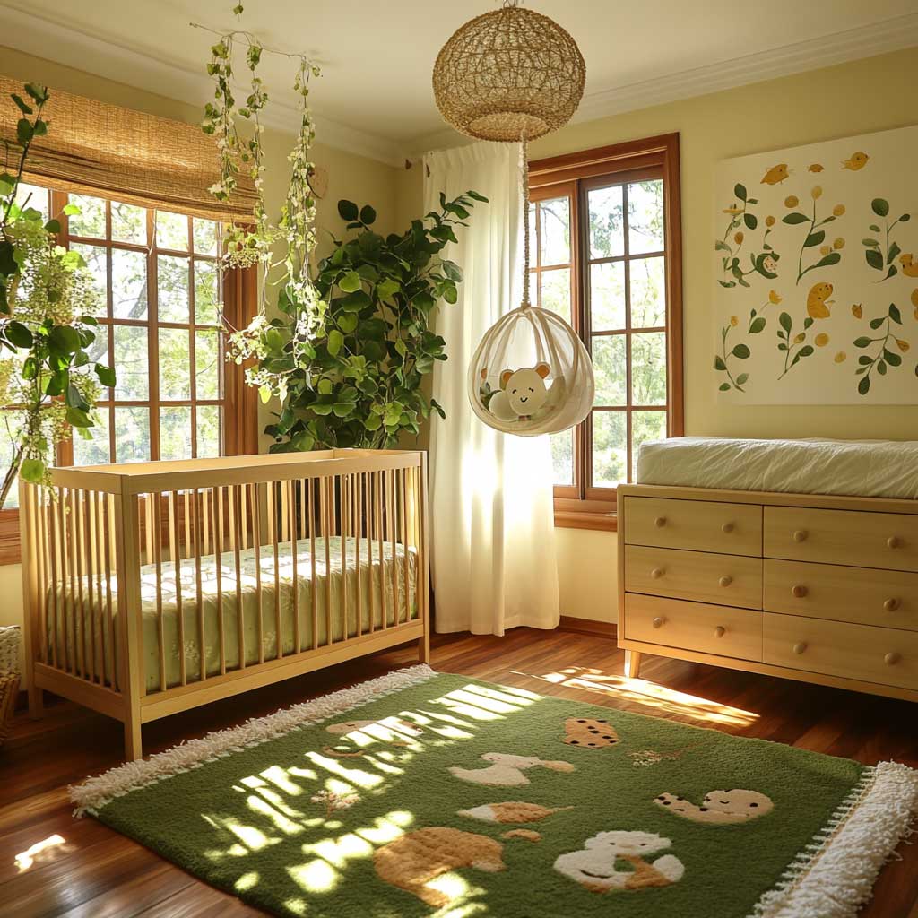
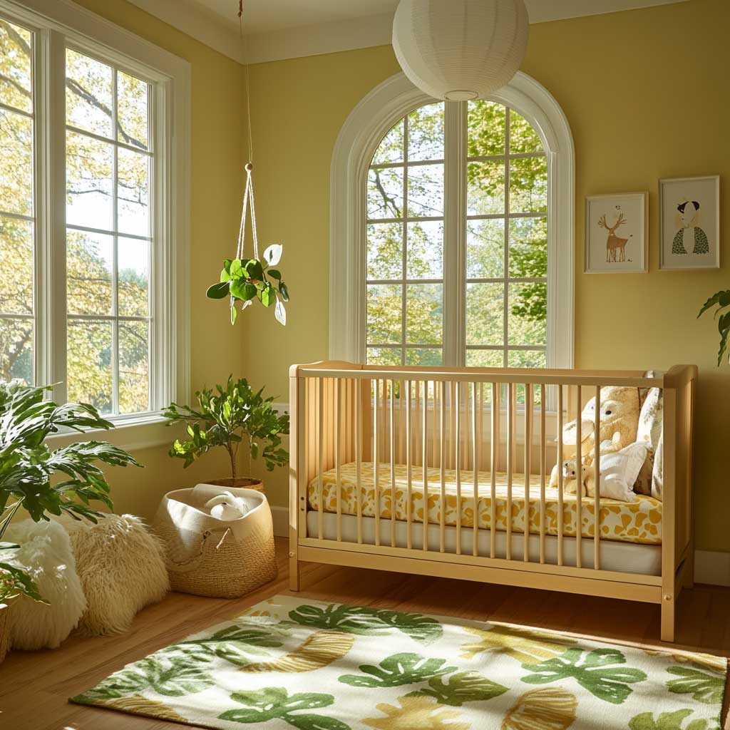
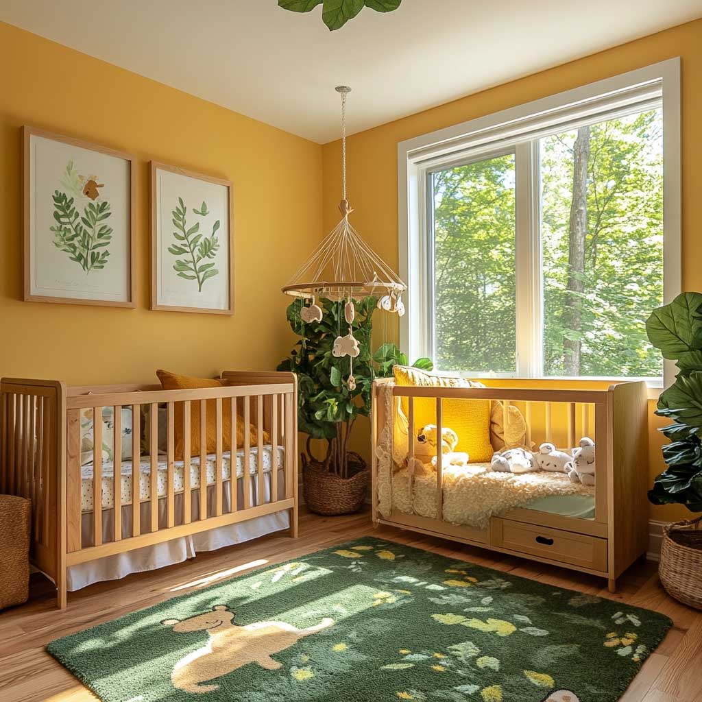
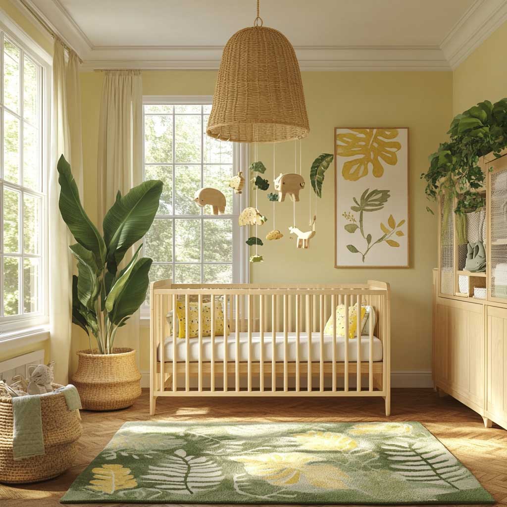
A solid-wood crib in a natural or honey finish is the anchor this palette needs. Pottery Barn Kids’ Kendall 4-in-1 Convertible Crib, constructed from plantation-grown solid pine and GREENGUARD Gold certified, runs around $600 and converts to a toddler bed — meaning you’re not rebuying furniture in three years. A leafy felt mobile overhead ties the woodland concept together without requiring a full wall mural. Ask yourself: is the mobile the first thing your eye goes to when you enter the room? It should be — the ceiling is the most underused design surface in a nursery.
A plush green area rug — sage or forest, not lime — does more work in this scheme than any single piece of wall art. It gives the room a literal ground plane that matches the forest metaphor, and it defines the play zone without a second piece of furniture. Subtle woodland animal illustrations on one accent wall (not all four) in muted yellow-and-green tones keep the theme readable without turning the room into a licensed-character showroom. Stylists consistently recommend keeping illustrated animals small-scale and clustered — a single large mural on an all-yellow background reads more like wallpaper-sample-gone-wrong than a curated woodland scene.
Light management is what separates a successful yellow nursery from a garish one. South- and east-facing rooms are ideal for Daisy SW 6910 because morning and midday light softens its chroma. In a north-facing room, the same yellow reads louder and cooler — switch to a warmer, slightly more golden tone like Sherwin-Williams Auric SW 6692 to compensate. Large windows without heavy treatments let the green accents visually breathe; the moment you add blackout drapes in a contrasting color, the room’s color story fractures. Nursery room decor ideas that anchor on nature themes consistently perform best when natural light is treated as a design material, not an afterthought.
Don’t Do This
Avoid painting all four walls in a saturated yellow like Daisy SW 6910 in a room smaller than 120 square feet or with fewer than two windows. The color bounces off itself and the LRV 68 brightness intensifies rather than diffuses in tight spaces — Sherwin-Williams’ own color guidance notes that high-LRV yellows in spaces with strong natural light can oversaturate the room and feel agitating. Save full-wall yellow for rooms with ceilings above 9 feet or significant cross-ventilation from multiple windows. In smaller rooms, use yellow on a single accent wall — ideally the wall opposite the window — and let the remaining three walls carry a soft white or cream.
Vintage Olive and Muted Yellow Done Without the Kitsch
A vintage approach to the yellow and green nursery palette works only when yellow is demoted to accent status. The structure of the room — walls, large furniture, curtains — should carry the muted end of the spectrum: think olive green walls or grey-green like Sherwin-Williams Rosemary SW 6187, which has a softer, more desaturated profile than the brighter greens. Yellow enters through cushions, a rocking chair pad, and small ceramic pieces on the dresser. The result is a room that feels collected over time rather than assembled from a single shopping cart, which is exactly the quality vintage design mimics at its best.
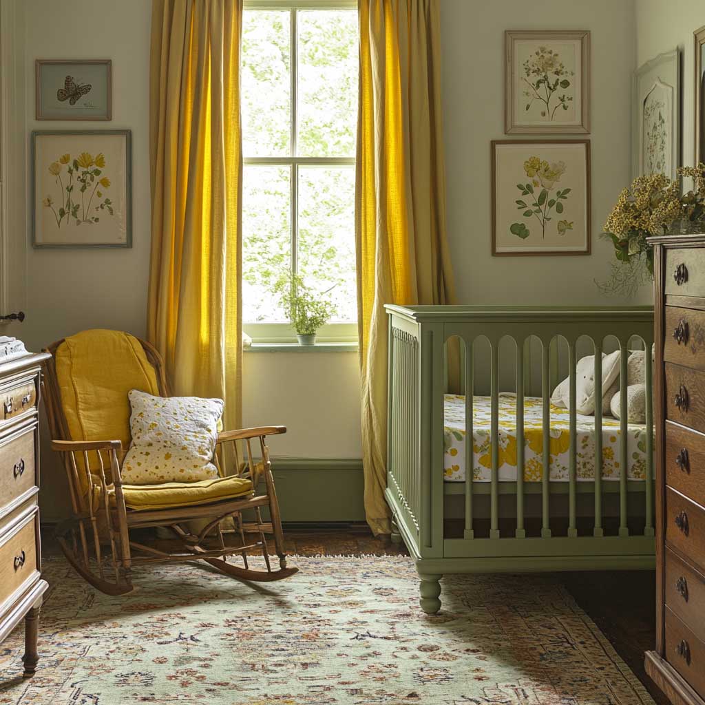
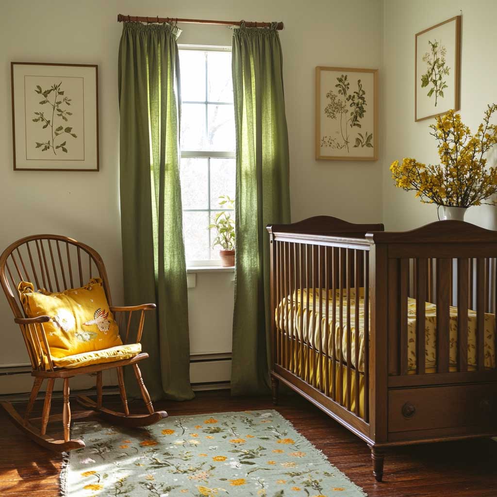
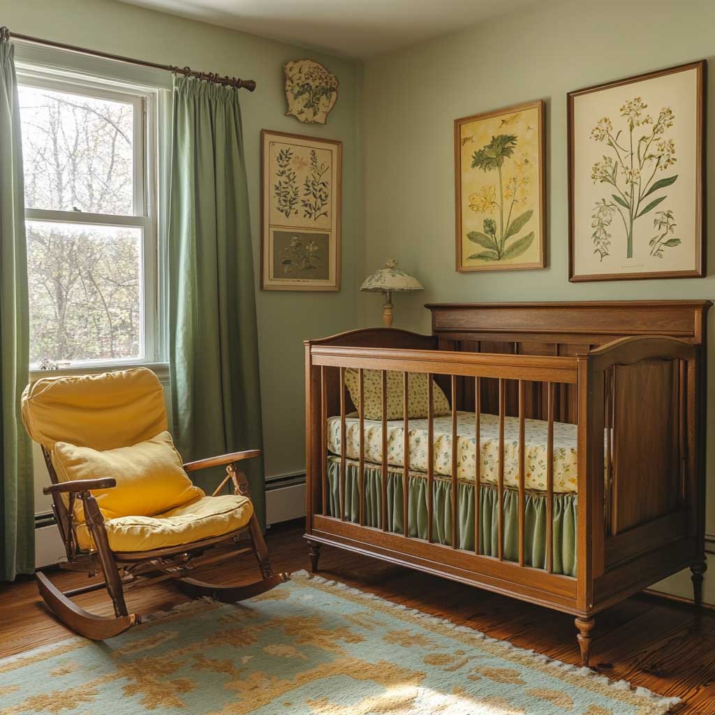
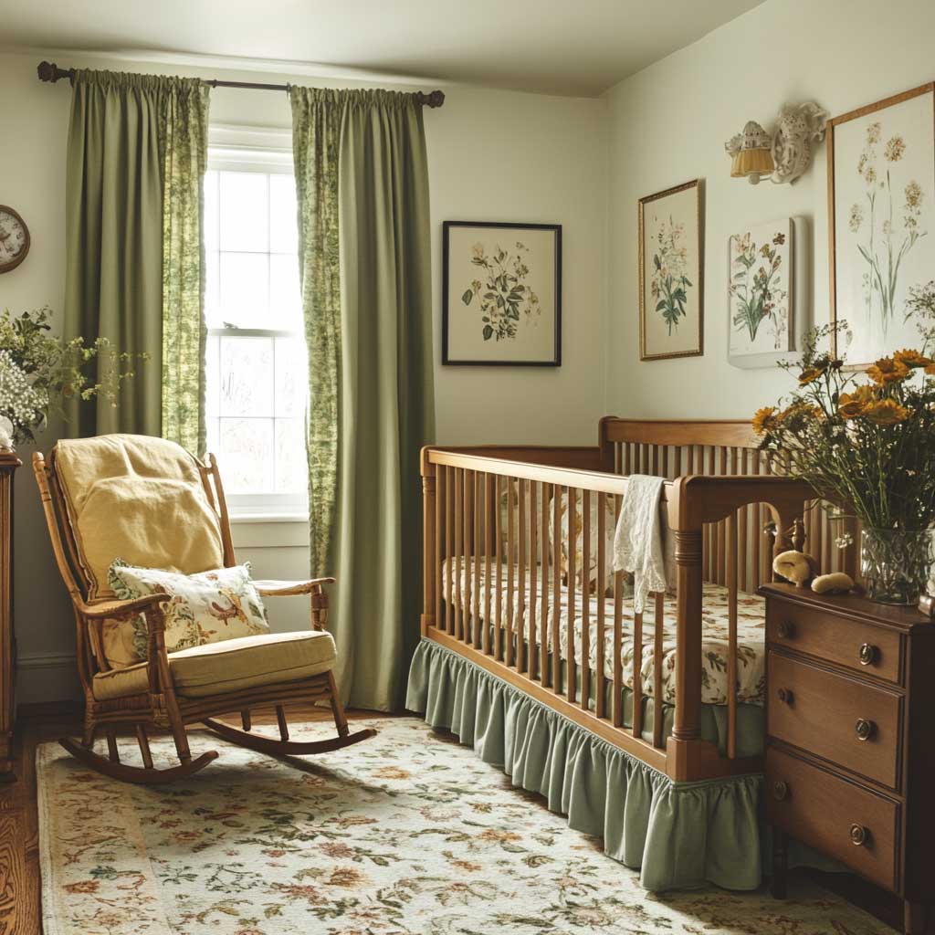
The crib anchors this scheme in traditional craftsmanship. Craftsman-style wood cribs with mortise-and-tenon joinery — a construction technique used in quality furniture for centuries, essentially interlocking wood joints that require no metal fasteners at the stress points — are particularly appropriate here. They visually justify the “vintage” claim without relying on artificially distressed finishes, which often look more thrift-store than heirloom. Pair the crib with an antique dresser in a matching wood tone. Does the hardware match the era you’re targeting? Oval bail pulls read Victorian; cup pulls read 1940s farmhouse. The difference matters more than most parents realize when standing in the assembled room.
Soft green curtains — linen or cotton, not synthetic — frame the windows and keep the palette anchored to nature rather than nostalgia. Sheer panels layered inside heavier olive linen create a light-filtering effect that shifts the room’s mood between daytime brightness and evening coziness without requiring a separate blackout shade. Vintage botanical prints on the wall — framed in simple dark wood or aged brass — add a narrative layer to the green theme without the cartoon element that dominates most nursery wall art. The frames themselves are a design choice: matching frames read curated gallery, mismatched frames read genuine vintage. Either works; just commit to one.
The mistake that turns vintage into retro is over-applying yellow. A rocking chair with a yellow cushion, yellow curtain trim, and yellow-painted furniture legs is no longer vintage — it’s a 1970s diner. One yellow accent piece per furniture grouping is the effective ceiling. Color consultant Justyna Korczynska from Crown Paints has noted in published design features that yellow functions best as a focal-point color, not a background one. In a vintage nursery, that focal point is most naturally the rocking chair or the window cushion seat — the spots where the eye rests during the nighttime feeding ritual that will define those first months. You can find more inspiration for pairing green with vintage nursery elements in these light green neutral nursery ideas.
Minimalist Yellow and Green Nursery Without the Sterile Feeling
A minimalist yellow and green nursery requires the most disciplined color ratio of the three approaches — roughly 70% white or near-white, 20% pastel yellow, 10% green. Drift from that ratio in either direction and the room either loses its gender-neutral energy or becomes busy enough that it no longer reads as minimalist. The wall color does the heaviest lifting: a pale lemon or butter yellow — something like Benjamin Moore Lemon Sorbet 2025-60, which reads almost white in indirect light — keeps the room luminous without declaring “this is a yellow room.” The green arrives in a single plant, a folded throw, or one framed print.
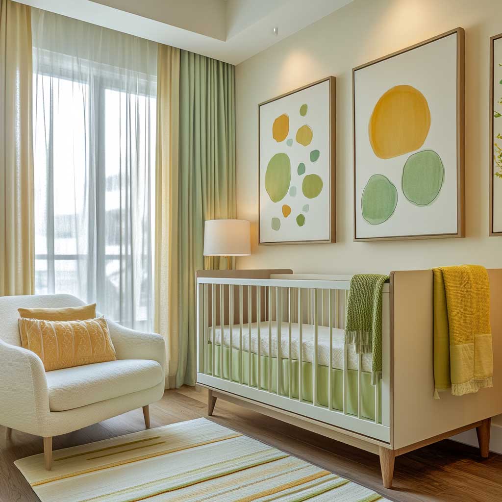
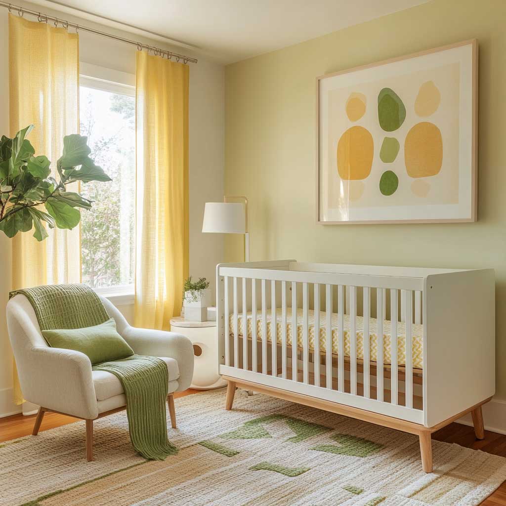
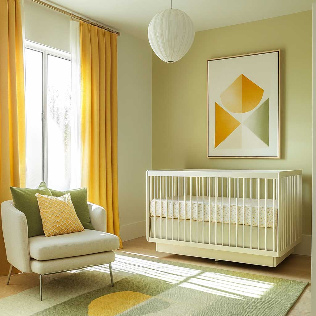
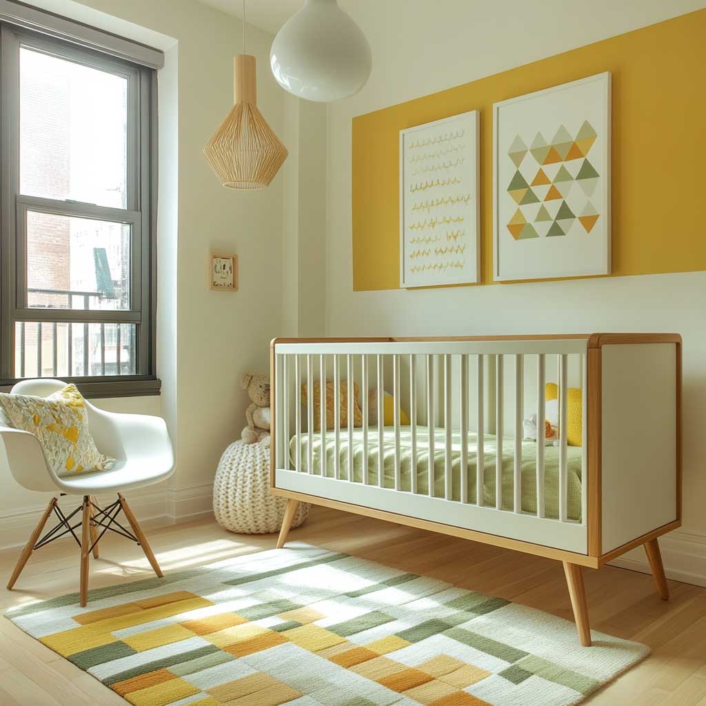
Furniture selection is where minimalist nurseries go wrong most often. A contemporary crib with clean slab sides and no decorative spindle work is correct; a crib with carved headboard details on a white background is not — the detailing reads as traditional, which undermines the minimalist claim. Color psychology research suggests that subtle yellow improves infant concentration, making it a surprisingly functional choice for a minimalist nursery that doubles as a play space. A convertible crib that transitions to a toddler bed is particularly appropriate here because the minimalist style doesn’t date as quickly — a room you’re still happy with when the child is four is a room worth spending on upfront.
Geometric wall art in yellow and green — think a single abstract print in two or three shapes, not a whole wall gallery — adds visual personality without clutter. The trick is scale: one large print (24″ × 36″ minimum) reads as intentional design; three small prints read as filler. A common approach is to choose art where yellow is the dominant color and green appears as a single shape or line, which mirrors the room’s color ratio and creates visual coherence. What doesn’t work: matching art to the crib bedding pattern, which turns the room into a coordinated collection rather than a designed space — the difference feels subtle but registers immediately.
The one live plant most minimalist nurseries include serves a function beyond aesthetics: spider plants and Boston ferns are both non-toxic and air-purifying, making them the standard recommendation for baby rooms. A spider plant on a floating white shelf is not a decorating cliché — it’s a practical signal that the room’s occupant breathes air. Keep the pot neutral (white ceramic, natural terracotta) and resist the urge to add a second plant “for balance.” In minimalism, one of something is balance. Project Nursery’s nursery color psychology guide — maintained by Little Crown Interiors — confirms that green in a room of otherwise neutral and pale tones is especially effective for concentration and calm because the eye finds it restful without being arrested by it.
| Theme | Yellow Role | Green Role | Key Risk |
|---|---|---|---|
| Woodland | Wall color (dominant) | Rug, mobile, accents | Oversaturation in small rooms |
| Vintage | Accent only (cushion, ceramics) | Walls or curtains | Too much yellow tips retro |
| Minimalist | Wall wash (pale pastel) | Single plant or throw | Furniture style breaks the mood |
FINAL TAKE
Yellow and green nurseries work when the ratio is decided before the paint is mixed.
Yellow dominant works in woodland schemes with south-facing light and natural wood — use Sherwin-Williams Daisy SW 6910 and budget around $60/gallon for SuperPaint coverage.
Green dominant works in vintage schemes where yellow stays at accent level — one cushion, one ceramic, one piece of hardware, nothing more.
Pale yellow at near-white saturation works in minimalist rooms where a single green plant does all the color work after the walls.
Save this post before you start your paint samples — the ratio decision changes which samples you pull.
Related Topics
FAQ
What is the best yellow paint color for a gender neutral nursery?
What green paint pairs well with yellow in a nursery?
Is yellow and green a good color palette for a gender neutral nursery?
How much does it cost to paint a nursery in yellow and green?
What furniture works best in a yellow and green nursery?
What plants are safe for a nursery and work with a green color scheme?
Complete guide
Green Home Color Ideas for Every Room and Every Shade
Sage, emerald, olive, mint — interiors, exteriors, gardens — all in one place
Complete guide
Kids Room Ideas Every Parent Will Actually Use
Nurseries, toddler beds, teen spaces, storage, colors, Montessori setups — all in one place