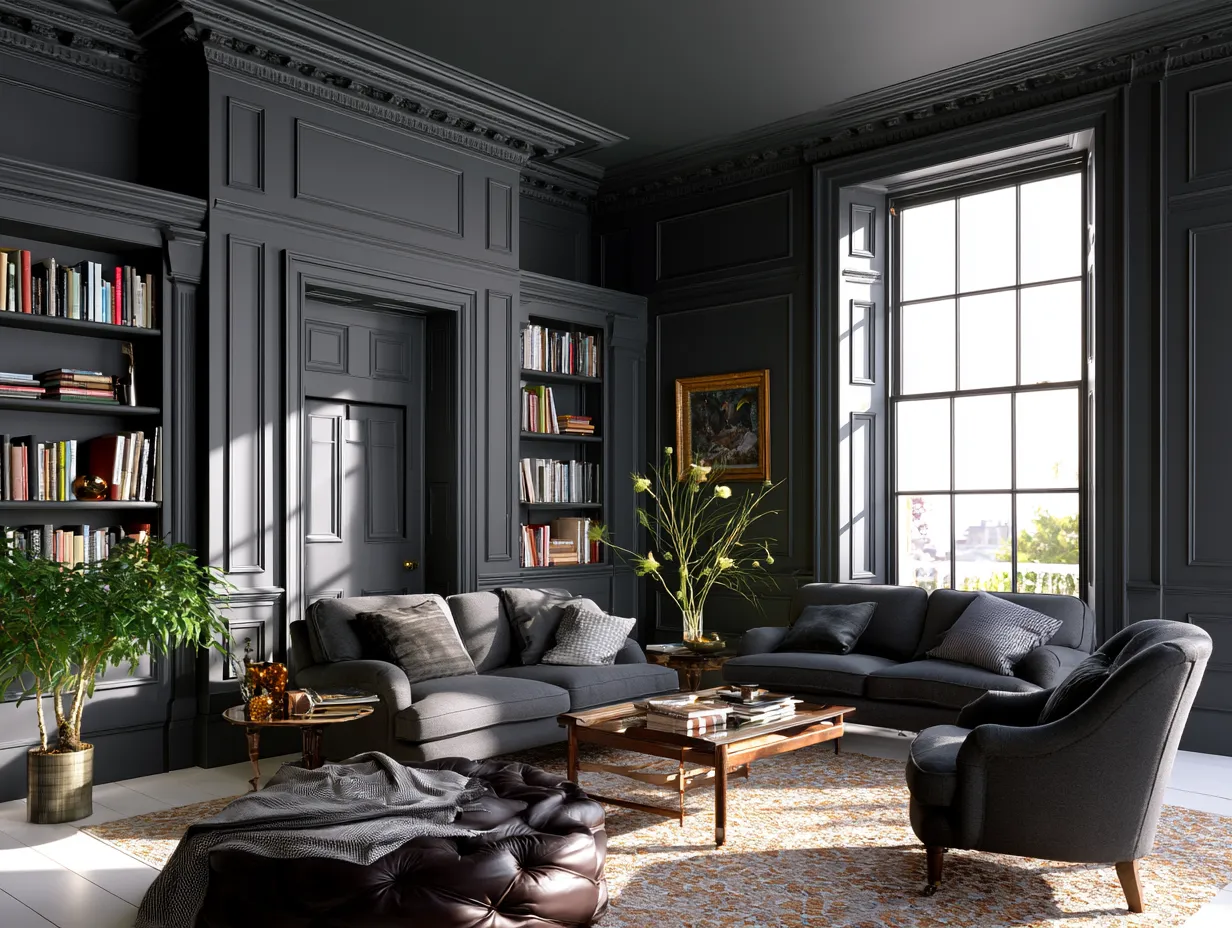
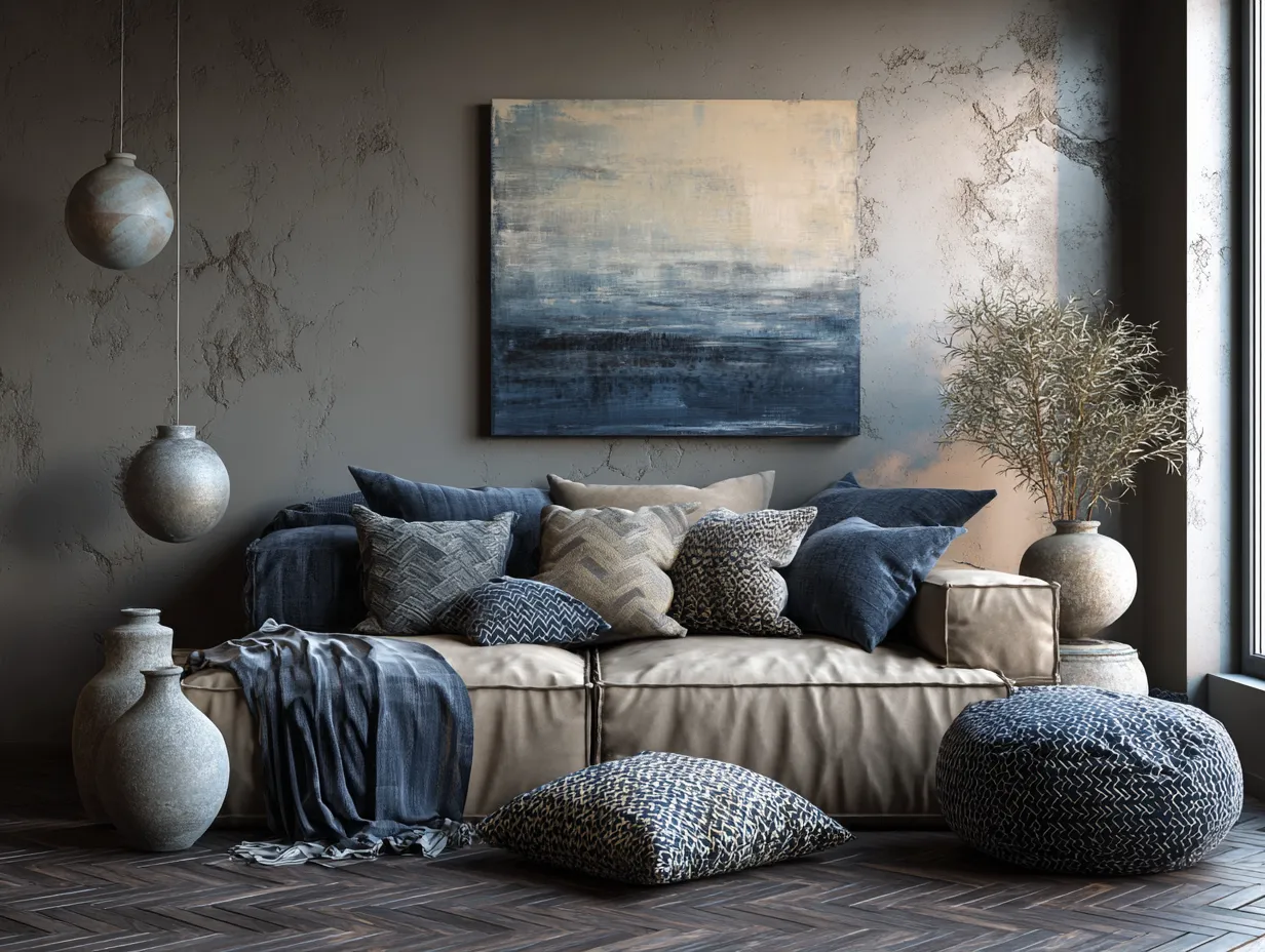
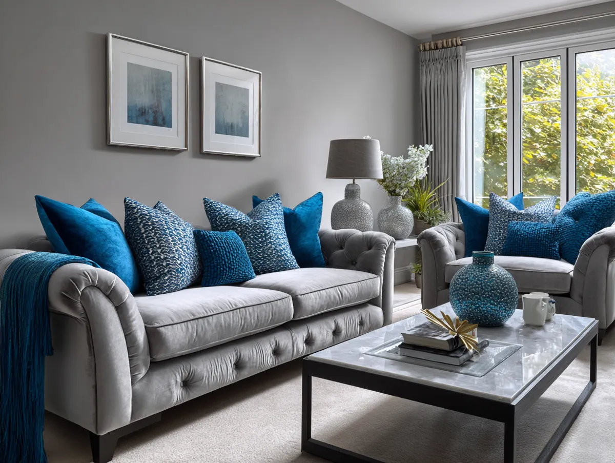
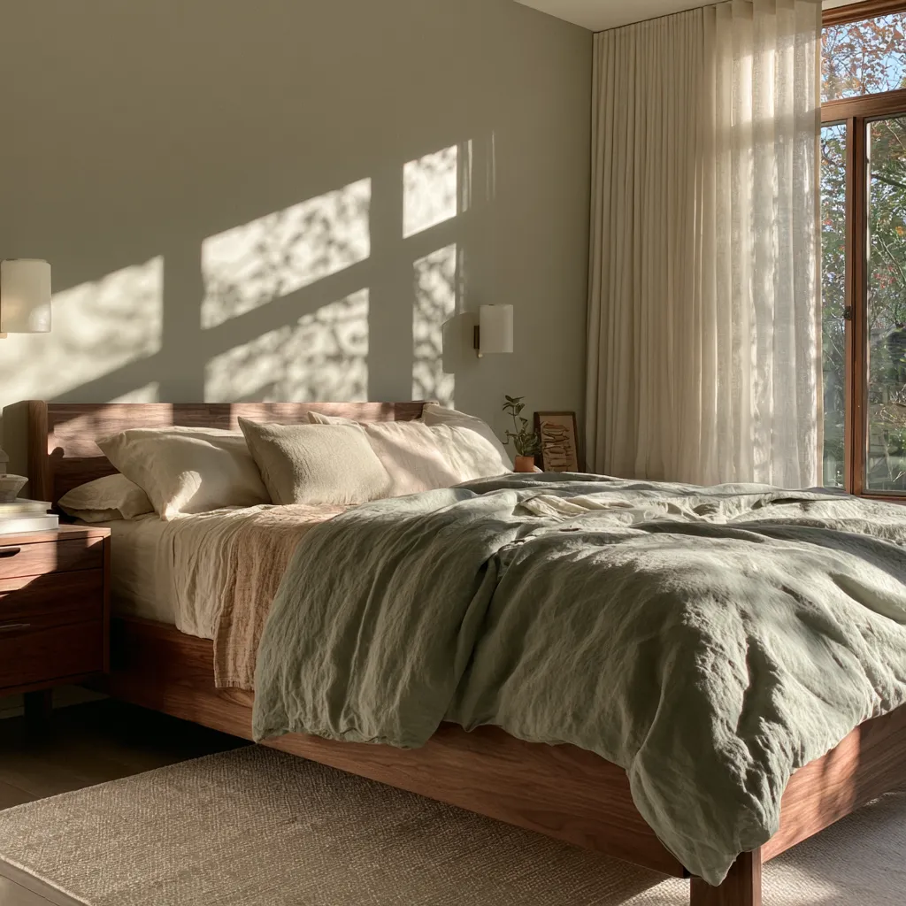
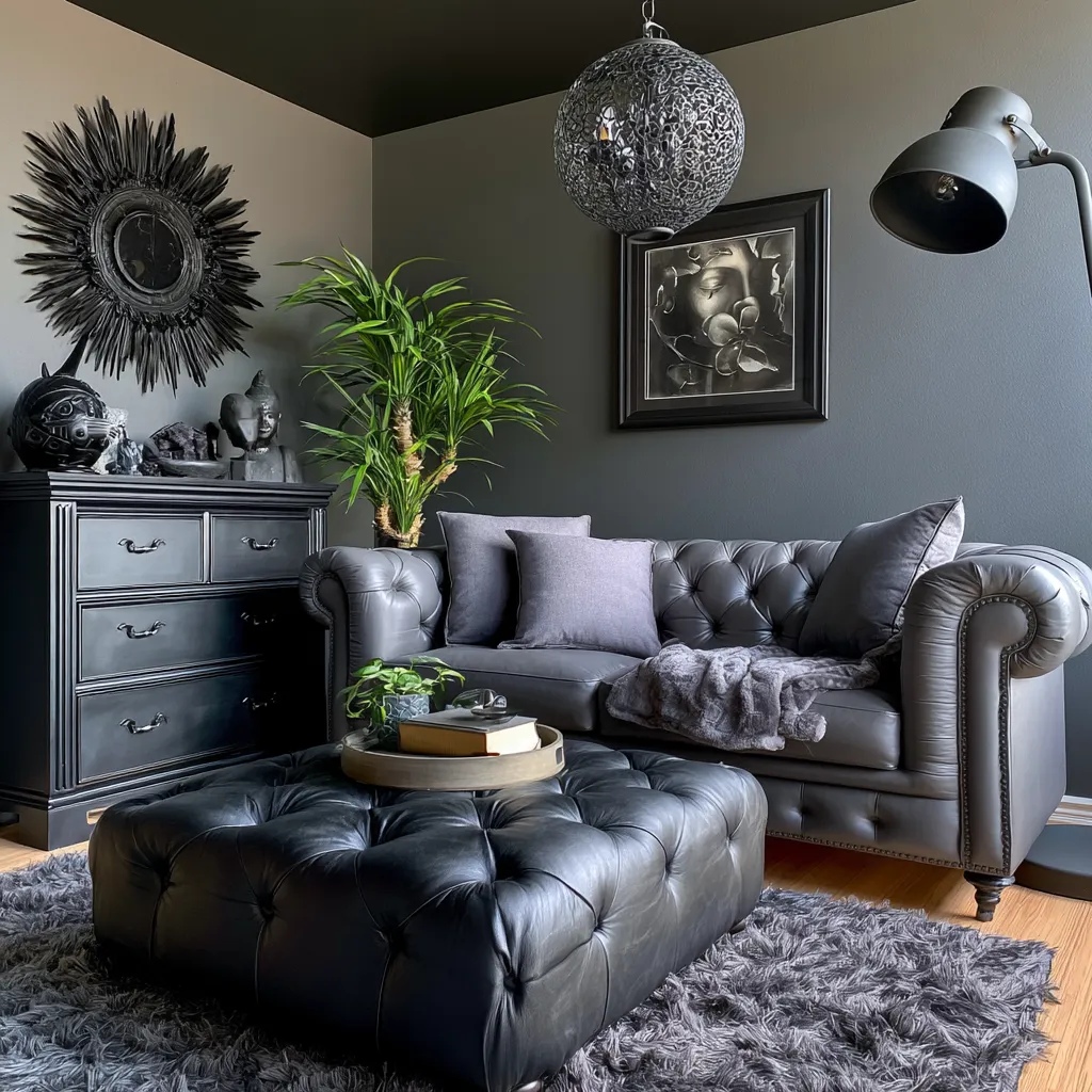
A blue and gray color combination is one of the few interior paint choices that holds up under scrutiny — it looks calm at 9 AM, composed at noon, and genuinely sophisticated under lamp light at night. Sherwin-Williams sold more blue-gray and cool-neutral shades in 2024 than any other color family, according to a nationwide survey of painting crews. That popularity isn’t accidental.
What makes this pairing work where others fail is temperature balance. Blue brings a visual coolness that lowers the perceived energy of a space; gray absorbs that intensity without competing with it. The result reads as stillness rather than emptiness — which is exactly what bedrooms and home offices need most.
The three sections below break down three distinct takes on the blue-gray palette — sky blue with warm gray, navy with subtle gray, and muted blue with ash gray — each with specific paint references, what goes wrong, and what to pair them with. Every combination here works from a standard 12×12 room up to a large open living area.
- Sky blue + warm gray makes small rooms read larger; Sherwin-Williams Misty SW 6232 (~$62/gallon) is the most reliable starting point
- Navy + subtle gray requires controlled placement — one accent wall behind the headboard, not four
- Muted blue + ash gray is the home-office pairing; low saturation supports focus without feeling sterile
- One gallon of paint covers roughly 350–400 sq ft — measure before you buy
- Warm white trim and brass or brushed-silver hardware close out any of these three combinations cleanly
Sky Blue and Warm Gray Pull More Light Into a Room Than Any Neutral Can
The blue and gray color combination that decorators reach for in smaller bedrooms and reading nooks almost always starts with a soft sky blue on one wall and warm gray on the remaining three. Sherwin-Williams Misty SW 6232 — a gentle blue-gray with a Light Reflectance Value of approximately 60 — is designed precisely for this role. At roughly $62 per gallon in the SuperPaint line, it bounces natural light across the room without introducing any of the harshness a brighter blue would bring.
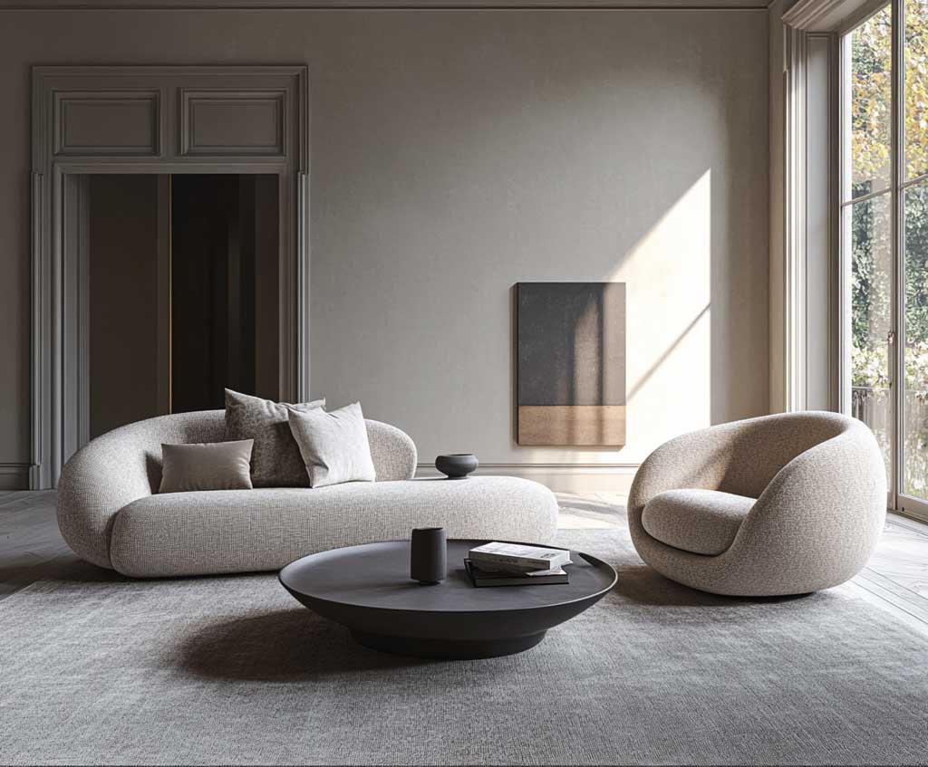
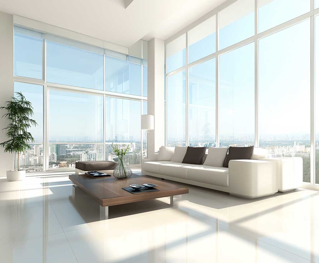
Think of sky blue as a mirror with color: it reflects light back into the room rather than absorbing it, which makes a 10×12 bedroom feel noticeably airier than the same space painted in even the lightest greige. Pair the blue accent wall with a warm gray like Sherwin-Williams Accessible Beige on the flanking walls and you get that sensation without any of the coldness people worry about. The trick here is to keep gray warm-toned — anything with a green or purple undertone will fight the blue instead of supporting it.
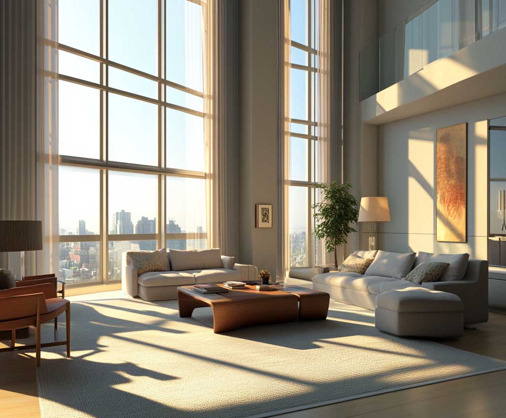
Furniture in white oak or light ash works exactly the way brass and silver hardware do — it keeps the warmth coming from somewhere so the cool tones never tip into clinical. Brushed silver light fixtures reflect the blue back into the room; textured linen in off-white absorbs some of that reflection so the room breathes. What does not work here: stark bright white bedding paired with cool gray walls. The contrast becomes harsh under artificial light and the room loses the softness the entire palette depends on.
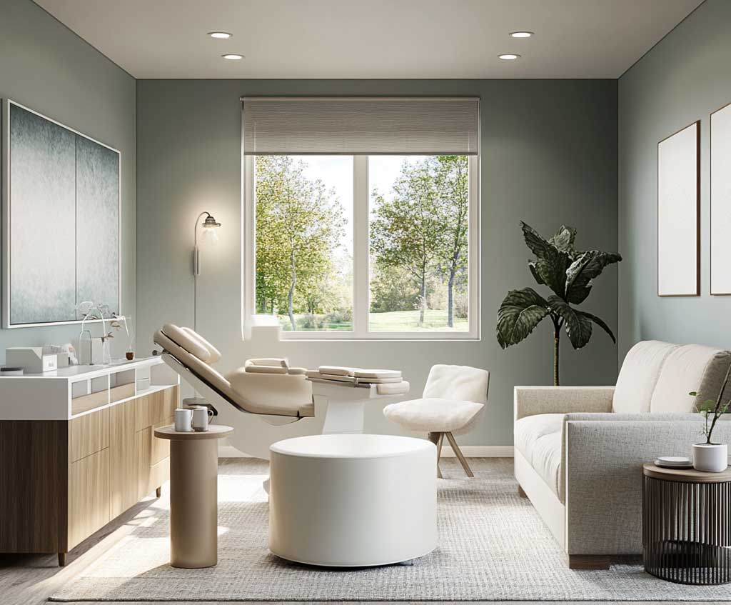
Stylists recommend testing Misty on a 2×2 foot patch near your largest window and living with it for 48 hours before committing to a gallon. The color shifts noticeably between north-facing rooms — where it reads cooler and more subdued — and south-facing rooms, where it picks up warmth and looks closer to a true spa blue. South-facing rooms can handle Misty on all four walls; north-facing rooms do better with the sky blue limited to one accent wall and warm gray carrying the rest. If you’re considering other blue and gray bedroom color schemes, the bedroom colour schemes for relaxation guide covers the psychological effects of specific blue and gray shades in more depth.
- Don’t skip the wall test. Phone screens and paint swatches both oversaturate. Misty looks different on drywall under your actual lamps than it does on any screen.
- Don’t pair sky blue with cool-toned gray. Two cool colors in the same room without a warm anchor create a space that feels like a hospital corridor — calm is not the word people use.
- Don’t use glossy sheen on bedroom walls. Satin or eggshell finish only. Gloss picks up every texture imperfection and turns a calm palette into a distraction.
- Don’t rely on ceiling lights alone. This palette needs layered light — a floor lamp and table lamp at minimum — to read as warm in the evening.
Navy Blue Against Subtle Gray — How the Blue and Gray Combination Gets Its Drama
Navy blue paired with subtle gray is where the blue and gray color combination stops being quiet and starts making a statement. Benjamin Moore Hale Navy HC-154 has an LRV of 8.36 — deep enough to absorb light and create genuine intimacy, dark enough to make a room feel like it was designed rather than just painted. One gallon covers approximately 400 square feet, so a standard accent wall behind a queen-size headboard typically takes well under a gallon, leaving budget for two coats without overbuying.
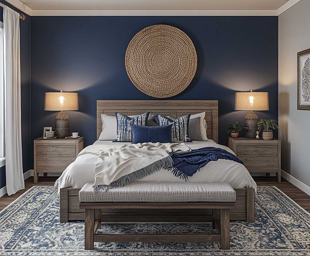
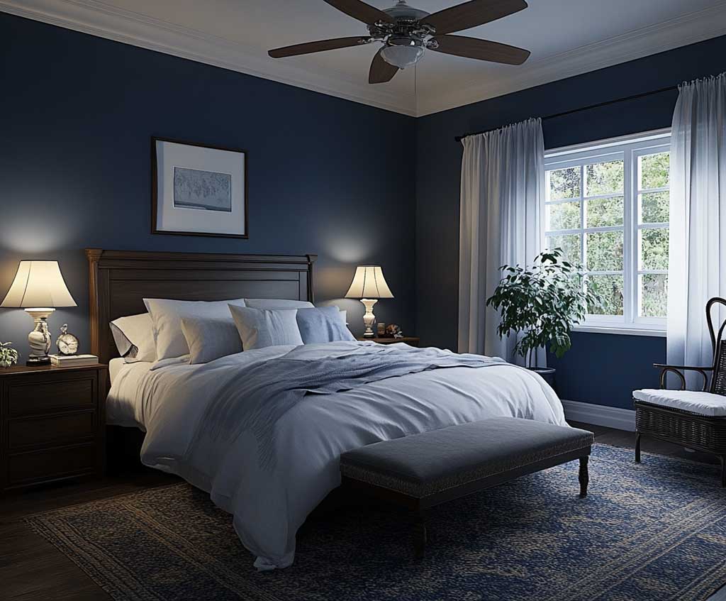
Surrounding gray walls — particularly those with a blue undertone in the light range, like Sherwin-Williams Silver Strand — act as the visual release valve. Without that relief, a navy accent wall turns an average-sized room into something that feels smaller than its dimensions. With it, the navy reads as grounded and intentional. What pairs with a navy and gray combination? Soft beige or light oak furniture provides the warmth the palette needs; metallic gold or unlacquered brass in hardware and lighting adds a layer of depth without shifting the room’s overall mood.
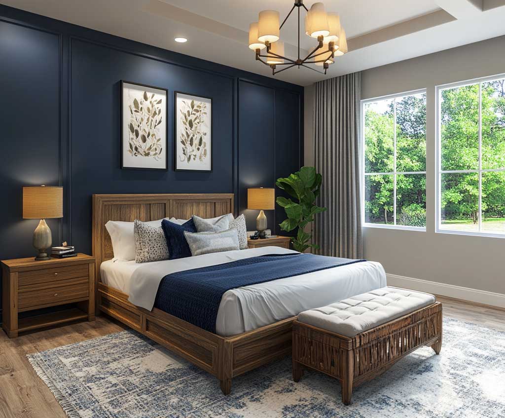
Lighting decisions matter more with navy than with any other shade in this palette. Warm white bulbs — 2700K to 3000K — pull the true blue out of Hale Navy; cooler bulbs at 4000K push it toward black, especially in north-facing rooms. Velvet throw pillows in warm taupe or dusty terracotta break the cool uniformity of the overall scheme and prevent the room from reading as a showroom. You’ll notice the difference immediately when you introduce even one warm-toned textile against the navy and gray backdrop — the room relaxes without losing its composure.
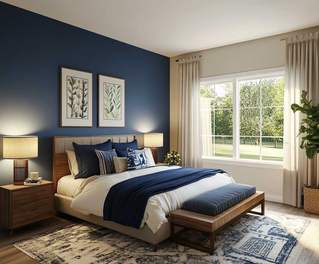
Stylists consistently recommend placing navy strategically — behind the bed, wrapping a fireplace wall, or on built-in cabinetry — rather than on all four walls. A common approach is to treat navy as the anchor and gray as the field: the darker color stops the eye, and the lighter color gives it somewhere to rest. Applying navy to all four walls in a room under 150 square feet without significant natural light is the most predictable way to make this palette feel oppressive rather than sophisticated.
Muted Blue and Ash Gray Turn a Home Office Into a Room Where Focus Feels Effortless
Muted blue combined with ash gray is the most underused version of the blue and gray color combination — and the one most consistently recommended for home offices, libraries, and quiet reading rooms. Color psychology research suggests blue hues lower perceived stress and support sustained concentration; ash gray grounds those effects without adding any visual stimulation of its own. Sherwin-Williams recommends blue-gray shades like Samovar Silver specifically for focus-oriented home office spaces, noting that low-saturation cool tones reduce visual noise without creating the flatness of a pure neutral.
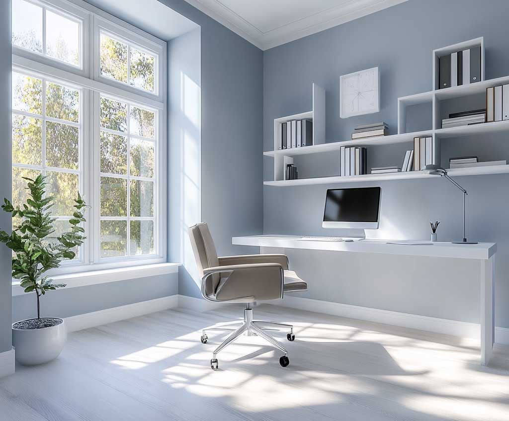
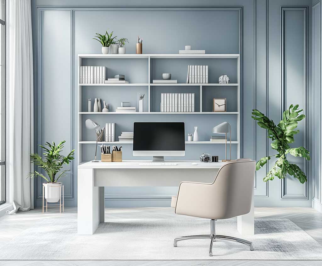
The goal here is a palette that disappears while you work — which is harder to achieve than it sounds. Muted blue has what designers describe as subdued elegance: it registers as a color rather than a neutral, but never demands attention. Ash gray alongside it acts like a frame around a photograph — it defines the space without asserting itself. Light-colored wooden furniture in this room, particularly a pale ash or white oak desk, reads as warm and natural against the cool walls without pulling focus away from the work surface.
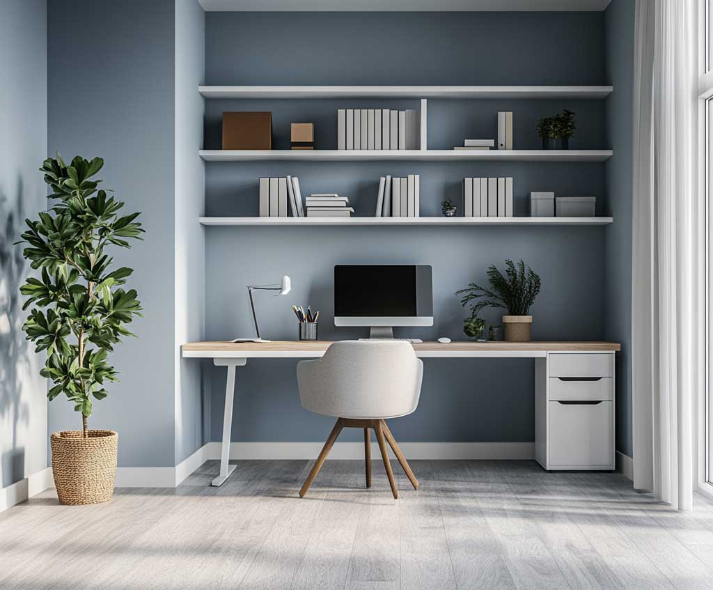
Natural light changes this combination more dramatically than it changes the other two palette options. With large windows or sheer curtains, muted blue in a south-facing office picks up enough warmth to feel genuinely comfortable — almost analogous to the soft light of a partly cloudy day. In a north-facing room, the same shade can feel noticeably colder; the fix is a warmer bulb (2700K) in your desk lamp and at least one textile accent in a warm neutral like sand or undyed linen. Try this: swap a cool-white desk lamp bulb for a warm-white equivalent and notice how much the walls shift in response.
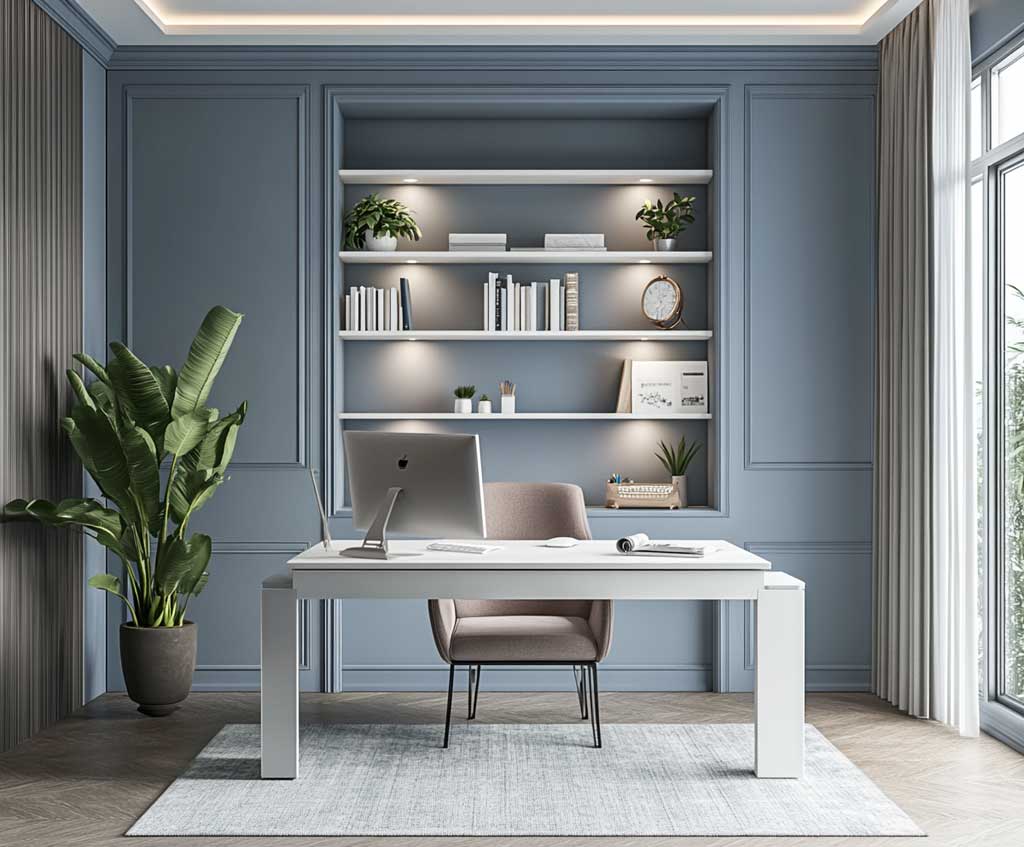
A feature wall in muted blue with ash gray on the remaining three walls prevents the room from reading as a single flat color — which is the typical mistake in home office design. That second color introduces just enough contrast to give the eye somewhere to travel without creating the kind of visual competition that makes focus harder. Woven baskets, beige textiles, and minimalist frames in natural wood all soften the cooler register of this palette. For a broader look at how blue and gray interact across different living room paint color combinations, the comparison there is worth reviewing before committing to a shade.
| Variant | Best Room | Key Paint Pick | Main Risk |
|---|---|---|---|
| Sky Blue + Warm Gray | Bedroom, reading nook | SW Misty SW 6232 (~$62/gal) | Cool-toned gray kills warmth |
| Navy + Subtle Gray | Bedroom, living room | BM Hale Navy HC-154 (LRV 8.36) | All-four-wall navy in small rooms |
| Muted Blue + Ash Gray | Home office, library | SW Samovar Silver (low saturation) | North-facing rooms run cold |
The color psychologist’s view on blue in interior spaces has been confirmed repeatedly in sleep and productivity research: rooms with blue or blue-gray walls show measurably lower resting heart rates in occupants compared to rooms with warm-spectrum colors. For color science and current Sherwin-Williams color recommendations, their official color pages include LRV data and coordinating color suggestions that are updated seasonally.
Color Takeaway
Blue and Gray Is a Palette That Works Because It Refuses to Compete With Itself
Sky blue plus warm gray makes rooms feel larger and lighter without touching a single wall. Navy plus subtle gray creates intimacy that brighter combinations simply can’t replicate.
Muted blue and ash gray disappear while you work — the highest compliment a home office color can receive.
Save this post before your next trip to the paint store. The specific shades and placement rules here are the details that separate a palette that photographs well from one that actually lives well.