Bold paint color ideas are the fastest room transformation money can buy — a gallon of Benjamin Moore Aura runs about $75 and a weekend of work can do what $5,000 of new furniture can’t. I’ve repainted five rooms in three years chasing exactly the right level of commitment, and every time I hedged with a pale version of a color I wanted, the room looked like it was apologizing. You’ll notice the difference the second you stop treating paint as a background and start treating it as the furniture.
Bold paint color ideas break into three distinct directions: geometric patterns with hard edges, color blocking with large flat sections, and monochromatic schemes that go deep into a single hue. Each has a different ceiling for drama, a different set of rules, and a completely different relationship with your existing furniture. Pick the wrong approach for your room’s architecture and you’ll fight it for years.
My go-to test before committing to any of these: tape a 24×36-inch swatch directly on the wall and live with it for 72 hours. Morning light, afternoon sun, and lamp light at 9pm read as three completely different colors on the same wall. The swatch that looked like a statement at the paint store becomes a completely different story by Tuesday morning.
- Geometric paint patterns need minimalist furniture — the two compete, and one has to win.
- Color blocking works in 3 colors max; more than that and you’ve built an art installation, not a room.
- Monochromatic deep blues (try Benjamin Moore Hale Navy HC-154, ~$72/gallon) create sophistication that lighter shades can’t touch.
- Texture variation — matte vs satin finish on the same color — is how you add depth in a monochrome scheme without switching hues.
- Every bold paint approach requires quiet furniture. Statement walls and statement sofas cancel each other out.
Bold Geometric Paint Patterns Demand Quiet Furniture
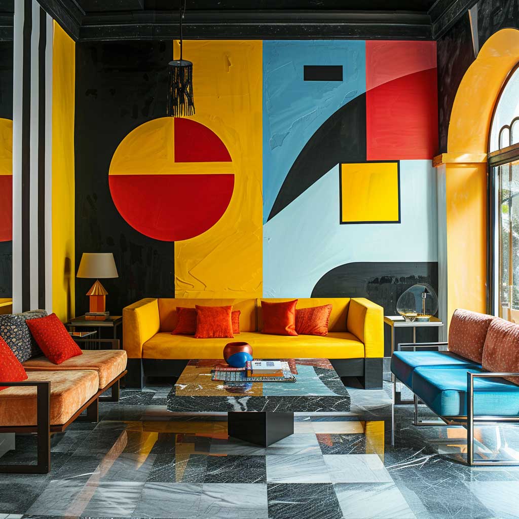
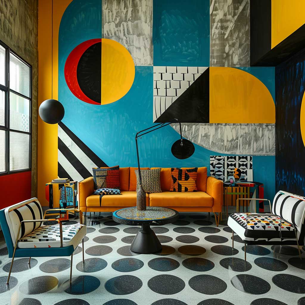

Bold geometric paint patterns are the most unforgiving of the three bold paint color ideas — the room has to be built around them, not alongside them. Yellow and blue in large triangles or chevrons at full saturation read as architectural when the rest of the room is quiet, and as chaotic when you pair them with patterned cushions or a busy rug. I learned this the expensive way: painted a geometric accent wall, kept my existing floral sofa, and spent six months in a room that felt like two people arguing. Swap the furniture first, then pick up the brush.
Triangles, hexagons, and chevrons are the three shapes that work at scale on a wall without collapsing into visual noise. Sharp painter’s tape and two coats of Benjamin Moore Aura in your chosen colors — budget around $150 total for a single accent wall — give you edges clean enough to read as intentional from across a room. You’ll notice that cheaper paint requires three coats to achieve the same crispness, which means the tape bleeds before you’re done. The $75 per gallon for Aura is the right investment here.
Black plays a specific role in geometric schemes: it grounds the pattern without competing with the color. Yellow and blue together read as playful; add black as the outline or background element and the same combination reads as graphic design. Remove it and you’ve got a nursery. The ratio I’ve landed on after three painted rooms: 60% dominant color, 30% accent color, 10% black — anything more and the black becomes the focal point instead of the frame.
What doesn’t work: metallic accents layered into a geometric pattern. Gold or silver finishes on hardware or mirrors create a third visual system competing with the geometry, and the room fragments. Keep hardware matte black or brushed nickel and let the pattern itself carry the drama. Plants are actually an excellent counter-balance — the organic irregularity of a large fiddle-leaf fig softens hard geometric edges in a way no furniture can.
Vibrant Color Block Paint Ideas That Hold Without Going Loud

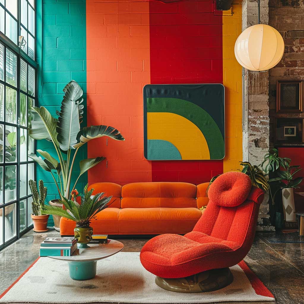
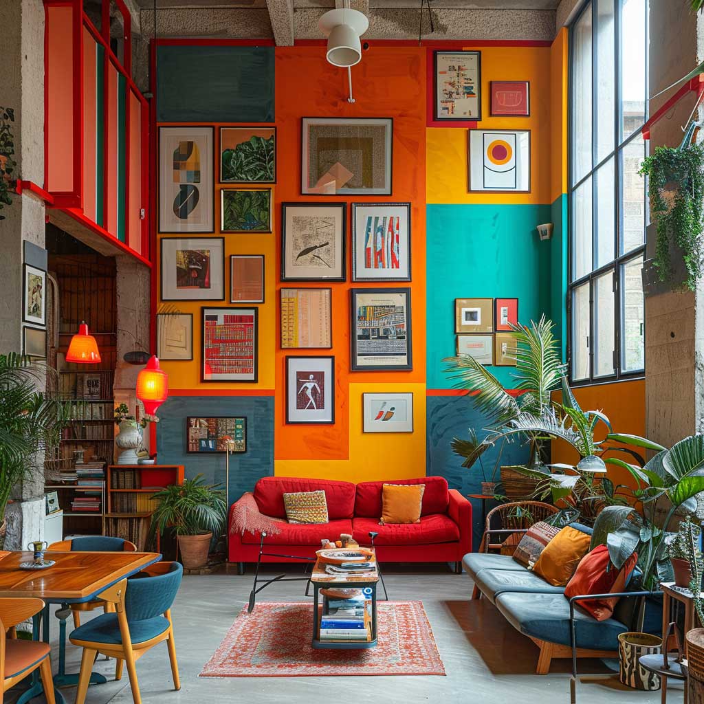
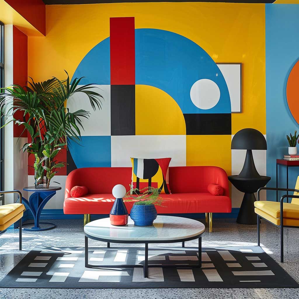
Bold paint color ideas don’t get more satisfying than color blocking — large, flat sections of contrasting hues that read as intentional from the moment you walk in. Red, orange, and teal are the three-color combination I keep coming back to: the warm tones of red and orange create energy, teal provides enough cool contrast to prevent the room from feeling like a sauna. Sherwin-Williams Fireweed SW 6328 (~$60/gallon) for the red, Tangerine SW 6346 for the orange, and Cay SW 6467 for the teal give you the saturation you need without fighting each other under artificial light.
The mechanics of color blocking are simpler than they look: decide your horizontal split point on the wall — I use chair-rail height, roughly 36 inches from the floor — tape it clean, and paint the lower section in your deeper color. Upper section gets the lighter or cooler tone. Does this make the room feel smaller? No, it makes it feel considered. A room that reads as designed always feels more spacious than one that reads as unfinished, regardless of square footage. For more approaches to bold interior color, the Art Deco colour palette breakdown on ArtFasad covers the same saturation logic in a different style context.
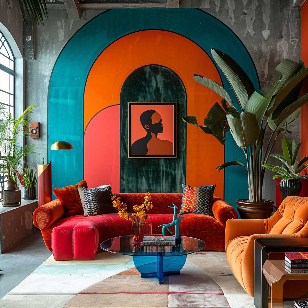
Eclectic furniture — a mix of midcentury shapes and vintage pieces — holds up inside a color-blocked room in a way that matching sets can’t. A mid-century sofa in warm mustard against an orange block reads as art direction. The same sofa in beige reads as the furniture store’s problem, not yours. Abstract wall art in oversized formats extends the color blocking principle off the walls and into the vertical plane of the room without adding visual clutter.
Plants earn their place in a color-blocked room the same way they do anywhere bold: the irregular silhouette of something organic interrupts the grid of rectangular blocks and prevents the room from feeling like a showroom floor. A large monstera or a trailing pothos in a matte ceramic pot in a neutral tone — white, terracotta, charcoal — adds a layer the paint alone can’t create.
- Don’t paint all four walls in three different colors — color blocking on three walls looks like a mistake, not a decision. One or two walls maximum per room.
- Don’t use pastel versions of your chosen colors when going for color blocking — pastels at this scale read as faded, not refined. Commit to full saturation or choose a different approach entirely.
- Don’t add patterned soft furnishings (printed cushions, busy rugs) into a color-blocked room. The blocks are the pattern. Everything else should be solid.
- Don’t trust the color on your phone screen. Sherwin-Williams and Benjamin Moore both offer physical 8×10 sample cards (~$5 each) — get them before committing to a gallon.
Dramatic Monochrome Bold Paint Ideas Finished With White Contrast
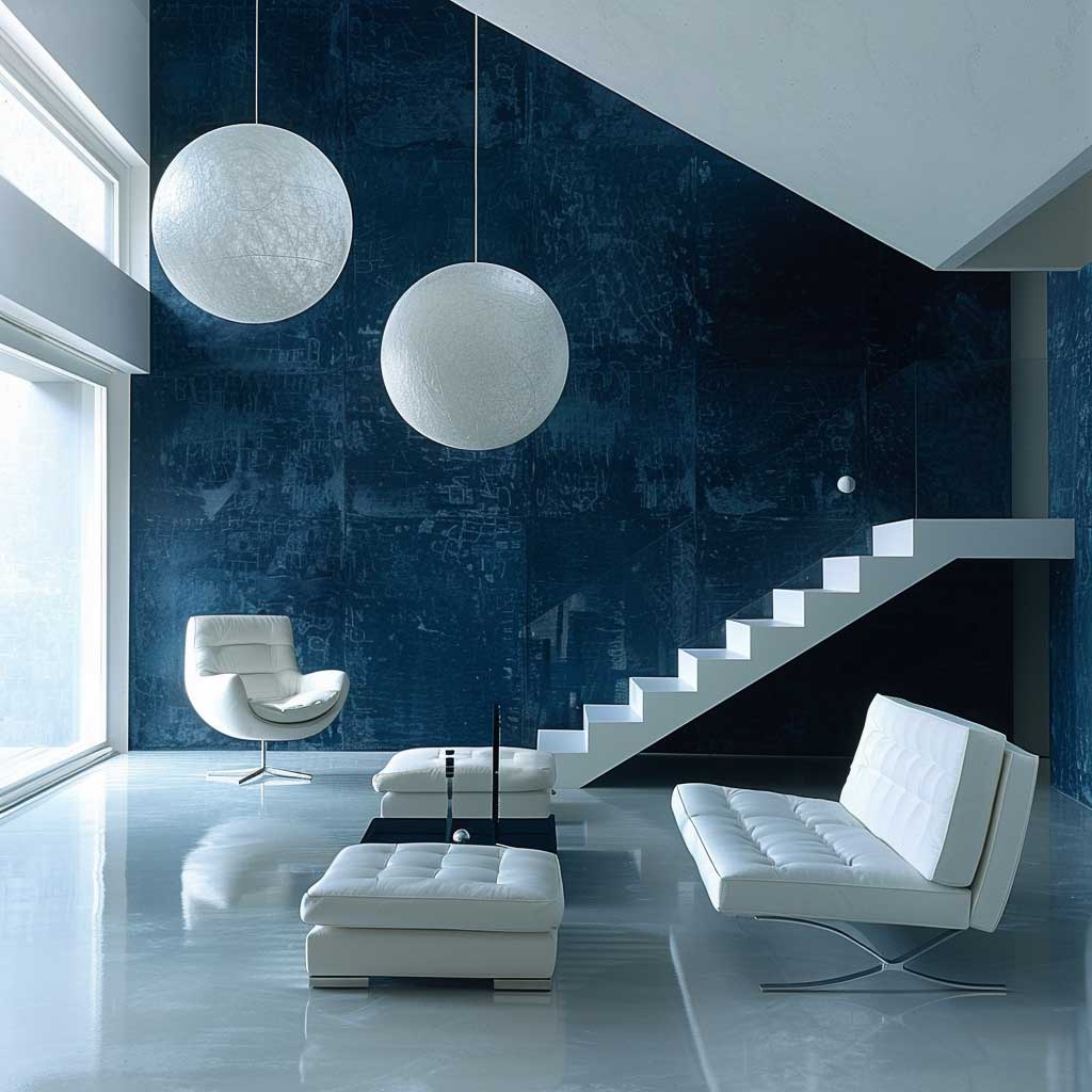
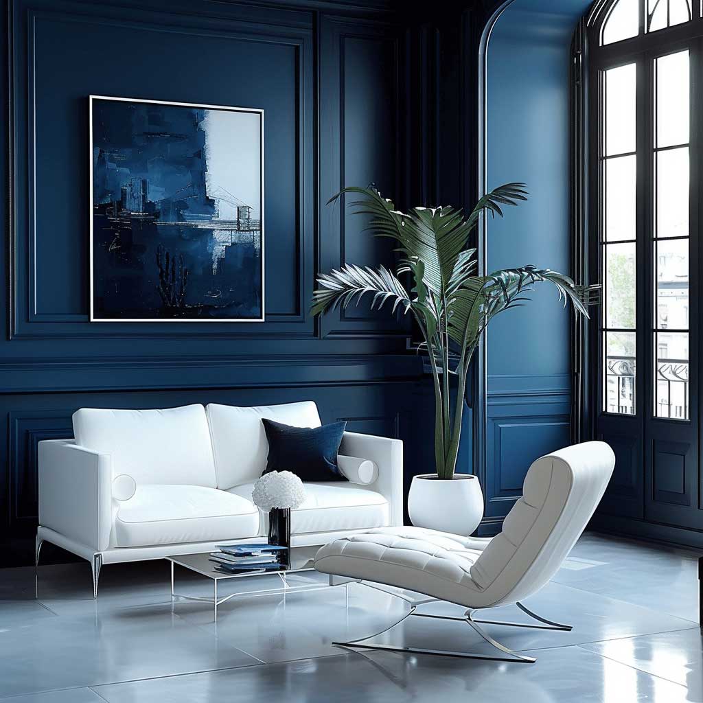

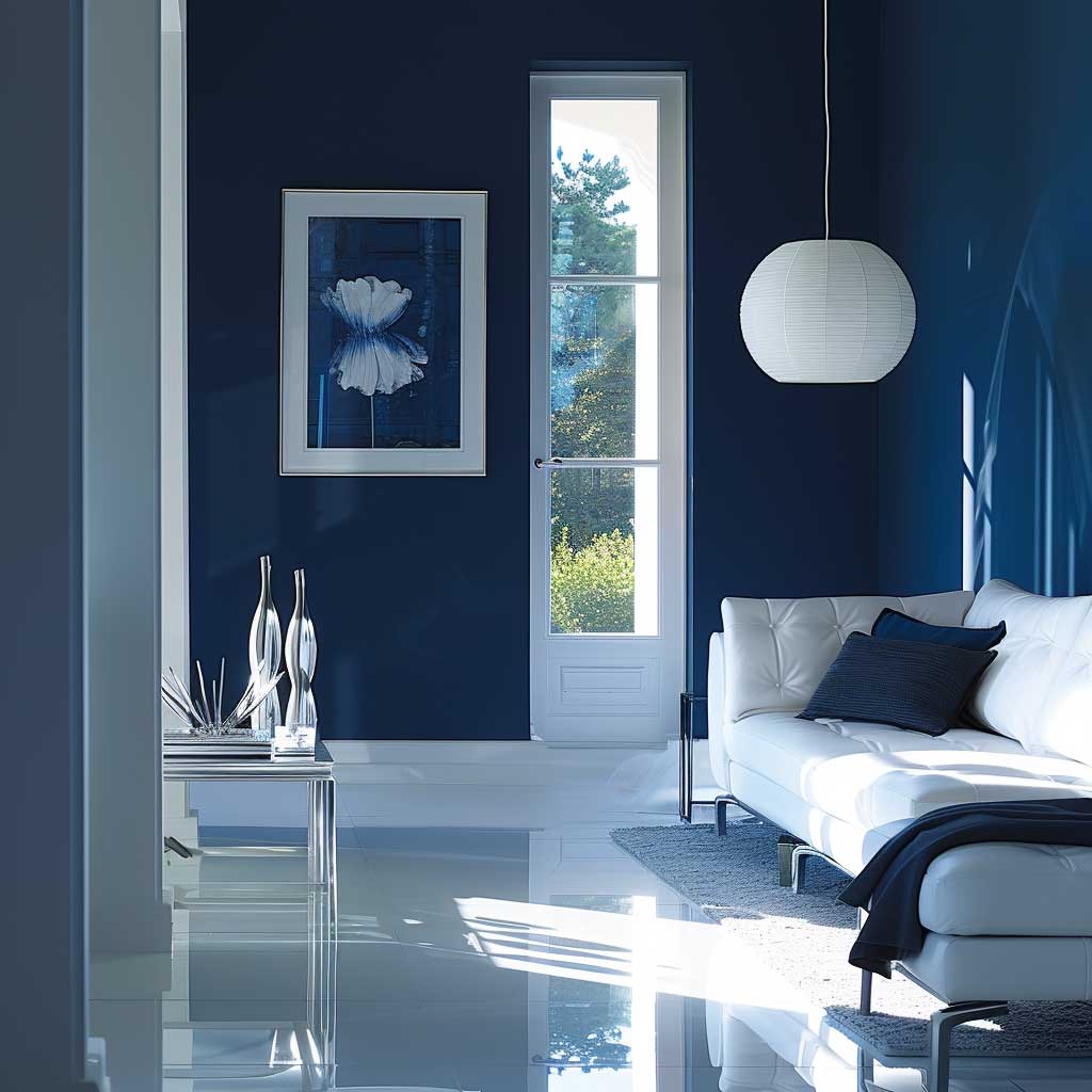
Dramatic monochrome bold paint color ideas operate on a different logic than geometric or color-blocked rooms: instead of contrast between colors, you build contrast between finishes and depths of the same hue. Deep blue is the strongest choice I’ve found for this approach — Benjamin Moore Hale Navy HC-154 (~$72/gallon) on three walls creates a room that feels like a ship captain’s library in the best possible way. Paint the fourth wall in the same color but in a satin finish instead of matte and you’ll notice the depth it adds without anyone being able to articulate why the room feels so layered.
White furniture is the counterweight that makes a monochrome deep-blue room function rather than feel like a tunnel. A white linen sofa or a white lacquer dining table provides the contrast your eye needs to settle, and the blue reads richer by comparison. Think of it like a photograph: the dark room needs a light subject to read as dramatic rather than heavy. Remove the white and you’ve built a cave; keep it and you’ve built a stage. For more on using a single-color palette as a complete room system, the kitchen wall paint guide on ArtFasad covers the same depth-through-finish principle in a practical room context.
Texture variation is the move that separates a well-executed monochrome room from a flat one. A deep blue velvet sofa ($1,200–2,500 from brands like Article or West Elm) against a matte navy wall reads as intentional depth. A silk throw pillow in powder blue provides a lighter accent without introducing a new color. Wooden furniture or woven accessories introduce natural warmth that prevents the monochrome scheme from reading as cold — which is the primary failure mode of badly executed all-blue rooms.
Lighting design matters more in a monochrome room than in any other scheme. Natural light shifts deep blue continuously — at 7am it reads almost indigo, by midday it opens up to a clear cobalt, and under warm incandescent light at night it pulls toward teal. Floor-level uplights aimed at the walls (Rejuvenation makes a solid pair for around $200) reveal the texture of the paint surface and completely change how the color reads after dark. Overhead-only lighting in a deep monochrome room produces the one effect you don’t want: a space that looks like a photo taken with a phone in bad light.
Bold Paint Color on One Wall Changes Every Room Differently
Bold paint color ideas applied to a single feature wall behave differently in every room type, and the reason most people get it wrong is that they choose the wall facing the door instead of the wall behind the main piece of furniture. I’ve seen this mistake in at least a dozen rooms — the accent wall faces you as you walk in, dominates the space, and competes with every other element. The wall behind the sofa, the bed headboard, or the dining sideboard is where a feature color earns its keep: it frames the furniture instead of fighting it.
Living rooms respond best to a single deep-color wall behind the sofa — navy, forest green, or terracotta all work. Bedrooms need the wall behind the headboard: the color frames the bed like a headboard extension and makes a $500 frame look like a $2,000 installation. Dining rooms are the interesting case: the ceiling is often the most dramatic surface to paint, because you look up at it during every meal and no furniture competes with it. Farrow and Ball’s Hague Blue No. 30 (~$130 per 2.5L) on a dining room ceiling is one of the most unexpected bold paint decisions I’ve ever recommended and the most consistently praised by everyone who’s done it.
What room doesn’t benefit from a bold feature wall? Hallways. Narrow corridors painted in a saturated color on the end wall look like a dead end, not a destination. Paint the long walls of a hallway in a deep tone if you want drama there — the length of the space reads as intentional depth rather than a closing wall.
Bottom Line
Committing to a bold paint color does more for a room than any other single decision
Geometric patterns reward minimalist furniture and punish clutter — get the furniture right before you pick up a brush.
Color blocking is three colors maximum at full saturation, split at chair-rail height, with solid-colored soft furnishings only.
Monochrome deep blue with white contrast furniture and varied finishes is the highest-impact approach with the most room for error. Save this post before your next paint store visit — it’s all here.
Related Topics