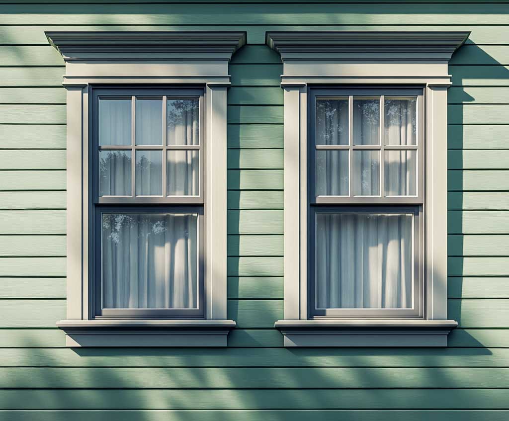
A cream and olive green colour combination for a home exterior sits right on the edge between warm and muddy — and the difference comes down to how much of each shade you apply, and exactly where. Cream as the primary body colour with olive reserved for trim and accents creates a sun-lit, grounded palette that reads as intentional from the street. Flip the ratio, and the same two colours can make a facade look heavy and unresolved.
Olive green brings a yellow-brown undertone that makes it pull warmth from whatever sits beside it. Against cream, that warmth is flattering. Against stark white, it reads muddy — which is why so many olive exteriors photographed in magazines look nothing like the test paint chip in fluorescent store lighting. The context matters as much as the colour itself.
This colour combination has appeared on Mediterranean villas, Colonial clapboard homes, and contemporary stucco builds for the same core reason: both shades belong to the same yellow-green family and share an undertone, so they never compete for dominance. That shared warmth is what makes the pairing feel pulled-from-nature rather than designed-by-committee.
- Cream walls with olive accents on trim and shutters outperform the reverse ratio on nearly every architectural style
- Sherwin-Williams Ripe Olive (SW 6209) and Renwick Olive (SW 2815) are the two most-used exterior olive greens against cream bases
- South- and west-facing walls fade first — budget for touch-up on those elevations after year 7
- A gallon of quality exterior paint covers 350–400 sq ft per coat; most houses need two coats plus a separate trim budget
- Lighter cream body colours can extend paint lifespan by up to 5 years compared to deeper shades on the same wall
- One accent colour limit applies: olive on shutters plus olive on railings plus olive on the front door is one too many — pick two of three
Mediterranean Architecture Pulls the Most From a Cream Body and Olive Accent Scheme
Arched windows, stucco siding, and terracotta roof tiles create a natural frame for the cream and olive green colour combination that’s harder to achieve on boxier architectural styles. The warm cream body reflects sunlight in a way that makes the facade glow in late afternoon — not white-bright, but honeyed — while olive shutters and door frames create the kind of depth that flat-front ranch homes struggle to produce with this same palette. Sherwin-Williams recommends Renwick Olive SW 2815 specifically for warm, grounding exteriors because its yellow undertone prevents the green from reading cold or grey on south-facing elevations.
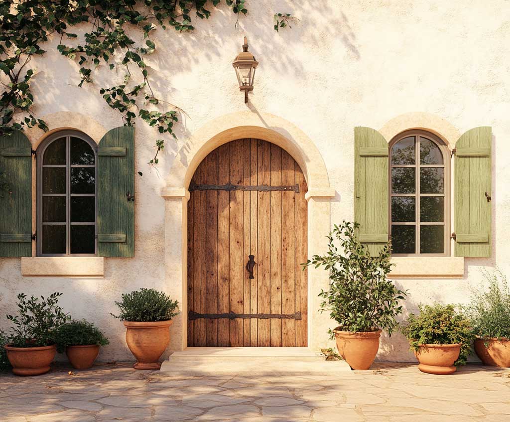
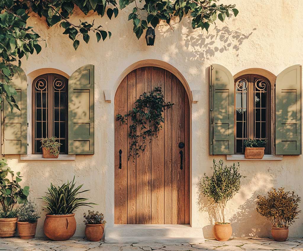
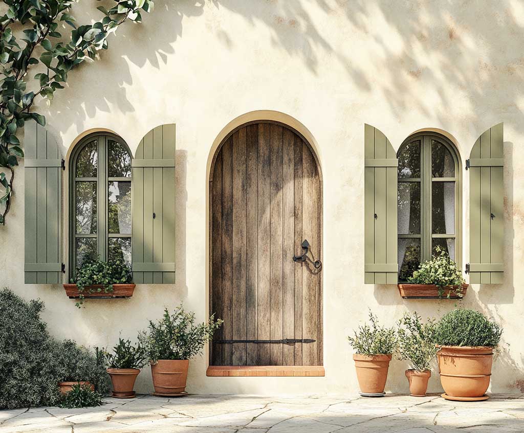
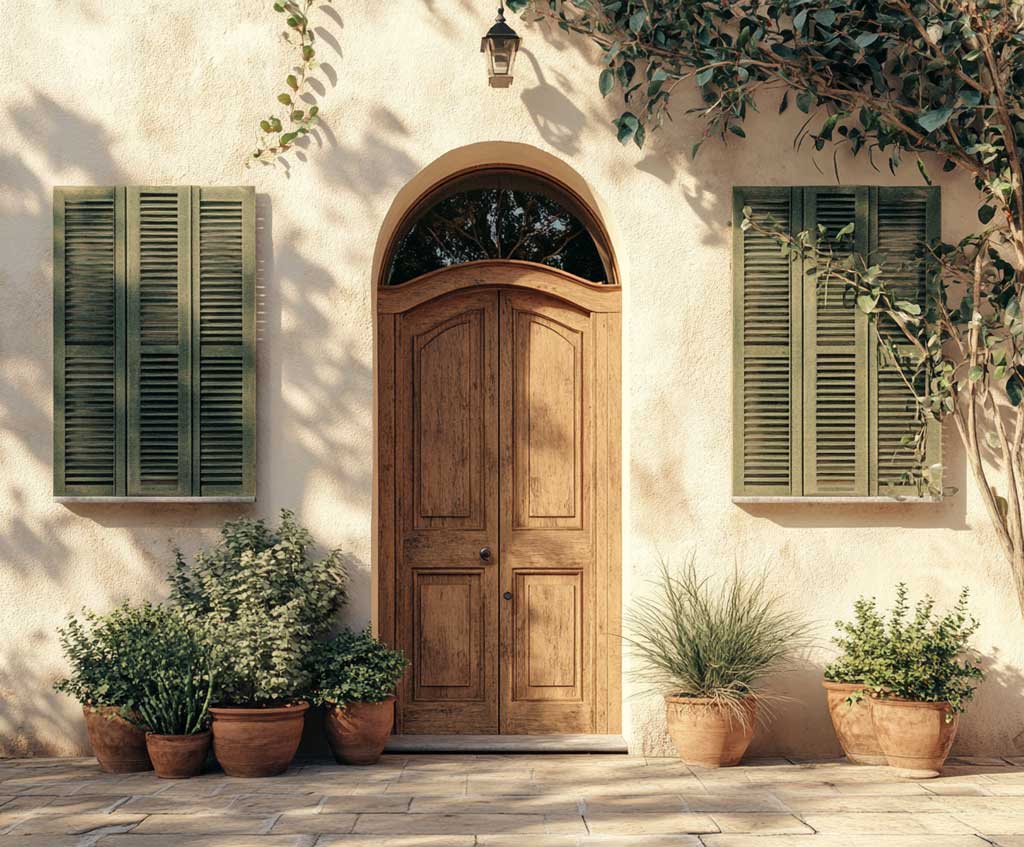
The practical detail most homeowners miss: olive on shutters and olive on the front door are two separate decisions, not one. Matching them exactly makes the colour scheme feel flat. Stylists often recommend going one shade deeper on the door than on the shutters — if the shutters are Renwick Olive, try Ripe Olive SW 6209 on the door. That single-step darkening adds visual hierarchy without introducing a third colour. Does it read complicated from the street? No — it reads considered.
Stone planters and ceramic pots near the entrance do more work for this palette than any paint trick. They carry olive and cream tones into three dimensions, so the facade doesn’t look like a flat stage set. Rustic wooden window boxes planted with trailing greenery extend the olive tone vertically and blur the hard line between the painted surface and the surrounding landscape. Avoid bright-white trim on a Mediterranean olive-cream build — it snaps the eye away from the warm palette and makes the whole scheme feel colder than it should.
Olive green on all accent surfaces simultaneously — shutters, railings, gutters, and front door — collapses the contrast this palette depends on. Olive works as an accent because cream is there to offset it. When olive covers 40% or more of the visible facade, the pairing stops reading as two-colour and starts reading as a single green-brown smear. Limit olive to two surfaces maximum: typically the door and shutters, or the trim and door, and let cream hold everything else.
Suburban Homes Get the Cream and Olive Green Combination Right by Staying Restrained
Cream and green house exterior colour on a standard suburban build lives or dies by restraint. The architectural details are usually simpler — a flat or slightly gabled roofline, standard rectangular windows, a straight-run porch — which means the colour combination has to carry more of the visual interest on its own. The trick is treating cream as the background and olive as the punctuation: a front door in Ripe Olive SW 6209, shutters in the same shade, and nothing else painted darker than the cream body. That’s the formula that makes a plain rectangle of a house look deliberate. For more two-tone exterior house paint ideas for traditional home styles, the pairing logic transfers directly.
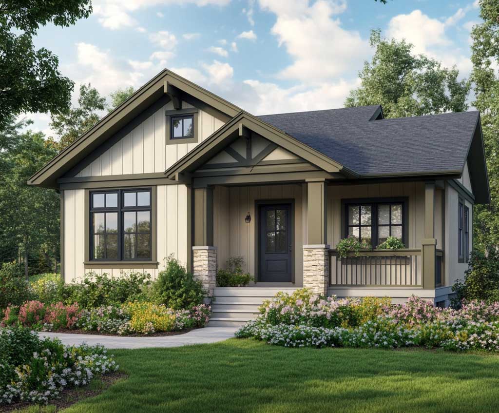
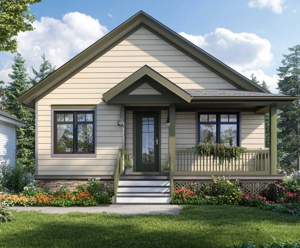
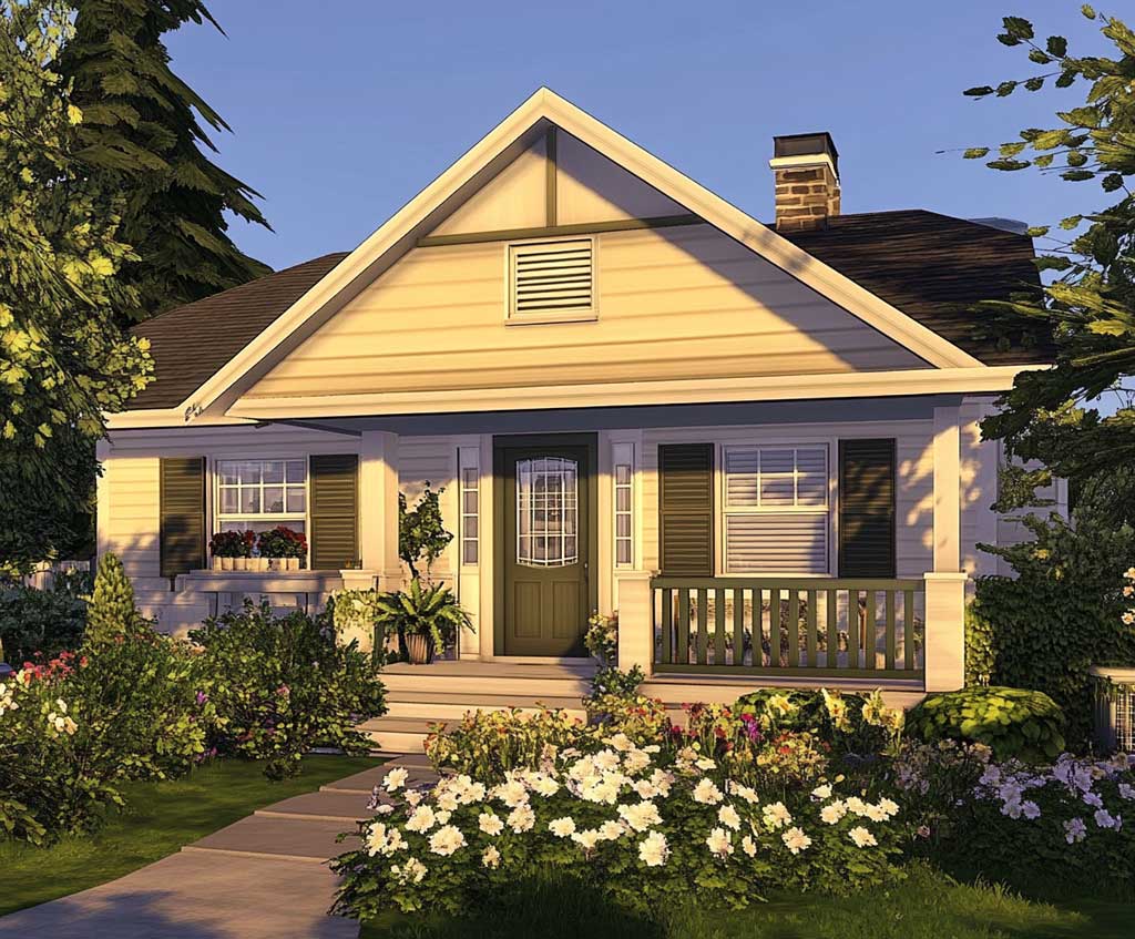
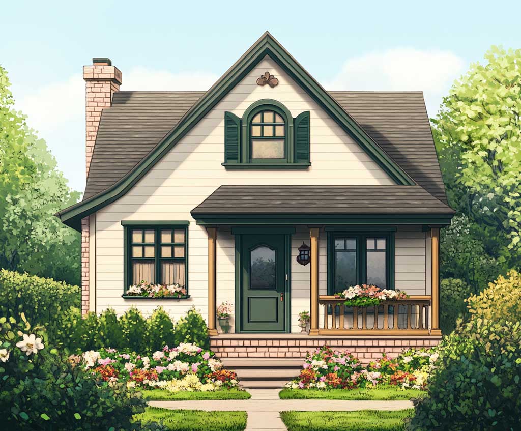
What distinguishes cream from white in this context is warmth. A cool white with olive accents reads as coastal or Scandinavian — pleasant, but a different aesthetic entirely. Cream, with its yellow-beige base, keeps the palette grounded in earthy territory, so olive accents feel like they belong to the same natural world rather than contrast against it. Think of it like bread and moss — the two textures exist together in nature without one overpowering the other. That instinctive compatibility is why this combination registers as calm rather than busy even on a home with multiple accent surfaces.
Seasonal fading behaves differently on cream than on white. Cream tends to shift slightly yellower as UV exposure accumulates, which actually deepens its compatibility with olive over time — the two shades drift toward the same warm centre. UV-resistant 100% acrylic exterior paints slow that shift significantly; a quality exterior coat in this range can hold colour for 7 to 10 years before a full repaint becomes necessary. The south- and west-facing walls will show wear first, typically 1–2 years ahead of the shadier north side, so plan touch-up budgets accordingly. Olive-toned outdoor furniture — a bench, a pair of chairs, a planter stand — reinforces the palette without requiring any additional paint commitment.
Exterior Paint in Olive Green Holds Longest When the Undertone Matches the Cream Base
Exterior paint in olive green fails early for one consistent reason: undertone mismatch. An olive with a blue-grey base placed next to a cream with a pink or peach base creates a visual dissonance that surfaces even before the paint starts to age. The two most reliable olive greens for cream pairings — Sherwin-Williams Ripe Olive SW 6209 and Renwick Olive SW 2815 — both carry yellow-brown undertones that align with the warm centre of most cream body paints. That alignment is what makes the combination look naturally cohesive rather than carefully assembled. For a wider look at how earthy green exterior paint ideas work across different architectural styles, sage and mossy greens follow the same undertone-first logic.
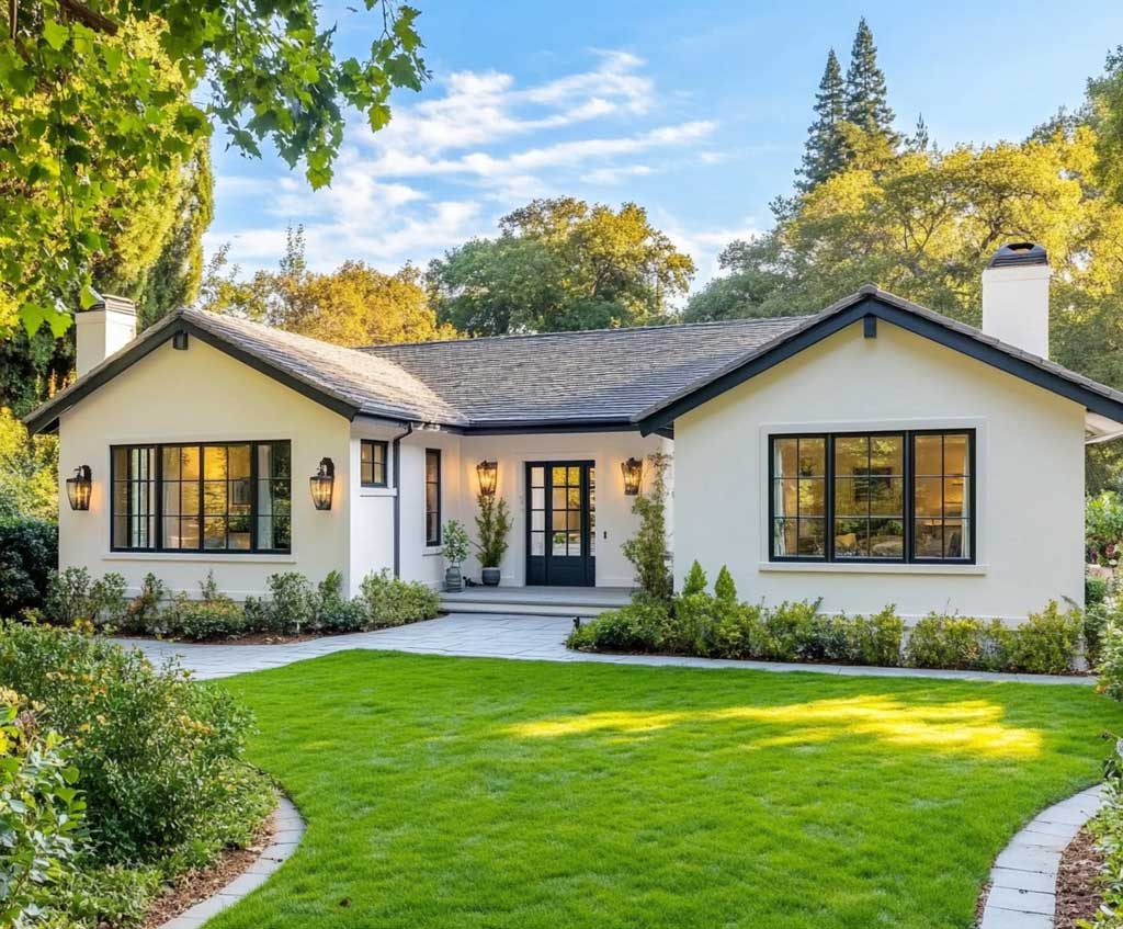
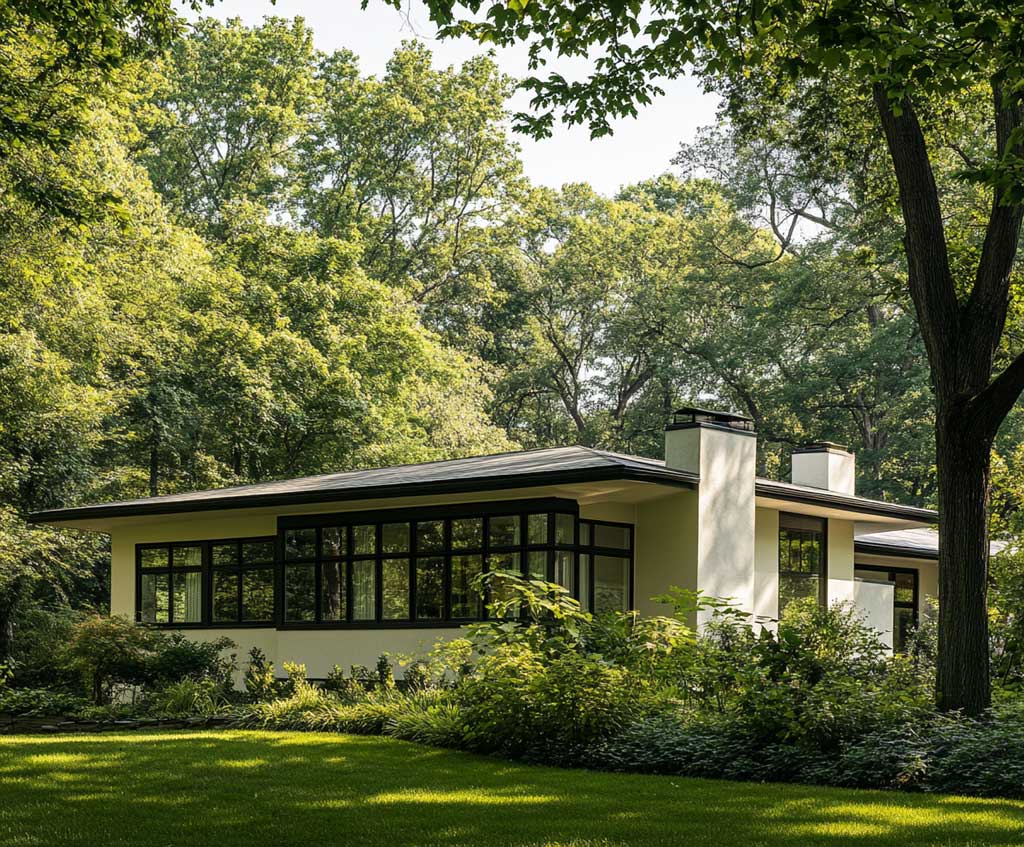
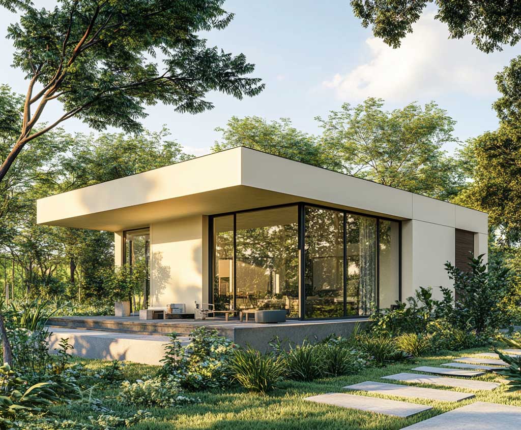
Coverage and cost: a gallon of quality exterior paint covers 350–400 sq ft per coat on smooth siding, dropping to roughly 200–250 sq ft on stucco. A typical two-storey home with 2,000 sq ft of paintable exterior needs 8–9 gallons for the body and 1–2 gallons for trim at two coats — budget separately for those olive accents, since trim paint runs around 1 gallon per 50 linear feet of detail work. Sherwin-Williams exterior lines run $50–$90 per gallon depending on product; premium lines hold colour and resist chalking significantly longer, making the higher upfront cost the better value over a 10-year repaint cycle.
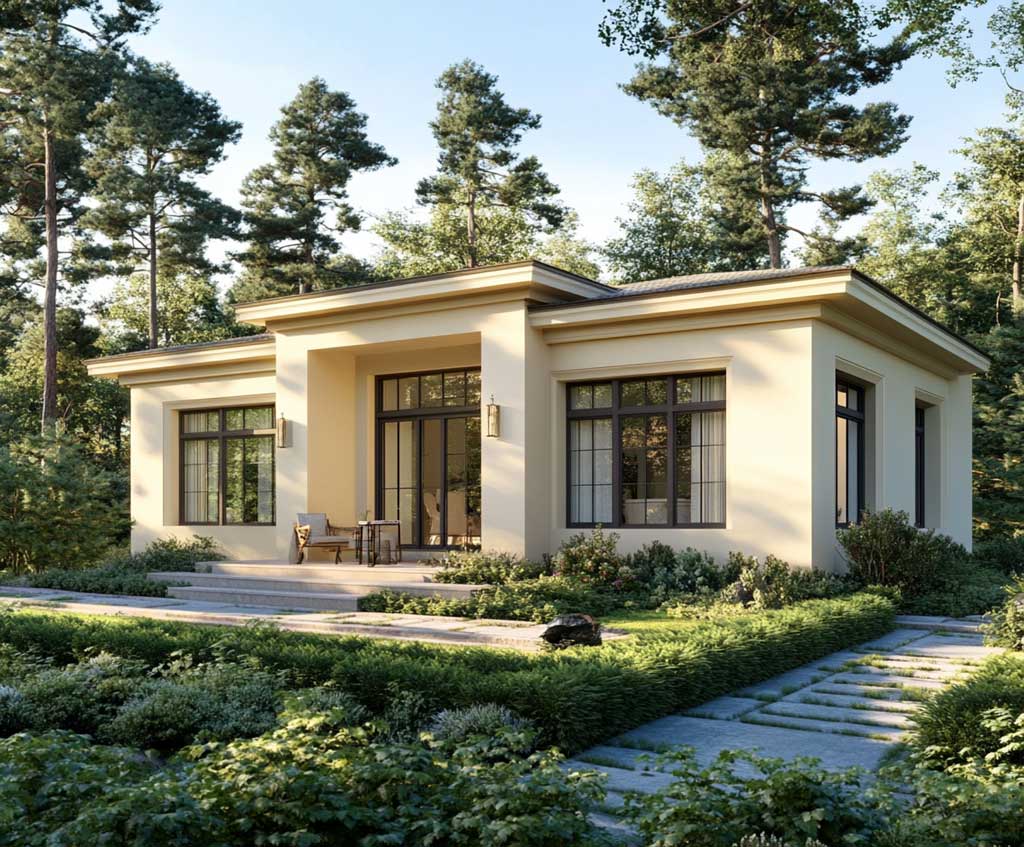
Single-storey homes benefit from this palette in a specific mechanical way: cream on the body makes the structure read taller visually, because the light, reflective shade pushes the roofline upward. Olive on the trim grounds that effect at the base — window frames and door surround pull the eye back to human scale. Does the paint shade on the north wall need to match the south exactly? Yes — but order from the same batch, since tint formulas can vary by a few points between production runs and that difference reads clearly on adjacent elevations in direct sun. The Ripe Olive SW 6209 colour page on Sherwin-Williams includes coordinating cream tones worth comparing before committing.
Lighter cream body colours last measurably longer than deeper shades on the same wall — research on exterior paint longevity shows light colours can extend coating life by up to 5 years compared to dark or saturated alternatives at the same exposure. That’s because lighter pigments reflect more UV rather than absorbing it, which slows binder breakdown. For a home in a high-sun region, this isn’t a minor difference — it’s roughly one full repaint cycle. Avoid applying olive green on surfaces that face full south exposure without a UV-stable formulation; a non-UV-rated olive will chalk and lighten within 4–5 years, losing the depth that makes the combination work.
| Olive Shade | Best Paired With | Ideal Surface | Watch Out For |
|---|---|---|---|
| Renwick Olive SW 2815 | Warm creams with yellow base | Shutters, door frames | Reads yellow-brown in shade |
| Ripe Olive SW 6209 | Creamy off-whites, stone trim | Front door, trim accents | Very dark — test in full sun first |
| Olive Grove SW 7734 | Light beige, natural wood | Full siding, porch ceiling | Can grey out on north-facing walls |
Cream Exterior Trim Colours on an Olive Green House Need Warmth, Not Bright White
Exterior trim colours for a cream house with olive green accents is a question stylists field constantly, and the wrong answer — bright white trim — shows up on too many otherwise well-considered facades. Bright white next to olive creates a hard, clinical contrast that strips the warmth out of the entire palette. The right answer is an off-white with a yellow or sand undertone: Benjamin Moore White Dove OC-17 or Sherwin-Williams Alabaster SW 7008 sit warm enough to maintain the earthy register of the combination without reading as cream themselves. The distinction between the body cream and the trim off-white should be subtle — enough to define the architectural edge but not enough to interrupt the palette’s cohesion.
Benjamin Moore White Dove retails around $70–$82 per gallon depending on finish and retailer, which puts it in the mid-premium range. Is it worth the price premium over a standard contractor white? For trim, yes — trim surfaces face concentrated wear at corners and window sills, and a higher-binder formulation holds its edge crispness longer before chalking. A trim coat that chalks unevenly at year 4 makes the whole facade look neglected even when the body paint is still performing well. Spend the quality budget on trim first, then step down one tier for the body if needed. The paint covering the most square footage is the last place to compromise.
Natural Surroundings Make the Cream and Olive Green Combination Pay Off Without Extra Work
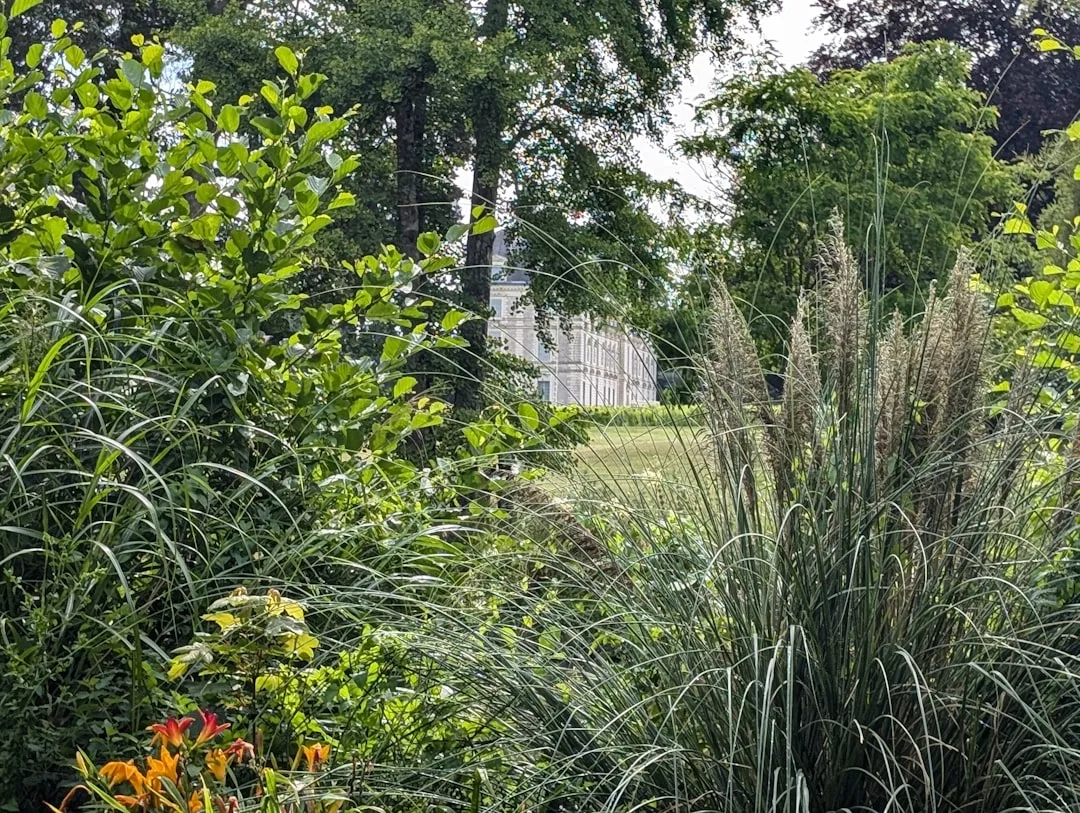
Houses set in garden landscapes or surrounded by mature trees get a free amplifier with this palette: the surrounding greenery resonates with the olive accents and deepens the impression of the cream walls by contrast. It works the way a mat board works in framing — the neutral surround makes the centre more vivid. What doesn’t work is attempting this palette in a context that actively fights it: a home surrounded by stark concrete hardscape, bright synthetic grass, or intensely coloured neighbouring houses loses the natural context that makes cream and olive feel connected to something larger than the paint job itself.
Wooden elements — a bench, a pergola post, a stone pathway border — carry the palette into the landscape without requiring additional paint decisions. Natural wood tones sit between cream and olive on the warm-yellow spectrum, which is why an unpainted timber front gate or a cedar deck near the entry can feel like a deliberate design choice rather than a budget shortcut. Adding architectural lighting at the foundation level extends the palette into evening hours: warm-white LED uplighting on a cream facade gives the same honey glow that direct afternoon sun produces, which keeps the home looking intentional even after dark.
Cream paint resistant to yellowing keeps its character in this landscape-heavy context. A cream that yellows under UV exposure shifts toward gold — which looks warm and pleasant in isolation but reads dirty against olive trim that hasn’t changed. Acrylic latex formulations with UV blockers hold their original hue significantly longer than alkyd-based or low-quality acrylic paints. Check the VOC rating alongside the UV spec: low-VOC formulations now perform comparably to older high-VOC exterior paints, and the absence of heavy solvents means the finish stays flexible through temperature swings rather than becoming brittle and cracking at caulk lines after a few winters.
Olive Green and Cream Combination for the Front Door — The One Surface Where You Can Commit
The olive green and cream combination on a front door is the lowest-risk, highest-return move in this palette’s toolkit. A front door in Ripe Olive SW 6209 against cream siding gives any home — regardless of architectural style — an immediate focal point without committing to a full exterior repaint. A gallon of door paint costs roughly the same as a standard exterior quart ($18–$30 at most retailers for a small tin), lasts 3–5 years on a covered porch, and can be repainted in an afternoon. The psychological upside is proportionally much larger: a cream facade with an olive front door reads as considered and current, while the same facade with a standard builder-grade brown door reads as unfinished.
Hardware choice matters more than most people expect on an olive door. Aged brass or matte black hardware ties into the warm-dark register of the olive without competing with it. Polished chrome or silver hardware pulls the eye into a cool-metal territory that conflicts with the earthy warmth of both cream and olive, making the door look mismatched rather than layered. The contrast trick: a brass door knocker reflects warm light that deepens the olive tone around it, functioning almost like a colour-temperature adjustment applied to one specific point on the facade. You notice the combination but can’t always name what’s making it work.
Beige and Olive Green Combination Works When Beige Skews Warm, Not Grey
The beige and olive green combination — which shows up in GSC data as a distinct search from cream — behaves differently depending on whether the beige reads warm (yellow-tan) or cool (greige-grey). A warm beige with olive accents creates the same earthy cohesion as cream, just with slightly less luminosity. A cool greige with olive accents creates a palette that reads disconnected — the cool grey undertone of the beige pulls against the warm yellow-brown undertone of olive, and the eye registers them as unrelated choices rather than a palette. Sherwin-Williams describes this undertone tension as the primary reason colour families (their grouped collections) exist: complementary undertones prevent adjacent colours from fighting each other even when the hue families differ.
A useful field test before committing: paint an 18-inch sample patch of both colours on the actual surface, let it dry fully (24 hours minimum — wet paint reads 10–15% darker than dried), and observe it at three different times of day. Morning light on an east-facing wall and afternoon light on a south-facing wall will give dramatically different readings of the same colour pair. What looks balanced at noon on the south elevation might look yellowed and flat by 4pm. This testing process adds a few days to the planning timeline but eliminates the most common outcome of exterior colour projects: repainting within two years because the combination didn’t look the way it did in the store.
Exterior House Colour Combinations That Work Best Near Olive Green on the Colour Wheel
The best exterior colour combinations that work alongside olive green share one characteristic: they sit within 30–45 degrees of olive on the colour wheel, or they are neutral enough that they take on the character of whatever sits next to them. Warm terracotta, aged bronze, natural stone in tan or brown ranges, and wood-tone accents all fall into the first category — adjacent on the wheel, warm in undertone, compatible without trying. Crisp white, bright yellow, or saturated navy fall outside that range and create high-contrast combinations that can work architecturally but read as a different aesthetic category entirely — more graphic, less naturalistic.
Brown and cream house paint combinations occasionally get lumped with olive-and-cream in search results, but they work by a different mechanism. Brown replaces olive’s green cast with a pure-earth tone, which looks warmer but loses the connection to living foliage that olive provides. The choice between them is really a question of whether the goal is warmth (brown) or landscape integration (olive). A house surrounded by deciduous trees works better with olive — when the leaves match the accents, the facade disappears into its setting in the best possible way. A house in a high-desert or arid landscape with minimal greenery often reads better with brown accents, because there’s no foliage for olive to echo.
Picking the Right Cream Colour for the Exterior — LRV Matters More Than the Shade Name
Choosing the best cream colour for an exterior house comes down to Light Reflectance Value (LRV) more than the shade name on the chip. Cream colours with an LRV between 65 and 80 strike the most useful balance: light enough to reflect heat and extend coating life, warm enough to maintain the earthy register of the olive combination. Colours with LRV above 80 start reading as near-white in direct sun — they look bright, not cream. Below 65, they begin to read as tan or buff and can make a facade look heavier than intended. Sherwin-Williams Navajo White SW 6126 has an LRV of around 73 and a yellow-orange undertone that aligns well with most olive greens — it’s a safe anchor shade for the cream side of this combination.
Flat and matte finishes on exterior body paint hide surface imperfections better than satin or semi-gloss, which is why most architectural painters recommend them for wall bodies. Reserve satin or semi-gloss for trim — including olive accents on doors and shutters — because the slight sheen on accent surfaces gives the eye a subtle cue to read them as separate from the body, reinforcing the two-tone effect without requiring dramatic colour contrast. That sheen difference can substitute for an additional shade of olive, effectively giving the palette three visual layers — cream body, matte; cream body, satin; olive trim, semi-gloss — from only two colour choices.
Cozy and Elegant Exterior Look in India — The Cream and Olive Formula Translates Across Climates
For a cozy and elegant exterior look in a tropical or high-sun climate like India, the cream and olive green combination requires one adjustment: UV resistance becomes the primary selection criterion, not just colour. High-UV climates accelerate pigment breakdown at roughly twice the rate of temperate climates, which means an olive green that would last 7–10 years in Northern Europe may show significant fading in 4–5 years in a region with year-round intense sun. Asian Paints Exterior Emulsion and Berger WeatherCoat are two Indian-market exterior paint lines formulated for high-UV conditions; both offer olive-range greens (look for shades in the Moss and Fern families) that maintain colour significantly longer than standard interior-grade paints used outdoors, which is a common cost-cutting mistake that leads to rapid chalking.
The interaction between cream and olive in high-humidity climates introduces a second concern: mildew resistance. Cream surfaces in humid conditions develop grey-green mildew blooms that visually merge with olive accents in a way that makes the colour scheme look unintentional rather than designed. A paint with a built-in mildewcide — listed on the can as an additive or specified in the product description — prevents this. Surface preparation matters equally: any existing mildew must be killed with a diluted bleach wash and fully rinsed before painting, or the new coat will blister from beneath within the first monsoon season. The cream-and-olive combination is forgiving aesthetically; it is not forgiving of skipped prep work.
Sage Green vs Olive Green on a Cream Exterior — What Changes and What Doesn’t
Sage green and olive green share the cream exterior conversation because both fall in the grey-green range and both pair naturally with warm body tones. The functional difference: sage has more grey in its undertone and less yellow-brown, which makes it read cooler and slightly more muted against cream. On a house with white or light stone elements nearby — a pale limestone path, white porch columns — sage stays in register better than olive, because its cooler undertone doesn’t fight the stone’s coolness. Olive, with its yellow-brown cast, reads warmer and more saturated, which suits homes where the surrounding landscape provides the cooling counterpoint.
The decision also comes down to architectural era. Victorian and Craftsman homes, with their complex trim profiles and multi-surface exterior details, typically suit sage better because its restraint doesn’t compete with the already-busy facade. Mediterranean and Colonial homes with fewer competing details can carry olive’s richer warmth without it overwhelming the architecture. A practical shortcut: if the roof shingles are warm-brown or terracotta, go olive. If the roof is grey slate, grey asphalt, or charcoal, go sage. The roof is the largest fixed colour on the exterior, and matching its temperature register in the accent colour creates harmony that no amount of colour consultation can replicate.
Olive Green Paint Colour for an Exterior — The Number to Check Before You Buy
Exterior paint in olive green comes with a number that matters more than the colour name: the LRV. Olive paints typically sit in the LRV range of 5–20 — very dark, absorbing more heat and UV than any cream body paint. That heat absorption is part of what makes them look rich and saturated in photos, and it’s also part of what makes them fade faster than lighter shades. Ripe Olive SW 6209 has an LRV of 6, which means it reflects very little light and will absorb significant UV on south-facing surfaces. Renwick Olive SW 2815 sits higher, around LRV 12–15, which gives it a slightly longer exterior lifespan in comparable conditions.
Trim paint for olive accents should be specified in semi-gloss or gloss finish — the sheen adds a practical layer of protection on surfaces that take physical contact (door edges, window sills, railing tops) and makes cleaning easier without requiring aggressive scrubbing. A matte or flat olive on a front door will look beautiful for the first season and show fingerprints, scuffs, and water marks visibly within the first year. The finish choice on trim surfaces is a durability decision as much as an aesthetic one — get it right the first time rather than re-doing the door in year two. Benjamin Moore Aura Exterior in any olive range runs approximately $82 per gallon and is widely cited by painting contractors as one of the most durable current options for high-contact exterior trim surfaces.
Olive Green House with Cream Trim — How to Reverse the Dominant Colour and Keep It Refined
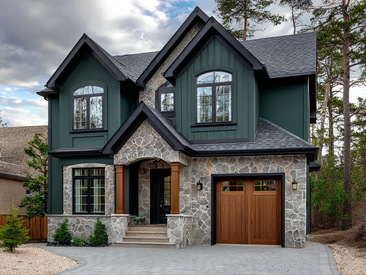
An olive green house with cream trim flips the standard distribution — olive becomes the body, cream becomes the accent — and the result is a substantially bolder statement. This approach works best on architecturally simple homes where the body colour is meant to do the visual work that trim and detail would normally handle. A board-and-batten farmhouse, a Craftsman bungalow with strong roofline geometry, or a Cape Cod with minimal trim detail can carry an olive body without looking heavy. A home with complex moulding, multiple gable profiles, and detailed window surrounds can tip into looking busy when the body colour is as saturated as olive.
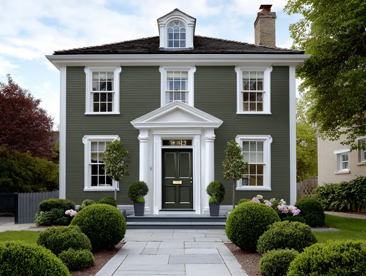
Cream trim on an olive body should lean toward warm ivory rather than pure white — the same undertone logic applies in reverse. A cool bright white against a warm olive body creates contrast that reads as conflict. Ivory with a yellow or sand base reads as intentionally composed. The cream trim functions here the way negative space functions in graphic design: it lets the eye rest between the heavier visual weight of the olive body and the structural lines of windows, doors, and roofline. Get the cream-to-olive surface ratio around 70% olive / 30% cream for this layout, and the palette stays grounded rather than looking like it’s being wrestled into submission.
Olive Green Exterior Paint on a Single-Storey Home — Scale Changes the Formula
Single-storey homes read differently with olive green exterior paint than two-storey builds do, because the roof occupies a proportionally larger share of the visible facade from street level. A dark olive body on a single-storey home with a dark grey or black roof can absorb so much visual weight that the house looks squat and heavy. The correction: keep the body in cream or a very light neutral, and apply olive only to the accent surfaces — shutters, door, window trim — so the colour reads as a highlight rather than a field. The roof colour anchors the top of the composition; the body colour needs to push up against it with enough lightness to prevent the whole structure from feeling like it’s pressing into the ground.
Cream on the body of a single-storey home visually increases perceived wall height by reflecting light upward. Olive accents at mid-height — window frames and shutters — create a visual band that reads as a waist, giving the single storey a sense of proportion that taller homes achieve automatically through sheer height. The combination becomes a kind of architectural optical correction: cream makes the structure taller, olive at the windows gives it scale, and the two together produce a facade that looks considered rather than accidental. The effect costs nothing beyond the colour selection — the paint itself runs the same price regardless of which shade goes where.
Colour Design Principle Behind Why Cream and Olive Always Works Together
Colour design in exterior paint is partly science and partly a deeply contextual judgment — the same combination reads differently on different surfaces, in different light, and against different surrounding materials. Cream and olive are well-suited because they belong to the same part of the colour wheel (the yellow-green-brown quadrant), share a warm undertone, and are separated by enough value (lightness-darkness difference) to create visible contrast without needing to be complementary opposites. In colour theory, this is called an analogous palette: colours adjacent on the wheel that harmonise by proximity rather than contrast. Analogous palettes on exteriors read as calm and cohesive, which is why they’re the dominant choice for residential architecture even when individual homeowners can’t name why they feel right.
The tension most homeowners feel when choosing between cream and olive as a combination is the fear that the result will look boring. It rarely does in execution, because the surrounding landscape, changing light, and the texture of the painted surface add variation that flat photographs can’t capture. A cream and olive exterior at 7am in low raking light looks different from the same facade at noon in direct overhead sun, and different again at golden hour when the cream goes amber and the olive deepens toward forest green. Paint is not static — it responds to its environment continuously, and this palette’s natural warmth makes it more, not less, responsive to that light shift. That responsiveness is the feature, not a limitation.
Olive Cream Colour for Room Interiors — When the Exterior Palette Carries Inside
The olive cream colour combination reads well in interior rooms when the olive shifts toward a lighter sage or muted green, and the cream becomes a warmer white rather than a body paint. A living room or bedroom with cream walls and olive on one accent wall or in soft furnishings carries the same cohesive warmth as the exterior palette without the weight of dark olive on four enclosed walls. Rooms with limited natural light handle olive poorly at full saturation — Ripe Olive SW 6209 with its LRV of 6 will make a north-facing bedroom feel like a cave. Step up to a lighter olive in the LRV 30–45 range — Olive Grove SW 7734 or something in the Benjamin Moore Historical collection — and the same earthy warmth becomes liveable without requiring floor-to-ceiling windows.
The dress-and-outfit question that appears in some search data — olive green and cream colour combination for clothing — follows the same palette logic. Cream or off-white as a neutral base with olive as an accent (a jacket, a scarf, shoes) creates the same analogous harmony in a wardrobe that it does on a facade. The proportional rule holds: cream dominant, olive as a measured accent. Going full olive on a cream background in clothing reads bold; going half-and-half reads muddled. The colour theory is identical whether the canvas is a wall or a person — analogous palettes work by contrast of value, not contrast of hue.
Colour Name and Code Reference for Cream and Olive Green Exterior Projects
Colour names vary by brand and market, which creates confusion when a homeowner finds a palette online and tries to replicate it with a different paint manufacturer. The hex code is the reliable reference point: Sherwin-Williams Ripe Olive SW 6209 has hex #44483D and an RGB value of 68, 72, 61 — a very dark, grey-green with minimal chroma. Renwick Olive SW 2815 is lighter and yellower. For cream, Navajo White SW 6126 is a widely available benchmark with a yellow-warm base that matches most olive greens without introducing conflict. Most paint retailers can colour-match from a hex code within one or two formula adjustments — bring the code printed on paper rather than on a phone screen, since screen colour profiles vary and can cause match errors under store lighting.
Indian market codes work differently: Asian Paints uses its own colour numbering system, and the closest matches to Ripe Olive in their exterior range sit in the 8282 and 8295 series (Jungle and Moss categories). Berger WeatherCoat’s equivalent olive-greens are in the Terrain collection. Neither brand publishes hex codes directly on chips, which means colour-matching from a Sherwin-Williams reference requires taking a physical chip to the mixing counter. The good news: paint technology at the mixing stage is now precise enough that cross-brand matches are accurate within a visual tolerance that matters only in direct side-by-side comparison — on a real-world exterior, the difference is indistinguishable.
Exterior Paint Combinations on a Budget — Where Cream and Olive Still Wins Without Premium Paint
Exterior paint combinations can reach $2,000–$4,000 in product cost alone for a large home, which pushes some homeowners toward lower-grade paints on the body to save money. A cost-effective approach that doesn’t sacrifice long-term performance: use mid-grade acrylic latex on the body (Behr Premium Plus Exterior runs around $38–$45 per gallon at Home Depot) and invest in premium paint only on the trim and accent surfaces. Trim paint covers far less square footage than body paint — a gallon or two at most — so the per-gallon premium has minimal impact on total project cost. Olive trim in Benjamin Moore Aura Exterior at ~$82/gallon uses roughly 1–2 gallons, adding $40–$80 to the project compared to mid-grade. That’s the cheapest possible insurance against trim re-do within five years.
Labour is the dominant cost in most exterior painting projects, typically running $1.50–$4.00 per square foot for professional application. On a 2,000 sq ft exterior, that’s $3,000–$8,000 before paint — which means the paint itself is a minority of total project cost. Skimping on paint quality to save $200 at the store, then repainting three years early because the cheap coat failed, costs $3,000–$8,000 in labour a second time. The math is straightforward: paint quality is the most leveraged variable in total cost-over-time, and cream-and-olive in premium-grade materials will outperform the same palette in budget-grade materials by 3–5 years on a typical residential exterior.
Olive Green and Cream Colour Combination for a Cozy and Elegant House — The Final Checklist
Pulling together the cream and olive green colour combination on a real exterior project comes down to six decisions made in a specific order: body colour (cream LRV 65–80, warm undertone), accent surfaces (limit to two — door and shutters, or trim and door), olive shade (match undertone to cream base), finish (semi-gloss or gloss on all olive accent surfaces, matte on cream body), paint quality (premium on trim, mid-to-premium on body), and hardware (aged brass or matte black, not polished silver). Get those six in order and the palette handles the rest — it is, at its core, a forgiving combination that rewards proportion and punishes excess.
The test of a well-executed cream and olive exterior isn’t how it photographs in flat midday light. It’s how it looks at the edge of a summer evening, when long shadows cut across the facade and the cream walls go amber-gold. At that hour, the olive accents shift toward deep forest, and the house looks like it has been standing in that garden for a hundred years — unhurried, warm, and exactly the right colour.
Colour Combination
Cream and Olive Green — The Ratio Is the Decision
Keep cream as the body (LRV 65–80), olive on no more than two accent surfaces, and match undertones before committing — olive with a yellow-brown base, cream with the same.
Exterior paint in this palette lasts 7–10 years with premium acrylic latex; south-facing walls will show wear 1–2 years ahead of shaded elevations — plan touch-up budgets accordingly.
Finish matters as much as colour: semi-gloss on olive trim surfaces, matte on cream body, and warm-toned hardware (aged brass or matte black) to keep the palette’s earthy register intact. Save this post.