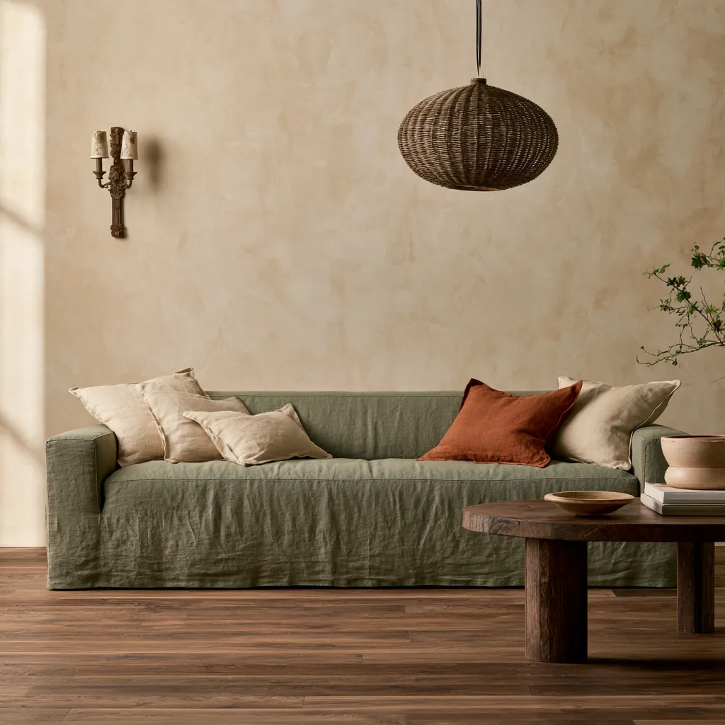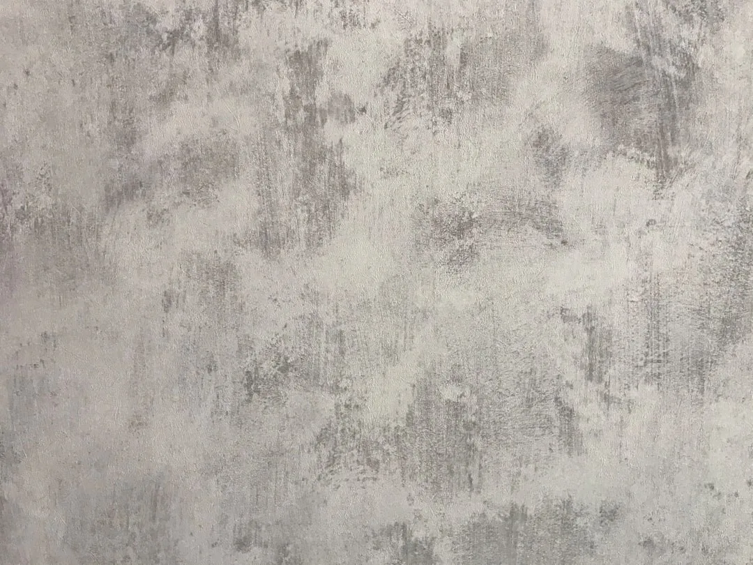
In August 2026, monochromatic neutral wall finishes have evolved far beyond a single coat of eggshell beige. What once felt like a safe default now functions as a deliberate design strategy—one that uses tonal layering, finish variation, and surface texture to create depth within a restrained palette. Designers are discovering that monochromatic neutral wall finishes deliver sophistication precisely because they don’t shout. They whisper.
The shift reflects a broader move away from color-as-primary-design-tool toward materiality and craft. A blank cream wall used to signal minimalism or budget constraint. Now it signals intention—the restraint that allows furniture, light, and texture to perform their own work.
Why monochromatic neutral wall finishes matter right now
Farrow & Ball, the UK paint house, reported in early 2026 that their neutral and earth-tone collections outpaced their jewel-tone offerings by 3-to-1 in renovation projects. That statistic alone tells the story. Homeowners are choosing restraint.
The reason: neutrals work with what you already own. They don’t demand replacement of furniture, art, or textiles when you want to refresh a room. A monochromatic scheme built from five shades of greige—from matte to satin to chalky to polished—creates visual richness without the decorating liability of a bold accent wall that dates in two years.
Monochromatic neutral wall finishes also solve the open-plan problem. When living, dining, and kitchen zones flow into each other without walls, a single neutral palette with tonal shifts creates psychological separation without physical barriers. Your eye reads each zone as distinct even though the walls belong to the same family.
Quick Tips
- Layer matte and satin finishes within the same neutral undertone to create depth without color change.
- Use warmer neutrals (greige, taupe) in north-facing rooms; cooler grays in south-facing spaces for light-balance.
- Apply a high-sheen finish to trim and ceiling within your monochromatic range to define architectural lines.
- Test finish samples at three times of day before committing; matte and satin read differently under morning, midday, and evening light.
- Pair monochromatic walls with one textured element—fluted wood panels, linen wallpaper, or plaster—to prevent flatness.

Texture as the real design work
Benjamin Moore, the American paint manufacturer, introduced their Natura line in 2025 specifically to address what designers call the “flat wall problem.” When everything is the same neutral, finish becomes the design element. Matte absorbs light and feels intimate. Satin reflects just enough to enliven a space.
The genius move: paint your walls in a soft greige base with matte finish, then apply the same color in satin finish to one accent wall. You haven’t changed the color. You’ve changed the light behavior.
Texture works the same way. A bedroom wall painted in warm ivory receives a chamois-cloth finish—a barely-visible texture that catches light without reading as patterned. Another wall in the same room stays smooth matte. The contrast creates visual movement that pure color never could.
| Finish Type | Light Behavior | Best For |
|---|---|---|
| Matte | Absorbs, creates intimacy | Bedrooms, studies |
| Satin | Reflects subtly, wipeable | Bathrooms, kitchens, trim |
| Eggshell | Middle ground, durable | Living rooms, hallways |
| Polished/Varnish | High shine, sculptural | Doors, trim, feature walls |
The mistake most people make with monochromatic schemes
The biggest error: choosing one neutral, painting all four walls and the ceiling in that single color and finish, then wondering why the room feels flat and corporate. This is what happens when people confuse “monochromatic” with “monotonous.”
A specific example: a homeowner in London selected Benjamin Moore’s Accessible Beige in matte finish for their living room walls, ceiling, and trim. No variation. No texture. The result felt like being inside a cardboard box—beige, yes, but soulless.
When they hired a designer to troubleshoot, the fix required only finish variation. The ceiling became satin in the same Accessible Beige. The trim received a polished varnish. A feature wall opposite the sofa shifted to a warmer greige (still in the same family) in matte finish. Suddenly the room had dimension, hierarchy, and warmth. The color hadn’t changed. The design had.
Material pairings that amplify monochromatic depth
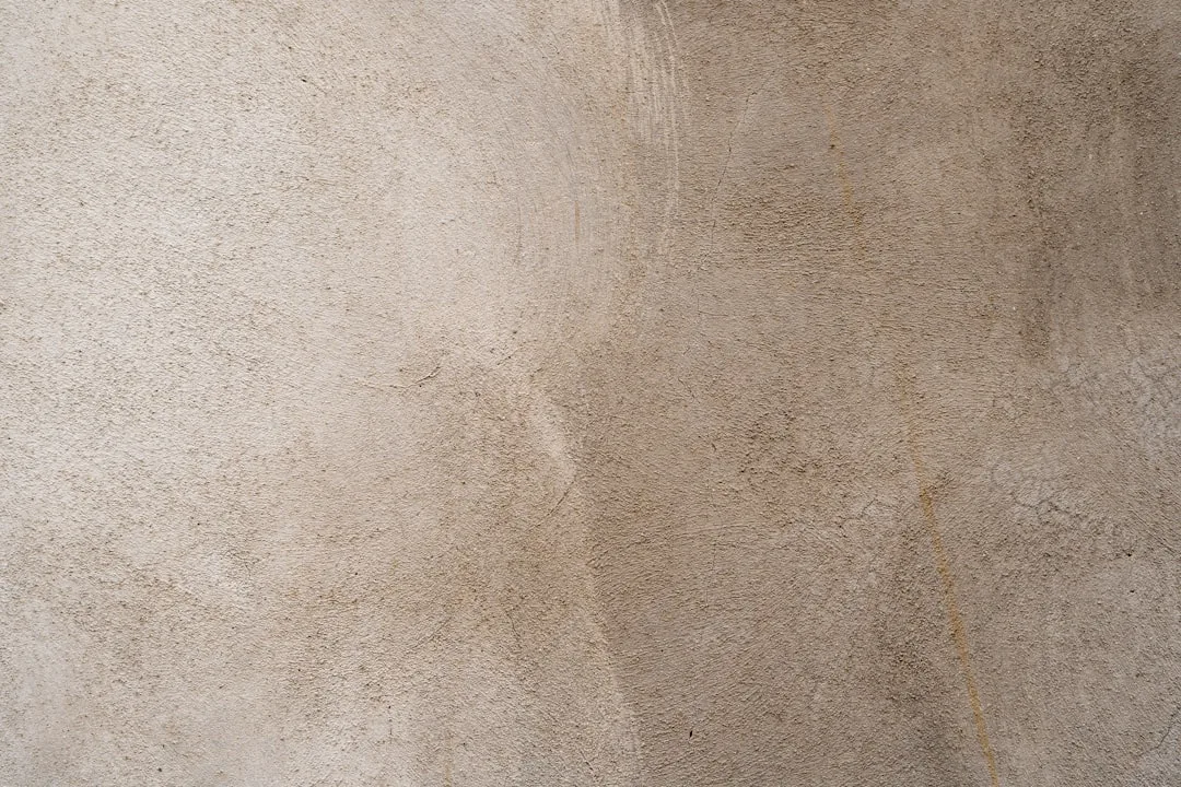
Sherwin-Williams, working with residential designers in 2026, found that monochromatic interiors paired with natural wood, stone, or metal accents read far richer than those paired with painted or plastic elements. The reason: real materials have their own color variation and texture. Wood grain moves within your neutral palette. Marble holds veining that echoes your tonal range.
Pair warm monochromatic neutrals (warm grays, greiges, soft taupes) with natural oak, walnut, or ash millwork. The wood’s undertones harmonize with the walls, creating a unified field. Then introduce a single brass fixture—a door handle, light fixture, or bookshelf bracket—to anchor the scheme.
Cool neutrals (cool grays, soft whites with gray undertones) pair better with pale oak, cerused wood, or light concrete. Add stainless steel or matte black metal accents. The logic is simple: your wall palette must dialog with your hard materials, not fight them.
Read more on how to build a beautiful home with stylish interiors by designing with a purpose using cohesive material selection and tonal strategy.
Monochromatic neutrals across room types
In bedrooms, monochromatic neutral schemes promote rest. Soft matte finishes on all walls create a cocoon effect; introduce linen wallpaper or flocked fabric in the same undertone for tactile warmth. Think of Japandi bedroom design for zen interiors—that restraint translates beautifully to a monochromatic palette.
In kitchens and bathrooms, satin or eggshell finishes dominate because they’re durable and wipeable. One wall can remain matte for visual interest; others in satin or eggshell create functionality. Pair with pale stone tile or concrete to echo the wall tone without repetition.
In hallways and entryways, monochromatic schemes with subtle texture create wayfinding clarity. A warmer neutral (greige or taupe) in matte on walls, with satin on the adjacent wall, signals direction without signage.
Why monochromatic neutral wall finishes outlast trends
Monochromatic schemes don’t trend because they’re trendy. They endure because they’re flexible. Change your art, your furniture, your accent textiles—your walls remain a stable backdrop. In 2026, when everyone else is chasing the next color story, a monochromatic neutral interior allows you to shift your design direction without repainting.
That flexibility is worth more than fashion. It’s worth staying power.
Practical Resources for a Monochromatic Wall Project
If you’re planning a layered neutral finish for your walls, these tools and guides cover the questions that come up once you move from inspiration to execution — safety, sampling, tools, and installation.
My house was built before 1978 — is it safe to repaint or sand the walls myself?
How do I actually test a color or finish before committing to it?
Will painting several walls in one session create an air quality problem?
What’s actually the difference between matte, eggshell, and satin, and where does each belong?
Why does my sample look different in the morning than it does at night?
Which sheen should go in the bathroom versus the bedroom?
How do I check that a contractor is actually licensed before I hire them?
How much paint do I actually need to buy for this project?
Has the paint or primer I bought ever been recalled?
I want to add the textured accent wall my plan calls for — how is wallpaper actually hung?