A green and yellow color scheme is one of the most misunderstood combinations in interior design — not because it’s difficult, but because most people default to shades that are too bright to live with. The pairing works across living rooms, kitchens, and bedrooms when you anchor it in the right tones: muted sage instead of lime, warm mustard instead of lemon, forest instead of neon. The result reads as nature-inspired, not a kindergarten classroom.
The rooms ahead cover all three spaces where green and yellow consistently land well. Each section tackles the shade decisions, the furniture logic, and the one mistake that derails nearly every attempt at this palette. Whether you’re starting from bare walls or reworking a room that never quite clicked, these approaches give you a framework that holds up.
Spend two minutes with the quick scan below before diving in — it covers the decisions that matter most before you buy a drop of paint.
– Soft sage or muted olive on walls, not lime or chartreuse — the former ages well, the latter dates fast.
– Mustard yellow or warm ochre as the accent color; avoid cold lemon yellow, which fights with green undertones.
– Sherwin-Williams SuperPaint runs ~$60/gallon; Behr Marquee is ~$44–55/gallon and covers in one coat.
– Kitchen cabinets in sage green pair best with white or quartz countertops, not yellow ones — put yellow in the backsplash tile instead.
– In bedrooms, keep yellow below 20% of the visual field (pillows, lampshades, a throw) and let green carry the walls.
– Forest green with mustard yellow skews traditional; sage green with pastel yellow skews fresh and modern.
What a Green and Yellow Living Room Actually Needs to Work
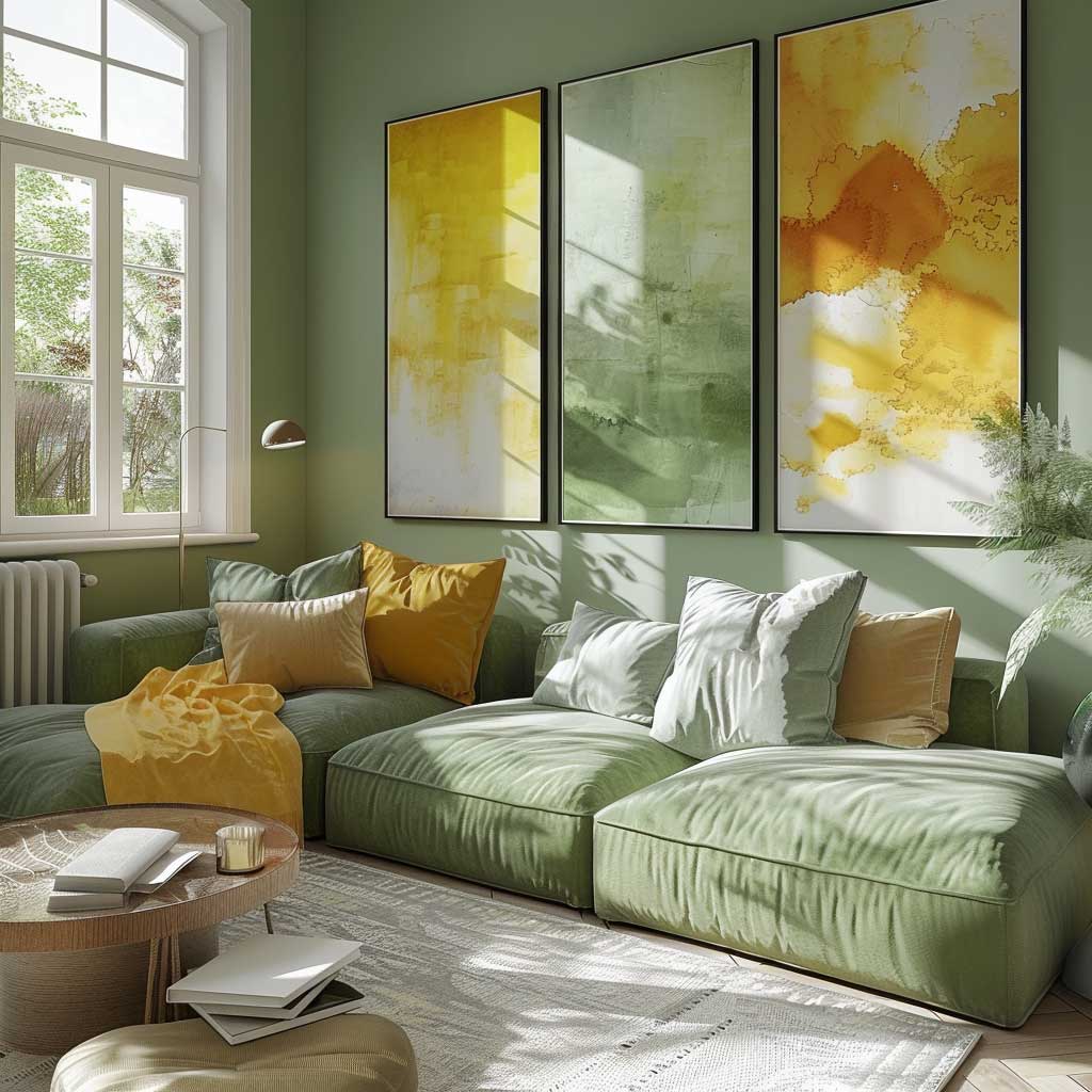
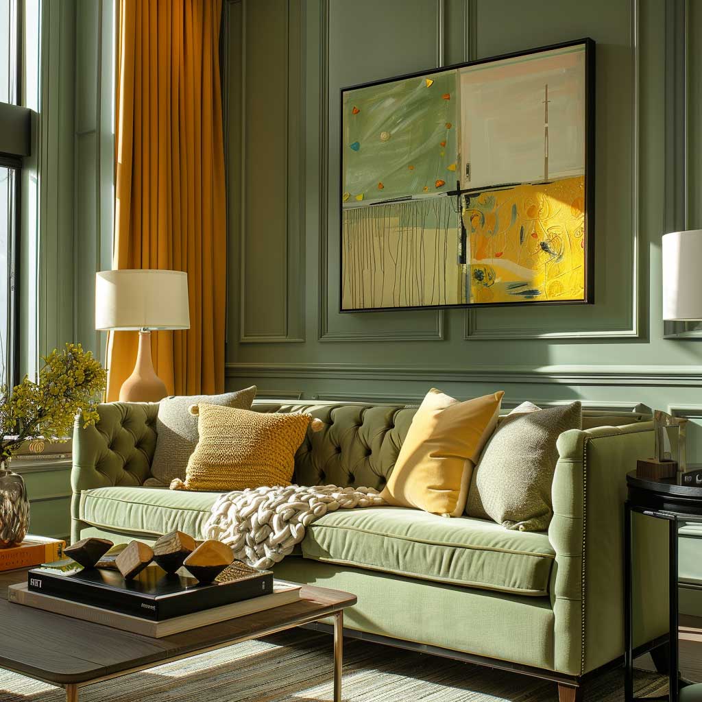
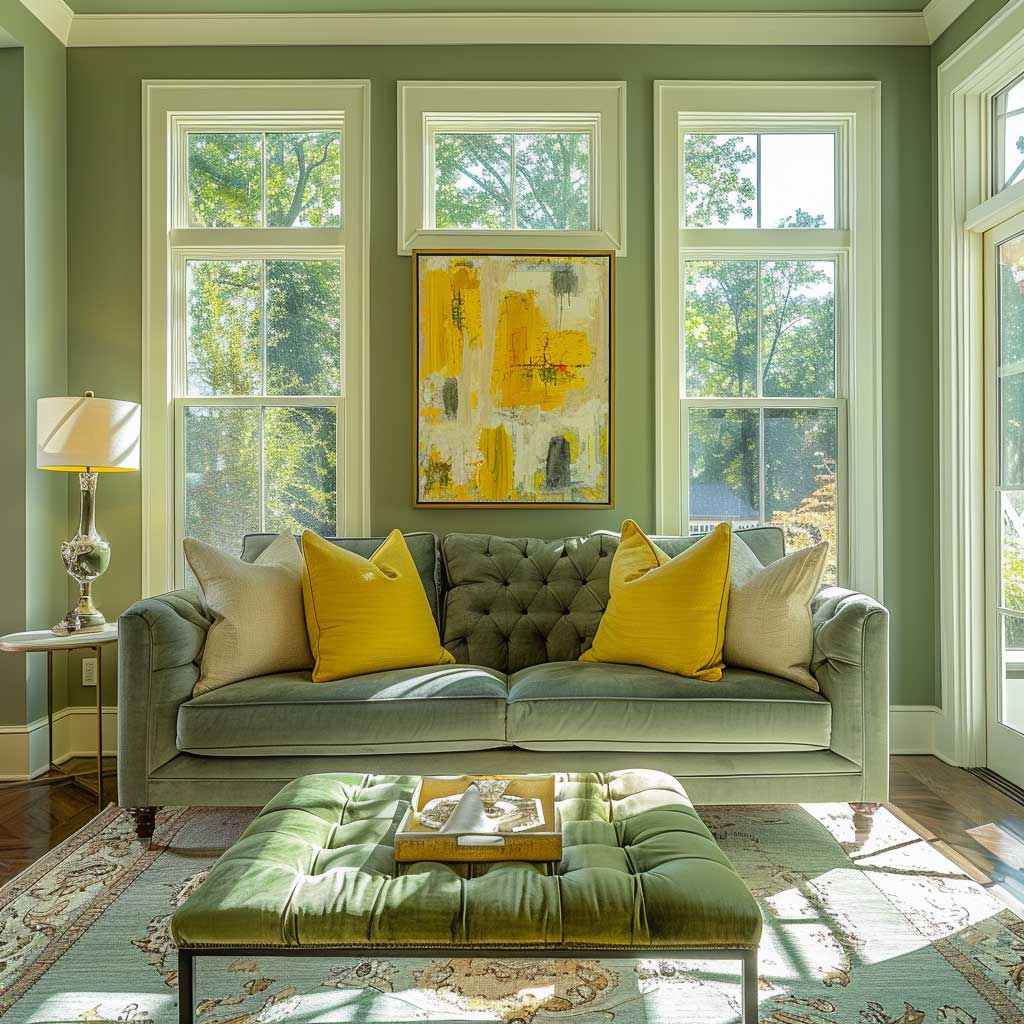
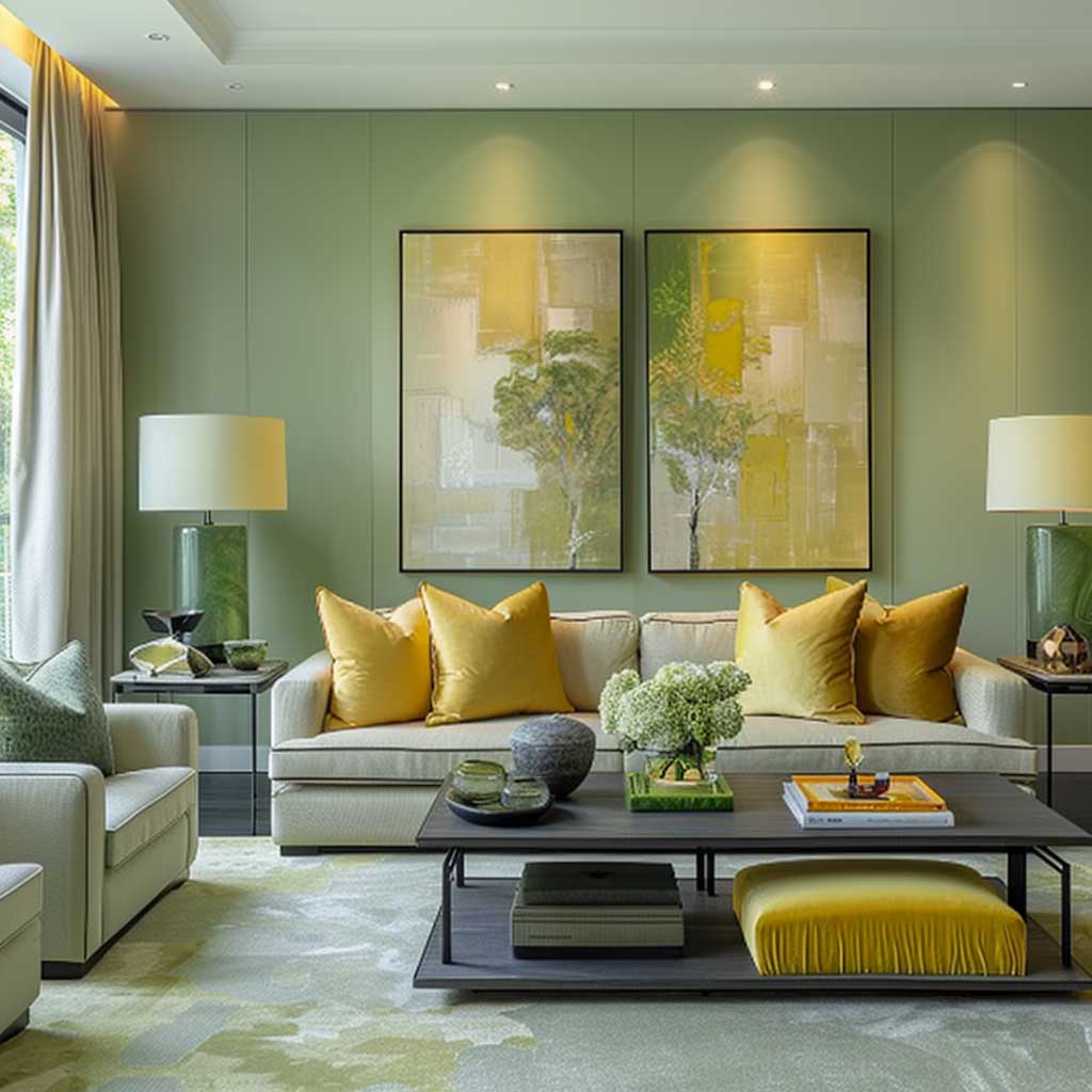
A green and yellow living room falls apart when both colors compete at the same volume — the fix is treating one as a wall color and the other as a movable accent. Stylists consistently recommend sage green on the walls (Benjamin Moore’s Soft Fern 2144-40 is a reliable starting point at roughly $60/gallon for their Aura line) and mustard yellow distributed across cushions, a throw, and one piece of artwork. That ratio — roughly 70% green, 20% neutral, 10% yellow — keeps the room readable without feeling flat.
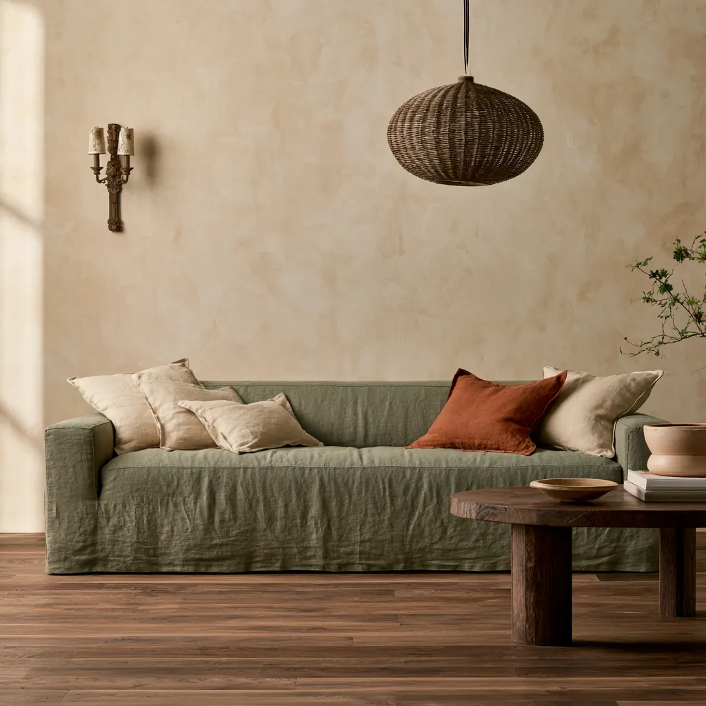
Furniture choice is where this palette gets complicated. A pale linen or warm cream sofa acts as the visual break between wall color and accent color, so the green and yellow don’t bleed into each other. A charcoal or walnut-finish coffee table does the same job with more contrast. The trap most people fall into: choosing a sofa that’s already green or yellow, then wondering why the room reads as overwhelming. Neutral furniture isn’t a safe choice — it’s the active decision that makes everything else possible.
Lighting shifts this palette more than most. Under warm incandescent or 2700K LED light, sage green pulls slightly yellow and mustard deepens into amber — a combination that reads as rich and cozy. Under cool daylight bulbs, the same sage tilts bluish-gray and mustard looks sickly. What works in a north-facing room in winter light will look completely different come July. Test your paint sample across morning and evening light before committing.
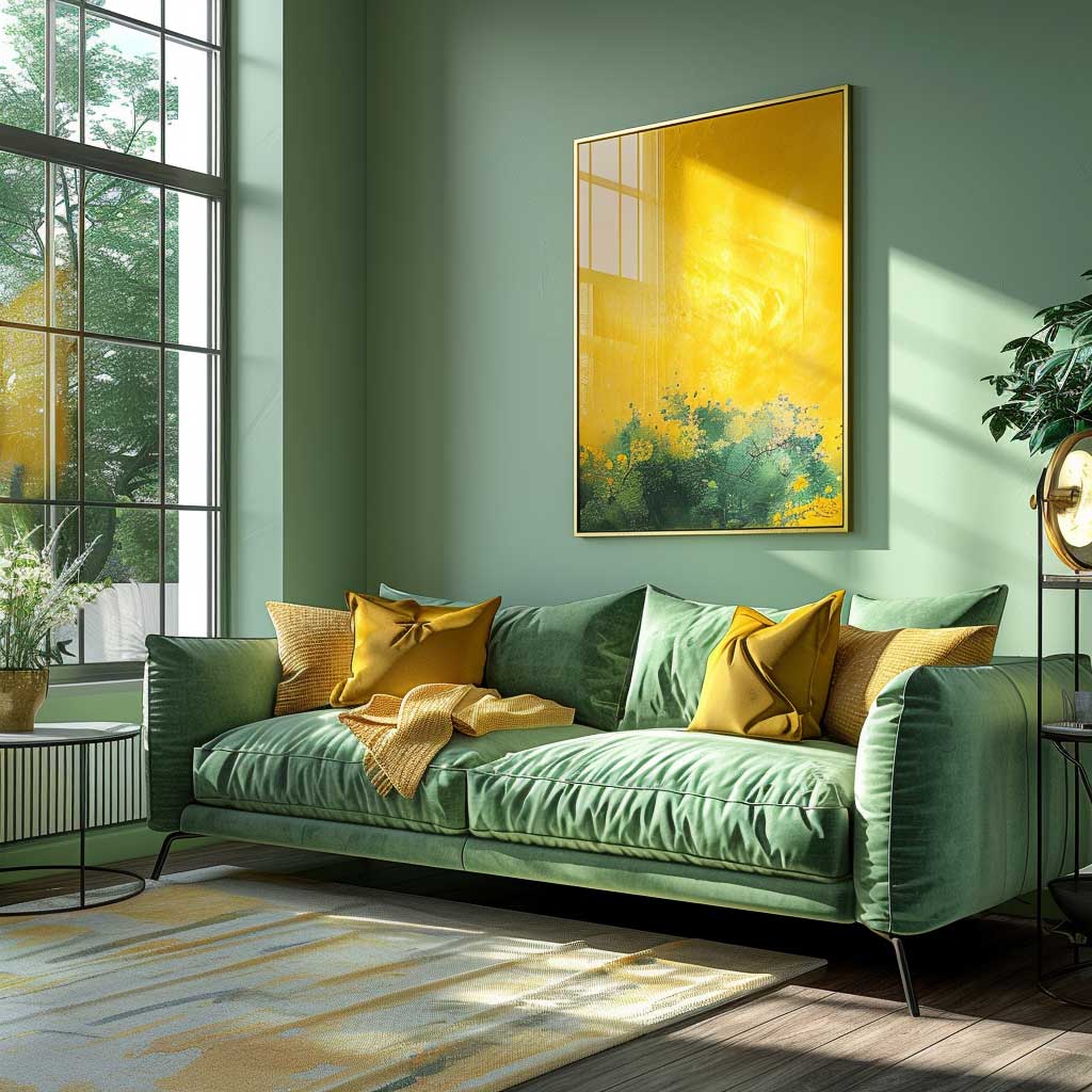
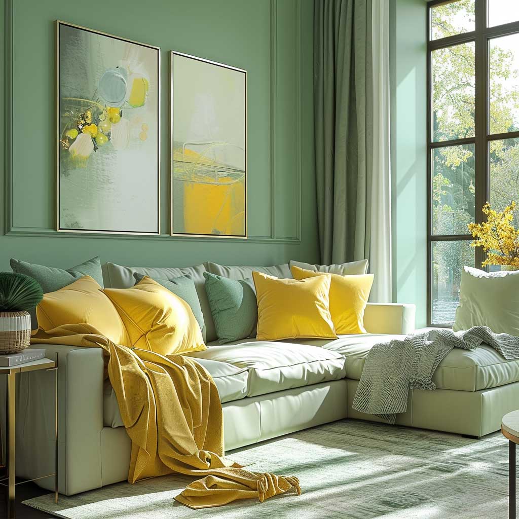
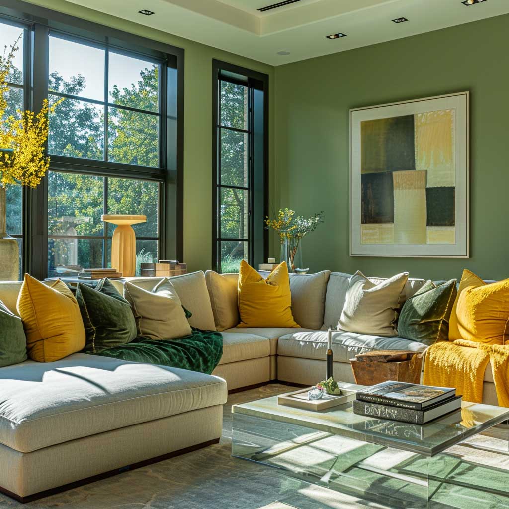

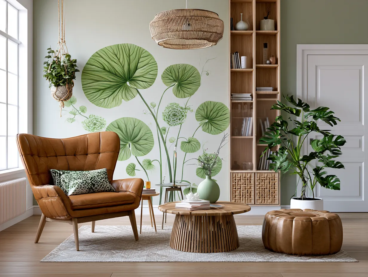
Plants are not decoration in a green and yellow room — they’re structural. A tall fiddle-leaf fig or a cluster of pothos in the corner bridges the wall color to the natural world it’s referencing, making the scheme feel intentional rather than picked out of a swatch book. The mistake is treating plants as afterthought greenery added once the room is “finished.” Add the plants first, then adjust how much green the walls need.
Avoid pairing two saturated tones — a vivid emerald wall with a bright lemon-yellow sofa reads as a sports bar, not a living room. The green and yellow combination only holds sophistication when at least one color is muted. Also skip yellow curtains in a green room: they pull the eye to every window simultaneously and make the space feel chaotic rather than layered.
Green and Yellow Kitchen Cabinets Done Right

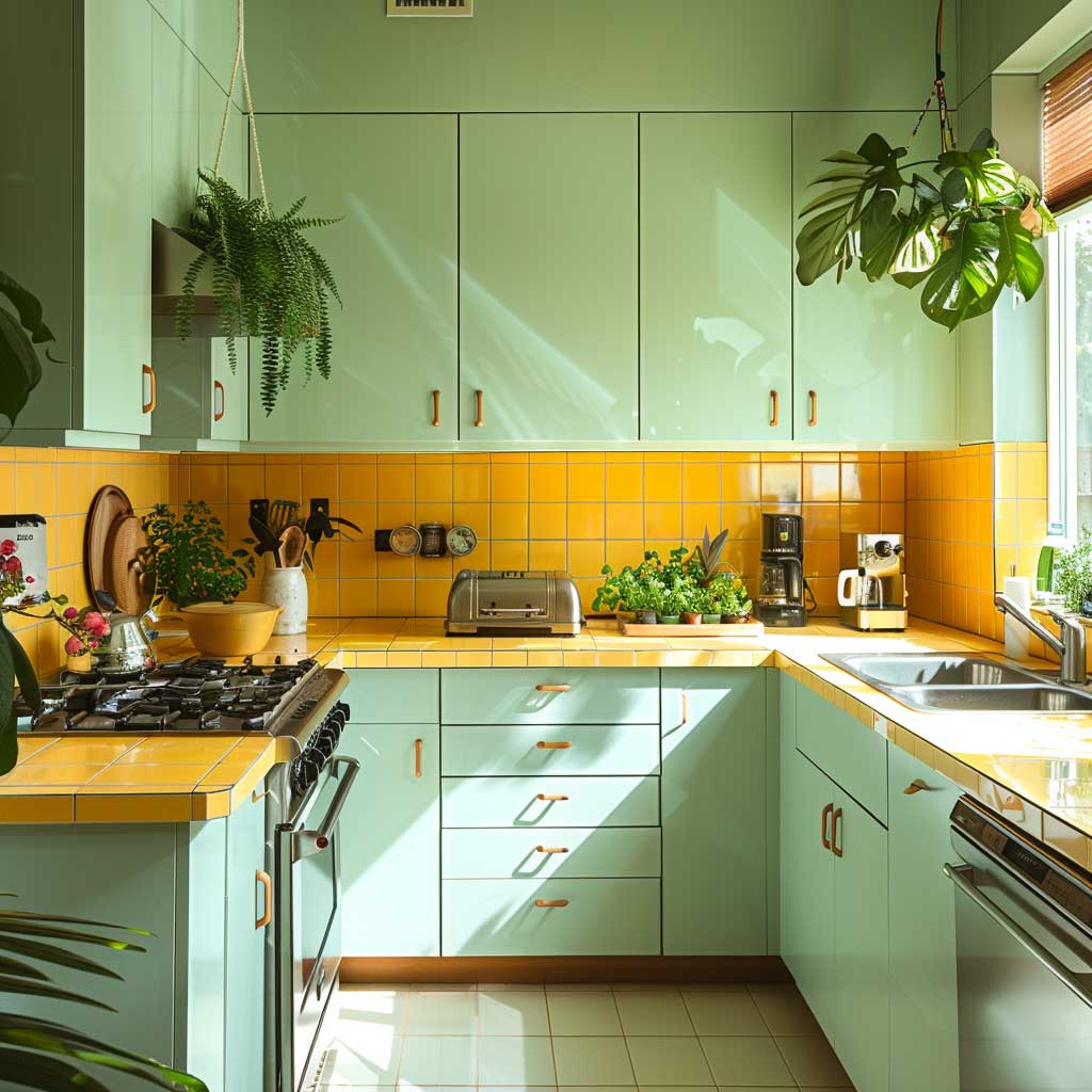
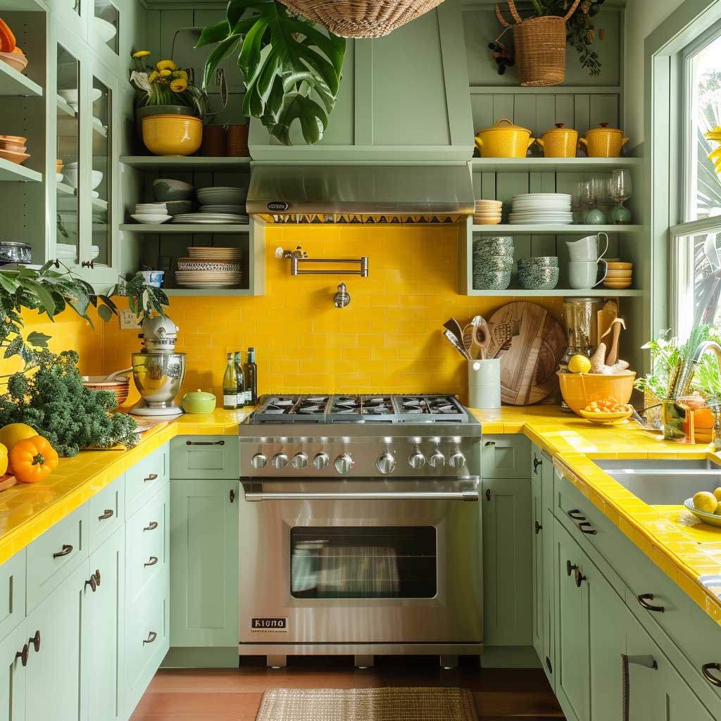
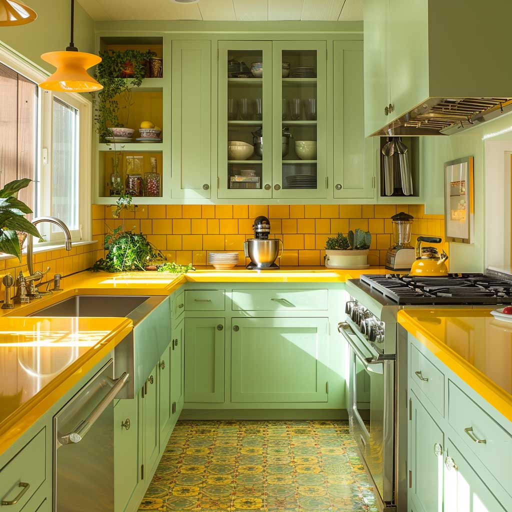
Green and yellow kitchen cabinets are having a genuine moment — sage green kitchen designs have dominated interior searches for three consecutive years because they photograph well and hold up visually over time in ways that trendy blue-grays don’t. The logic for adding yellow: bring it into the backsplash tile, not the countertop. A yellow countertop locks you into a commitment you’ll tire of; yellow subway or hexagonal tile in the backsplash can be replaced for a few hundred dollars if your taste shifts.
Professional cabinet painting costs an average of $942 for a standard kitchen, according to Angi’s 2026 data — far less than the $3,000–$25,000 replacement cost. That price point makes experimenting with a sage-green-and-yellow palette financially reasonable even if you’re not certain it’s a permanent decision. The key caveat: professional painters charge by the face, not the hour, so a kitchen with 40+ cabinets will run $7,000–$12,000. For smaller kitchens under 20 cabinets, DIY cabinet painting with Behr Marquee (~$44–55/gallon with a written one-coat guarantee) is genuinely achievable over a long weekend.
Hardware is where the palette gets its personality. Brass or unlacquered brass pulls warm up sage green cabinets and echo the yellow undertones without requiring any actual yellow on the cabinetry. Brushed nickel reads colder and tends to push sage toward gray. If you’re placing yellow in the backsplash, brass hardware completes the triangle of warm tones in the room — wall color, tile, pulls — while keeping the countertop and appliances neutral. Try this arrangement on a single cabinet door with a stick-on sample before committing.
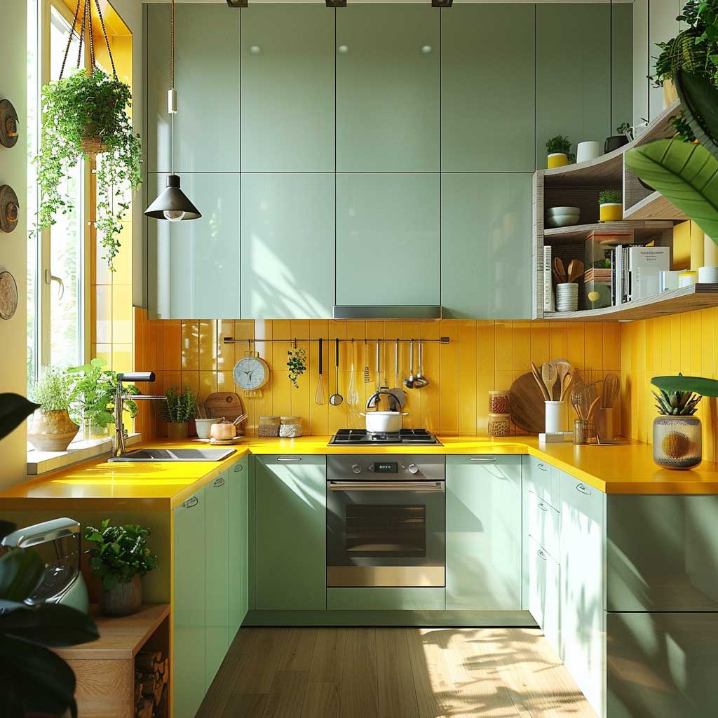

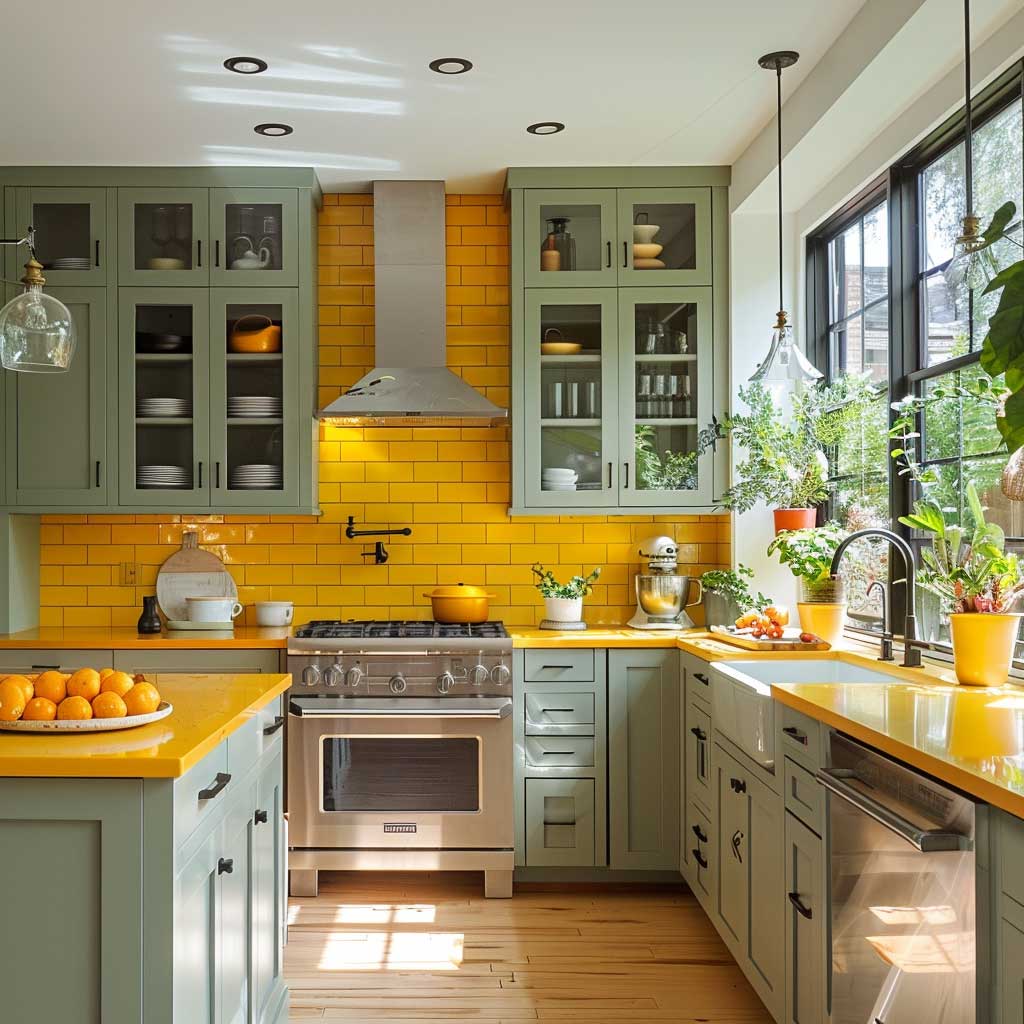
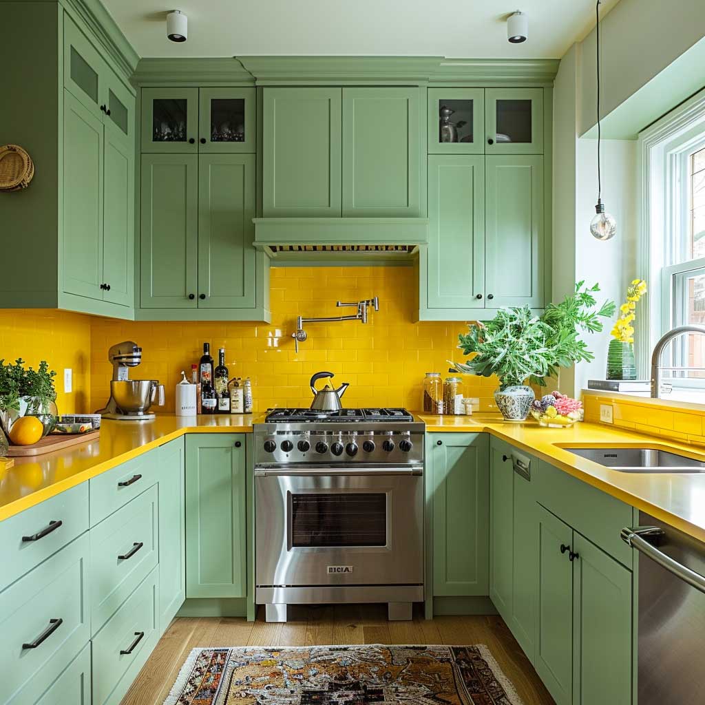
Open shelving in a green-and-yellow kitchen gives you a free hand: stack yellow ceramics, green herb pots, and white dishware in alternating clusters rather than lining everything up by color. That randomness actually reads as intentional because it mirrors how nature groups colors — never in perfect rows. The equivalent of bad museum curation is color-coordinating every shelf. Interleave, don’t sort.
Forest Green and Mustard Yellow Bedroom — Why the Dark Version Works
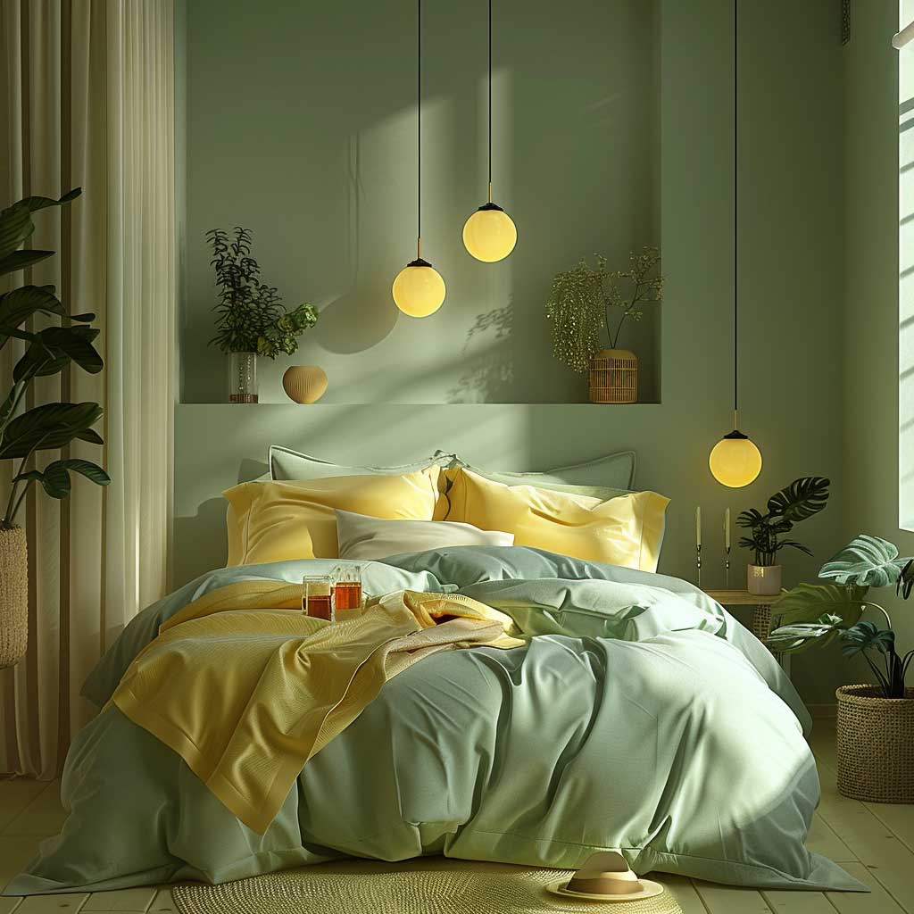
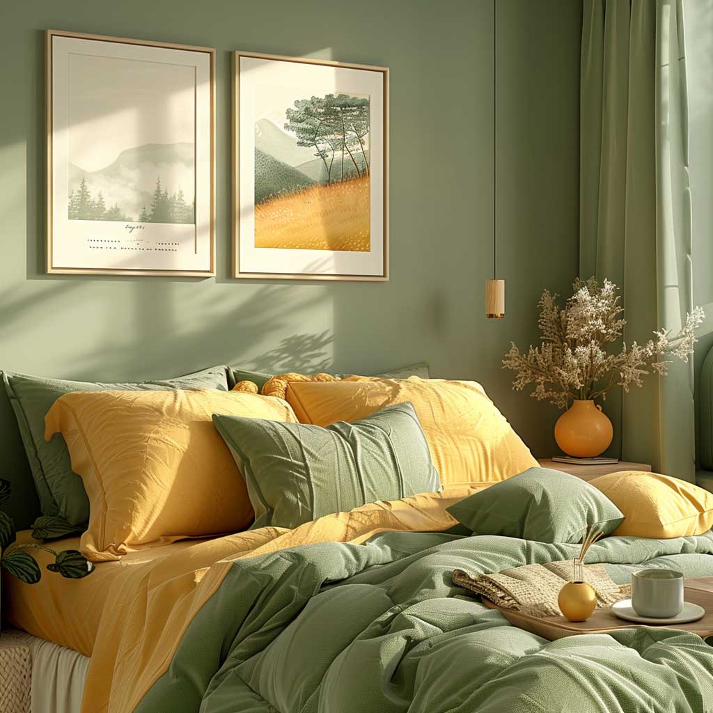
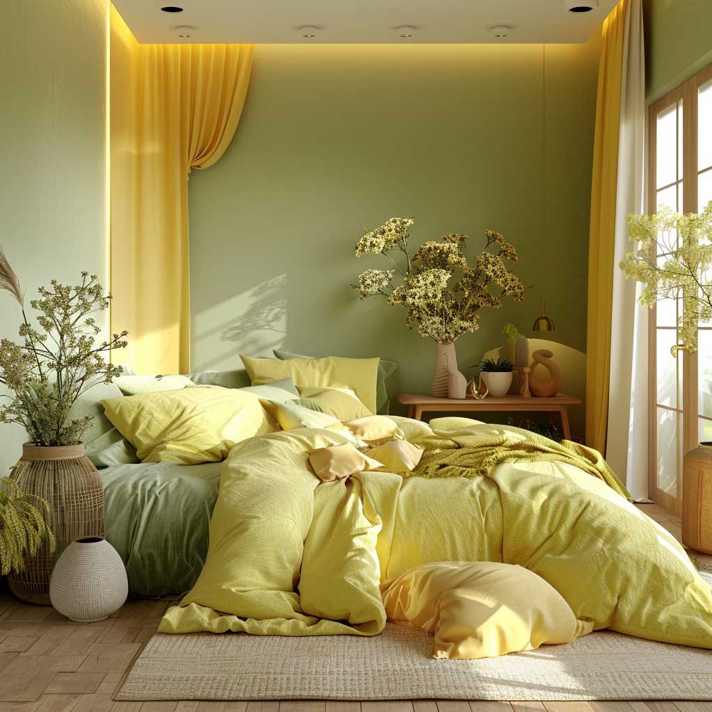
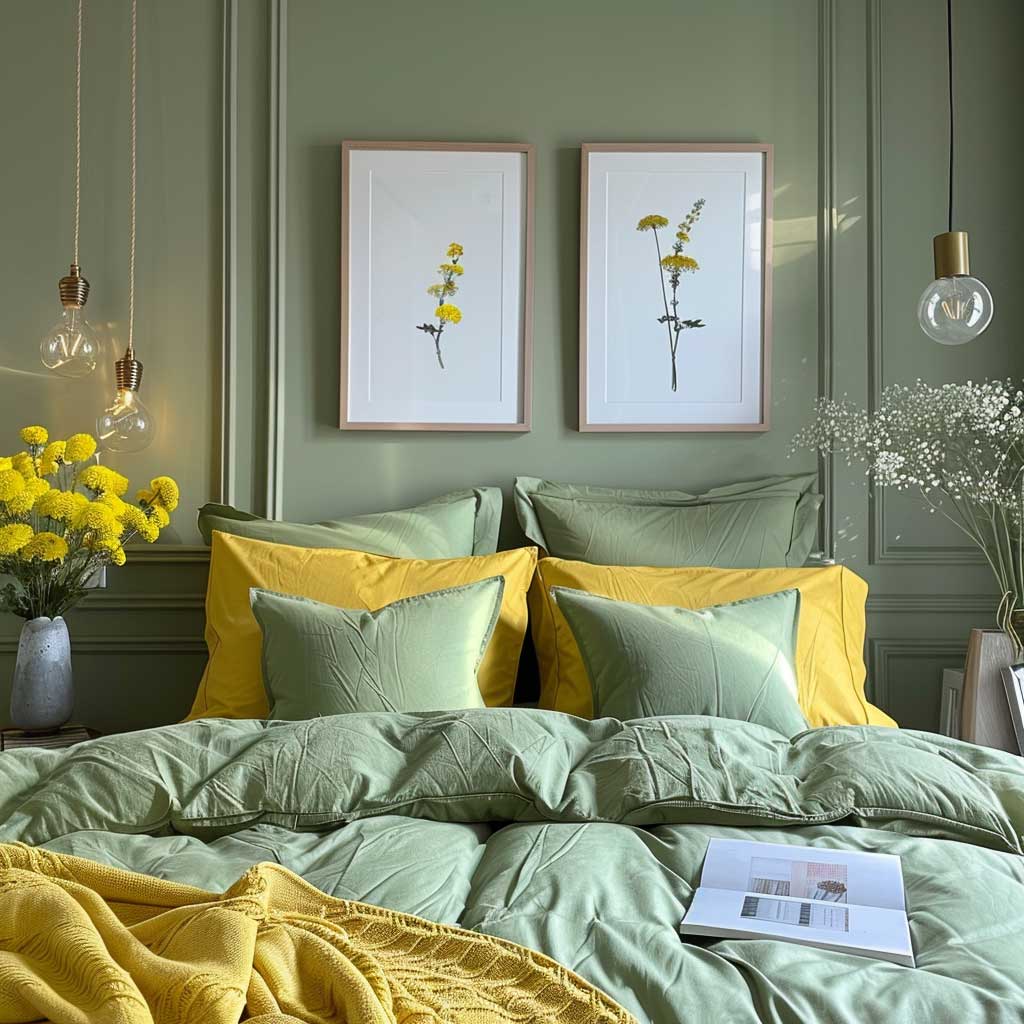
The forest green and mustard yellow bedroom combination consistently surprises people who assume dark wall colors shrink a room — they don’t, they compress the perceived ceiling height in a way that makes the space feel deliberately cocooning rather than claustrophobic. Benjamin Moore’s Avon Green HC-126, part of their Historical Collection, is a reliable forest green that reads differently at different times of day: earthy and warm at dusk, deeply saturated and grounding at night. For those who want more information on choosing green bedroom paint, Benjamin Moore’s green bedroom guide covers undertone differences across their full range.
Mustard yellow works in this scheme precisely because it’s a warm, slightly brownish yellow — it shares undertones with the amber and gold that naturally appear in wood grains, aged brass, and dried botanicals. Lemon yellow does not have this compatibility. Try pairing lemon yellow with forest green and you’ll notice the two colors fight rather than harmonize: lemon reads as cool and fresh, which conflicts with the deep warmth that dark green creates. Mustard’s golden undertone is what bridges the gap. You’ll notice the difference immediately when you hold swatch samples side by side in actual light.
The question many people have about this combination: does it work for adults, or does it read as retro? The answer depends almost entirely on material choice. Linen bedding in natural ivory rather than white, a woven wool rug instead of a patterned synthetic, and raw wood nightstands keep the palette grounded in texture rather than in a specific era. The same colors in polyester and lacquer will skew vintage. More on pairing green bedroom walls with the right accent shades — including the mint-and-yellow version for those who prefer softer tones — in this closer look at mint green and light yellow bedroom paint ideas.
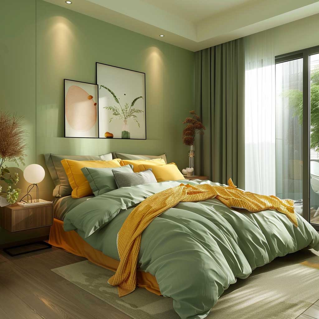
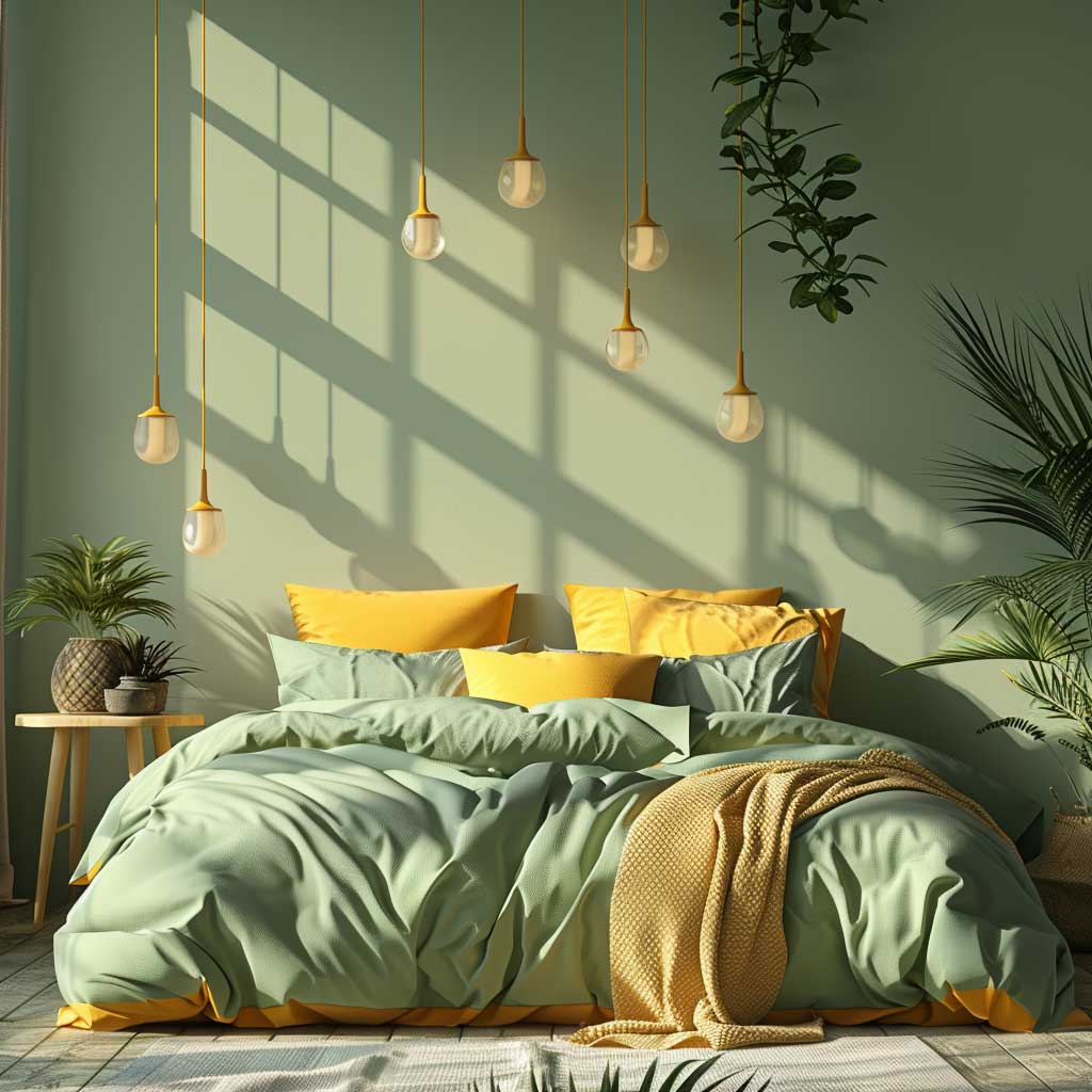


Soft lighting is non-negotiable in a dark green bedroom. Table lamps with amber or warm-toned shades cast the kind of glow that makes a forest green wall look intentionally rich rather than just dark. A single overhead light fixture — especially a cool-white ceiling recessed light — will flatten the color entirely and make mustard yellow look dingy. The architecture of the light matters more than the shade of green you chose. Two bedside lamps at 2700K do more for this palette than the most expensive paint on the market.
| Variant | Best For | Yellow Tone | Key Risk |
|---|---|---|---|
| Sage + Pastel Yellow | Small rooms, modern aesthetic | Butter or cream | Looks washed out in low light |
| Sage + Mustard | Living rooms, transitional style | Warm ochre | Mustard can overwhelm if overused |
| Forest Green + Mustard | Bedrooms, traditional rooms | Deep golden yellow | Requires warm lighting to avoid gloom |
| Olive + Yellow-Green | Kitchens, earthy interiors | Chartreuse accent | Difficult to balance, narrow margin |
Color Pairing
Green and yellow rooms work when one shade leads and the other stays in its lane
The living room version is about restraint — sage walls, neutral sofa, mustard in small doses. The kitchen version is about placement — green on cabinets, yellow in tile, never reversed. The bedroom version is about depth — dark green carries the room, mustard warms the textiles.
Paint costs land between $44 and $115 per gallon depending on brand and line. Cabinet painting runs an average of $942 professionally. Neither is a reason to play it safe with beige.
Save this post before your next paint store trip.