Wall color combination for living room walls is where most decorating decisions quietly fall apart. You pick a sofa you love, inherit a bookcase from your parents, buy a rug on impulse — and suddenly you need a wall color that doesn’t fight any of it. These four shades do exactly that, and I’ve watched each of them survive furniture swaps, style pivots, and the kind of lighting conditions that make perfectly nice paint look like a mistake.
The short version: warm neutrals anchor mixed-style rooms, earthy greens buy you flexibility across decades, gray reads differently in every light source and that’s actually useful, and creamy off-whites photograph warmer than they look on the chip. Each section below shows you where a color genuinely wins — and where it quietly fails.
Quick Scan
- Soft Sand — warm neutral that disappears behind any furniture style; best in rooms with mixed wood tones
- Muted Olive — earthy, nature-pulled; pairs with both antique wood and lacquered modern pieces; never goes fully out of cycle
- Classic Slate Gray — shifts warm in low light, cool in daylight; handles dark wood furniture better than almost any other neutral
- Warm Vanilla — creamy off-white that reads cozier than pure white; the one color that Scandinavian and traditional furniture both accept without complaint
- Avoid: cool bright white with warm-toned wood floors — the undertone clash will bother you every morning
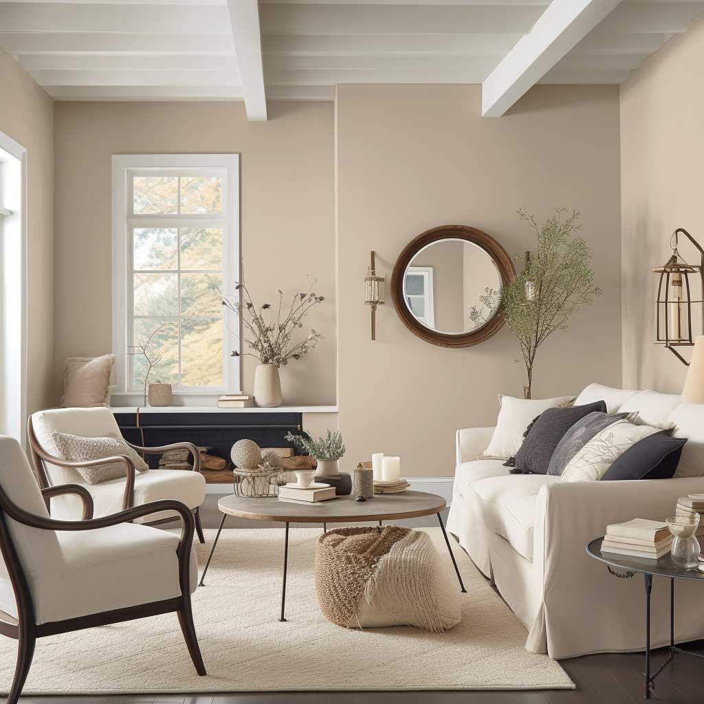
Soft Sand Earns Its Place Behind Wooden Furniture

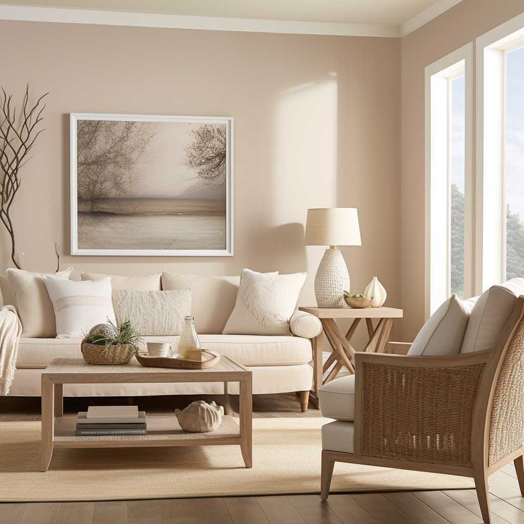

Soft Sand sits just warm enough to absorb the yellow undertones in oak flooring without amplifying them. My go-to reference for this shade is Benjamin Moore’s Pale Oak OC-20 at around $72 per gallon — it’s the one I’ve watched work in a room with a walnut credenza on one wall and a white-painted IKEA KALLAX on the other. That shouldn’t work. It does. The warm beige reads as a referee, not a participant, so the furniture takes all the credit.
What color combination for living room walls beats this in a furniture-mixed space? Honest answer: very few. Soft Sand handles rustic wood, lacquered modern pieces, upholstered grays, and even glass coffee tables without producing the undertone clash you’d get from a cool greige. The one place I’d skip it: if every piece of furniture is very dark espresso wood, Soft Sand can start to look washed out. Go one shade deeper toward warm taupe instead.
Lighting does real work here. In north-facing rooms under artificial warm bulbs, Soft Sand reads almost like a biscuit — cozy, slightly golden. In a south-facing room at noon, it stays clean and airy without going chalky. You’ll notice the shift. That’s not a flaw; it means the wall responds to the room instead of dominating it.
Skip the version with too much pink in the undertone — some “sand” chips from hardware stores lean rose, and against medium-brown wood furniture that pink shows up like an uninvited guest. Pull the chip against your actual floor sample before buying. That two-minute test has saved me more repaints than any design rule I’ve ever read.
Muted Olive Stays Relevant When Every Other Trend Has Cycled Out


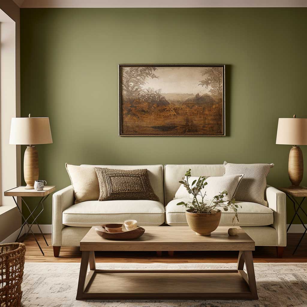

Farrow & Ball’s Mizzle No.266 at roughly $120 per gallon is the version of muted olive I keep recommending — not because I enjoy expensive paint, but because the pigment depth holds correctly under changing light in a way that a $40 hardware-store olive simply doesn’t. I own a room in this color and after four years it still looks deliberate rather than faded. Sherwin-Williams Sage SW 2860 does a decent job at around $68 per gallon if budget matters more than that last 10% of quality.
The wall color combination for living room spaces with wood accents is where olive earns its reputation. Against medium-toned oak: grounding. Against dark walnut: dramatic, in a good way. Against painted white furniture: the olive makes the white look intentionally crisp rather than just unfinished. I stole this trick from a hotel lobby in Lisbon that had both a Louis XVI console and a brutalist concrete shelf on the same wall — the olive held both without choosing sides.
Do not go full yellow-olive in a small room with low ceilings. I made that error in a 130-square-foot sitting room and it felt like being inside an avocado. The muted, gray-pulled version of olive — the kind that reads almost khaki in dim light — is what gives you flexibility. Pure olive is a statement. Muted olive is a strategy.
Psychologically, green-adjacent walls slow the pace of a room. Conversations in olive-painted rooms tend to run longer — that’s my observation from hosting dinner parties in three different color schemes, not a scientific study. But it’s consistent enough that I now specifically recommend this shade for rooms where people tend to eat and talk rather than just pass through. For more ideas on wooden wall decor that pairs with earthy tones, there’s a full breakdown worth reading alongside this one.
Don’t Do This
- Don’t pull olive straight from a paint fan deck under store lighting. Fluorescent bulbs strip the gray undertone and the chip looks far more yellow-green than it will on your wall at home. Always test a 12×12 inch painted patch in the actual room before committing.
- Don’t pair muted olive with cool-toned purple or blue-gray furniture. The undertones fight and the room looks like it couldn’t decide on a decade. Olive belongs with warm wood, warm white, terracotta, and brass — not with anything that reads overtly cool or silvery.
- Don’t use high-gloss finish on an olive wall. The sheen amplifies the yellow in the pigment and the room ends up reading neon instead of earthy. Eggshell or matte are the finishes that keep this color behaving correctly.
Classic Slate Gray Behaves Differently in Every Light Condition — Use That


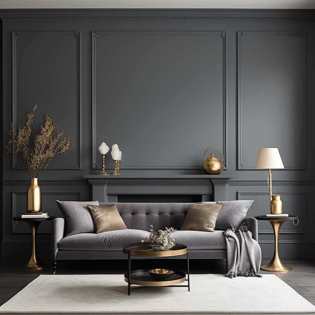

Benjamin Moore’s Revere Pewter HC-172 is the specific shade I’m talking about — $75 per gallon, warm-leaning gray that reads almost taupe under incandescent bulbs and proper cool gray under daylight. That chameleon quality is not a problem. It’s the whole reason this color works across furniture styles. You’ll notice your dark walnut side table looks richer at 6pm than at noon, and that’s the gray doing its job rather than staying fixed and predictable like a neutral beige would.
Wall color combination with wooden furniture is the search that leads most people to gray, and it’s justified. Gray doesn’t compete with wood grain the way warm beiges sometimes do. It sits back, lets the wood read as a material rather than just a color, and makes the room feel curated even when the furniture was assembled from three different decades and two different countries. I own a living room piece from 1982 and a Muuto side table from 2021 — Revere Pewter makes them look like they were bought together.
Where does gray fail? Cool-toned grays — anything with blue or purple leanings — turn actively unpleasant in rooms with warm-honey oak floors. The undertone clash is not subtle. It looks like the floor and walls are having an argument the furniture is trying to ignore. Stay on the warm side of gray, specifically the greige zone, and you avoid the problem entirely. Agreeable Gray by Sherwin-Williams at around $68 is the other safe version — I own test pots of both and Revere Pewter wins in rooms with warm wood floors while Agreeable Gray performs better with white or cool-toned furniture.
For rooms where you want to see how a full gray palette works before committing, this breakdown of modern living room paint colours covers the full range from elephant gray to charcoal with photos of each in actual spaces.
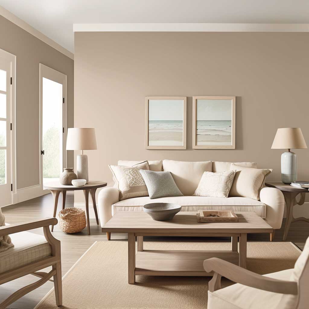
Warm Vanilla Photographs Warmer Than It Looks on the Chip


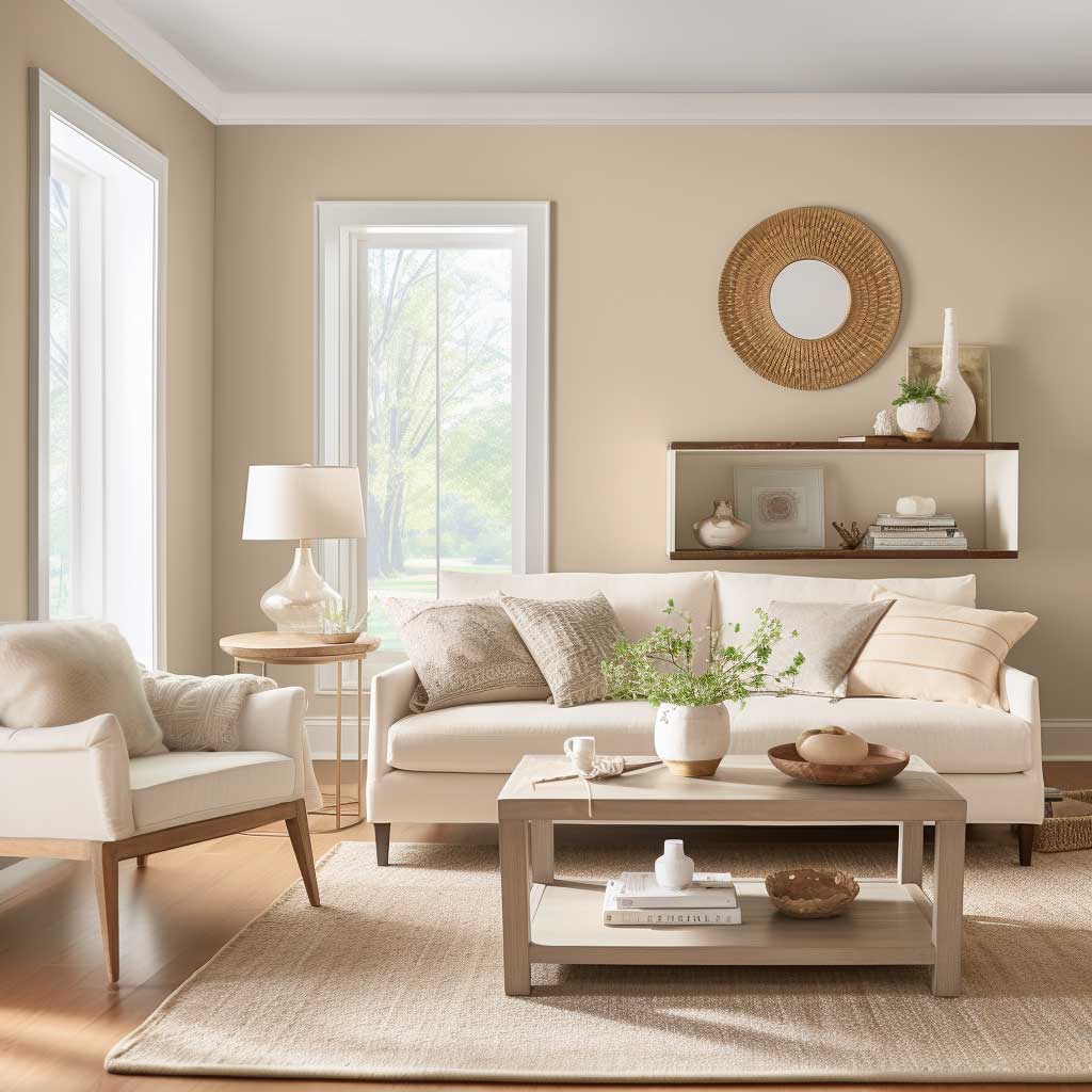
Benjamin Moore’s White Dove OC-17 at $72 per gallon is the vanilla I reach for when someone says they want “white but warmer.” It’s the off-white that reads creamy in photos and near-neutral on the wall — which means it doesn’t fight furniture, doesn’t dominate art, and doesn’t make a linen sofa look yellowed. Behr’s Swiss Coffee is the $40 alternative that works almost as well in rooms with abundant natural light. In low-light rooms, spend the extra money on White Dove because the pigment holds more consistently.
Good wall colors for living room spaces with Scandinavian furniture — that’s the one question where vanilla wins over every other shade I’ve listed. Scandinavian pieces are typically light wood, clean-lined, and slightly cold in temperature. Warm vanilla softens that coldness without adding clutter. You get the clean-lined aesthetic you paid for without the room feeling clinical. I’ve decorated two apartments this way and visitors always assume the furniture is more expensive than it is.
What doesn’t work: pure cream or very yellow vanilla in a room with honey-oak floors. The yellow stacks on yellow and the room looks like someone spilled tea on everything. You need the version of vanilla that has just enough white in it to read as off-white, not the version that reads as pale yellow. The difference on a paint chip is almost undetectable. The difference on a wall is not. Test with a large patch first — the vanilla that looks safe on your phone screen is not the same color under your actual lighting conditions. Benjamin Moore’s living room inspiration page lets you see the same color across multiple room types, which is the closest thing to testing a chip in your own space without actually painting.
The timelessness argument for vanilla is real, not marketing. It doesn’t attach to a decade the way greens and blues do. My grandmother had a vanilla living room in 1978. It looked period-appropriate then. It would look intentionally retro-chic now. That’s a rare quality in any decorating decision.
The Bottom Line
Your wall color should disappear behind your furniture — not announce itself
The four shades in this post share one trait: they make the room look finished without making themselves the subject. That’s harder to find than it sounds. Most colors at the paint store have an agenda — they want to be noticed. Soft Sand, Muted Olive, Slate Gray, and Warm Vanilla want your sofa to be noticed instead.
If you’re still undecided, start with the wall color that matches your floor undertone rather than your furniture. The floor is the one thing you’re almost certainly not replacing. Build up from there.
Save this post before you head to the paint store — the specific brand names and prices above are in the body text, not in any summary widget.
Related Topics


