Bedroom floor tiles design is the decision most people make last — and that’s exactly why so many bedrooms feel unfinished before a single piece of furniture arrives. Tile sets the room’s emotional temperature before the bed frame, before the curtains, before anything. Gray concrete holds a room still. Midnight blue pulls it inward. Sandstone beige warms it up the way afternoon light never quite manages alone. I’ve watched friends redo rugs, repaint walls, swap out lighting — and the room still didn’t resolve until they fixed the floor. Pick your tile first. Everything else will follow.
Modern bedroom floor tile doesn’t punish you the way hardwood does. Porcelain won’t scratch from a dragged nightstand, won’t swell in a humid climate, and costs $3–$8 per square foot installed for mid-range ceramic versus $12–$18 for solid hardwood. You’ll also notice matte finishes are having a real moment right now — Daltile’s Indoterra concrete-look line and Marazzi’s Cotto Revival both launched matte-surface bedroom-ready options in 2025, specifically because gloss shows every footprint in a sleeping space.
At a glance — what this post covers:
- Soft concrete gray tiles for minimalist and modern bedrooms
- Matte midnight blue porcelain for a moody, luxury feel
- Warm sandstone beige for organic and Scandi-inspired rooms
- Which tile finish to avoid in a bedroom (and why matte wins)
- Color pairings, furniture fits, and what not to put on gray floors
- FAQ: size, grout, best color for small rooms, and more


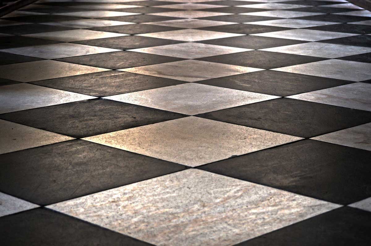
Soft Concrete Gray Pulls Every Wall Color Into Line
Gray ceramic tile in a bedroom works the way a pencil sketch works before paint — it clarifies structure without committing to a mood. I installed 24×48-inch concrete-look porcelain in a client’s master bedroom two years ago and she’s cycled through three different wall colors since: blush, sage, dusty lavender. The floor held every single one of them. That’s the real argument for concrete gray — not minimalism for minimalism’s sake, but genuine flexibility you’ll actually use over time.
Pairing gray tile with light oak furnishings is the safest move, and it’s safe for good reason. The warm wood undertone cuts the tile’s cooler edge without fighting it. Matte black accents — drawer pulls, light fixtures, a thin bed frame — give the floor something to echo without adding visual weight. What doesn’t work: chrome or nickel hardware. I tried it once. The whole floor read clinical, like a dentist’s waiting room with better pillows.
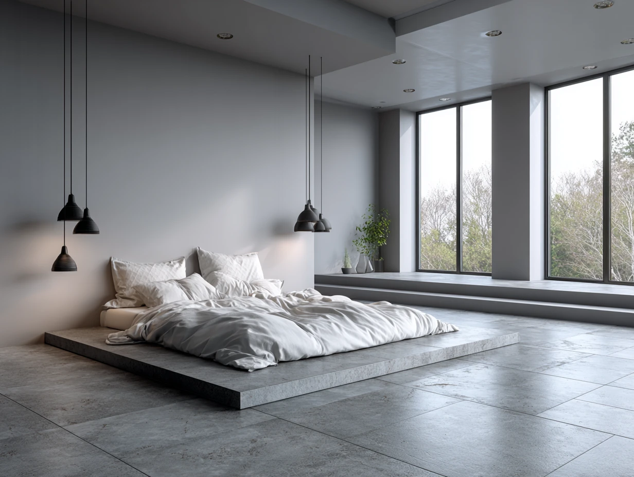
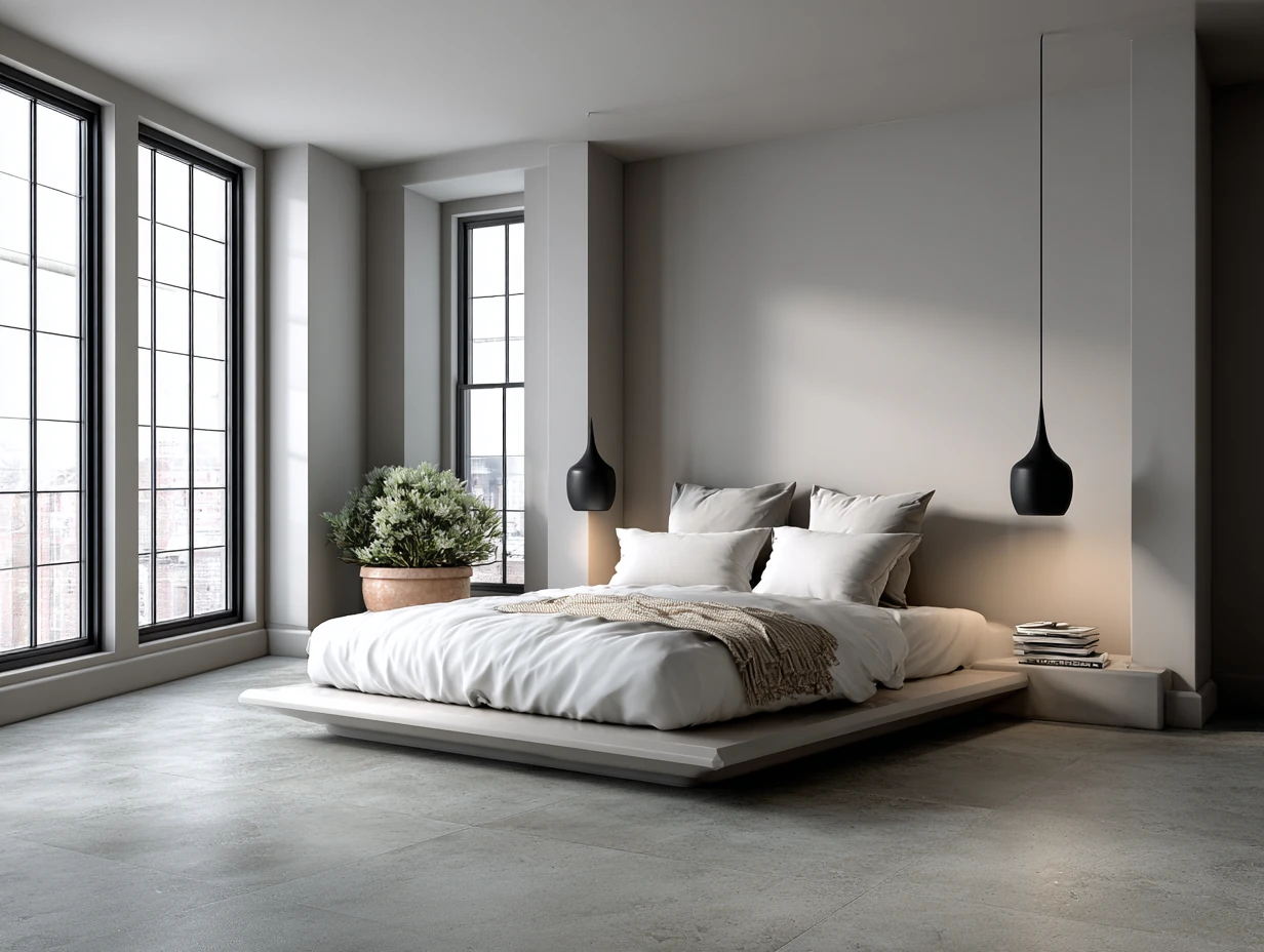
Smaller bedrooms get a real lift from gray tile floors. The tone reflects diffuse light without the mirror-effect of gloss tile, which means a 10×12 room reads 20% more spacious — at least that’s been my consistent observation. Floor-to-ceiling windows make this even more pronounced. If you have natural light pouring in, gray tile becomes a second sky underfoot. Without natural light, drop a warm white pendant and the floor still cooperates.
For furniture, low-profile and floating pieces are the pairing. Think a streamlined platform bed at 14 inches clearance, floating nightstands mounted at 26 inches, a modular wardrobe that sits flush with the wall. You’re letting the tile read as a continuous plane rather than chopping it into sections. Wool rugs in ivory or oatmeal add texture without interrupting the floor’s visual rhythm — a 5×8 rug under the bed is the minimum worth bothering with.
Plants finish the job. Deep green monstera or fiddle leaf fig against a gray tile floor creates exactly the contrast the room needs without the commitment of a bold wall color. I stole this trick from a hotel in Copenhagen and have since recommended it to everyone. Skip terracotta pots — they’re too warm against the cool gray. White or matte black ceramic planters only.
For more ways to layer a gray floor with the right wall treatment, see how grey and white interior design works across a full room — the same logic applies underfoot.
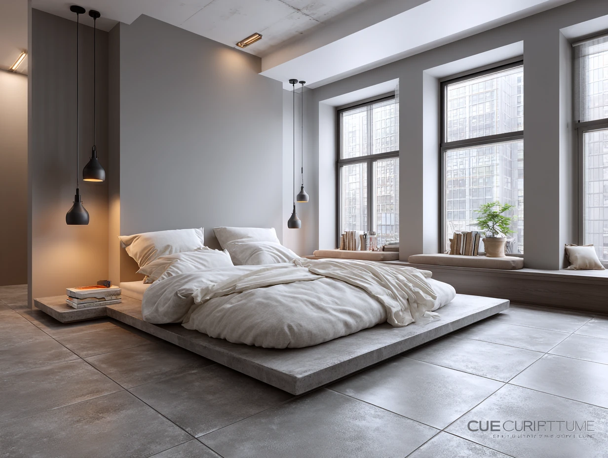
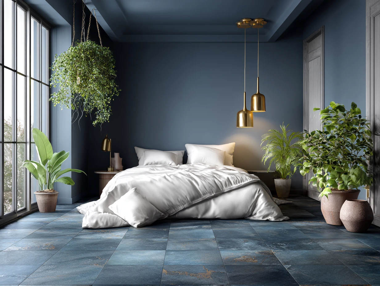
Matte Midnight Blue Floor Tile Earns Its Drama Without Being Exhausting
Midnight blue bedroom floor tile is the choice that makes people pause in the doorway. It’s also the choice most interior designers I know secretly want every client to make but don’t suggest first because clients get nervous. You shouldn’t be nervous. Matte porcelain in deep navy absorbs light the way velvet does — the room feels enclosed, intentional, wrapped. It’s a different emotional register than gray or beige, and for a sleeping space, that depth is an asset.
The pairing that actually works: warm white walls, warm metallics, neutral bedding in ivory or cream. Brushed gold hardware from Emtek runs $40–$80 per pull and makes the blue tile look twice as expensive. Aged brass pendant lights in the $120–$200 range from brands like Rejuvenation do the same. What doesn’t work: cool white walls and chrome hardware. That combination turns midnight blue from luxurious to corporate-bathroom-at-the-airport. Warm everything. Every single element.
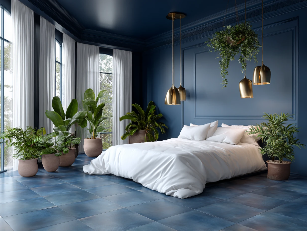
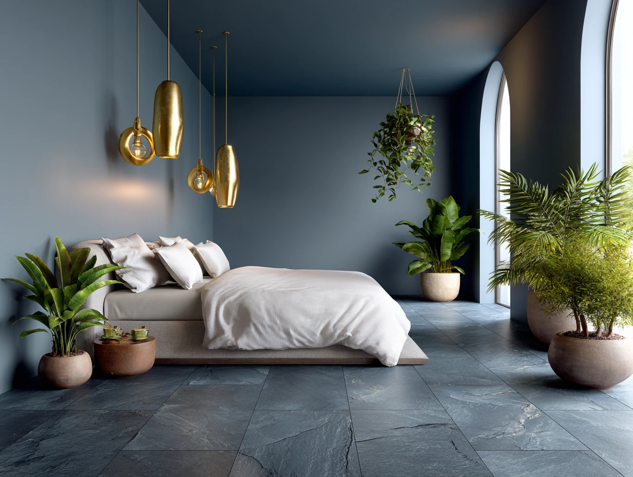
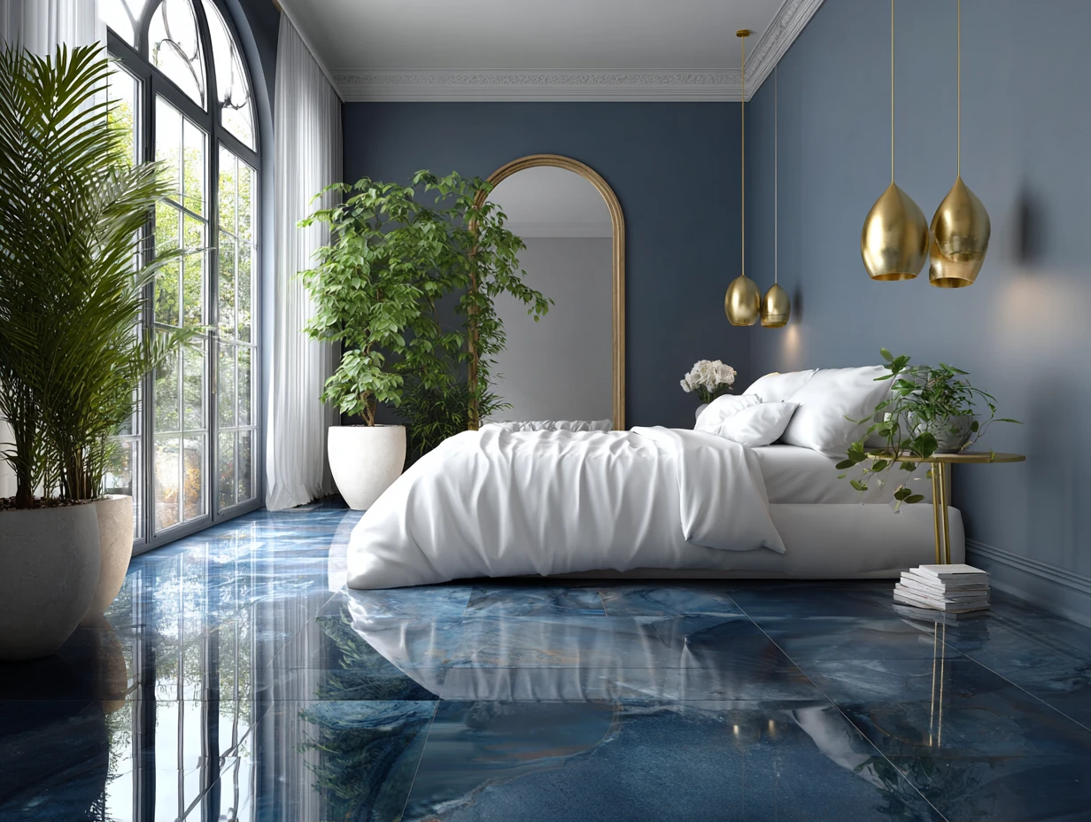
Lighting is where midnight blue tile either pays off or betrays you. Under-bed LED strips in warm white (2700K, not daylight) graze the tile surface and give the floor a hovering, theatrical quality. Globe pendants at 2400K do the same from above. Avoid cool LEDs above 3500K — they’ll kill the depth and make the floor look like the inside of a shipping container. My go-to is a pair of Schoolhouse Electric Wilshire pendants flanking the bed, around $180 each. Worth it.
Maintenance is easier than pale tile. Dust reads less on dark surfaces, and porcelain in deep hues hides foot traffic better than any cream or light gray floor I’ve ever maintained. The Mohawk Group and Emser both make commercial-grade matte blue porcelain in 24×24-inch format for $4–$7 per square foot, installed cost around $10–$14. For a 150-square-foot bedroom, you’re looking at $1,500–$2,100 total including labor — less than a new bed frame from a design-forward brand.
Don’t do this with bedroom tile floors:
- Don’t use glossy finish in any color. Gloss tile in a bedroom shows every footprint, reflects overhead lighting at unflattering angles, and makes the room feel like a restaurant bathroom. Matte only.
- Don’t grout dark tiles with white or light grout. The grid pattern overwhelms the floor’s depth. Match grout to tile color within one shade. For navy, use a charcoal or dark gray grout.
- Don’t skip the area rug. Tile floors are cold underfoot at 5am. A wool rug on one side of the bed is non-negotiable. Synthetic rugs slide on tile. Don’t bother.
- Don’t lay large format tiles in a small room without a layout plan. A 24×48-inch tile in a 9×10 room creates cut lines that fight the space. 12×24 is the right format for rooms under 150 square feet.
A low-profile bed in white oak at around 18 inches to the mattress top sits beautifully above midnight blue tile — the pale wood floats against the dark surface the way a boat hull sits on water. Add a single accent in sage green or burnt orange (a throw, a ceramic vase, one framed print) and the room stops looking like a single-note mood board and starts looking designed.
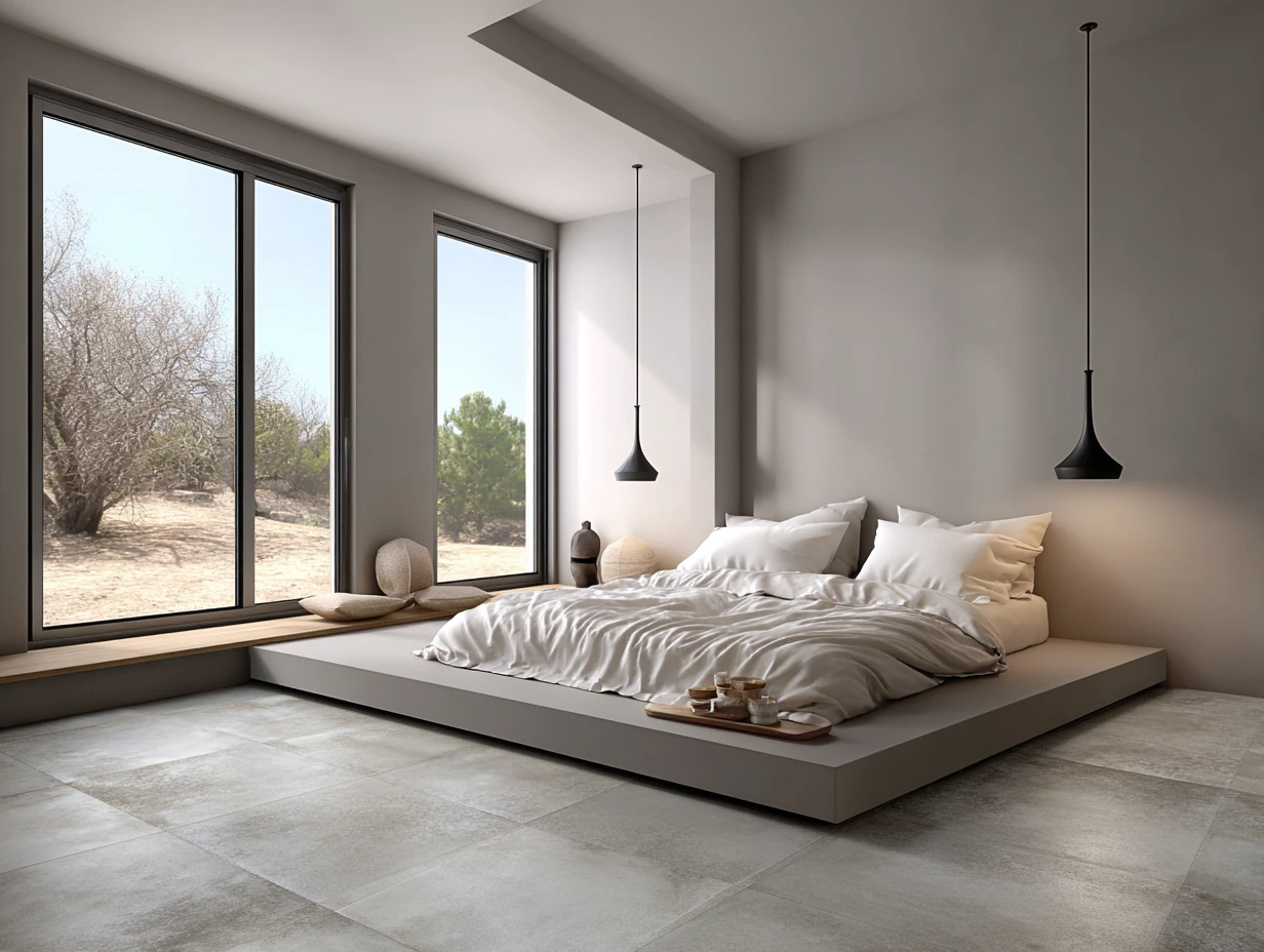
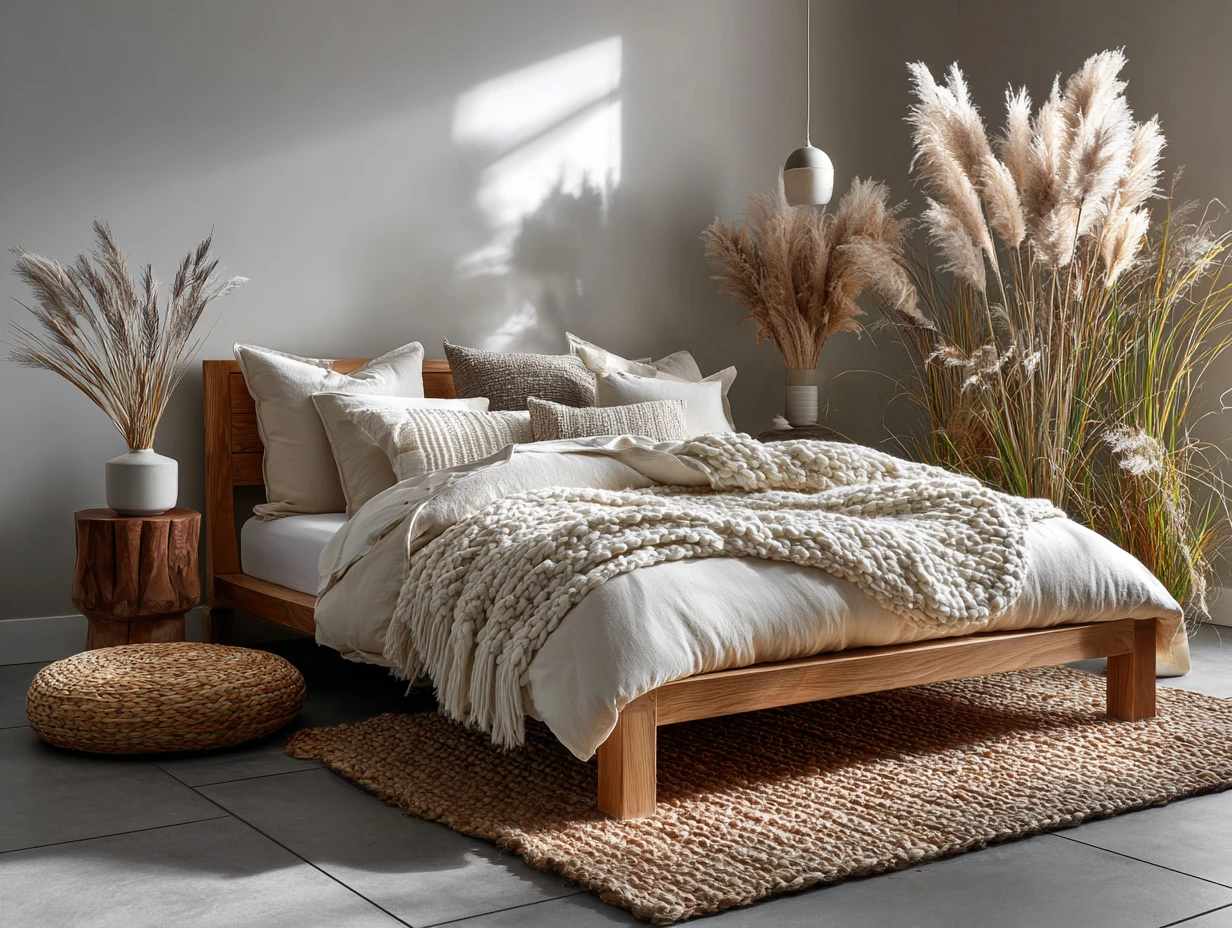
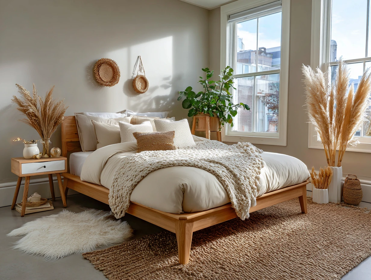
Warm Sandstone Beige Floor Tiles Hold Morning Light Better Than Any Other Color
Sandstone beige bedroom floor tiles do something none of the other colorways do: they glow. At 7am with eastern sun crossing the room, a good beige ceramic floor looks like the surface of the Sahara at dusk — warm, soft, alive. It’s not a neutral in the passive sense. It’s a neutral that works actively. I own two rooms tiled in a warm beige (MSI’s Montpellier Almond 18×18, around $2.40 per square foot), and the light behavior alone justifies every penny.
This palette fits Scandinavian furniture perfectly — natural ash, light birch, cane seating — but also handles bohemian layering without protest. Macramé wall hangings, a rattan headboard, jute rugs, pampas grass in a terracotta pot: the floor accepts all of it. You’ll notice it refuses to compete. That’s its best quality. Try this with a gray floor and suddenly everything feels like a competition for attention.

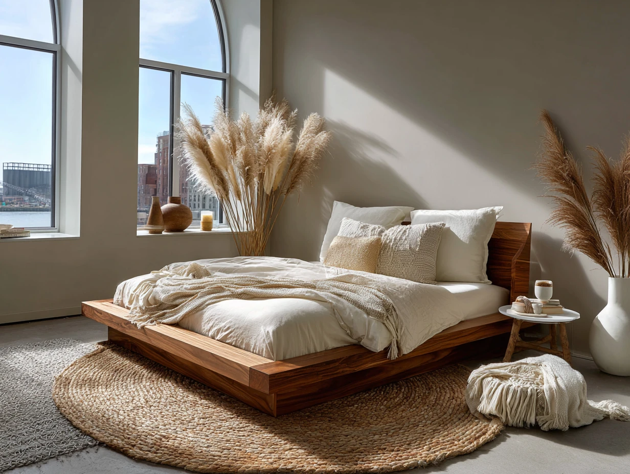
Seasonal color-swapping is where sandstone beige earns its long-term value. Soft greens in spring, terra cotta in fall, deep maroon in winter — the floor absorbs every seasonal palette shift without requiring any changes to the permanent room elements. I’ve restyled the same beige-tiled bedroom three times across four seasons for a design client and she’s never once felt the need to repaint. The floor adapts. That’s worth more than any other feature in long-term room planning.
What doesn’t work on beige tile: cool gray furniture, gray linen, gray walls. The combination produces something called “visual mud” — a room where everything has similar value with no contrast, and the eye has nowhere to land. You need warmth against warmth with one clear contrast element. Dark espresso or black provides that. Pale blond wood provides it too, just more softly.
Durability is real. These tiles resist stains, clean with a damp mop, and their natural stone texture hides micro-scratches in a way solid beige gloss tile never could. Arizona Tile’s Invictus Vein Cut in Beige (travertine-look porcelain) runs around $3.80 per square foot and looks like $15-per-square-foot stone once installed. For a master bedroom makeover on a budget, it’s the single highest-ROI material swap I know of. If you want to see how this flooring works inside a fully styled bedroom, the slate bedroom flooring post shows what the beige alternative is competing against.
Layer wool throws in cream or dusty pink, a jute rug at 6×9 under the bed, and a single large potted plant in a white planter. The room feels like a boutique hotel in Tulum — and costs significantly less. According to Houzz’s 2025 tile trend report, warm and earthy tones are dominating new tile collections, with terra cotta and stone-look porcelain specifically called out as the high-demand categories — which tells you the sandstone beige direction has enough runway to still feel fresh three years from now.
Tile Size and Grout Color Change the Room More Than the Tile Color Does
Large format tiles — 24×48 inches — make a master bedroom feel like a hotel suite. Small tiles — 12×12 or smaller — make the same room feel like a mudroom. Size is not a preference. It’s a decision with visual consequences. I specify 24×24 as the minimum for any bedroom over 150 square feet and 12×24 for everything under that. The grout joint also matters more than people admit: a 1/16-inch grout line on large-format tile looks designed; a 3/8-inch joint on the same tile looks like a renovation project that stalled in 1994.
Grout color is the detail almost no one talks about until after installation when it’s too late. Matching grout to tile color within one shade creates a continuous surface — the room reads as a plane, not a grid. Contrasting grout (white grout on gray tile, for example) emphasizes each tile individually and makes the floor look busier and smaller. You’ll notice design-forward projects from brands like Porcelanosa consistently use tonal grout. It’s not accidental. For the technical side of how modern bedroom interior design layers these decisions, the bedroom modern house interior post walks through the full sequence.
Grout also requires sealing. Unsanded grout on matte porcelain in a bedroom should be sealed within 48 hours of installation with a penetrating sealer — Aqua Mix Sealer’s Choice Gold runs about $35 for enough to cover 350 square feet. Skip this step and you’ll be scrubbing grout lines within six months. Ask me how I know.
Bedroom tile size reference table
| Tile Format | Room Size Fit | Visual Effect | Price Range (installed) |
|---|---|---|---|
| 12×12 in | Under 100 sq ft | Traditional, busy in large rooms | $6–$10/sq ft |
| 12×24 in | 100–180 sq ft | Elongates space, modern feel | $8–$13/sq ft |
| 24×24 in | 150–250 sq ft | Spacious, hotel-quality visual | $10–$16/sq ft |
| 24×48 in | 250+ sq ft | Luxury, maximum continuity | $14–$22/sq ft |
The bottom line
Bedroom floor tiles design starts with color, but it’s finished by finish, size, and grout.
Gray gives you room to move. Midnight blue gives you mood you can sleep in. Sandstone beige gives you morning light that actually flatters the room. None of them work in gloss, none work with mismatched grout, and all of them need a rug on at least one side of the bed.
Pick the color that fits the room’s light, not the color that looks good in a tile showroom under fluorescent tubes. Those are very different things.
Save this post before you head to the tile store — you’ll want the price benchmarks when the salesperson tries to upsell you to a glossy finish.
Related Topics
FAQ
What tile color makes a small bedroom look larger?
Is tile flooring in a bedroom actually comfortable to live with?
What finish is right for a bedroom tile floor — matte or polished?
What grout color should I use with gray or beige bedroom tiles?
Can you use large format tiles in a master bedroom?
What is the most popular bedroom floor tile color right now?
You Might Also Like