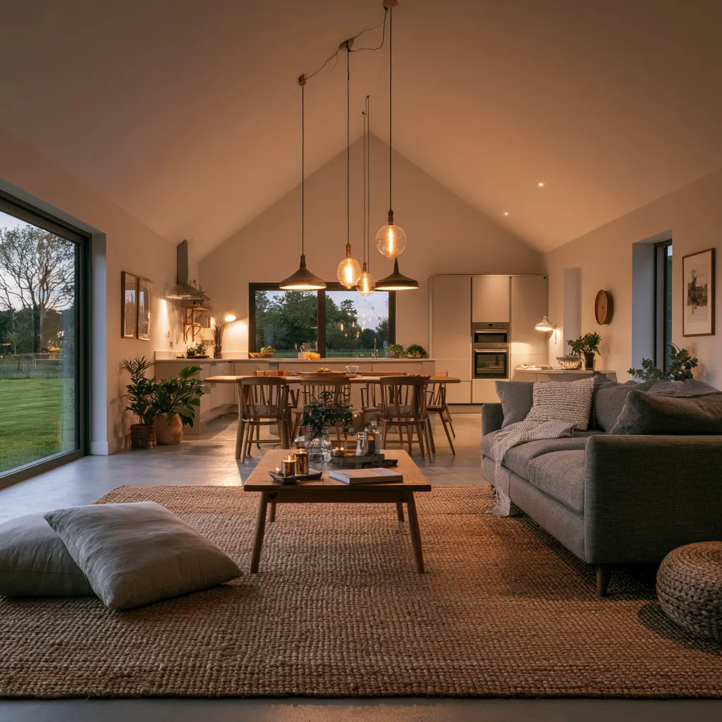
Nate Berkus has spent more than two decades convincing the public that a beautiful living room is not about budget, square footage, or access to trade-only vendors. It is about intention. His rooms consistently read as deeply personal, visually layered, and somehow both collected and composed — the kind of spaces that take years to accumulate and yet look exactly right the moment they are finished. Understanding why his living rooms work is more useful than copying them directly, because the principles transfer to any home, any size, and any starting point.
This guide breaks down the Nate Berkus living room approach into its working parts: color logic, layering method, furniture philosophy, material choices, and the small decisions that do the most visible work. Every section includes actionable steps so the ideas land in a real room rather than staying on a mood board.
Who Is Nate Berkus and Why Do His Living Rooms Keep Getting Copied
Nate Berkus founded his Chicago-based interior design firm at 24, became a recurring design contributor on The Oprah Winfrey Show beginning in 2002, hosted his own nationally syndicated talk show from 2011 to 2013, and went on to launch the Nate Berkus Collection with Target — a line that generated over $100 million in its first two years and made his design vocabulary accessible at mass-market price points. In 2012 he married interior designer Jeremiah Brent, and the two have collaborated on several high-profile projects and co-hosted the HGTV series Nate and Jeremiah by Design from 2017 to 2018.
His influence on American interior design taste is measurable. According to Google Trends data, searches for “Nate Berkus” consistently rank in the top five among designer name searches alongside Kelly Wearstler and Joanna Gaines. His Target collection routinely sells out within days of restocking. His 2012 book The Things That Matter reached the New York Times bestseller list and argued the central thesis of his design approach: rooms that tell the story of the people living in them are always more beautiful than rooms that follow a style manual.
Living rooms are where his philosophy is most visible. They are the room he has discussed most publicly, styled most consistently, and been photographed in most frequently. The result is a recognizable signature that designers and homeowners return to as a reference point precisely because it never looks dated.
The Core Nate Berkus Living Room Palette
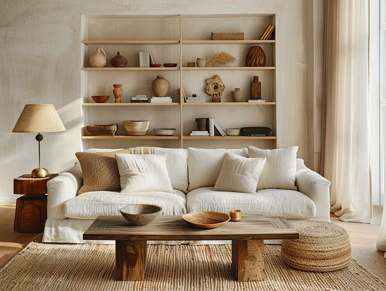
Berkus does not prescribe a single color palette, but his living rooms cluster reliably around warm neutrals: creamy ivory, warm greige, wheat, warm white, and sand. These are walls and large upholstered pieces. Against this foundation he introduces depth through materials rather than color contrast — dark walnut against ivory linen, aged brass against stone, matte black against warm plaster. The color interest comes from objects and art, not from walls or sofas.
This restraint is deliberate. In a 2019 interview with Architectural Digest, Berkus described his approach to color: “I want the room to be the frame. The life you live in it, the things you’ve collected, those are the painting.” When walls and large furniture compete for attention, the room becomes about the design rather than the people. When they recede, everything placed in front of them becomes personal and meaningful.
The practical implication is that Berkus favors warm white paints with significant yellow or pink undertones — Benjamin Moore’s White Dove OC-17, Farrow and Ball’s Pointing No.2003, and Sherwin-Williams’ Alabaster SW 7008 appear repeatedly as reference points in designer interviews citing his work. These are not decorator whites; they are warm enough to read as a color in their own right while still functioning as a backdrop for everything else. The walls feel inhabited, not institutional.
For those exploring how warm neutral walls interact with the objects placed in front of them, this article on creamy off-whites and cozy warm neutrals covers the specific undertone decisions that make a neutral wall feel inviting rather than cold — a distinction Berkus returns to repeatedly in his public commentary on color.
How Nate Berkus Layers a Living Room
Layering is the word most frequently used to describe the Berkus method, but it is rarely defined with enough precision to be actionable. In practice, his layering operates across four distinct registers: architectural, furniture, textile, and object. Each register has a different purpose, and the rooms that look most like his work are the ones that have addressed all four rather than concentrating everything in one or two.
Architectural layer: This is what exists before any furniture arrives — wall finish, flooring, trim, fireplace surround, built-in shelving. Berkus consistently treats this layer with more care than most homeowners do. Limewash or plaster finish on walls rather than flat paint. Herringbone or wide-plank floors in natural wood rather than engineered click-lock. A fireplace surround in plaster, stone, or vintage tile rather than standard drywall trim. These choices create the room’s texture baseline, and they are the reason his rooms feel rich even before furniture is placed.
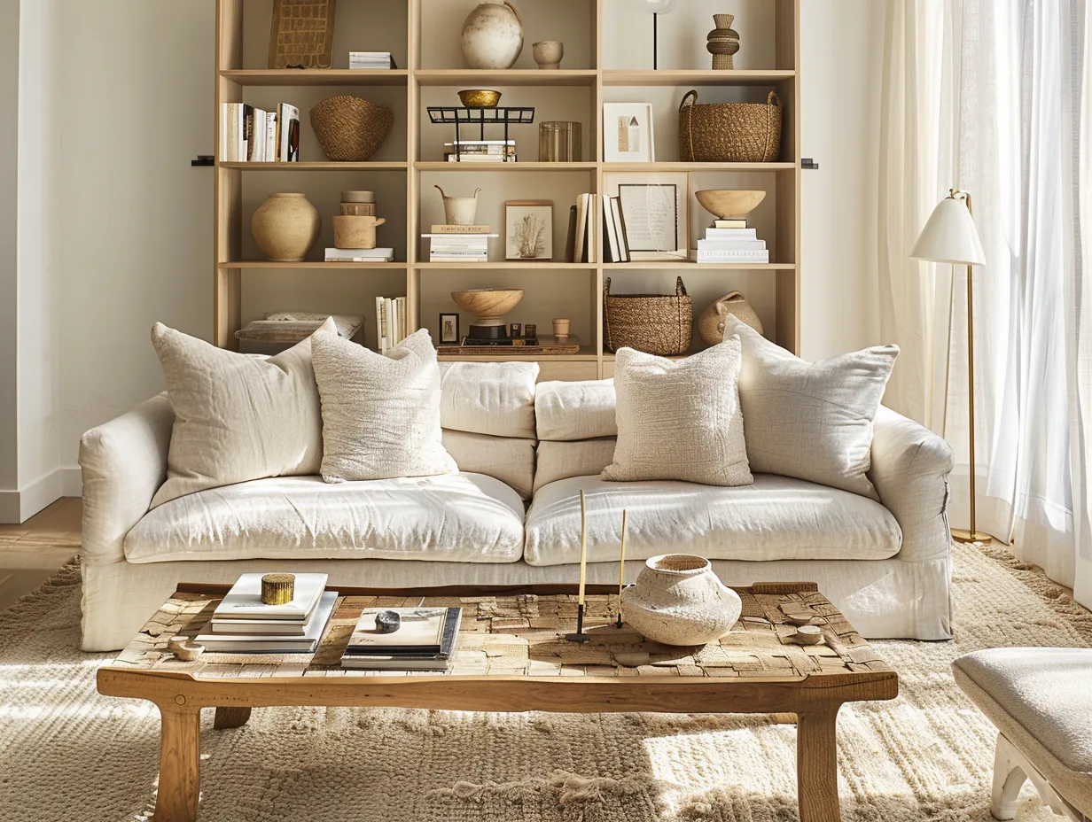
Furniture layer: Large pieces in neutral upholstery — linen, cotton, or bouclé in cream, ivory, or warm oatmeal — with natural material frames in walnut, oak, or brass. The sofa is rarely the room’s statement piece in a Berkus living room. It is the room’s resting point. The statement comes from what surrounds it.
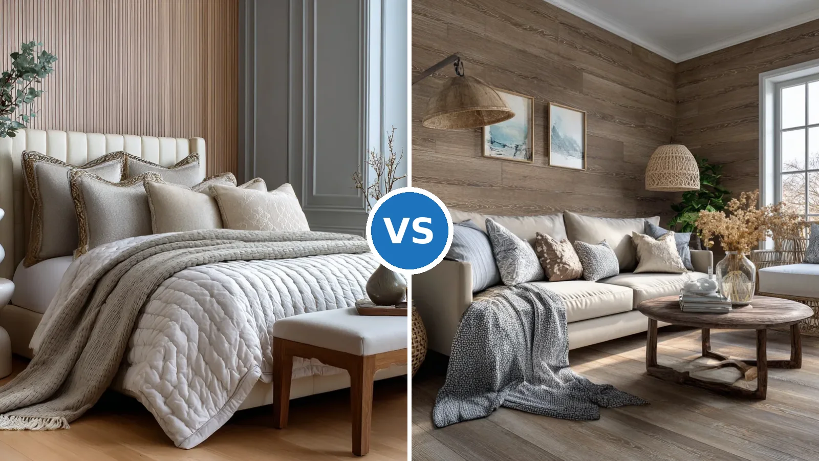
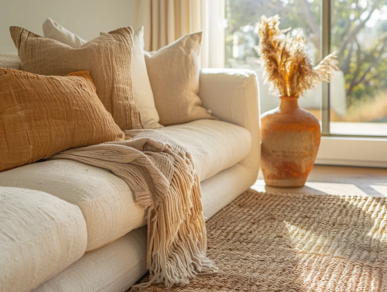
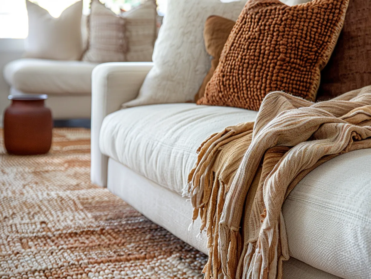
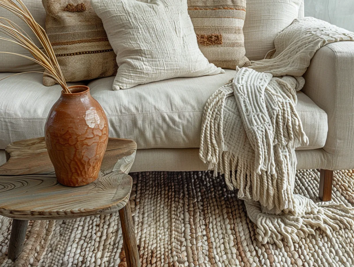
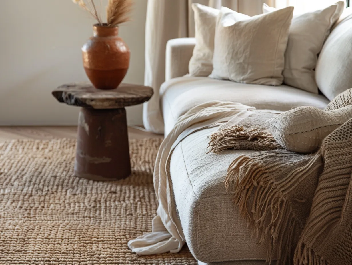
Textile layer: Multiple rugs, layered throws, and cushions in varied textures within a controlled color range. A jute rug under a wool flat-weave. Linen cushions beside a velvet cushion in a closely related tone. A cashmere throw draped with specific carelessness over one arm of the sofa. The textile layer adds tactile depth that photographs cannot fully communicate but that the body registers immediately upon entering a room.
Object layer: This is where Berkus’s philosophy of personal objects becomes most legible. Ceramics from a market in Oaxaca alongside a family photograph, a stack of architecture books, a single sculptural branch in a handmade vessel. The rule is not that objects must be expensive or rare — it is that they must have meaning to the person who lives in the room, and they must be displayed with enough space around them to be seen individually rather than collectively.
Furniture Choices That Define the Nate Berkus Living Room Aesthetic
Berkus is consistently drawn to furniture that sits at the intersection of history and function. He mixes eras deliberately — a vintage 1960s armchair beside a new upholstered sofa, an antique chest used as a coffee table, a reproduction Saarinen tulip side table beside a found-object floor lamp. The effect is a room that looks collected over time even when it was designed in a single project.
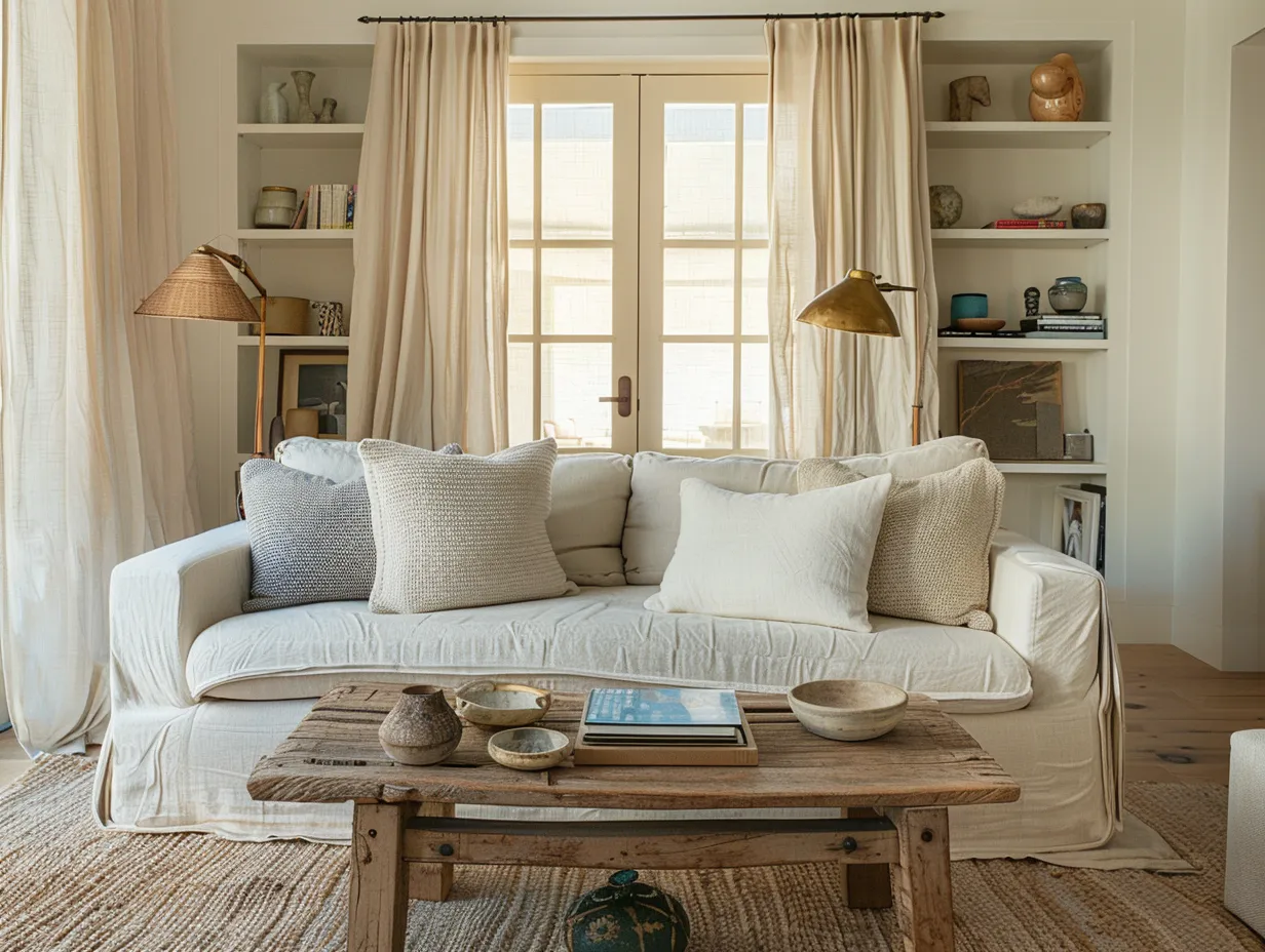
His sofa selections tend toward clean-lined, low-profile frames in linen or cotton. The Belgian linen sofa — a piece he has referenced publicly multiple times — is the closest thing to a signature Berkus piece: low arms, tightly filled cushions, visible loose slipcover or naturally wrinkled upholstery that signals ease rather than formality. Brands he has worked with or publicly cited include RH (Restoration Hardware), Williams-Sonoma Home, and his own Target collection, which offered versions of his sofa silhouettes at $400 to $900.
Coffee tables in his rooms are almost never glass-and-chrome. They are travertine, reclaimed wood, hammered brass, or stacked vintage luggage. The surface must be able to accumulate objects — books, trays, candles, a small plant — without looking messy, which means material and proportion matter more than style. A rectangular coffee table two-thirds the length of the sofa in front of it, at a height within two inches of the seat cushion, is the reliable Berkus proportion.
Armchairs appear in pairs more often than not, flanking the sofa or anchoring a second seating grouping. Berkus has noted in several interviews that two chairs in different styles but in the same material family — both linen, or one linen and one leather — create the sense of accumulation that makes a room feel personal rather than purchased as a set. The chairs do not match. They belong to each other.
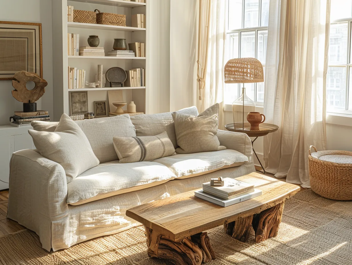
Rugs are almost always natural fiber at the base layer. Jute or sisal under everything, then a layered wool or cotton rug on top if the room needs pattern. The layered rug approach is one of the most distinctly Berkus moves in a living room, and it produces a floor that reads as warm and complex even when the walls and furniture are almost entirely neutral. For a deeper look at how layered rugs build visual depth without renovation, this article on layered rug home design covers the sizing, placement, and material logic that makes the technique work.
Nate Berkus Living Room Ideas for Styling Shelves and Surfaces
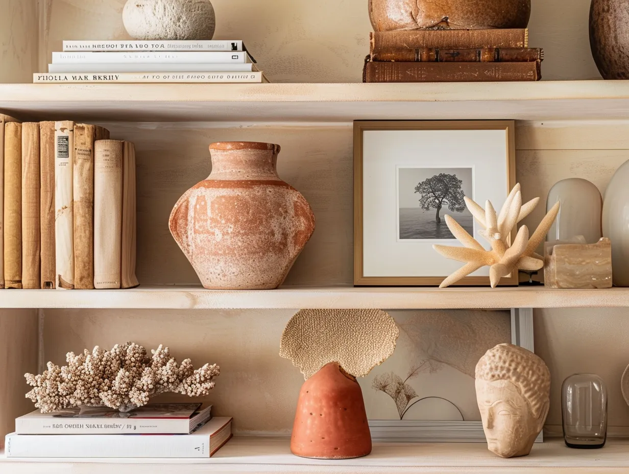
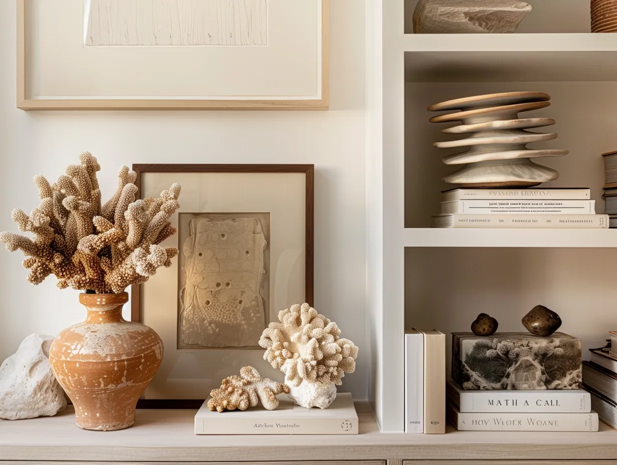
No element of a Berkus room is more studied or more copied than his shelf and surface styling. The approach looks casual in finished photographs; it is anything but in practice. His styling follows a set of structural rules that he has described explicitly in interviews, books, and television appearances over the years.
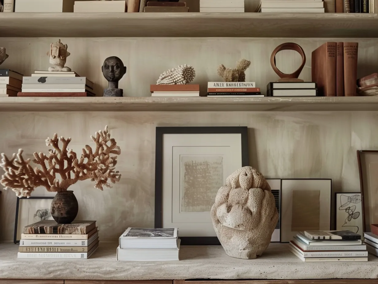
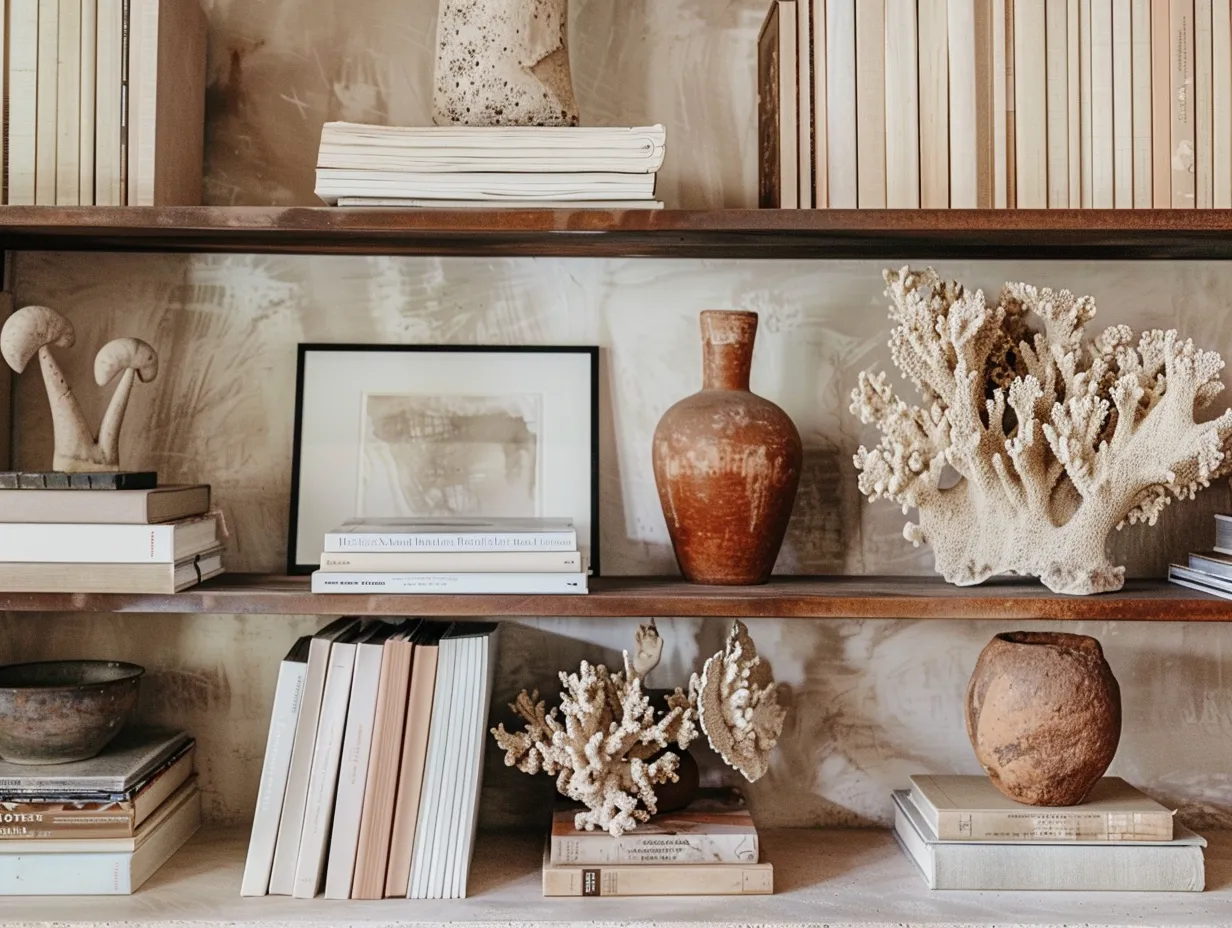
Books are always present and always mixed — art books, travel books, and novels together, never organized by color (which he has described as “turning your library into a prop”). They are stacked horizontally as often as they are shelved vertically, with objects placed on top of horizontal stacks to create height variation. The books function as furniture for smaller objects: a ceramic figure balanced on a stack of three hardcovers sits at exactly the right height relative to the books shelved beside it.
Objects group in odd numbers — threes and fives — at varied heights and in varied materials. A tall ceramic vase beside a short bronze sculptural piece beside a small framed photograph reads as curated. The same three objects at the same height read as a row of products. The height variation is the difference between a shelf that feels designed and one that feels stocked.
Natural objects — a piece of coral, a geode, a weathered stone, a branch — appear in almost every Berkus surface styling. They introduce an irregularity of form that manufactured objects cannot replicate and a reference to the natural world that makes the surrounding man-made objects read as more considered by comparison. The natural object does not need to be precious. It needs to be genuinely interesting in shape, surface, or weight.
The empty space between objects is as deliberate as the objects themselves. Berkus consistently leaves more breathing room than most homeowners are comfortable with, because objects that are too close together compete for attention and none wins. The rule of thumb he has referenced: if you can remove one object from a grouping and nothing looks worse, you are styling correctly. If removing an object makes the grouping feel sparse, you have found the minimum. Never go below it.
Lighting in a Nate Berkus Inspired Living Room
Berkus does not use overhead lighting as a primary source. His living rooms rely on layered task and ambient lighting at table height and below, with overhead fixtures used sparingly and chosen for their sculptural quality rather than their light output. This is one of the choices most responsible for why his rooms photograph warmly and feel genuinely intimate in person.
Table lamps are the workhorse of his lighting strategy. They appear in pairs on side tables flanking the sofa, singly on consoles and shelves, and occasionally on the floor when a space needs vertical warmth. His lamp bases favor handmade ceramic, hammered brass, antique bronze, and turned wood — materials that look better slightly imperfect and that carry the same warm-material-first logic as his furniture choices. Shades are almost always white or warm linen, never patterned.
Bulb temperature in all visible fixtures runs at 2,700K. Berkus has mentioned this explicitly in a number of home tours, noting that cool bulbs flatten the warmth out of neutral rooms and make people look tired. At 2,700K, warm ivory walls look golden, linen upholstery looks sun-bleached in the best sense, and the brass and bronze objects in the room glow rather than glint.
Candles appear in almost every Berkus living room — pillar candles on a tray, tapers in brass holders, small votives clustered on a coffee table. They are not primarily decorative; they contribute warm flickering light at the lowest level of a room, which no electric source can replicate. In a room already lit primarily by table lamps near eye level when seated, candles at coffee table height complete a downward gradient of light that interior photographers describe as the quality that separates rooms that feel photographed from rooms that feel lived in.
Key Nate Berkus Design Principles Compared to Other Leading Designers
Understanding where Berkus sits in relation to other influential designers clarifies what makes his approach distinctive and helps identify which elements to borrow most directly for a given room personality.
| Design Element | Nate Berkus | Kelly Wearstler | Joanna Gaines | Studio McGee |
|---|---|---|---|---|
| Wall palette | Warm ivory, creamy white | Bold color or rich plaster | White, white shiplap | Warm white, light grey |
| Sofa approach | Neutral linen, loose silhouette | Sculptural, statement color | Slip-covered farmhouse | Clean-lined, tight upholstery |
| Object sourcing | Travel, vintage, personal | Curated art collection | Flea market, handmade local | Matching accessory sets |
| Rug strategy | Layered, natural base | Statement single rug | Jute or sisal single rug | Neutral single rug, often overdyed |
| Metal finish | Aged brass, unlacquered | Polished brass, chrome | Matte black, oil-rubbed bronze | Aged brass, warm brass |
| Personal objects | Central to the design | Art-forward, less personal | Family photos, signage | Minimal, matched accessories |
| Price point approach | High-low mix, Target accessible | High-end only | Mid-range, Magnolia line | Mid to high, Shea McGee line |
| Key signature move | Layered textiles + curated objects | Unexpected color pairing | Shiplap + farmhouse elements | Clean lines + warm neutrals |
The comparison reveals that Berkus occupies a specific position no other major designer fully fills: accessible in price point, personal in philosophy, warm in aesthetic, and eclectic in sourcing. His rooms can be replicated on almost any budget precisely because the defining element — meaningful personal objects — costs nothing to acquire if you already own them.
The Personal Object Rule in Nate Berkus Living Room Ideas
The most frequently quoted Berkus principle — that rooms should tell the story of the people who live in them — sounds simple and is genuinely difficult. Most people look at their possessions and see clutter. Berkus looks at the same possessions and sees potential for the most interesting room in the neighborhood. The difference is not in the objects but in the editing and display.
His practical advice, repeated across books, interviews, and television appearances, runs to three steps. First, identify the objects you already own that carry genuine meaning — a souvenir that reminds you of a specific trip, a piece of pottery made by a friend, a photograph taken by someone you love. These objects are always more interesting than objects purchased for decoration because they carry a story the room can communicate without explanation.
Second, give each object enough space to be seen. An object surrounded by other objects at the same size and height disappears into pattern. The same object on a tray, on a stack of books, or elevated on a small stand becomes a considered choice. The display is what transforms a possession into a design element.
Third, let the objects change over time. Berkus has mentioned in multiple interviews that he rotates objects in his own homes seasonally — not because he tires of them but because the room changes, the light changes, and different objects become more or less relevant to the way he is living in a given period. A living room that changes slightly over time is a room that continues to feel alive rather than finished.
Nate Berkus Living Room Ideas for Specific Room Challenges
The Berkus approach adapts effectively to rooms that feel problematic in other design frameworks. Here is how his principles apply to three of the most common living room challenges.
Rooms with too much furniture: Berkus consistently advocates for removing rather than adding. In almost every episode of Nate and Jeremiah by Design, the first intervention in an overwhelmed living room is subtracting furniture, not replacing it. The target is always fewer, better-placed pieces with visible space between them. If you can walk comfortably through every path in the room without turning sideways, the furniture density is approximately right.
Rooms dominated by a television: Berkus treats the television as a functional object rather than an architectural anchor. He has noted publicly that he dislikes rooms organized entirely around a screen and prefers arrangements where the sofa faces the most interesting architectural feature of the room — a fireplace, a window with a view, a built-in bookcase. The television can exist on a perpendicular wall visible from the sofa without being the room’s focal point. For readers navigating the fireplace-versus-television question in their own living rooms, this article on balancing the TV and fireplace in living room decor provides specific layout strategies that align with the Berkus preference for architectural over electronic focal points.
Rooms with low ceilings: Berkus compensates for low ceilings with floor-length curtains hung as close to the ceiling as possible, floor lamps that draw the eye upward, and tall narrow objects — a sculptural branch, a standing lamp with a very slim base — that create vertical lines without adding visual weight. He avoids low horizontal furniture arrangements in these rooms and tends to use lighter-colored upholstery to prevent the space from reading as compressed.
Living Room Fireplace Ideas in the Nate Berkus Tradition
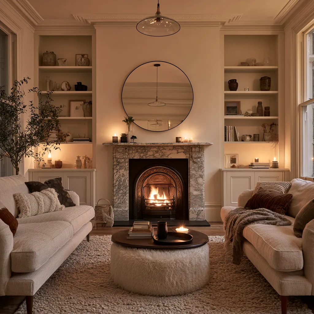
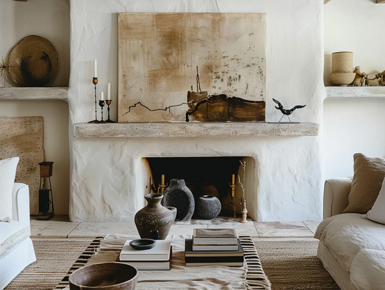
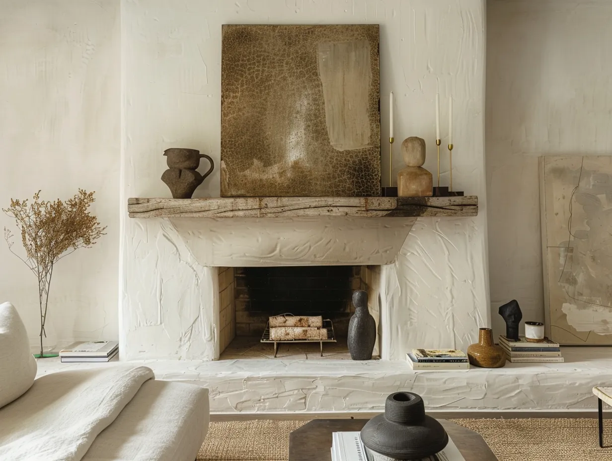
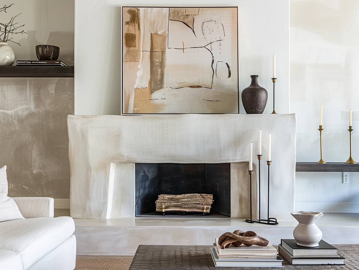
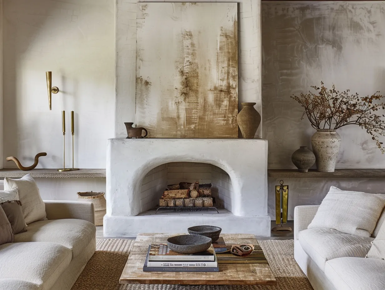
The fireplace surround is the single architectural element Berkus has most consistently transformed in his project work. His interventions typically move away from standard drywall-trimmed fireboxes toward plaster, limestone, unlacquered brass, handmade tile, or reclaimed stone. The surround becomes a piece of functional sculpture rather than a builder’s detail.
His mantel styling follows the same object-display logic as his shelves: meaningful objects grouped in odd numbers at varied heights, with generous space between them and at least one natural material element. A large format art piece or mirror above the mantel is preferred over a television — he has cited the television-over-fireplace arrangement as one of the combinations he finds most difficult to resolve elegantly, primarily because both elements want to be the room’s focal point and neither wins the competition convincingly.
In rooms where a real fireplace exists, he typically treats it as the sofa’s anchor point — the piece of architecture the seating arrangement faces and the area around which the room’s most personal objects are concentrated. For anyone looking to develop a fireplace wall as a compositional anchor in their living room, this article on living room fireplace feature walls as room anchors covers the architectural and styling decisions that make the fireplace wall do the work Berkus intends it to do.
How to Apply Nate Berkus Living Room Ideas on a Tight Budget
The Berkus Target collection demonstrated something most design-world observers already believed but rarely said publicly: the objects in a Berkus room do not need to be expensive. They need to be right. This distinction opens the entire approach to anyone willing to shop carefully rather than spend heavily.
The highest-value investment in a Berkus-inspired living room is wall treatment. Limewash paint, which produces the textured, light-reactive quality his rooms communicate, costs between $45 and $85 per gallon and applies over existing painted drywall. In a 14-by-16-foot living room, one to two gallons typically covers all four walls with one coat — the varied coverage is part of the aesthetic. The result shifts a standard rental or builder-grade room into something that looks architecturally considered for under $200 in materials.
The second priority is a jute rug in the right size. This is the foundation layer that everything else sits on, and undersizing it is the most common reason a Berkus-influenced room fails to cohere. An 8-by-10 rug in a standard living room, or a 9-by-12 in larger spaces, from sources like Rugs USA, Wayfair, or IKEA (the HULSIG range) runs between $80 and $350 and establishes the warm natural-material baseline the rest of the room needs.
After wall and rug, source personal objects before purchasing decorative accessories. Thrift stores, estate sales, and your own storage are more likely to produce the meaningful, irregular objects that define a Berkus room than any home goods retailer. A handmade ceramic found at a local potter’s market for $35 will do more for a room’s story than a manufactured vase from a design boutique at $250. The market is not the point. The object is.
For linen cushion covers, throw blankets, and curtains at accessible prices, Berkus’s own range at Target during its run offered the most direct interpretation of his textile preferences at $15 to $80 per piece. Current alternatives with similar proportions and materials include IKEA’s DYTÅG and MAJGULL linen collections, H&M Home’s linen cushion range, and Quince, which produces a 100% European linen throw at approximately $100 that reads with the quality of significantly more expensive alternatives.
The Organic Modern Connection in Berkus Living Room Design
Nate Berkus was practicing the core elements of what is now marketed as “organic modern” design before the term existed as a searchable category. Warm neutrals, natural textures, handmade objects, imperfect surfaces, and furniture that references both historical making traditions and contemporary silhouettes — these are the elements that define organic modern in 2024 and 2025, and they are the same elements that appear in Berkus living rooms documented from 2005 onward.
The distinction between his work and the broader organic modern trend is in the personal object requirement. Organic modern as a style category can be executed with entirely purchased items and produce a beautiful room. A Berkus room cannot. Without the personal object layer, a room built on his other principles looks like a well-done organic modern showroom rather than someone’s home. The personal layer is not decorative; it is structural to what the room is communicating.
For anyone interested in how the organic modern framework supports the kind of warm neutral layering that defines both Berkus’s work and the broader trend it has influenced, this article on organic modern style with warm neutrals and muted olive charts the relationship between material choices, color restraint, and the visual warmth that makes rooms in this mode feel genuinely welcoming.
What a Nate Berkus Living Room Feels Like in Practice
Design writing about Berkus often focuses on what his rooms look like. Less attention goes to what they feel like, which is ultimately the point. People who have visited his personal spaces — journalists, collaborators, and television crew — consistently describe the same quality: the rooms feel like they belong to a specific person. Not to a style. Not to a trend. To someone.
That quality is achievable by anyone willing to start with the objects they already own rather than with the furniture they plan to buy. The layering, the warm neutrals, the natural materials, the aged brass — all of that supports the story being told. But the story comes first. Berkus’s most repeated advice, offered in essentially every format he has used to discuss design, is: start with the things that matter to you and let the room grow from there. The design follows the life, not the other way around.
Rooms built this way require patience. A Berkus room that looks right typically reflects years of acquisition, editing, and rearrangement. The consolation is that a room assembled this way does not go out of style, because it was never built on style in the first place. It was built on the people living in it — and that, by definition, does not date.